Both web designers and developers dream of the perfect website that users would simply adore. The most important thing they should do to ensure this, is to create a visual harmony among their elements. This article will reveal few tips and tricks that can show you how to become a successful web designer. Ready to make everybody talk about your website? Let’s begin!
Intuitiveness
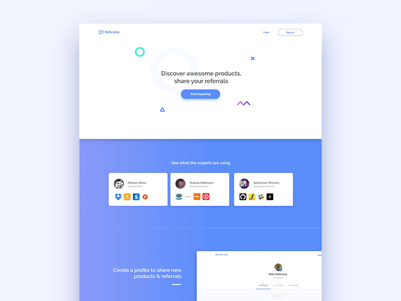
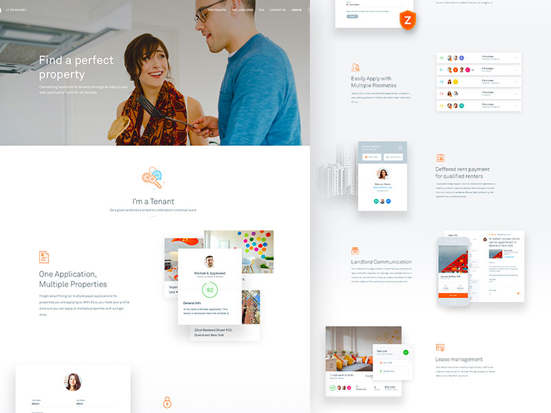 Image source: Balkan Brothers
While all designers strive towards uniqueness (and that’s perfectly fine), some of them seem to have neglected the importance of intuitiveness and familiarity.
In a user-focused world, all apps and websites should comply with the intuitiveness rules, and deliver products that are actually simple to learn and to navigate. Without it, no website will be genuinely memorable.
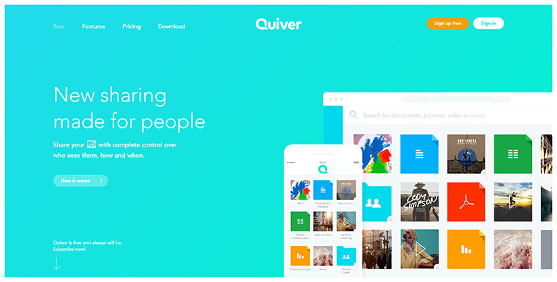 Image source: quiver.net
Users want and should spend some time to familiarize with our website/app, but that should not take them hours. It is up to you to simplify the procedure, and to not require any specific efforts for the performance of certain actions.
Innovation is also an essential skill that good designers should posses-their work should be interesting and artistic; and they should be able to predict the right moment for the introduction of a new feature. Still, the best thing for a designer is to avoid serious deviations from the already established standards.
For instance, employ regular registration procedures, or place key elements right where the visitor expects to see them.
Familiar navigation
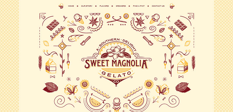 Image source: sweetmagnoliagelato.com
Think of a real-life example: when you go to a friend’s place for the first time, you don’t really know where a particular room is, and you don’t know how to move around. Still, you will hardly come across a place whose washroom is in the basement, or, in case you do, you will certainly not like it.
That’s exactly what happens with web design: users need to learn how to navigate it, but they come with certain expectations. The thing you cannot afford to do is to confuse them so badly that they would never come back.
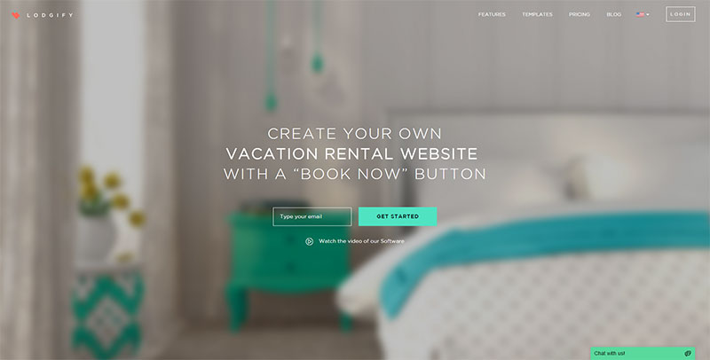 Image source: lodgify.com
Be a good guide! Users will be impatient, and they will not stay unless you indicate them where to go or what to do.
The same as in your house, you’re hosting people on your website, and you should provide detailed tutorials telling them how to accomplish their goals. A great design should have intuitive navigation, placing elements right where they are supposed to be.
As an example, log in/sign up options should stand in the upper right corner. Remember that every item/tool can serve the purpose of easy navigation: you have to work with shapes, lines, and colors; and use them to indicate people what each element is about.
Flexibility
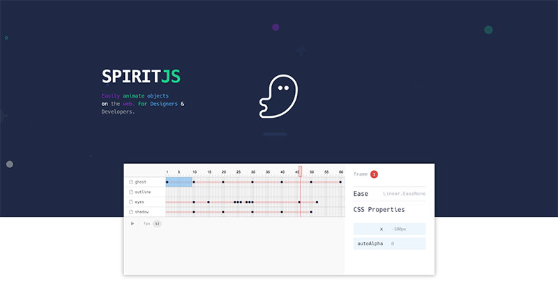 Image source: spiritjs.io
Flexibility is the most challenging aspect of design; since you’re supposed to create a product which will perform equally well on any browser/device. Many designers underestimate the importance of flexibility, and they end up presenting designs with unreadable fonts, or even such that are non-responsive.
Designing for a particular browser/device is not a good approach: remember that users have different preferences and browsing habits, and are always looking for a design which is appropriate for all devices they posses.
Simplicity
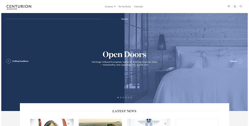 Image source: centurion-magazine.com
It is hard to resist the temptation of including piles of different options, but you must do it. Too many bars, navigation buttons, or sections will confuse users, and will provide them with a tone of unnecessary choices. Observed broadly, it could even lead them to neglect important content areas.
Take the Google example, for instance: one of the reasons why Google is so successful is that it works with maximal simplicity.
Still, we are not recommending you to simplify things to the level of boredom and lack of amusement. We’re just saying that your back-end management system will still remain complex, but just in order to simplify interaction as much as necessary.
Comfort
 Image source: Sebastian Petravic
Good designers know that their websites need redesigning here and there, especially in order to make new comers feel welcomed and comfortable. Still, redesign ought to bring an innovative breeze, while preserving the same functions. There were many successful websites in the past that failed just because of their completely different redesign.
Keep loading time minimal
 Image source: redcollar.digital
As a user, you probably know that loading time has a huge impact on how visitors feel about a website. Nobody likes to spend hours waiting for a page to load, while there are thousands of other places where he could gather the same information, or perform the same action.
Nowadays, competition is very harsh, and while all websites are fun and entertaining, time happens to be the only criterion which makes a difference.
In order to reduce loading time, reduce firstly the number of graphic elements you have on your website (animations, videos, graphics, or even high-resolution images). Optimization of content never fails to deliver good results.
Pay attention to feedback
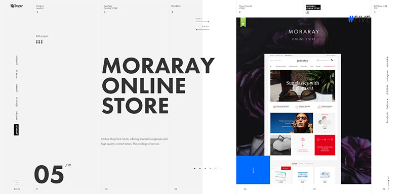 Image source: sdklimov.com
Leaving and receiving feedback is not just a trend-it is an evaluation tool that reveals what people really think of your product. Take a look at the most successful designers and developers: they rely almost completely on what their users have to say.
Besides, they know that a user is always right, and there is no other argument that is more valid than that one. Feedback indicates the need for change, but it also establishes a firm connection with users, where they feel appreciated and cared about. Every user likes that!
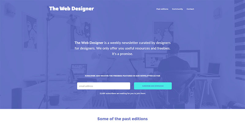 Image source: the-webdesigner.co
By providing a feedback option, you show that you’re genuinely acknowledging the interaction of your users. Remember that feedback is not your only interaction tool: you can give visual cues to guide users (highlighting important items, for instance); dialog support; on-time confirmations; error messages, etc.
There are a lot of means you could use to create visual cues: shape, size, color, or placement will show users that you’re ‘always there’, and you really care about what they are doing.
Readability
 Image source: Jason Kirtley
You can have the most perfect website of all times, but unless you make it readable nothing else will matter. As you know, users have no problems to switch websites, especially if they experience difficulties when reading the content. That’s why you should think of readability as a crucial element of your website.
Readability doesn’t only refer to size: you have to use an eye-friendly typeface; and to divide information in a logical and understandable manner. Let’s not forget that content should also be interesting, so that users would be tempted to visit the website again.
Few additional tips to remember
 Image source: Sunil Joshi
Don’t stop working on your skills, and learn everything that could be relevant for your work. You might have created the most amazing site ever, but it will be worth nothing if you don’t maintain your visitors’ comfort.
Summing up, don’t underestimate the visual effect of your design. Leave lots of white space; and use eye-friendly colors that cause no harm to the viewers. Don’t turn the site into a stressful environment, packed with items and options that visitors don’t really need. The more you work to organize your content, the more relaxed users will feel when exploring it.