A color is one of the most powerful tools in web design. The right color combination can evoke emotions, communicate personality, and influence user behavior. But with so many options, how do you pick the best color palette for the site? This Article will discuss some of the best color palettes for websites design and tips on how to create a beautiful and functional design. Website colors serve more than one purpose-they are part of the means of communication between the users and the brand that they are associated with. Well-combined colors inspire confidence, are more likely to elicit conversions, and are far more unforgettable than others.
In this article, we will discuss what are some of the best website color combinations for websites, different industries and design styles thereby helping you choose the right color combinations for professional and appealing websites.
Table of contents
Why Does Color Matter in Web Design?
Colors are more than just decorative pieces of ideas. They help convey meaning and give an emotional appeal to audiences. For example:
- Blue conveys trust and professionalism.
- Red evokes excitement and urgency.
- Green symbolizes growth and nature.
- Yellow radiates energy and optimism.
This means that the appropriate colors will give your website a pleasing look and convey the right message corresponding to your brand aim.
Check out 10 Best Font Combinations To Elevate Your Typography.
Color Combinations for Websites Ideas
Following are the different types of best color combinations for websites that you can use to built the most eye catching website that cater towards your audiences and brand.
1. Classic and Professional
Want to give your website a touch of class and add a proffesionalism look to it? then definitely try out these below best color combinations for websites to get the perfect classy look!
1.1 Navy Blue + White + Gold Color Combination

Excellent for corporate, finance, or luxury brands.
Navy blue conveys trustworthiness, white simplicity, and gold luxury.
Why It Works:
- Navy Blue: This deep, rich tone embodies trust, stability, and authority. No wonder many corporations and financial institutions are now favoring it: it portrays reliability and professionalism.
- White: White adds clean lines and minimalism to any design, maintaining openness and uncluttered breathability. It also enhances readability and provides a neutral background of sorts against other elements.
- Gold: Gold brings in that element of luxury and class. It truly shines for high-end brands or websites that want to communicate exclusivity and sophistication.
Here are some examples of where you can use it – real estate, law firm, financial institutions, or investment firms.
Do check out 20 Abstract Gradients Bundle.
1.2 Charcoal Gray + Light Gray + Teal Color Combo
Why It Works:
- Charcoal Gray: This dark, neutral shade is modern and professional. It’s less harsh than black and adds depth to the design.
- Light Gray: Light gray provides contrast and balance, making the design feel clean and organized. It’s perfect for backgrounds or secondary elements.
- Teal: Teal is a refreshing pop of color that adds energy and creativity without overwhelming the design. It’s a great way to make a professional website feel approachable and modern.
Here are some examples of where you can use it – professional blogs, tech startup, tech companies or SaaS companies.
Check out Must Have Mix Bundle.
1.3 White + Black + Sliver Color Palette

Why It Works:
- Black: Black represents the hallmark sophistication and power. It brings a richness and timeless quality into any design.
- White: White gets the minimalist view off black, giving a balanced impression and clean design.
- Silver: Silver brings in a sleek, modern look. This metallic is great for providing a futuristic and upscale presence without being excessive or glitzy.
Here are some examples of where you can use it – Luxury brands, futuristic brands or tech companies, creative agencies.
Also might like Black And White Art Photography : Free Tutorial.
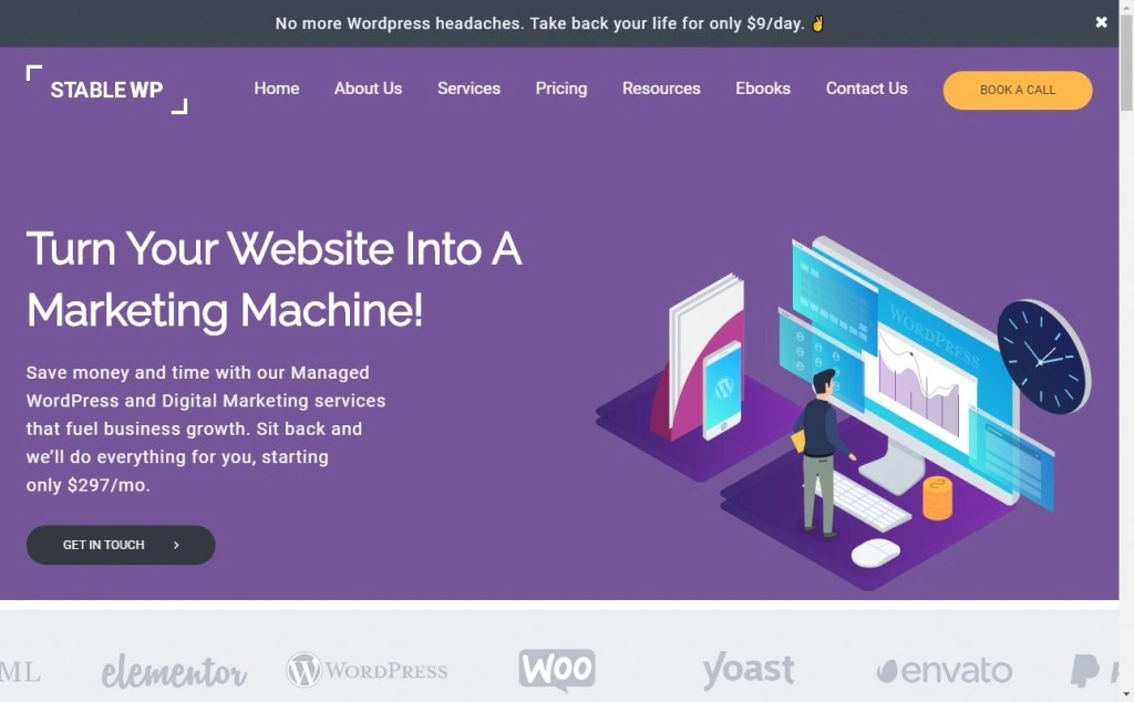
1.4 Deep Blue + Cream + Gold Color Combo

Why It Works:
- Deep Blue: Deep blue depicts trust, stability, and professionalism in richness, making it ideal for a corporate or financial website.
- Cream: Cream is a warm neutral that serves to lighten the design and calls for elegance. Less stark than white, it makes for a more inviting appearance.
- Gold: Gold contributes luxury and class, making the design feel upscale and exclusive.
Here are some examples of where you can use it – corporate or financial institutes, luxury brands or high end services, personal websites.
Check out 460+ Graphic Design Assets Pack.
2. Bold and Energetic
Add a essences of energy to your website using different color combination and bring a sense of bold look to your website. Using the following best color combination for websites will help achieve stunning websites.
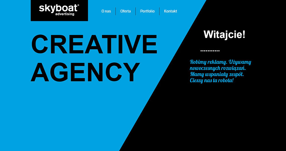
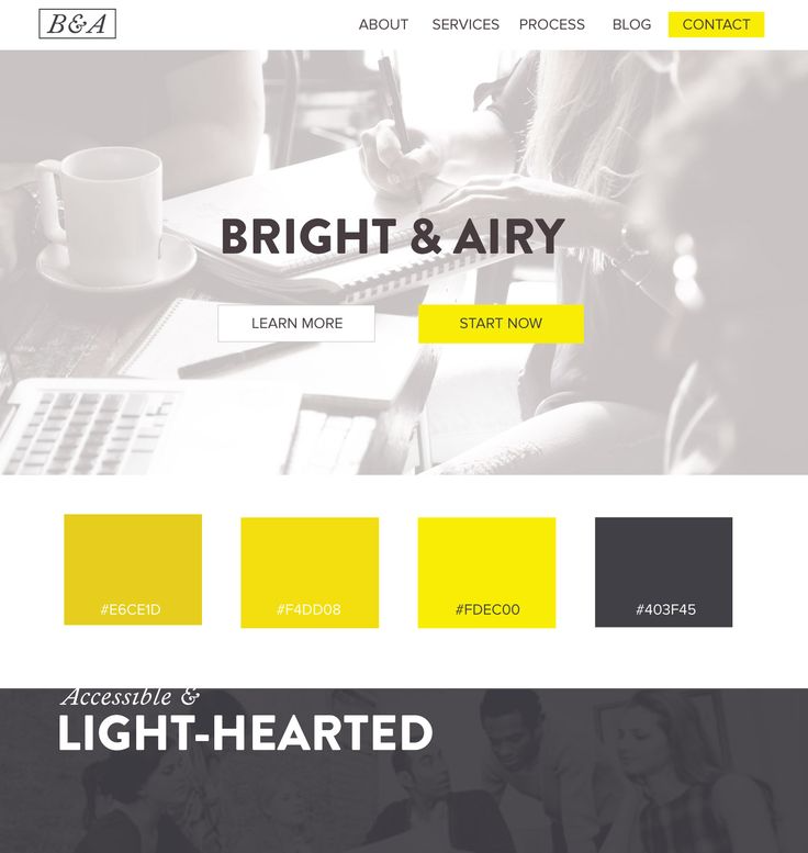
2.1 Yellow + Black + White Color Combination
Why It Works:
- Yellow: Yellow is the color of energy, optimism, and creativity. It’s very hard to miss it, as it demands instant notice.
- Black: Black gives an edge to this palette, creating contrast and tempering the vividness of yellow.
- White: This is used as a backing to keep the design calm and readable, rendering it a palette which does not overwhelm the eyes.
Here are some examples of where you can use it – Entertainment or event websites, youth focused websites, creative agenies or design studios.
Might also like The Ginormous Bundle Of Premium Graphic Resources.
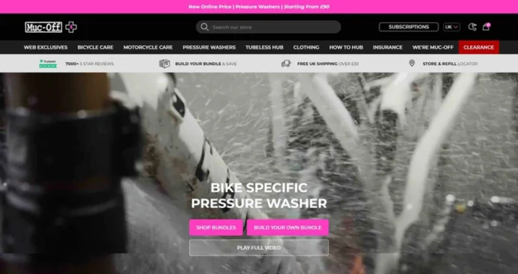
2.2 Red + White + Black Color Palette
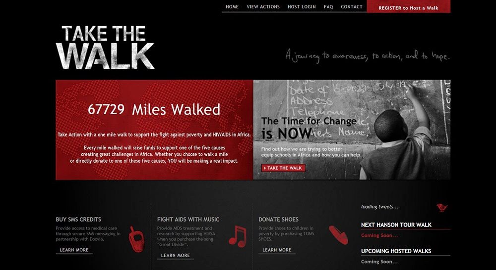
Why It Works:
- Red: Red is the color of passion, of urgency, of excitement. It calls attention to itself as something bold. Therefore it is perfect for calls to action.
- White: White carries an air of cleanliness and neutrality that allows the red to be emphasized.
- Black: Black provides depth and elegance to the color combination; it provides an excellent contrast with red.
Here are some examples of where you can use it – E-commerce websites, sports or entertainment, food and beverages brand.
Also check out RemoteSpace – Multi Account Manager | Lifetime Access.
2.3 Orange + Blue + White Color Combo

Why It Works:
- Orange: Orange is active, easy-going, and creative. It motivates approachable and fun brand participation.
- Blue: Blue brings trust and calm to that which rose from the vivid orange.
- White: White gives everything a clean feel and provides readability.
Here are some examples of where you can use it – Creative agencies or design studios, tech startup or Saas companies, sports or fitness brands.
Check out Entrepreneurial Wisdom Memes | Lifetime Access.
2.4 Purple + Orange + Green Color Combination
Why It Works:
- Purple: Purple is symbolic of creativity, luxury, and individuality. A bold and unique choice.
- Orange: Orange is energetic and warm, which provides a stark contrast to purple.
- Green: Green truly balances the lively colors with a natural freshness.
Here are some examples of where you can use it – gaming or entertainment websites, artistics brands, creative agencies or design studios.
Might also like 1500+ Premium Vectors Bundle.
3. Calm and Trustworthy
A main reason to have a best color combination for websites is to mainatain trustworthiness with the customers. This gives them a sense of belonging and calmness. The following few best color combinations for websites fits just perfectly with you ideas of calmness!
3.1 Blue + White + light gray Color Palette
Why it works:
- Blue: Blue is the color of trust, stability, and tranquility. It is preferred in corporate and healthcare settings due to being associated with dependability and professionalism.
- White: White lends to a clean, minimalist appearance, making it possible for the design to feel open and free from clutter.
- Light Gray: Light gray provides a subtle countenance against white and adds some depth to the overall scheme without feeling overwhelming.
Here are some examples of where you can use it – coporate or finanical websites, healthcare or wellness platforms, tech or Saas platform.
Check out 85 Watercolor Clip Art Bundle + Huge Bonus.
3.2 Soft Green + White + Beige Color Scheme

Why it Works:
- Soft green color: In general, green suggests nature, growth, and tranquility. A softer kind of green is better in soothing and offering approachability.
- White: Contributions to a clean, minimalist design should enhance user experience.
- Beige: Beige contributes warmth and smoothness to a good design that fosters welcoming and ease.
Here are some examples of where you can use it – Different wellness or lifestyle brands, eco-friendly or sustainable businesses, educational or childcare websites.
Check out 10 Pastel Aesthetic Backgrounds.
3.3 Light Blue + Pale Yellow + White Color Combo
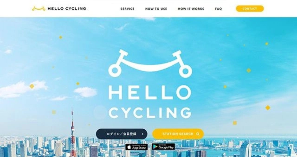
Why It Works:
- Light blue: calming and refreshing, fostering feelings of peace and tranquillity.
- Pale yellow: This adds a hint of warmth and optimism without being garish.
- White: keeps the design clean and the text easy to read.
Here are some examples of where you can use it – Healthcare or therapy platforms, educational or childcare websites, lifestyle or wellness brands.
3.4 Sky Blue + Lavender + White Color Combination
Why It Works:
- Sky Blue: Sky blue is effective, soft, and refreshing and gives off feelings of peace and quiet.
- Lavender: Lavender adds that little touch of softness and inventiveness to make the design feel special and welcoming.
- White: White keeps the design clean and promotes readability.
Here are some examples of where you can use it – Platforms in wellness or therapy, creative agencies and design studios, lifestyle or beauty brands.
might also like 10 Free Kawaii Backgrounds Collection.
4. Modern and Minimlistic
Modern and Minimalist color combinations focus on simplicity, clean lines, and a sleek aesthetic. These palettes often use neutral tones like Black, White, Gray, and Pastels, with occasional bold accents like Neon Pink or Mustard Yellow for a touch of vibrancy.
4.1 Black + White + Neon Pink Color Combo
Why It Works:
- Black: Black has a sophisticated and modern quality. It gives depth and drama to the overall design.
- White: White keeps the design clean and simple, enabling a seamless user experience.
- Neon Pink: Neon pink is a bold, futuristic take on color that attracts attention and adds excitement.
Here are some examples of where you can use it – Tech startups or SaaS platforms. Creative agencies or design studios.Fashion or beauty brands.
Might like The Easy Peasy Image to Background.
4.2 Gray + White + Pastel Pink Color Scheme
Why it Works:
- Gray: Gray being a neutral color and very unobtrusive, grays offer depth and balance in designs.
- White: White keeps the design clean and minimalistic while offering seamless user experience.
- Pastel Pink: Pastel pink offers a modern soft touch that seems friendly and stylish.
Here are some examples of where you can use it – With lifestyle or wellness brands, Creative agencies or design studios, Fashion or beauty brands.
Check out 10 Abstract Watercolor Backgrounds.
4.3 White + Black + Pastel Blue Color Combination
Why It Works:
- White: The white color gives a clean and minimalist design for a seamless user experience.
- Deep Black: Black serves to add sophistication and contrast, creating a bold modern aesthetic.
- Pastel Blue: The pastel blue adds softness and calmness which also feels fresh and modern.
Here are some examples of where you can use it – Tech startups or SaaS platforms, Creative agencies or design studios, Healthcare or wellness platforms.
Do check out 10 Aesthetic Liquid Backgrounds.
4.4 Charcoal + White + Mustard Yellow Color Combo
Why it Works:
- Charcoal: A dark, elegant tone of gray that brings depth and modernity to the design.
- White: White keeps the design bright, pure, and uncluttered, thus enabling seamless usability.
- Mustard Yellow: The mustard yellow spot adds a bold, modern pop of color that feels fresh and unique.
Here are some examples of where you can use it – Creative agencies or design studios, fashion or beauty brands, and lifestyle or wellness brands.
5. Neutral and Versatile Color Combinations
For brands that want a timeless, adaptable, and sophisticated design, Neutral and Versatile color combinations for websites are the way to go. These palettes are understated yet elegant, making them perfect for a wide range of industries, from lifestyle and wellness to corporate and luxury. Let’s dive deeper into five standout combinations:
5.1 Beige + Brown + White Color Combo
Why It Works:
- Beige: Beige is warm, neutral, and inviting. It creates a sense of calm and comfort.
- Brown: Brown adds depth and earthiness, making the design feel grounded and natural.
- White: White keeps the design clean and minimalist, ensuring a seamless user experience.
Here are some examples of where you can use it -Lifestyle or wellness brands, Eco-friendly or sustainable businesses, Interior design or home decor websites.
Might aslo like All Shop Lr Presets for Mobile & Desktop.
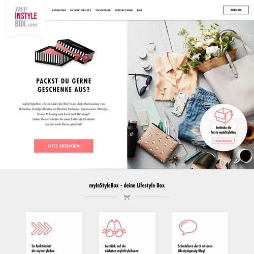
5.2 Taupe + White + Soft Pink Color Scheme
Why This Works:
- Taupe: Brings a warm nutral blend that is capable of binding into a very elegant look and versatile enough to be applied on the schematic.
- White: keeps the eyes clean and free from crammed decoration and promotes seamless user experience.
- Soft pink: adds warmth and femininity to the look, making it seem welcoming and chic.
Here are some examples of where you can use it – A lifestyle or wellness brand, A fashion or beauty brand, A creative agency or design studio.
Also check out Pink Photoshop Actions Bundle.
5.3 Cream + Brown + Gold Color Palette
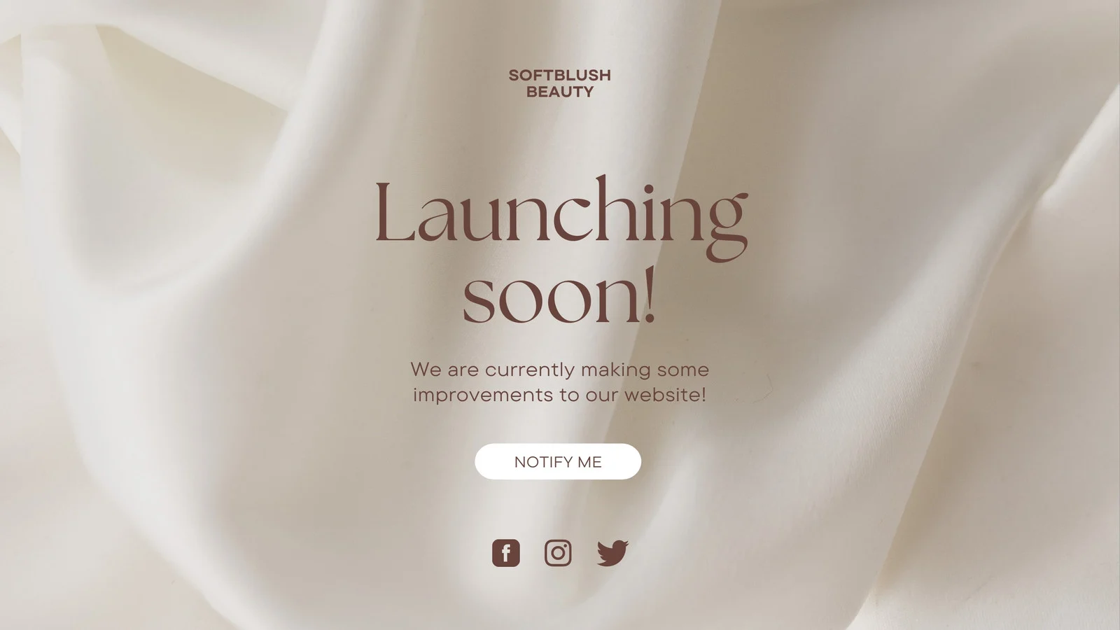
Why it Works:
- Cream: It’s such a warm and neutral shade that radiates pure elegance and sophistication.
- Brown: Brown brings richness and earthiness to make the design more grounded and natural.
- Gold: Gold brings in a luxurious and opulent feel to elevate the design.
Here are some examples of where you can use it – Luxury brands or services, interior design or home decor sites, and lifestyle or wellness brands.
Might also like 460 Canva Social Media Templates Bundle For Marketing.
5.4 Emerald Green + Black + Gold Color Combo

Why it Works:
- Emerald Green: Emerald green is a masterpiece that makes one think of wealth, prosperity, or growth. This bold, stimulating, and calming color can do wonders for the design of luxury brands, creative agencies, or eco business brands. This color infuses vitality into your design as well as natural beauty.
- Black: Black creates style, authority, and a timeless essence. It becomes a powerful anchor by giving depth and contrast to any design. Helps tone down the vibrancy of emerald green while amplifying the luxurious feel of gold.
- Gold: The color of luxury, accomplishment, and opulence. Its use brings chicness and glamour into the mix. Gold imparts a sense of exclusivity and adds an overall luxurious feel to the design, particularly when used as an accent.
Here are some examples of where you can use it – Luxury brands (high-end fashion, jewelry, or real estate), Creative agencies or design studios wanting to stand out, Eco-friendly or sustainable businesses (emerald green connects back to nature), Premium Services (financial consulting, private clubs, and elite events).
Might also like The Gold Backgrounds Collection.
FAQs
Q1. What emotions do different colors evoke?
- Blue: Trust, calmness, professionalism.
- Red: Energy, urgency, passion.
- Green: Growth, nature, harmony.
- Yellow: Optimism, creativity, warmth.
- Purple: Luxury, creativity, spirituality.
- Black: Sophistication, power, elegance.
- White: Simplicity, cleanliness, purity.
Q2. How many colors should I use on my websites color palette?
Keep it simple: 2-4 colors for the achingly chic design.
Follow the 60/30/10 paradigm:
60% for the primary color (e.g., background).
30% for the secondary color (e.g., headers, sections).
10% for the accent colors (e.g., buttons, links).
Q3. Why is color combination important for a website?
Color combinations are crucial in the following ways:
Brand Identity: Colors reflect your brand’s personality and values.
User Experience: Right colors help in readability and navigation.
Emotional Impact: Colors bring emotions and, as such, affect user behavior (trust, excitement, calmness).
Aesthetics: A well-designed palette will make your website look beautiful and professional.
To Wrap Up:
Picking out the best color combinations for websites gives it more aesthetic appeal, projects an image of your brand personality, and provides a lasting user experience. From traditional and timeless palettes like Navy Blue + White + Gold to bold and energetic combinations like Yellow + Black + White or the tranquil and trustworthy scheme of Blue + White + Light Gray, the secret lies in matching colors to your brand identity and audience preferences.
Remember about accessibility, balance, and consistency so that your website will surely be a glamorous and functional one. A perfect color palette for your website will make it beautiful, functional, and easily remembered by its visitors.


