Considering the technology behind displaying a page currently evolving, the designer remains the one responsible for arranging all of the content in an orderly manner; however, it can sometimes be difficult to determine which visual hierarchy definition is the best one that can be utilized when it comes to achieving visual hierarchy.
What is Visual Hierarchy?
When you are dealing with digital media, you are playing with words and images that look appealing when organized in a layout. To put it out there, visual hierarchy can be considered as the prioritization and organization of content, in a way to convey some meaning efficiently.
Designers have to keep in mind each choice that the audience could possibly make- and create a layout that best utilized the space and sells. The designer needs to establish the key region that the audience must first focus on, and also determine what call-to-action space needs to draw in attention.
In a broad sense, graphic design exists to facilitate and raise the quality of a communication; whether that communication is an explanation of quantum physics or simply the idea of longing and nostalgia. Utilizing certain hierarchy principles can help even non-designers create successful visual presentations that are both efficient and effective.
Simply put, a visual hierarchy in design is something that adds not only functionality to all of your designs, but beauty as well. In addition, visual assistance is also offered to the human eye, guiding it from one specific element of data to another.
In a way, it’s almost like an invisible computer pointer moving through everything in order to prevent the individual reading it from suffering from any kind of visual fatigue. Whenever visual hierarchy is added to any of your designs, your target audience will not fall victim to any kind of unnecessary clutter.
- Visual Hierarchy by placement. Any object that is placed dead in the center of something will automatically be perceived as the main focal point of the piece, as the attention of the viewer will end up becoming focused on that particular area of the piece.
- Visual Hierarchy by isolation. When putting several groups of elements together in one piece of art, one object by itself can end up becoming perceived as being the main focal point.
- Visual Hierarchy by contrast. Contrast is something that can be used to help create emphasis. Whenever a particular element is in contrast with something else, it can cause that element to become better seen and understood, which can lead to the eye becoming more attracted to it.
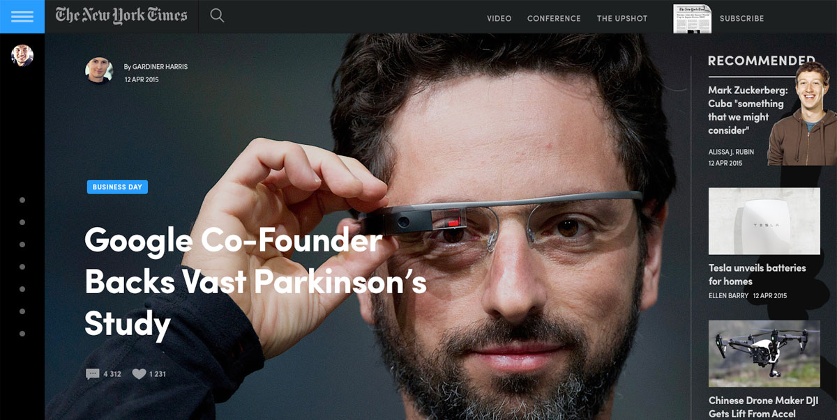
Typography
Image source: Dann Petty
The title, subtitle, and body copy are the three biggest aspects of the entire typographic family and should always be read in an order that is as naturally progressive as possible.
Obviously, the title is the very first thing your audience will see, which makes it extremely important that you make it truly stand out. You can achieve this by taking such steps as making the font size large and the font style itself unique. After the title comes the subtitle, which should also stand out, though it should be smaller in size than the title.
After these two aspects comes the body copy, which is something that should be smaller in size, yet still easy to read. No matter what, always ensure that you avoid using any kind of special font type for this.
Scanning patterns
Image source: Stas Petryanick
It’s only normal that as humans, we scan pages from top to bottom and read from left to right, as that’s how they have been taught. However, to designers, this is something that is more complex than one might think.
Studies have shown that a vast majority of individuals will scan through a page to see if they are even remotely interested in beginning to actually read it.
There are two different types of scanning patterns that people usually follow, which you can also take advantage of in your own designs: “F,” which is mainly used for blog pages and articles that are heavy on text, and “Z,” which applies to websites or advertisements that do not present information in block paragraph form.
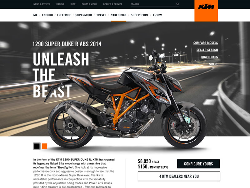
Icons
Image source: Afnizar Nur Ghifari
When utilizing icons in your design, always remember that the most important ones should always be the biggest, as this can greatly reflect visual importance.
Color
Image source: Mykolas Puodžiūnas
Color is something that can not only invoke various feelings in an individual, but it can also help determine what is important and what isn’t.
When you apply a color that is both bright and bold, it can help naturally draw the eye to it, which can make it a point of importance in your design.
Font styles
Image source: Oliur Rahman
As we all know, fonts come in different styles, which can lead to some rather unique and successful designs when they are used properly. This means that when you need to highlight any words of important in your title or subtitle, consider using a font type of a different style and size to help draw attention to it.
Establishing a good typeface selection is absolutely essential in terms of visual hierarchy, with the most important aspect being the weight of the typeface, which is often defined as the overall width of the strokes that compose all of its letters. Included with this is the specific style of the typeface, as well as other designs such as italicization.
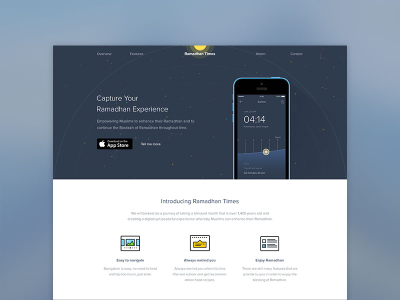
Whitespace
Image source: Gene Ross
Making sure that all of your content has sufficient breathing room is another great way to help draw attention to it. For instance, if there is a decent amount of negative or empty space around something such as a button, everything will end up being more visible to your readers.
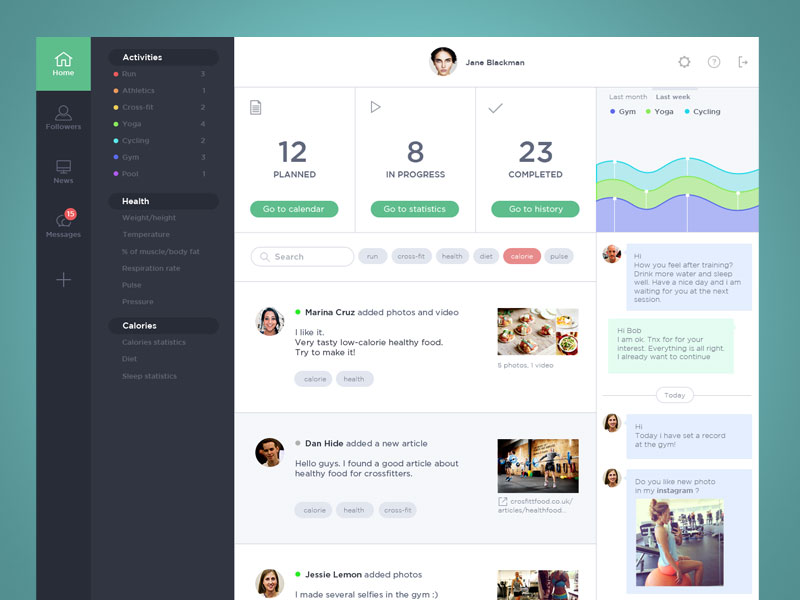
Obligatory grids
Image source: Elegant Seagulls
One great way to help showcase images as areas of importance is by the use of grids. The best way to achieve this is to place images that are more important in the larger placeholder, while smaller and less-important images should be placed in secondary photo holders.
Grids are also generally used in terms of page layouts. The biggest difference is that these grids consist of lines that are both vertical and horizontal. By utilizing these particular grids, achieving visual hierarchy can occur when the grid is broken, meaning that whenever there is any text that is arranged either diagonally or on a curve, it will automatically stand out against any other text that has become gridlocked.
Additionally, you can also achieve visual hierarchy by using the same kind of filter code on all of the photos that you include in your design.
Principles of Visual Hierarchy
Perspective:
By using the concept of perspective, designers may be able to create an illusion of depth which could range from a few inches to several miles. As we happen to see similar illusions in the real world, larger objects are generally perceived as being closer than similar smaller objects and, therefore, they usually command attention before any other object on a page.
For example, an illustration of a road will usually be wider at its lowest point and gradually grow narrower the higher it stretches across the canvas. Likewise, an object closest to the viewer will always appear larger than the same object farther away.
Proper perspective will establish both scale and proportion to accurately communicate the appropriate distance. A drawing of a five-mile stretch of road will diminish far more sharply than a half-mile stretch drawn on the same size canvas.
Proximity:
Proximity, which refers to the relation in which elements appear to one another, is one of the significant elements of design. Simply put, placing related elements close together suggests to readers that they are, in fact, related.
Imagine a white screen with a group of five dots on one side and a single dot on the other side. Our first assumption is always going to be that the five are, indeed, a group.
Placing elements close together can send other messages, as well. For instance, placing elements in certain locations on a map can provide audiences with an understanding of distance, whether near or far. Of course, this also depends on the size and scale of the map. By placing elements within a particular proximity of each other, added images and messages can be created. Think of how often you see three circles and a line positioned in a way to suggest the shape of a happy or sad face? The suggested image then often gains more attention than its individual elements. Do you see a happy face, or do you see three circles and a line?
Line:
Movement is a substantially effective way to attract viewers’ attention, especially when it’s implied within a still design. Lines are obviously efficient in pointing to items of emphasis, such as an arrow. However, they don’t have to physically appear on the page to do the trick.
Leading lines can be implied through the use of repeated elements, such as a row of dots. The proximity of objects or shapes, as well as the relationship of positive and negative space, can emphasize and be interpreted as different things. For example, by slanting an object up or down, lines can be created that suggest flight or descent.
Random:
Sometimes going against the pattern and being random can work in your favor, but randomness has to be calculated. You cannot just start throwing elements on a design without any specific reason. Use it strategically. Breaking from your usual design or template is very effective to draw attention to specific items and stand out.
Rule of Thirds:
This is a simple technique where you divide up your design into three rows and three columns. The point where your vertical and horizontal lines meet is where your focal points should be. This a commonly utilized strategy in design,
Visual Triangle:
A visual triangle is when you use three elements to create a “triangle” around content that you want to emphasize. It’s a common design technique used in scrapbooking. While you don’t necessarily have to have a visual triangle when creating layouts, it does help when you are making your layouts from scratch to try to remember this design technique because it will help ensure your pages are well balanced.
Most layouts generally only have 1 or 2 triangles, but more complex layouts with many different photographs, journaling text blocks, and embellishment clusters may have as many as three or four different triangles on one digital layout.
Texture:
Adding some texture to help minimize negative space is a great strategy as a filler in design. Adding a texture to empty space can be used to strategically attract a visitor’s attention. You can use either natural, grainy structures, or unnatural, bold ones, whatever matches your theme.
Ending thoughts
Hierarchy is a way to guide the user from one design element to the next, ideally in a flow that corresponds to the actual message of the entire content piece. However, it is important to note that if you give visual importance or weigh into too many elements, everything becomes flat. Elements should not have to compete for our attention. Let the content shine through and ensure that your graphic elements don’t distract your audience!
In the end, we always convey all of our written feelings through text, and this text should always be easy and convenient to read. In addition, visual hierarchy also adds an additional sense of usability whenever a designer is working on a text block or text itself.
Credit for featured image: Tema Troinoi
