Over the past decade, high-quality usability and efficiency have been at the heart of debates. Great usability has the potential to accumulate brand familiarity and to improve visitors’ attitude towards a business and its online platform.
In fact, there is a lot of emphasis on usability, since enterprises of all sizes have demonstrated the true value of a clear usability strategy. This is why careful and measured usability has been a key process for younger businesses.
Sometimes, the most basic of plans turns out to be the most valuable and this is what usability represents. It describes the ability to make sure that a product or resource is simple to use, whilst still retaining its integrity and quality.
 Example of how it should be done by Ann Tereschenko
Usability should not be disregarded anymore, so the tips outlined here should be remembered. In order to succeed, you need to understand the worth of good usability, as it pertains to your work and plans. A usable website provides a high-quality user encounter and a great user encounter results in a satisfied visitor.
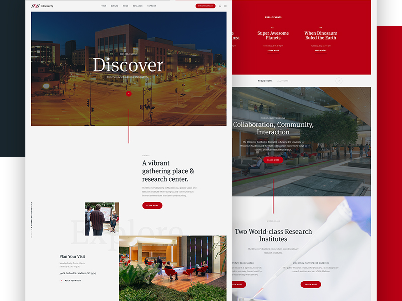
Good Search Results

Example of how it should be done by Wayne Thayer
If a search engine functions mainly in a literal manner, it will likely have trouble tackling typos, plurals, hyphens, and any other variants of the regular search phrase. It is this type of search engine which tends to perplex older users, but it can make things tricky for all users.
Things can get even trickier if a search engine organizes its results according to the number of query phrases they incorporate and not according to the value of the result.
A search engine should be present at the top of each results page, particularly for essential queries, like the titles of your own products.
The search function can be a lifesaver if standard navigation tools fail to operate correctly. Whilst sophisticated search tools can be useful in some instances, it is the basic search function that is most valuable.
This is why it should always be displayed in a very basic and easy to find space. Most visitors will reach it, so make sure that they can find it.
Use Color for the Links

Example of how it should be done by: Ali Sayed
Including links that are not clearly identified in any way is another usability mistake in web design.
The visitor would always prefer to be confronted with a space with the standard blue ink tone or with a dotted underline than with something that is lost in the featured content.
It is also vital that visitors can master the navigation rules of a website quickly. You should not make them hunt for links by repeatedly moving over every single word with a mouse until the cursor switches tones.
Use High-Quality Typography

Example of how it should be done by Enes Dal
If we consider typography, ‘good typography’ does not necessarily mean using huge headings or decorating pieces of text.
Regarded through the eyes of good usability, the basic visual appeal of typography becomes secondary. It is more valuable to prioritize the ease of consumption – if it is easy to read, it’s doing its job.
If you want to make the words easier to consume, you only have to take on a few simple tasks: for example, raising the line height, upping the font dimensions, or selecting a more user-friendly font where possible.
Consistent Font Dimensions

Example of how it should be done by Pieter van Est
The CSS style sheet gives web pages the ability to break down the ‘Change Font Size’ function for a web browser, which can cause big problems – particularly if it is employed to specify a consistent set of font dimensions.
In fact, on more than 90% of occasions, the consistent font dimensions end up being too small to read, especially for older visitors and anybody with sight difficulties.
It is important to respect the characteristics of the visitors and allow them to choose the text dimensions that best suit their vision.
Maintain Design Rules
Example of how it should be done by Ruslan Siiz
Constancy is one of the most influential of all the design standards. If resources always respond in the same manner every time they are used, visitors never have to feel anxious about what might go wrong or how things might be different to what they expect.
They know what is likely to occur, especially if they can fall back on past user encounters and experience. If their predictions turn out to be accurate, visitors feel confident and enjoy your platform. Otherwise, if the website persistently breaches their expectations, they will start to feel less happy about using it.
Provide Solutions

Example of how it should be done by Timur Nurutdinov
The typical visitor interacts with a website to fulfill an aim or objective. They might be looking for fun, information, communication, or for an easy way to stay in touch with friends.
No matter what the aim, it is your responsibility to help them achieve it.
You should not hesitate to provide answers to solutions. Assist your visitors to find what they are looking for – if you do so, they will remember your website as having a great deal of value and will certainly return.
The Bottom Line

Example of how it should be done by Artem Mashirov
If you want to create websites with a high level of usability and user experience, you need to prioritize user experience and make the process of using your website smooth, easy and extremely pleasant.
Credit for featured image: Gene Ross