Gutenberg discovery allowed us to develop the technology that we use to communicate today. The smartphone, tablets, computers and the internet were all produced by the sharing of ideas through print. Today we use the internet to meet our needs regarding knowledge and entertainment. The sad part is that print is becoming a dying art. However, digital print is exploding.
Today we no longer use movable print as often; instead, we have replaced it with software that can do the same in a quicker manner. Without typographic fonts, we would not be able to communicate using advanced technologies. The internet itself would not exist.
We have much to thank Gutenberg for; he can even be considered the Father of technology. Through this new technology, new ideas and findings can travel worldwide in just a few days. Imagine not being able to Google a word definition or explanation. It would be much harder if we had to depend on print since it takes longer and is more difficult to access information.
Transitioning To Web
Image source: orthology.com
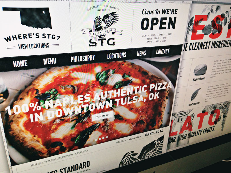
It’s for this reason that Web designers value text. They have helped to show us the importance of text in spreading information and knowledge. They make use of beautiful web typography to inform and entertain us every day. You will find typographic fonts everywhere on the web.
It’s used in different applications and missions to legibility convey knowledge and entertainment through the bulk of web-based projects that are easily read by users. Web typography best practices keep things readable and are an important aspect of the success of the web.
Things Can Go Wrong
Sometimes, however, things go wrong. For some reason, the page is not readable, or it’s cluttered and confusing. This issue is where web typographic best practices come into play. They can be used to determine what went wrong and how to correct the issue.
It’s possible that a developer for some reason has overlooked the way a typographic element interacts with other elements on a page. This lack of testing can lead to some real issues with its readability. Typography should gently weave throughout the page, interacting with other elements in a way that allows it to keep its structure.
This issue usually occurs when we proceed without the proper testing to make sure that all the interactions end well without breaking our project in any way. Beyond all these interactions, there are web typography best practices to be considered.
To use typography well, we must understand how it was developed and how people have allowed this advance to develop. This type of knowledge will give the designer a deeper comprehension of type usage. It also allows us to better choose from among the many beautiful web typography available today.
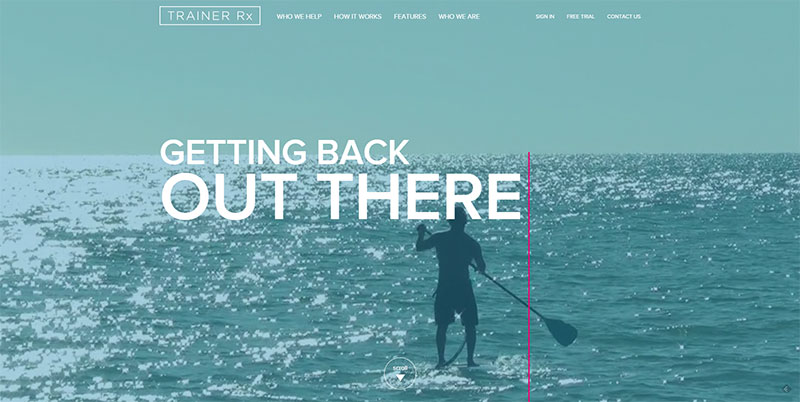
Limit The Number of Fonts Found On One-Page
Image source: trainer-rx.com
Again this is caused by persons wanting to try out all of the great fonts they have found. It’s also a big no-no in the design world. It can cause significant readability issues, and many readers are turned off by it. It makes the page seem much more complicated and cluttered than it is.
Think of buying a new wardrobe. You have so many beautiful things to wear, and you’re excited about it, but you would never wear all of it at once. You also shouldn’t attempt to try out too many fonts at once.
Serif and San Serif Fonts Are Not Interchangeable
Image source: Macon Printing
This is a mistake often made by new designers or non-designers who are attempting to put together a web page. The issue is one of readability. Sans Serif should be reserved for pages that are intended to be read from far away.
That is why it makes great headlines, it’s easily seen and the eyes are drawn to it. Serif fonts are intended for private reading and are easier to read close-up. Many books are printed using Serif for just that reason. So decide how you want the text to be read and apply to close up and far off rule.
Of course, this is a general rule, but you should always use a font depending on your audience.
The Choice of Font Will Affect How Readers Feel About A Page
Image source: madebyshape.co.uk
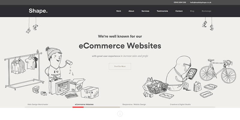
First impressions are crucial in all areas of commerce and entertainment sites. The designer will have to decide the purpose of a site by determining its type. Is it professional or casual? Perhaps it should be creative or unique. Once this is determined, work can begin.
By work, it’s meant that the target audience should be researched, and the correct design for that audience applied. Let’s face it a website intended for use by fangirls should not have the same look as a site for a bank.
What About Letter and Word Spacing?
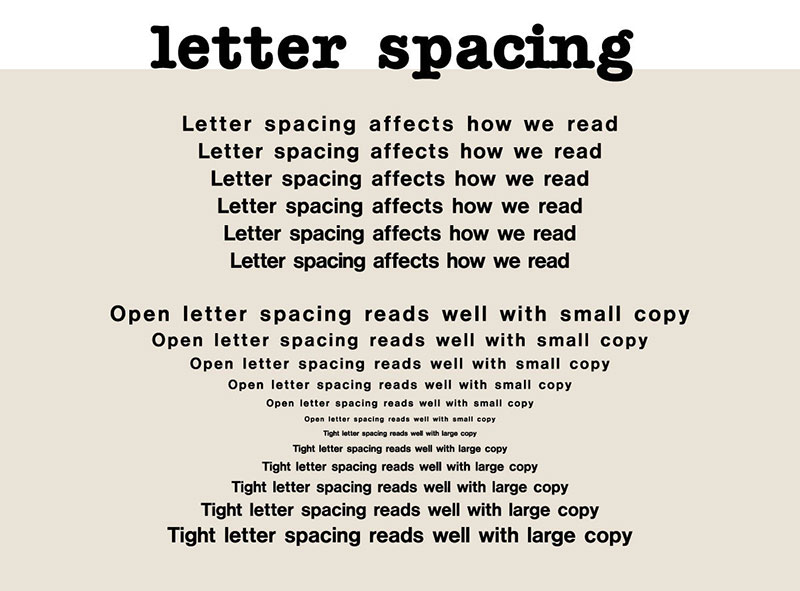
Persons who want to work as a designer, need to understand just how crucial white spaces can be. It makes a tremendous impact on the readability of the site, especially if you’re dealing with large blocks of text. Think of a Stephen King novel. Now image doing away with paragraphs, pages, and chapters. It’s just one long string of words. Odds are that if this occurred Mr. King would lose a large number of fans.
White spaces are just as important with typography fonts. It creates natural breaks without overloading the reader. If it’s neglected or poorly done, the lack of white spaces will drive away most readers. The goal, of course, is the opposite.
Depending on the font, used it’s possible that you will have to use some adjustment. Letter and word spacing are often more abstract, and you may have to experiment and tinker a bit to get it right. Just keep tinkering until you achieve the look you want.
What Should I Know About Line Height?
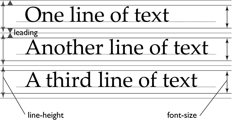
Line height concerns the spacing between lines of text stacked above another. Think of a paragraph that sits below another. If you’re using web typography best practices, you will know that you should take the time to make sure it shows up the way you want it to.
The goal is to ensure readability. Almost all fonts can be increased to 140% to improve readability. Don’t forget that people with slight vision problems can use this increase.
Conclusion
There are so many beautiful web typographic that a designer can get carried away. However, using web typography best practices can make the difference in whether or not a user returns or just leaves right away. After all, that is the goal of all web designers, readability and return visitors. Keep those two goals in mind and you will go a long way to becoming a success.
Credit for featured image: Forefathers™
