We love to follow different trends and this is important for web designers too, as these help them keep up with their competition. However, while doing so, they should never overlook the importance of usability.
Here are some of the web design trends that should be followed with caution.
Infinite Scrolling and Footers
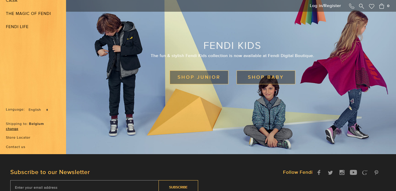
Image source: fendi.com
Many people like the idea of infinite loading simply because of how smooth it is.
The main issue with infinite scrolling is that the website will often scroll automatically, essentially forcing the footer content to be pushed to the very bottom of the page. This is a major issue involving usability that clearly needs to be addressed – like in the above example.
Parallax Scrolling
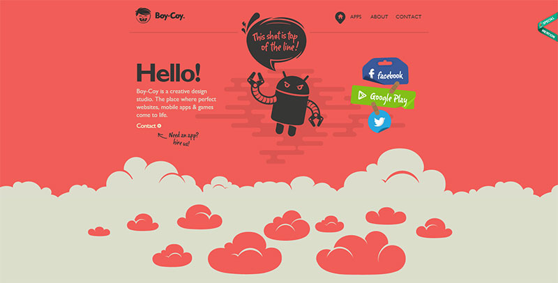 Image source: boy-coy.com
Although fashionable, with elements such as altered movement, parallax scrolling doesn’t work properly on mobile devices. This is largely because of slower connection speeds, an increase in the amount of plugins, and of complex scripts.
If users find that they have to scroll too much to get to the information they are looking for, chances are they will end up leaving your website and moving on to another.
However, you can see a successfully implemented parallax in the example above.
No Demands
This is how it should work.
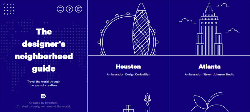
Credit for featured image: onthegrid.city
No user should ever be forced into learning how to navigate through a website, regardless of what kind of a website it is.
For example, in terms of navigation, desktop computer users should never have to be forced to use arrow keys to navigate through a page, nor should any other kinds of unreasonable and impossible demands be made.
Backgrounds
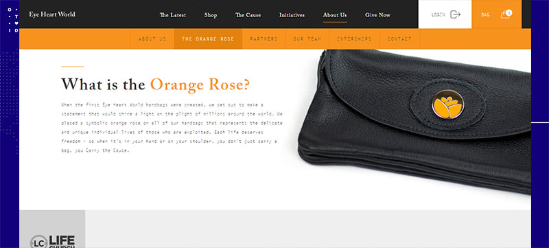
Image source: eyeheartworld.org
In terms of web design, it is often best to keep things as simple as possible. For example, if the main purpose of your website is to provide information, then you never want to focus on creating a background that can distract your users from the information that they’re seeking.
Just try to keep it balanced and simple, like in the example above.
Floating Elements
Floating elements on a website have always been tempting and they can look pretty awesome, like in the website below.
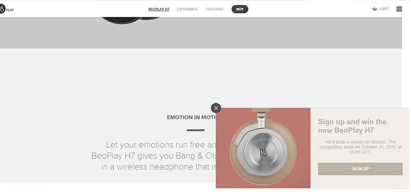
Image source: beoplay.com
However, this is another trend that needs to be carefully implemented, because content cannot be seen very well on smaller-sized screens and this can be rather unpleasant for some users.
What should definitely be avoided are splash pages or pop-ups that display advertisements from various third-parties. They will most likely make your visitors quit and never return on your website.
Videos Replacing Text
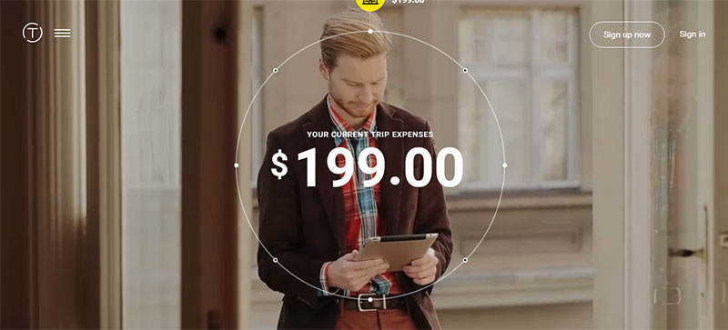
Image source: v1.trippeo.com
This is a trend that has been on the horizon for quite some time, to the advantage of users who do not have the time to scroll through mountains of text to find what they are looking for.
However, some argue that videos don’t belong on a website because they can essentially create slower loading times for the entire website. On the other hand, if a video is done well, it can be a great addition to any website – like in the example above, where videos are essential features.
Automatically playing videos also create a few different issues, the main one being slower loading times. Additionally, this trend that can even cause the internet browser to completely crash and annoy its visitors.
A user should be able to decide when and if they want a video to play on a website and this decision should not be made for them by the web designer.
Horizontal Scrolling
 Image source: ao.com
It can be visually appealing to encounter any content that moves in a different manner than a more traditional vertical scroll. Consider the example above.
Yet, a functionality of this type may not be obvious to some people, so its mechanism can oftentimes be missed. This is because we are more used to using vertical scrolling than the horizontal one, especially on desktop computers.
Final Thoughts
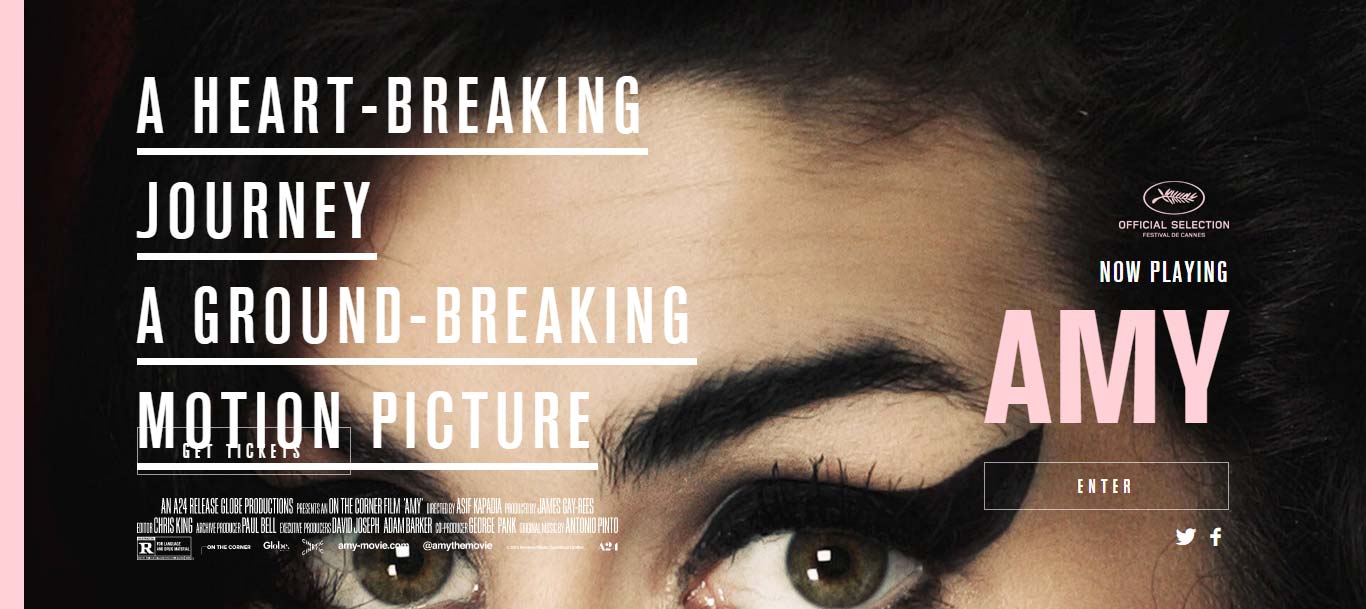
Image source: www.amy-movie.com
When trends are used without careful consideration, things can take a seriously wrong turn. Web designers need to remember that their job is to make people as comfortable as possible when navigating on their website, allowing them to easily use them.
Credit for featured image: Kyle Anthony Miller