What are credit card payment forms? We all love to go shopping. We then reach the part where we must hand over an actual amount, either in the form of notes or by disarmingly swiping a credit card briefly.
For most, this is the part of the experience which can sting a little, particularly as the cashier hands back your card and you start trying to justify the amount which you have spent.
Then again, there are not many of us who would turn back the clock if given the chance anyway – and put back those beautiful shoes or that beaded purse. We can hope for the transaction to be fast and simple!

Impatient shoppers exacerbate frustration in consumers when combined with fussy or overly complex payment systems.
The same rules apply whether consumers are buying from ‘brick and mortar’ stores or from online platforms. For e-commerce sites, the value of a high-quality credit card payment form should not be underestimated.
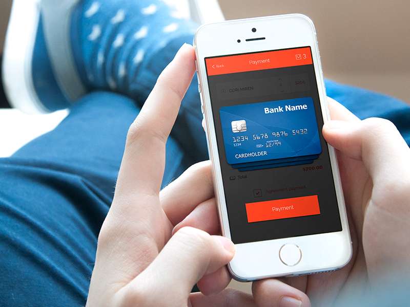
The steps involved in making a transaction all lead to this one place, so it is extremely important that the customer does not lose interest before completing it and that you start designing credit card payment forms which offer a high level of value.

Image source: Alex Dapunt
There are times when just one form field description can make all the difference, so take the time and needed care to assess and evaluate the quality of your credit card forms for payment.
Check out: Formvio – Create Custom Forms Without Code
Table of contents
The Value of Great Checkout Page Design

Image source: Roland Szabó
According to the results of our checkout form quality survey, online shoppers fail to think about safety until they are being invited to fill in their financial details.
Moreover, of those shoppers who do tend to consider the safety of their details, the majority think that are some bits of a website which are ‘safe’ and others which are not.
For instance, the bits of an online store which clearly display safety logos, icons, or symbols – pertaining to network security – were considered to be safe by shoppers, but the bits without these markers were considered to be unsafe.
This is an important observation because it says a lot about how online consumers make purchases, especially considering that there is no difference at all between the two parts of the site.
They are both equally safe.
Check out: Designing For Mobile UX – Best Practices
Creating High-Quality Credit Card Payment Forms

Image source: Denis Nistratov
For all of those companies which already have a reliable online payment form, we recommend carrying out some routine assessments, just to make sure that transactions are running as smoothly as possible.
One of the best ways to do this is to get in contact with some of your visitors and clients. Simply ask them directly about their experiences.
Furthermore, there are a handful of tasks which you need to complete if you want to create a high-quality payment form.
For example, make sure that the security icon is as close as possible to the entry fields. As discussed, your site should be encrypted all over anyway, no matter where the icon is placed but most of your shoppers will not know that.
In fact, customers will feel more confident about buying from you if they can spot this indicator of safety.
Check out: AkioSurvey – Online Survey Tool
Ask for the Bare Minimum from Shoppers

Image source: Connor Gaughan
Whilst this might sound counterproductive – and it certainly is useful to gather marketing data about your customers from time to time – the payment form is not the place to do it.
A visitor likely has already invested a significant amount of time picking their items and does not want the monetary transaction to hold them up. This means requesting the bare minimum of information.
If you do not need it to make a safe sale, do not ask for it. Always prioritize efficiency when designing credit card payment forms design.
Check out: SurveyFunnel – WP Plugin For Better Conversion Rates
Take Advantage of Visual Encapsulation

Image source: James Lucia
If you are looking for a way to boost the ‘visible’ level of safety around your online platform, you can always visually encapsulate your entry spaces – within payment forms.
Once again, this will not actually influence the overall security of your site, but it will make the level of safety a visible and noticeable feature for visitors.
You can visually encapsulate credit card forms for payment with the use of borders, shading, background themes, and a whole host of other visual effects. The main aim here is to make the entry spaces stand out from the rest of the page, so it is clear that they are a top priority.
The only thing to remember here is that, if you are going to take advantage of visual encapsulation techniques, you need to stick to using them for ‘serious’ aspects of your site.
If you use them with abandon, they will not have the same impact.
The Importance of Doing Your Research

Image source: Stelian Firez
The key to providing a great user experience is the ability to make things simpler for your customers. Shoppers don’t want to be ready to make a transaction and then get held up with administrative details.
As studies have shown, the longer you make a prospective customer wait to buy, the less likely they will stick around to do it.
The first step is to get rid of the ‘Credit Card Type’ entry space. You don’t need to request the first number on a payment card because it determines the type of card.
If anything, let it be one less task standing in the way of your customers and their purchases.
Check out: OneSuite – Lead Generation Software
Maintain a Cohesive Theme & Design

Image source: Volkan
The credit card payment form is clearly the essential component of an online checkout space. It is also the space in which shoppers will pay the most attention.
Ensure that your site is fully encrypted all the way around! However, the average shopper gets to the credit card payment form and imagines that this must be where the highest level of security should exist.
They are right but wrong about the presumption that it is the only area of high security.
You can take advantage of this assumption by keeping the space around the payment from very clean and clear. If there is a lot of clutter, it will look, visually, like a chaotic and unorganized transaction environment.
Check out: GenAI Creator Studio – All-In-One AI Powerhouse
The Bottom Line – Credit Card Payment Forms
The concept of web form usability and user experience is one which you really should be taking into consideration all the time.
Indeed, it probably ranks as one of the single most influential features of an online platform, despite also being one of the most easily influenced. It is indeed a bit of a conundrum, but it will get clearer as you accumulate feedback from users.
Credit for featured image: Cuongvq
Like this post? Check out more amazing web design content here.