Mobile phones have risen to great heights of popularity in today’s world. But perhaps you are not currently aware of just how much in use these mobile phones really are. Well, the fact of the matter is that they are used more commonly than the traditional desktop computer. That’s why knowing mobile UX best practices is important.

It is true that during our times today, people have resorted more to the usage of their mobile phones than their desktop computers. Based on statistics that have been provided for the year of 2015, it has been revealed that the common adult is now spending 2.8 hours of his or her time on his or her mobile phone, while only 2.4 hours of time is spent on desktop computers per day.
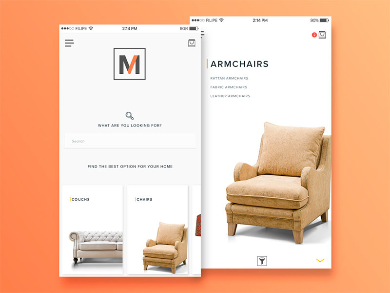
Image source: Filipe Marcelo
All e-commerce sites or publications will surely suffer from major catastrophes if they don’t get into designing for mobile users. So what makes a good mobile site?
Table of contents
Remove unnecessary elements
In relation to the usage of real estate regarding a mobile website, this indeed must be used with wisdom. Designers here have now a lot less space to work with; therefore, one must be very quickly able to deliver content and messaging efficiently. The goals of the site are forced to be fulfilled in an evidently substantially smaller space compared to the version of that of your site that is featured for desktop computer users.
Check out this blog to get detailed insights about user experience design.
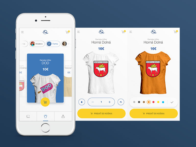 Image source: Martin Štrba
It is automatically necessary to enforce the removal of all functionalities and effects that appear stellar on the desktop version of the site, but that are not feasible or reliable for the mobile version of the site. This is truly a must when designing for mobile UX.
Doing this will certainly help enhance the user experience. The fact remains that when mobile users see and interact with a mobile site with a clean interface, they will be able to find what they are looking for much faster and more efficiently. This improves the user experience overall.
Also read: A Step-By-Step Mobile App UI Design Process
 Image source: Andrew Reynolds
Though you may really like to implement the use of fancy text as images in your web design strategies, this really is not appropriate for usage in relation to designing for mobile sites. Text really should be maintained as text. Implement fancy fonts to achieve the desired effect. However, be sure to leave out the images in order to keep your site’s footprint and loading time from being too slow.
Consider all devices
 Image source: Peter Deltondo
You must be sure to keep in mind that, though you are creating sites for mobile. Not all mobile devices have been created equally. This really is the key to success in relation to mobile UX design in today’s mobile market of users. To be able to design for mobile, you must be able to design for mobile sites and also mobile apps.
You must therefore possess a good and adequate knowledge of what devices the various audiences use. And what traits the mobile behavior patterns reveal. In other words, you must come to terms with the realization that iPhone and Android users will not interact with your mobile site or app in the same way and context.
There is research stating that iPhone users spend more of their money on e-commerce sites than those who are Android users do. What is really interesting in relation this revelation is the fact that there are actually fewer iPhone users in existence than there are Android users.
Therefore, this really increases the iOS spenders’ relevance in relation to their spending in the various e-commerce markets in today’s society. Because it is plain to see that there is more money to be made with these clients, you would want to first concentrate on designing a top-notch UX for iOS instead of concentrating on Android primarily when designing mobile sites and apps for e-commerce businesses.
Also read: Why You Need A Mobile E-commerce Strategy?
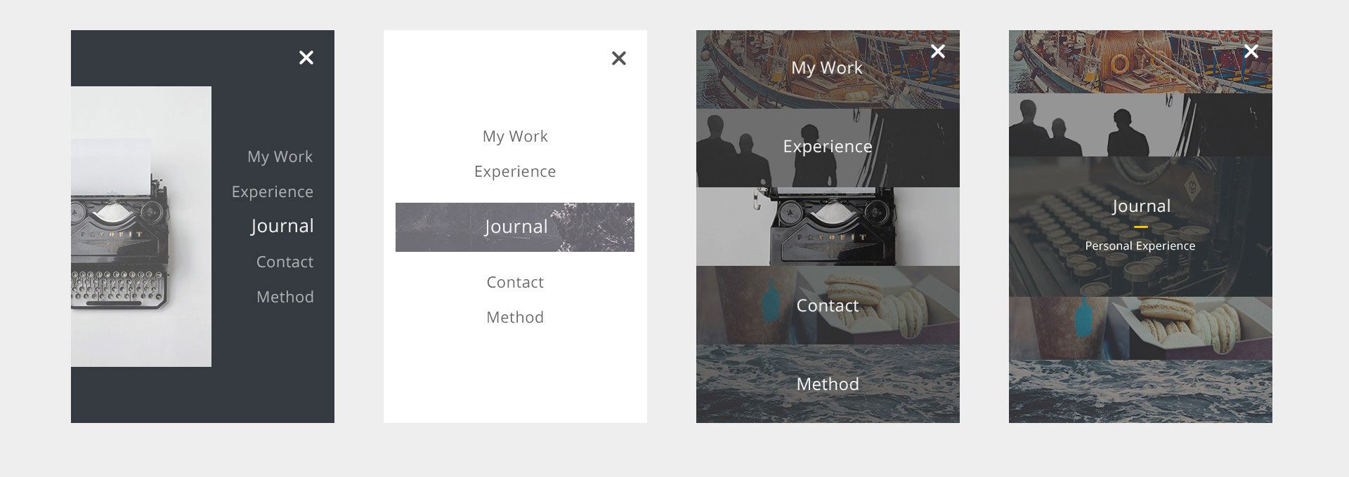
Mobile Navigation Best Practices : Simple navigation
 Image source: Emiliano Cicero
A prominent menu bar is visibly displayed at the top of the page in relation to websites that have been designed for traditional desktop computers. However, this overtaxes screen space usage on mobile sites. It is very efficient to resolve this dilemma by implementing mobile menu UX best practices in the form of a drop-down application or icon on the right or left of the mobile screen.
It is worthy of note that desktop multi-menus with drop-down menus that also feature sub-menus that are revealed when the user hovers do not work well on mobile sites. Therefore, in relation to mobile, you must make things easily and readily accessible for the user.
The chances are at high that if the mobile user has to engage in going through four levels to find something, he or she will leave after only reaching two levels. This is a deep contrast to the desktop websites that have had much hard work put into them to achieve the three levels of navigation and ten widgets crowded into the sidebar to get in as much information as possible.
Mobile space is at a premium, so use it wisely. Keep mobile sites simple and place focus on the key message you want to convey to the user. This is also a good, practical tip to apply even in regard to desktop websites.
Also read: Mobile Web Navigation: Best Practices
Mobile Ecommerce UX Best Practices: Checkout Should Be Simple
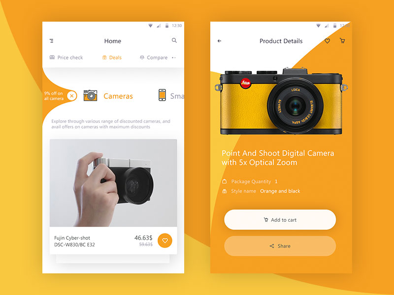 Image source: Prakhar Neel Sharma
One of the most important mobile user experience best practices. If you do not want people to abandon shopping carts on mobile sites, then you must make sure that you keep the check out process as simple as possible since the objective of designing a mobile site should be to make it user-friendly, which results in conversion.
In no way is it surprising that studies reveal that shopping cart abandonment occurs on mobile sites when the UX is really bad. If something goes wrong when people are trying to place an order on a mobile site, the experience is truly a bad and complex one. Thus, the clients will never likely return to the site again–not even on a desktop version of the site.
One of the main ways in which the check out process on mobile sites can really suffer is when the call-to-action and check out buttons do not meet the user’s expectations. The problem could be that the button could be too small to see or tap on, or the buttons may fail to be present when items are placed in the cart.
Design for desktop and mobile differently
 Image source: Kevin Yang
If you want to be successful to your mobile designs, desktop and mobile must be differently constructed. Yet this does not mean that they should each have tremendously diverse looks and feels. The experience in relation to both should be quite similar. But each one must be equipped to efficiently accommodate how users are accessing them.
Doing more with less is good minimalism, which is one of the key factors of mobile design due to the fact that the screen is conceivably smaller. Also, designers must take into consideration that the behaviors of users regarding iOS and Android are far different. Therefore, it is very beneficial and necessary to understand their behavior beforehand, which will require some research on your part. Different platforms require different mobile sites and apps.
Also read: The Key Elements Of Mobile UX
 Image source: Tobias van Schneider
In conclusion, get the check-out process done right by making it run as smoothly as possible while implementing mobile UX design best practices. This will prevent inhibition for shoppers, who will be more willing to shop on their mobile phones, which is the end result that you want. If you don’t follow through with this plan, you will be throwing money away. It is always worth it to implement mobile UX best practices.
Like this post? Check out more amazing web design content here.


