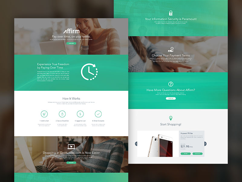
Designing for the next web is one of the biggest conversation topics to consider, starting from the following questions:
- How are we even talking about something that isn’t taking place yet?
- How will the next web look like?
- How do we adapt our skills to this kind of environment?
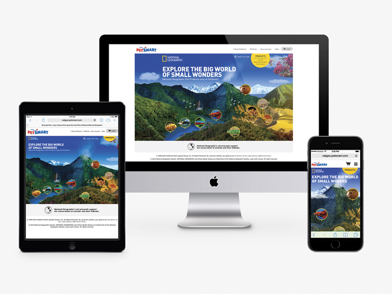
We should create websites that are fluid and that can be constructed around a consistent core. These will adapt to the features of the device they are viewed on, whether it is a desktop computer, a laptop, a smartphone or a tablet.
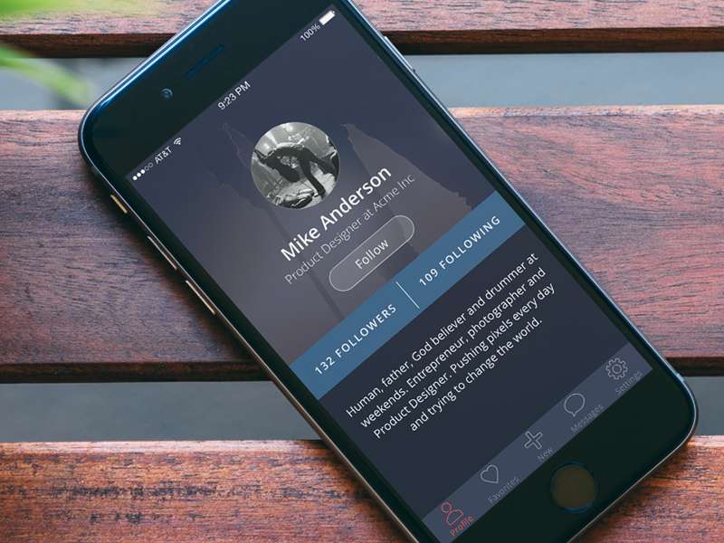
It is also important to look at how the overall conceptual approach to designing websites is expected to evolve.
But first, we also need to discuss what exactly “future web” means.
What Is the Future Web?
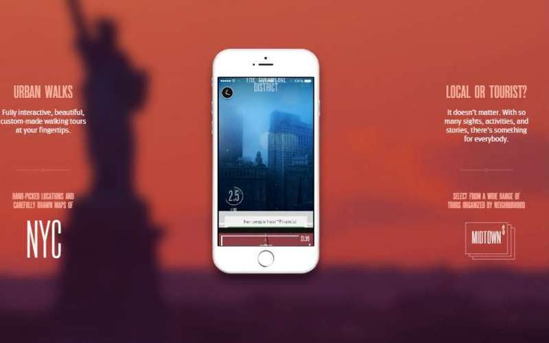
The answer to is rather simple. There’s one word that we hear every single day and that one single word is “mobile.” From apps to devices to websites, the list of mobile possibilities can only continue to grow.
However, we should not focus solely on the mobile aspect of things. It is also essential that we look at things from a broader perspective and consider portability.
Portability
As the overall structure of the internet is constantly changing and spreading, the chances of accessing the internet no matter where we are in the world are also increasing.
Just in the past decade, the number internet users has increased by an astonishing 444.8%. This includes approximately 28.7% of the population – roughly the equivalent of two billion people.
The majority of these individuals are located throughout Asia. This growth is fueled by the hardware allowing us to access the internet, including millions of computers, cables, wireless hot-spots, etc.
Trends of the Future

Gestures are the new clicks: Scrolling different websites used to be a hard thing to do. We would automatically move our mouse to the right side of the computer screen in order to access the scroll-bar.
Today it is much easier to scroll through a website than it is to click on a certain part of it. For example, on mobile devices, all that’s required to scroll through a website is the quick swipe of a finger or thumb.
However, clicking on a certain thing on a mobile website has proven to be much more difficult than doing the same on a website accessed from a PC. We will need to focus on creating one single design that can be used everywhere without needing to be changed in any way, shape, or form.
The fold is dead: Thanks to scrolling becoming much simpler thanks to the sizes of various mobile devices, the fold is quickly becoming a thing of the past.
Things are no longer stuffed at the top of a webpage. Designers can focus instead on full-screen image titles, which leads to other content being shown when you start to scroll through the page.
Designers can ultimately fill pages with many different kinds of large images.
Consistency: This is a key feature since web designers often work for various types of devices and specifications.
Yet, consistency should come more with experience rather than with design. There are two different layers to be considered: the core content/service and the actual display.
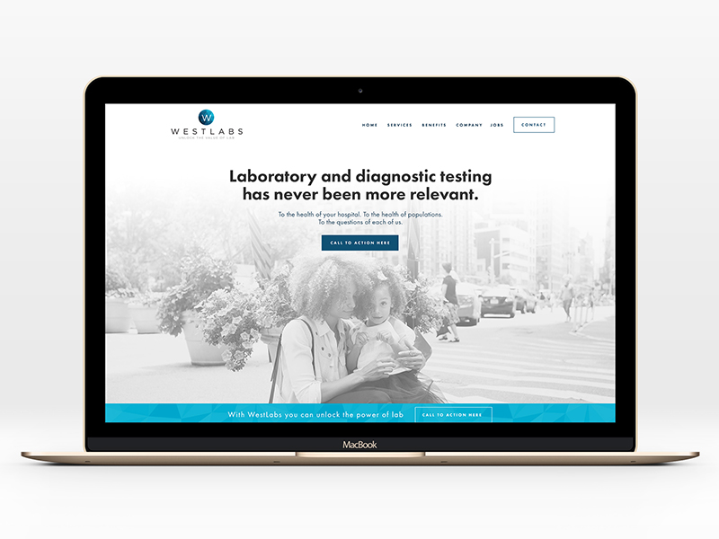
In terms of the core, this is something that should never change: it should always deliver a user experience that is as consistent as possible. This means that the navigation patterns and content should always work the exact same way.
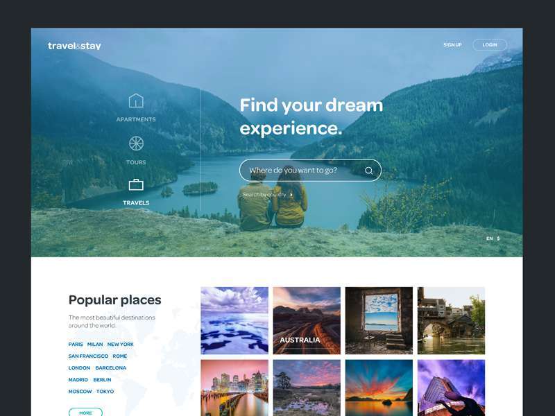
No more pixels: In the past, 72 dpi was the standard measurement of pixels per inch on a traditional computer screen. Now, thanks to responsive design, we see more percentages and grids and people tend to ignore pixels.
Yet, the largest area that remains virtually unchallenged is that of bitmap images.
Today, almost half of the entire internet is constructed with images that contain only half of the resolution of a modern display. Since these do not scale properly, vector images are likely to become much more popular in 2015 and in the years to come.
Animation Has Returned
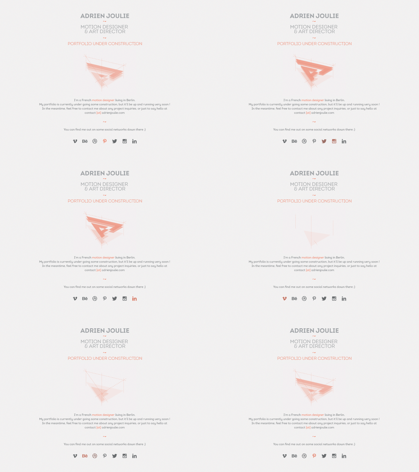
In order to make a website you’re building look fresh and active, you could consider using some “under construction”-type GIF files.
The animation is quickly becoming a rising star in the world of web design once again and is likely to be present in the landscape of the new web.
Final Thoughts
Although the fully portable version of the internet may not have reared its head as of yet, it will soon be here before we know it.
This means that web designers will need to work hard to re-educate themselves to become familiar with these changes and to act as the driving forces behind them. They will have an essential input to the development of new standards.
Credit for featured image: Omar Borjas
