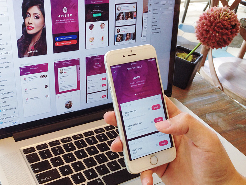
Today’s consumers are ‘on the go’ consumers and the only way to connect with them effectively is to design for their smartphones and other mobile devices, instead of restricting them to read and buy from their computers.
They need to be able to complete all buying phases in movement: from research and discovery, to their purchases check out.
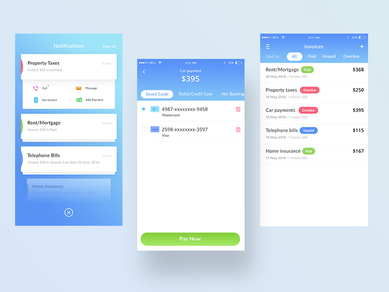
Image source: Prakhar Neel Sharma
The feelings and perceptions of consumers before and after they’ve interacted with your mobile presence are all elements of mobile user experience. Everything matters: what they thought, how they felt, whether they used a high-definition tablet or a low-end feature phone.
In fact, you’re challenged to create an app with such delightful elements of mobile UX design that users would appreciate switching to it from their desktop version.
Now that one thinks about it, there are many things we used to underestimate in desktop design: fitting the same elements on mobile screens is a demanding process, with lots of specific considerations, constraints, and usability challenges.
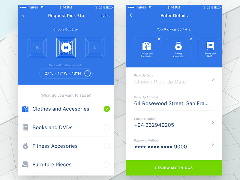
Image source: Ionut Zamfir
The most ‘ungrateful’ part of the experience is probably that one has to update the app constantly, so that it won’t fall behind competitors in the ever-changing technology environment.
However, displaying an app on multiple platforms and devices itself is not enough to improve mobile UX. A lot needs to be done with meeting user expectations, and understanding the context in which they may use the app.
The problem that arises here is that users are absolutely different, and there is no way to generalize expectations even for those using absolutely identical devices.
Image source: Gale P?
To be more precise, some users will read your content, while others will use the app to input content. What you need to do is to generalize the scenario: they should be able to do everything they need.
Another factor that will harden the process is competition: there are millions of apps out there (most of them free), the same as optimized websites and platforms, meaning that users are highly intolerant even towards the tiniest weakness. They focus mostly on the speed of delivery, and the access to elements meant to simplify their experience.
Dual functionality
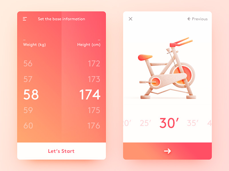 Image source: Dea_n
Before we proceed, let us share some important information: you’re not supposed to remove functionality from your app/website just because users need to access it on smaller devices. You can achieve the same effect by changing certain functions’ locations and emphasis.
It may be even simpler for the user to minimize browsing navigation and to use the filter options that way. Still, make sure that layout differences and breakpoints won’t be drastic from one device to the other, because users would feel as if they were using two completely different systems.
Navigation
Image source: Budi Tanrim
Think of a responsive template you know: you’ll probably imagine one where the navigation menu is created as a 3-bar icon in the upper left corner. That should be the rule for your design too, and you need to optimize UX both above and beyond those bars.
The simpler the better (elegant too!)
While designing buttons, navigation patterns, and link, keep a minimal 40px radius because everything below could result in tapping the wrong button, and leading user experience in an undesired direction. Don’t force users to ‘pinch and zoom’ in order to tap a button, because that’s one of the things that can frustrate them the most.
Understanding the needs of a mobile user
 Image source: Dea_n
When optimizing a mobile-friendly website, there is much more to be done than simply resizing it to fit a smaller screen. Real optimization has to do with the needs of the user, his motivation, expectations, and problems.
In order to familiarize with users, you need to track them and to study their online behavior from all sorts of devices.
There will be little information from their desktop persona that you could use – instead, you should pay attention to the differences in their behavior, and implement their specific mobile gestures (tapping, double-tapping, zooming, swiping, pinching, zooming, scrolling, etc.) in your own design.
Going mobile
Image source: Reznik | Creative Interactive
The best thing about mobile technology is that it is adapted to all usage circumstances, and such flexibility is more than likely to affect interaction between the user and the UX in a positive way.
At the same time, our design becomes more susceptible to external changes and distractions, such as noise, multitasking, motion, poor lighting, and of course poor connectivity.
Practicing mental modalities
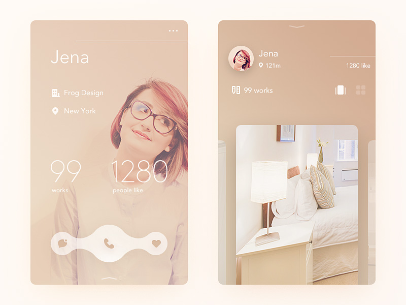
Image source: Dea_n
As you saw for yourself, mental modalities can do a lot for you, and you should practice them as often as possible. Just to give you an example: in case the screen is too narrow, you should transit from your current tab-system to accordions, because clicking headers to access content instead will cause no change in any of the two widgets.
Loading times
According to statistical data, time is the most essential part of every user’s experience. Think of yourself as an example: you will rarely have the patience to wait for a website to load, and you will soon move to another one. That’s most likely what your users would do, and your bounce rates will reach the peak in no time.
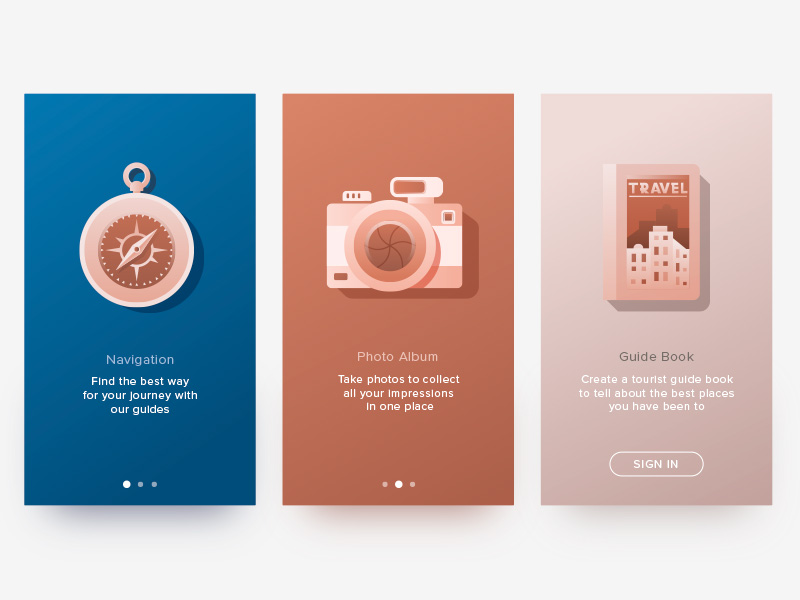
Image source: Denys Boldyriev
What you are supposed to do is to balance between speed and your enhancements – a balance that will always lean more on one side (a reliable and stable site or a fast one). We recommend you to think of priorities first: what is the feature you need the most to convey a successful mobile message?
In case that’s speed, you should opt for conditional loading, and avoid demanding third-part integrations such as webfonts, Adsense, social counters, etc.
Full desktop versions
If you’re planning to disable some of the displaying functionalities, make sure users will be informed on time, and that there will be a clearly visible link to guide them to the desktop version instead. The link should be available even with a functioning mobile version, so that users would have the chance to access full experience if they prefer so.
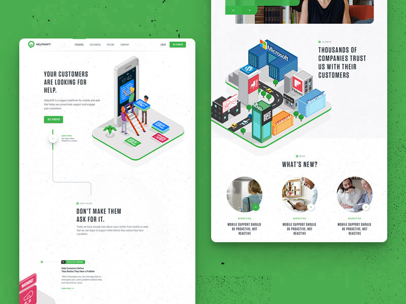
Image source: Julien Renvoye
Social-like interfaces
Remind users of social networks, by ordering content in a similar way, or by including the same features. At the same time, encourage them to interact, and to share content on the networks they’re using.
Encourage users to scroll
With the emergence of smart mobile technologies, the minimal scrolling traditions seem to be fading. Smartphone users find it much easier to scroll a page than to click here and there in order to access information. What you should learn from this is that users want to perform their actions quickly and easily.
That’s where hierarchies come handiest: most relevant content is placed in the upper part of the page, and its importance decreases as the user is going down. Still, this doesn’t have to be case: scrolling can also be encouraged with signposts and visual cues, as long as you’re sure that users can interpret them.
Equal usability for novice and experienced users

Image source: Thomas Budiman
Targeting with web design is like walking on thin ice: you never know when you’re going to slide through the crack. The challenge here is that you have to design a mobile app for two distinct groups of users, the main difference between them being their capacity to navigate it. It means that you must settle for nothing less a solution which captivates experienced users, and makes the novice ones feel comfortable.
Zoom
Many designers avoid zoom options just because installing fixed ones is much easier, but that’s a strategic mistake. With zoon being off, headlines and easy navigation won’t make any sense, because the site will be decreased in width, and users would still have to scroll their way down to find what they want.
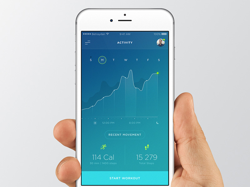
Image source: Daniel Klopper
What is much better is to conceal the content, and to implement the ‘drill in’ method.
In case you’re really prevented from turning zoom on, try to find an alternative mechanism that can enlarge images and fonts, and that can make a website suitable even for disabled viewers to access the content.
A never-ending evolution
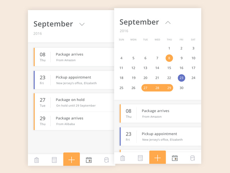
Image source: Budi Tanrim
What I happening to the mobile app industry is a paradigm shift, and this won’t change any time soon. Technology will advance, trends and preferences will change, business requirements will conflict, and most of all – feedback will become more important.
For the good or the bad, designers depend on what users say, and users have more and more to say every day.
The challenge is to stay alert and to respond to every change, including the constant updating of your mobile propositions. Whatever users say, listen to them. Take feedback as something that has to be considered, eliminate errors, and introduce all the features you’re missing. Don’t blind-ape competitors, and try to use fair means to stay ahead of them.