
Limitations in web design can be just as good as they are bad, assuming that you know how to use them to your advantage.
Designers often complain about the variety of obstacles and limitations in web design they face every day.
It can be the browser, screen resolution or user interaction, but the struggle to be unique and to stand out of the constraining ‘best practice box’ is still going on.
The fact that there are many limitations, however, doesn’t have to mean that they are bad. Sometimes, they are the driving force behind development without which we wouldn’t produce half these good results.
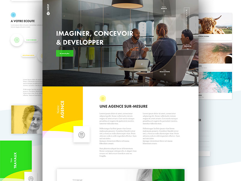
Image source: Barthelemy Chalvet
It is absolutely wrong to assume limitations exist only in design – they are everywhere around us, improving our ingenuity. All it takes is to look at them as advantages, because if everything has gone smooth since we were born we’d have no capacity so whatever to look outside the box. In design that’s pretty much visible, considering the little screens that are designers’ biggest challenge.
Limited use of color
The most visible difference in the design of experienced designers and amateurs is the way how they use colors: unlike professional masterpieces, amateur design uses all possible colors combined in one piece, and showcases there of incredible design inconsistency. Remember: even if it looks like it can work, it won’t be the same when replicated on a smaller surface.
After all, there is a reason why sports uniforms and companies branding consist of two colors the most, don’t you think?
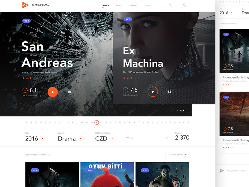 Image source: Andrej Krajčir
If you’re not sure how to do it, compare your work with the work of proven designers in your field. You’ll get a variety of vibrant and great ideas, and you’ll only need to scale back the number of variables to obtain a more coherent and sophisticated structure.
One of the most specific problems will be to stick to an established set of colors and to build your design around them, knowing that Pantone colors may not be reproduced on a small screen exactly the way you imagined them.
In this aspect, colors are divided in browser-safe and browser-unsafe, meaning that when an unsafe color appears, the browser will most likely change it to something more acceptable. If the device is old and has aged graphic hardware, you may experience the same effect again.
 Image source: Angela for Cleveroad
Obviously, your best bet is to avoid uncommon choices and to stick to a ‘browser-safe’ scheme which has approximately 256 nuances (or even 216 if you’re really conservative) to choose from.
All of them will be accurately displayed on the browser, and there won’t be any risk of messing up. The rule of thumb says designers don’t like being limited in this way, but it is their most secure tactic to ensure that files will load faster.
Limited display capacity
The way how sites are displayed on the web is already a limitation for designers. They need to produce something equally capable to display on all browsers and screens of all sizes, emphasizing the need to have a mobile-friendly version at stake.
Compatibility is the key for serving more customers, knowing that they can access the site from screens with varying resolutions and use all of their devices to do it.
 Image source: Tania Bashkatova
Some users discuss the tendency to enlarge screens or mobile devices, but that’s true only in particular cases. If you look at iPhone or iPad, for instance, you’ll understand that screens are not going larger, but clearer instead. At the same time, wider design can mean even more repercussions, which is why we dare to claim that limitations don’t always need to be a bad circumstance.
Font usage limitations and how to overcome them
Web design may sound like a simple and entertaining task, but there are a lot of things to be considered before a project is actually planned. One of them is obviously typography, which can make or break entire projects if not used prudently. Rather than making an ornamented experience, you should stick to something that is perfectly legible under all circumstances.
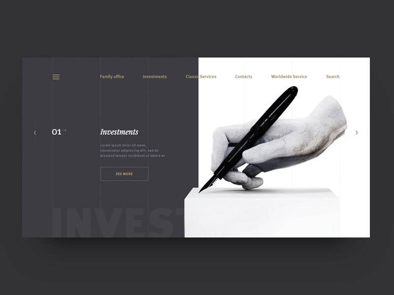 Image source: Moroshilova Ekaterina
The same as color, typography should be simplified and expected, if not more extreme than in the case of color. With few exceptions whose success can hardly be explained, typography works best with a single uncomplicated design that is easy to use: the human eye will recognize the pattern, and will make your brand more recognizable.
Experienced designers advise beginners to use 2 fonts on a single design.
One of them will be fancy and artistic to give the design some flair, depth, and personality. Obviously, the choice will be dictated by the story the website is trying to tell (you will certainly develop expectations if we tell you it is a girls’ party website, or a boy’s rock band one, won’t you?).
 Image source: Ben Johnson
Still, this will be the most characteristic part of your website and you’ll need people to focus on it, so try to use it only for critical information, restricted to the lowest possible level.
The other font will be completely basic, as much as to assume that the audience won’t notice it, but read the information delivered instead. That’s why you should use minimalistic fond for text bodies and copies, and keep them aside of every extravagant and overdone typing to avoid loss of functionality.
The minimalist approach
 Image source: orey Haggard
Quite often, people refer to minimalism as the small and simplified version of something, but that’s too analytic to say. Minimalism refers also to the variety of options we have, and our content too. Let’s say you’ve planned to use three colors for your website but decided later on to undertake a minimalist approach: you will go one step back and eliminate the third color. The rule can be used also for typography, contrasts, spaces, and any other critical design element.
What minimalism does is to eliminate complexities and to make websites look more elegant by simply using as little technology, content, and art on them as possible.
 Image source: Dwinawan Hariwijaya
A more concrete example is to eliminate gradient background images or complex patterns with solid colors that can keep the focus where it really needs to be: the content. Contrast can also be a quality tool to emphasize importance, and to give your pages a more intuitive flow. Long story short, the more graphical elements, icons, or images you remove the better, because otherwise you’re risking a crowded website where the user has no idea what to focus on first.
But how will you know which are the unnecessary elements? Well, the best way to go is not to add such in the first place. Better late than sorry, so spend some extra time planning and outlining your purpose, and you will understand which elements are not really necessary.
While the process is still lasting, take some time to rethink about every element you’ve included. Do you really need it? Wouldn’t it be a much better idea to remove it and to go on without it?
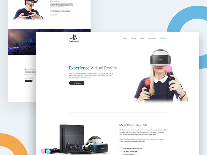 Image source: Ishtiaq Khan Parag
Final thoughts
Limitations in web design can be just as good as they are bad, assuming that you know how to use them to your advantage. The more limitations you’re trying to impose the better, but that’s still a challenge knowing that visitors don’t like plain simple and boring websites.
Once you’re in the game, you have to balance, so be ready to get seriously challenged by your audience’s expectations.
Once you’ve learnt how to deal with tight limitations, everything will become easier. You will train yourself to create the most amazing and genuinely unique pieces with minimal time and means.