The masterful use of dark colors in the web design process has led to the creation of some of the most amazing websites out there. Dark website design uses an ingenious combination of lighter hues for the lettering and graphics and a dark background.
The color black delivers a strong online presence, being suggestive of both sophistication and elegance. Somehow, it appears in contrast with light design and manages to keep the visitor concentrated on the essential parts of the website in question.
In color psychology, the black color is considered a symbol of mystery. At the same time, it is considered a sign of power and control. Leaving its signification aside, when it comes to web design, it is definitely the right way to spice up things.
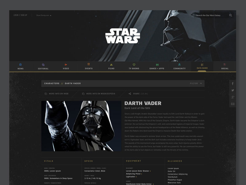
We are all familiar with the websites that have a light design, guaranteeing a browsing experience that is full of energy and optimism. This is the way the majority of today’s websites are. But then come the dark color schemes, which are definitely unique and very convincing.
If we were to make a comparison between light and dark web design, we would have to say that light color schemes are compatible with a wide range of website concepts.
On the other hand, the dark web design is part of a limited niche and not all websites can benefit from it. In the situation that you are adamant in using it, without the dark background being actually suitable for your website, you might end up with a website that looks anything but professional and well-made.
How do you decide on dark vs light background?
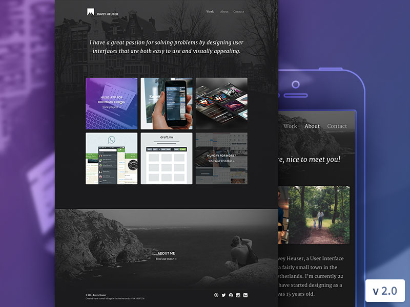
Deciding on whether you should use a dark or a light background for the making of a particular website is dependent on a number of factors. First and foremost, you have to think about the subject of the website in question. Then, you have to take into consideration the fact that the choice of colors, as well as the created contrast, is going to transmit a number of emotions to your website visitors. For example, if you are creating a wedding blog, you cannot expect for a dark background to be suitable.
Another factor to take into consideration is the visitor to the website. The customer is always the kind and you need to be able to satisfy his or her personal preferences. So, think about who he/she is as a person, what kind of social level you are expecting and do not forget to take age into account.
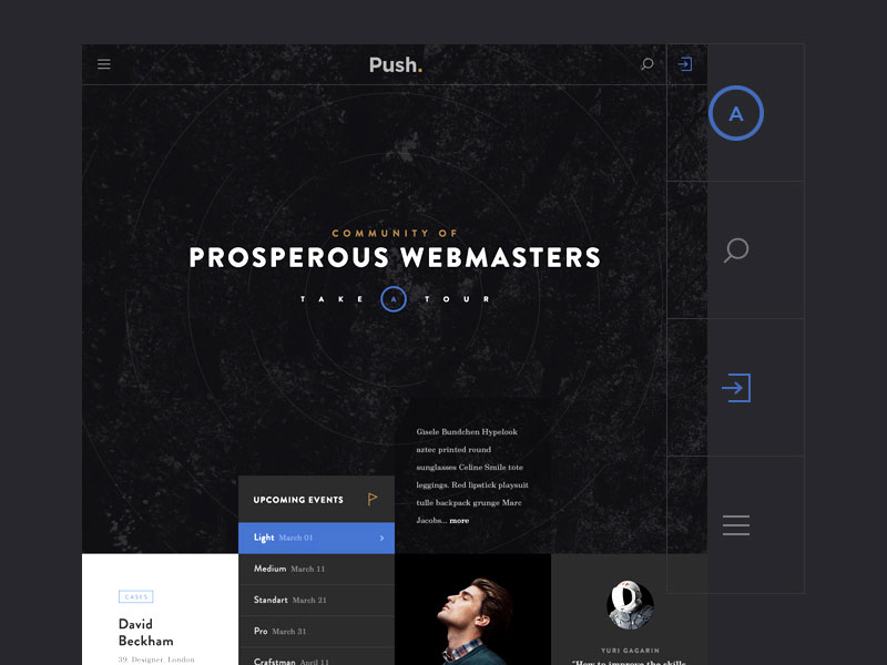
Try to organize a portrait of the website visitors, as is going to prove out to be useful, especially when it comes to choosing the colors of your website and the contrast to be created. Apart from that, it will help you choose other elements of the websites, such as the general styles or even the fonts.
Returning a little big to the age feature, don’t be quick to jump to conclusions and think that older people prefer a light background just because of the guaranteed readability. One of the main reasons is age causes habits and, often times, people prefer a certain website layout or color, because this is the type they have gotten accustomed to.
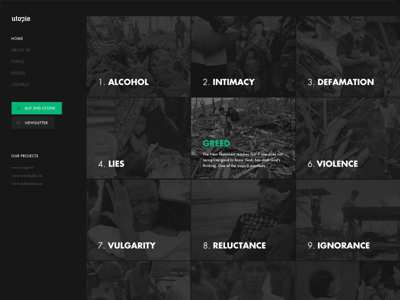
Last, but not least, you have the purpose of the website. When going for dark web design, you need to make sure that you are certain about the purpose of the website you are going to create.
If you are going to create a design gallery and you need for the colors of the designs to stand out, it is clear that a light background would not be suitable. On the other hand, if you are planning on creating a news website, it is clear that the light background is more-than-adequate.
The impact of dark web design over readability
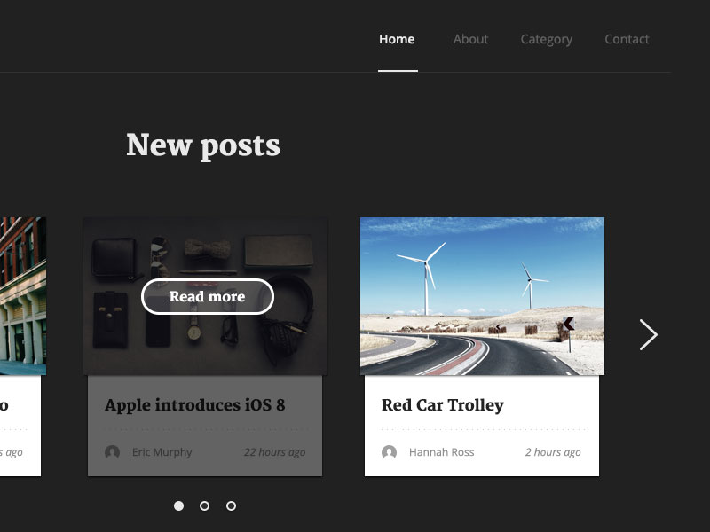
The dark design has often been criticized by Internet users and designers alike, due to the fact that its readability and general usability are not at the desired levels. Many people consider that it is difficult to read light content on a background that is dark in color, as this places an additional effort on the eyes.
Is the dark background the only one responsible for such problems or are there other factors involved in the process, driving visitors away? Let’s find out.
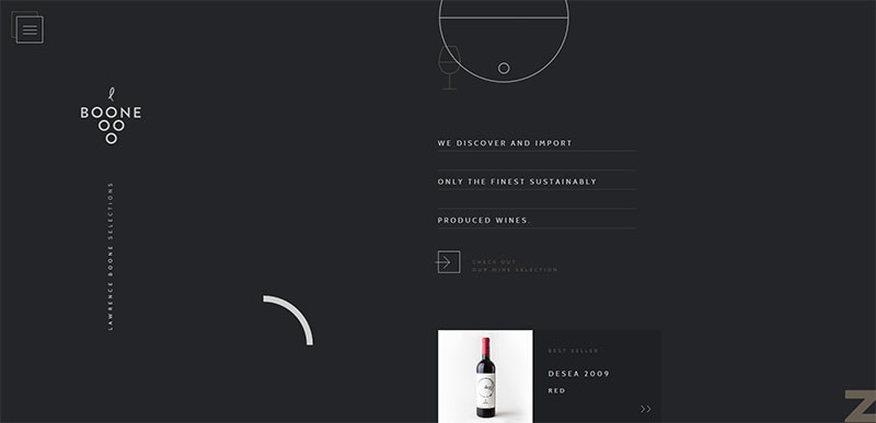
Not surprisingly, the dark background is not the main enemy here. In fact, there are a lot of other factors that have a negative impact over readability. It is sufficient to choose the wrong color or size for the text, to have an inadequate line height or use kerning inaccurately and the overall readability is affected.
So, typography matters more than you think, especially in connection with the type of background you have chosen for the website. You cannot maintain the same line height for a light and dark background, that is not if you want to guarantee efficient readability.
White space for better readability
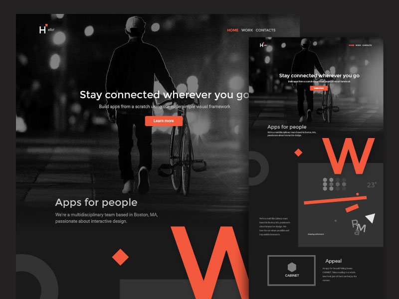
We all know how important is the usage of white space in any web design process and this does not change for dark web design. When you have a website with a dark background, it delivers a powerful message and the lack of white space can make the matters even worse, leading to an overwhelming feeling.
If you want to improve the level of readability for the website in question, you have to consider increasing the quantity of white space. This is a rule of proportion and you need to remember it – more white space, easier to read the text. Pay attention to kerning, consider the amount of white space you actually need and break the text into smaller paragraphs, in order to eliminate the clutter-like atmosphere.
Typography on a dark background
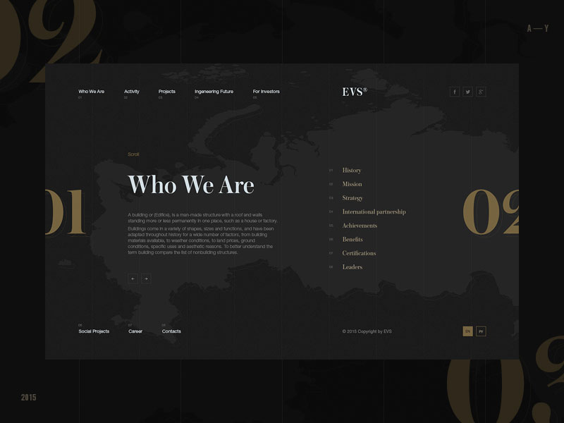
Web designers are well aware that typography matters just as much as the other elements involved in the process. This affirmation is even truer when it comes to the dark web design. Without careful planning, we return to the readability problem, which is often presented in connection with the usage of the dark background.
From what has been said so far, you have probably understood that you improve readability by increasing the size of the font and the line height. The same goes for the increase of kerning and also by breaking the bigger text into smaller paragraphs, all of these things demonstrating indirectly how important the right amount of white space actually is.
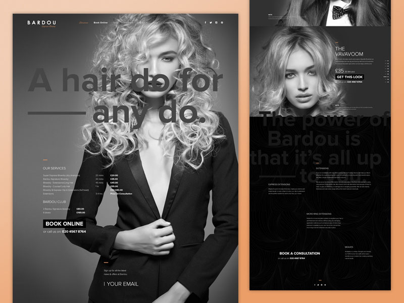
As for the font itself, you have two obvious choices – serif fonts and sans-serif fonts. In general, the serif fonts are preferred for text of a larger size, due to the reduced readability when in a small size. For paragraphs, you can stick to the sans-serif fonts.
And what about the text contrast?
We have all been there, trying to browse a website that had excessive contrast or, on the contrary, no contrast at all. Both of these two things lead to one thing and that is straining our eyes. Yes, contrast does matter and one always has the difficult job of finding the perfect balance.

In order to understand the principle of contrast, you have to think about yourself being a room without a source of light. Once a source of light appears and you stare straight into it, there will be a lot of discomfort. However, if the room is slightly dark and you are looking at a not-so-bright source of light, you are alright. This is how contrast works in web design as well.
So, how can you achieve the perfect balance? You just have to make sure that the dark color of the background is in tune with the level of text brightness. Do not be tempted to use bright white text on a dark background, as you will certainly drive your visitors away. And vice-versa. Just make sure that no pure white or black is used on the other text color.
Go minimal with your color scheme

We all want our final design to have a look that is clean and free of clutter. This is the main reason why choosing a minimal color scheme is so encouraged. If you are going to break the rule for a more colorful scheme, make sure that you use the right techniques. Keep in mind that you have already chosen a dark background, so more color will only complicate things.
Style switch as an alternative
A wise decision would be to give the website visitors the opportunity to switch the background to a lighter hue. In this way, you show that you understand that not everyone likes the combination of dark background and light lettering & graphics.


