
Knowing how to use white space in web design is essential when creating layouts for websites. Incorporating negative space into a design can be difficult at times, but it is something that must not be ignored. Too many website designs are excessively busy and cluttered, because of a lack of white space.

Table of contents
What Is White Space?
White space, or negative space, and can be defined as a blank area on a webpage, an area lacking in content. This would include blank spaces between objects on a page.
A blank space is not always white. It can have color, and even exhibit gradients, patterns, or background objects.
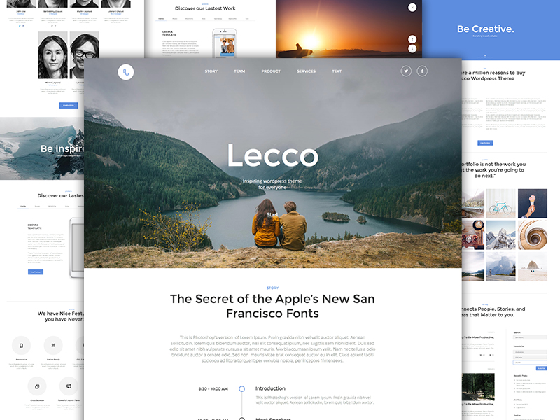 Image source: Lecco WP Theme
White space can be compared to the mortar used between bricks in construction, or the adhesive used in a stained glass mosaic. Although we may admire the pattern of the bricks and the stained glass, it is what is in between and holding everything together that is lately responsible for the flow and overall appearance of the design.
Just as adhesive defines the flow of a stained glass mosaic, negative space influences the appearance of website design, as well as user experience. Be prepared to use white space in design to its maximum potential to achieve the best results.
Check out this blog for an in-depth look at web design basics.
Importance Of White Space In Web Design
 Image source: UENO
There is a reason for having the right amount of whitespace on a web page. When used correctly, it has the potential to bring out the best in the design and layout, and by extension, benefit the website as a whole.
Layouts that are easy on the eyes encourage viewers to keep reading, which can be crucial when the goal is to deliver a superior product to a client. A webpage layout involves more that the aesthetics of the design elements. You can display beautiful artwork by talented artists, and still deliver a poorly designed website.
The way website design white space is used by each element with respect to others is just as important as the aesthetics of the elements themselves.
Websites featuring great content but also feature poorly-designed layouts are rarely successful. As important as great content is, proper layout design together with ease in navigation is just as essential.
Empty Space Is Not Evil
 Image source: Ilja Miskov
Empty space, like silence, is not necessarily bad. Some designers feel the need to incorporate detail in every open area of a page to maximize the number of features or images.
This practice leads to confusion and poor readability. Text requires a decent amount of white space. Without it, content can become unreadable. Too much white space can also be a problem. Web designers need to find a proper balance.
It is usually better to have too much white space than not enough; but you still need to strive for balance, and experiment to see what works best.
Balance, And The Proper Use Of White Space
 Image source: Nguyen Le
The proper use of whitespace is all about balance. An email subscription form for example should never be completely isolated with respect to the rest of the site or the content on a page. No element should in fact be isolated to the detriment of the site as a whole.
Ecommerce sites do have many elements to organize and present to the viewers. White space, when properly used, provides the correct and effective balance between all the elements being displayed. Proper balance relates to, and is dependent on the amount of content being presented.
 Image source: Olly Sorsby
White space should be used consistently. This includes consistency in line spacing, letter spacing, margins, and padding. Consistent use of white space in web design also applies to the spacing between larger elements, such as images, forms, or tables.
Things To Consider
 Image source: Tintins
Following best practices for including white space in layouts is important, but it is all too easy to allow white space to be crowded out of the design, and it is worth knowing why and how that can happen, and how to prevent it
Designer and Developer Interaction
A designer has created a design for a fantastic layout. The developer who a layout that is quite different than what the designer expected. To avoid this, designers and developers must collaborate, and discuss concepts, wireframes, padding, and margins, and line heights, along with other design elements to prevent misunderstandings.
Don’t stuff everything above the fold
When a client or someone on the team insists on placing as much content as possible high on the page, an excessive amount of white space will often be omitted. Since where a person will begin scrolling from is an unknown, excessive content should never be placed above the fold.
Presenting your design to the client
It is obviously important to explain to your client why you are doing things the way you are. In doing so, use terms your client can understand. Have good reasons for your choices and the decisions you make, and make a point of avoiding arguments. Explaining the facts to your client is the best way to build and maintain trust.
Like this post? Check out more amazing web design content here.


