You have been supervising a team that has invested a lot of time and effort in a web application and the final product is really something to shout about. It has been taken for a test drive by a number of users and they are all satisfied. They simply adore the community enriching resources which you have incorporated – what a result! Now, half a year has passed since the unveiling and the platform is still struggling to gain the momentum in the login experience that you hoped it would. The users just keep abandoning it, but you cannot work out the reason.
It all felt so flawless, so where is the figurative leak in the boat?
Well, the reality is that this scenario is not an uncommon one. The real problems tend to be found with the simplest of things too.
In other words, even an aspect of a website that feels very minor can actually have major consequences for user login experience.
Image source: Boris Borisov
For instance, if the login functions are not easy to navigate, visitors will simply choose not to log in at all. If this happens, it does not matter how many amazing widgets and tools you have to offer, because there is nobody to offer them to.
If existing users are prevented from accessing the site, your community will shrink rapidly and so will the chance of conversions.
Also check out: Multipurpose Web Design Templates Kit For Your Startup
Table of contents
Identifying the Problem

Image source: Maxim
It is often the case that issues with a website or web application are rather basic. However, even little leaks can bring down a big boat and lots of little issues with a website can significantly harm the level of user login experience.
The last thing that you want is to be sending visitors away with bad memories of using your website. Internet users are very intuitive and they will share poor experiences with friends and family members.
Whilst most people are happy to get to grips with any usability conflicts which emerge within the design of a website, people are growing less tolerant of poor interaction design.
These individuals are the ones who tend to pursue substitute sources if they are promised a superior experience. If an investment in a new website brings them more, they will jump ship.
Considering the Different Log in for a Better Experience
Image source: Jessica Ciccolone
There are two main ways in which visitors can log in to online platforms. The most contemporary approach is via a social networking website. This is a popular option for apps because they tend not to ask a user to register for an account.
It is easy to log in using a platform like Facebook or Twitter, as all you have to do is to hit a button, wait for the connection, and then you are in.
The second method of logging in involves creating a username or substituting a username for an email address, and a password. This is the older approach and it has been enhanced now.
Whilst both methods come with benefits and downsides, we are going to focus on the second one for the moment.
Also check out: The Ultimate UI Mega Bundle
Improve Login Experience
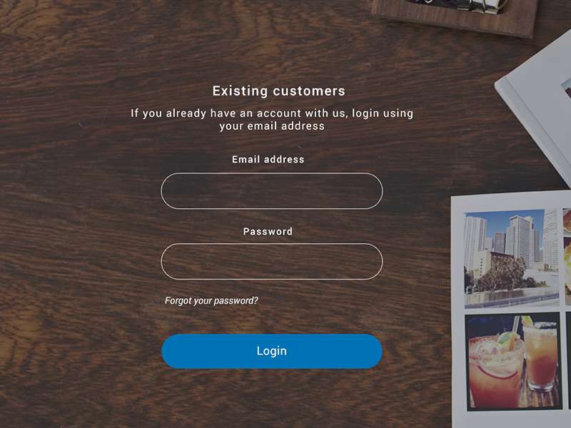
Image source: prakhar
It is not unusual to see platforms which do not need a username at all. They, instead, negate the need to invent a name and just ask for an email address.
The bottom line is that there is no real operational difference between the two, so why force your visitor to create new details – which they will have to remember for next time – when they could just use the personal information which they already have?
Also check out: Professional Website Templates
Allow Longer Passwords
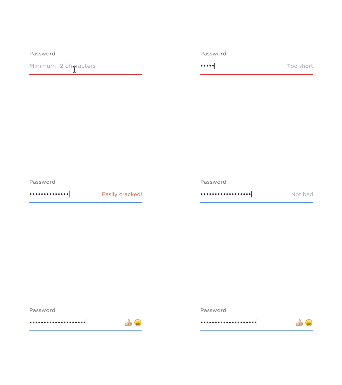
Image source: Tom Petty
These days, we are bombarded with warnings about safe passwords and keeping login details as secure as possible. The general message always seems to be: the lengthier the password, the safer it is.
The more unique characters it contains, the more secure it is.
With the development of password recalling tools and browsers, which have the ability to instantly enter usernames and passwords, it is somewhat of a surprise to find that the typical length of a password entry space today is not as long as your arm already.
Will we ever get to a point when we are generating passwords that are 75, 150, 230 characters long?
If the experts are to be believed, this is the direction that we are moving in. But there has to be a transitional time-frame first.
It is important to remember that there can be issues if the text space for a username or password is not of an equivalent size to the corresponding database where it is stored.
This can actually lead to the truncation of the password or a clear rejection of the password. If you want to offer long passwords, test the tools first.
Offer Mistake Free Messages
Image source: Kyle Thacker
There is a real skill involved in determining whether you have offered a visitor too much or too little data when logging in. The balance is important. Too much data could allow an intruder to enter, but too little is going to make things hard for a visitor.
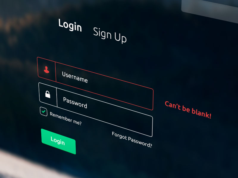
We can at least come to a consensus on the idea that digital mistakes such as ‘Invalid Input’ are very frustrating. If there has been an error, say so in easy to understand language, not technical jargon.
This is one of the basics of good login form design.
Incorporate Some Ajax
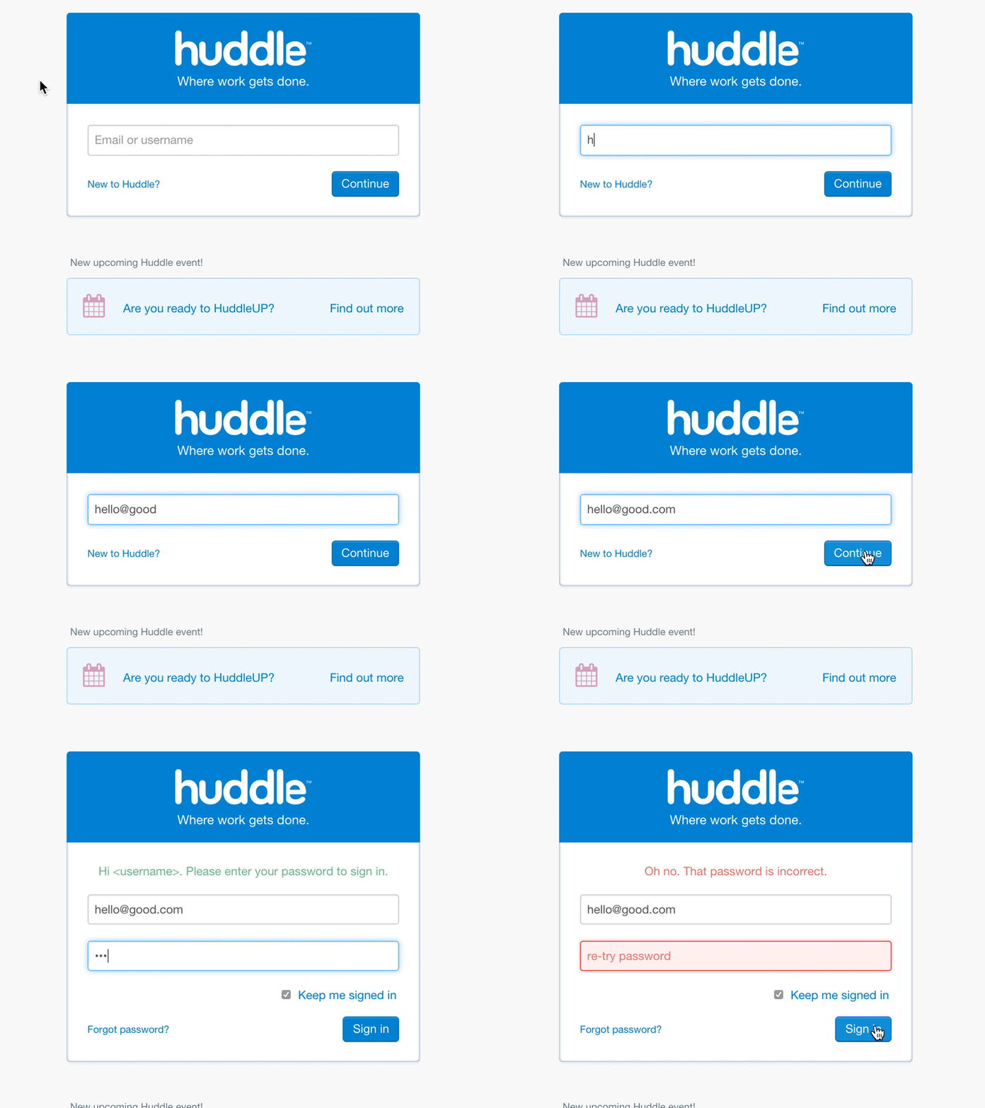
Image source: Peter Thomas
The bottom line is that everybody makes errors sometimes. We all accidentally put typos in password fields and so do visitors.
However, a password which has been inputted by a visitor absolutely does need to belong to their account before they can be offered entry. This is vital for security.
Yet, it always helps to offer a little support. For example, if a visitor needs to enter the correct email address to gain access, it is useful for them to know immediately if they have entered any typos or made any mistakes.
In this scenario, a dash of Ajax-style validation can be invaluable.
In other words, instantly assessing the username or email address for the necessary credentials means that it can be flagged quickly if there is a problem.
Also check out: Wunder UI- Design System & UI Kit
Establish a Central Login
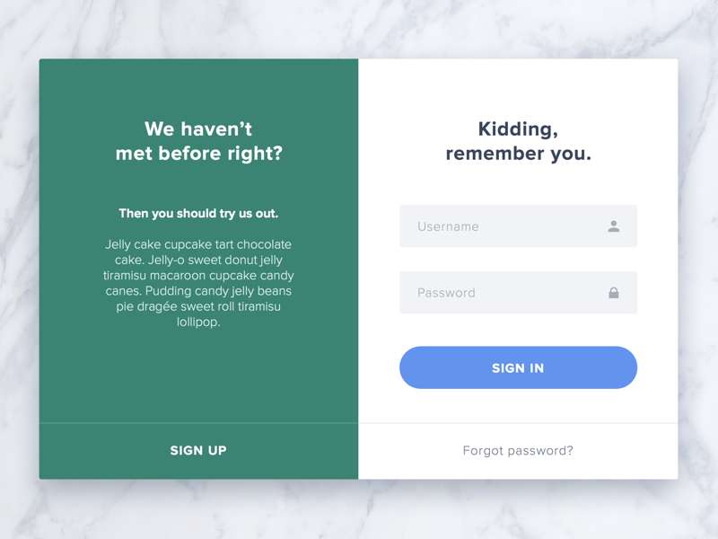
Image source: Viktor Hofte
For websites that provide a range of different resources, there is a good chance that the tools are all being drawn together from a number of different places, rather than just the single source.
In fact, you might even by using a number of different suppliers to get hold of all these tools.
Yet, the essential component of this kind of diverse integration is making sure that all resources are regulation by a central login.
Group Text Fields Together

Image source: Nenad Merćep
It is a good idea to position your username space and the linked password entry space on their own distinct page. For many different reasons, creating a unique ‘login’ area is always going to be a lot simpler than incorporating the entire operation into an already established page.
It is often extremely difficult to marry the two, so why not keep them separate?
The question is, how should you get your password and username entry fields aligned correctly? You could either opt for a side by side position or for an on top of one another position.
The essential part is simply making sure that the two entry fields are placed close enough together. They are linked when it comes to function and purpose, so they do need to linked spatially too.
Also check out: Website X5 – Professional Website Builder
The Summary – User Login Experience
These tips and tricks will help you to start designing login functions at a much simpler and quicker rate. Is that not what this is all about – making the job easier?
Credit for featured image: Stas Petryanick
Like this post? Check out more amazing web design content here.
