One of the main objectives of web designers is to use techniques that make their websites stand out. Pastel colors help you do just that!
Bold colors are often implemented to create landing pages with a more salient look. Colors are indeed masterful tools that web designers can use effectively, due to their ability to draw attention, guide the visitor’s eye, and to evoke emotions.

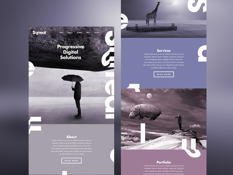
Image source: Jamie Aucoin
However, the use of less bold colors in web design is also an increasingly popular trend. They serve to create a soothing and peaceful atmosphere, appealing and welcoming to visitors.
Pastel colors show a fun and light side of a site and are also great in highlighting a feminine essence. This is why they are often used for fashion websites.
What are Pastel Colors?
 Image source: Jakub Reis
Pastel colors have lower to medium pigmentation, which creates a softer, more serene shade with a lower chromatic content. When implementing a chosen color scheme used in web design, one needs to have in mind brand identity and awareness, together with the development of a particular tone for a website’s atmosphere.
In the case of pastel colors, these facilitate obtaining a sense of calmness and tranquility. Since there is not an expansive spectrum of shades within pastels, websites never look overloaded with their hues.
In summary, pastels serve to create softness and sophistication, giving the site a light and true refined appeal.
Using Pastel Colors
 Credit for featured image: Myles Kedrowski
The primary places where pastel colors are integrated are backgrounds (in relation to textures and images) logos, icons, fonts, and frames. However, it is not all that important where the pastels are applied since the main focus is the end result: a polished, refined look for the website.
Many vintage and flat designs look excellent in pastels thanks to the clean and precise overtone that they give to the site, and also to its retro feel.
There is a variety of contexts in which the use of pastels in more than welcome.
Pastels in Photography
 Image source: lobagola.com
Overlays of pastels placed on top of photographs provide a soft and unique canvas to a website. With softer hues within a photo, the web designer gains increased space for implementing other elements.
The use of pastels in photography facilitates the creation of contrast in conjunction with other elements, which can include logos and buttons. Pastels also aid designing ghost buttons.
Backgrounds in Pastels
 Image source: Daniel Solana
Backgrounds in pastels can be an excellent way to implement many colors without overwhelming visitors.
A monochromatic color scheme can be achieved by using variations of tones of a singular color, which has a very powerful visual impact. This contrasts in a lovely way with text and other elements that are done in white. Using the correct typography also helps to attain a modern appeal.
When the pastel backgrounds are properly used, this kind of color spectrum allows the insertion of color without damaging the text. In addition, pastel backgrounds also help to set the tone of a brand’s website.
Pastels in Flat Design
 Image source: everylastdrop.co.uk
 Image source:
 There are designers who frequently use pastels that are usually scaled back hues of brighter colors. These pastels were used in the first stages of flat design.
In flat design, pastel colors maintain an overall appeal and feel but do not scream out for attention. Together with flat lines, they direct visitors to various parts of the screen or help to emphasize other important text elements.
Pastels and Contrast
 Image source: Josefina Nino
Pastel colors in web design do not have to be used standing alone. These can also be incorporated with other elements in order to create the desired contrast effect.
Pastels and Modes

Image source: Harsha Kakkeri
Pastels also enable you to design with boldness. It is very easy to design something around the pastels thanks to the way in which they are able to blend.
You must also consider how you desire those who come to your website to feel. Pastels can evoke a sense of serenity, relaxation, and ease. If those moods go along with the essence of your website or business, then these are a viable option for your project.
Are Pastels too Feminine?

Image source: Snowden Industries
Designs with lighter tones and pastel hues are by times thought to be relatively feminine, but this is not always the case.
While light colors work well for women’s websites and provide an air of softness, other business that has more of a male side can also take advantage of these color schemes, which are also able to effectively create a masculine vibe.
Conclusion
 Image source: Sven Lenaerts
While pastel colors do affect the mood that you want to create on your website, they can be relatively difficult to use. A site should not look too washed out or too overtly feminine. The correct balance in correlation to colors and tones needs to be created.
You should also remember that it is still possible to insert bold colors for highlighting or drawing attention to a location on the page, such as a button that incites a call to action.
The primary goal of using a pastel color scheme is to have a design that is refreshing. You can create an amazing impact by infiltrating pastels with deeper saturation levels, bright images and elements contrasted in white.
Credit for featured image: STUDIOJQ