
According to a recent study, non-responsive e-stores or mobile ecommerce website cause approximately 30% of customers to abandon a website before making a purchase.
In order to get a better picture of this, think of traditional retailers, and what it would mean to their profit if they have to put a ‘Closed’ sign on the storefront window every Monday in a row. You are right: they will lose a high percentage of their revenue, but they will also annoy customers and send them to the competitors.
 Image source: Nomo iOS UI Kit
It is quite similar with designers: unless they develop some advanced responsiveness skills when building e-stores or mobile ecommerce websites, they won’t provide customers the experience they expect.
In the case of online retailers, it means that they have to take some stock out of the e-store and check whether their store is optimized to work on different screens and devices.
They should also check whether customers find it easy to make purchases at the store because there are many retailers that lose hundredths of customers each year just because they complicate checkout instead of actually using the advantages of mobile commerce.
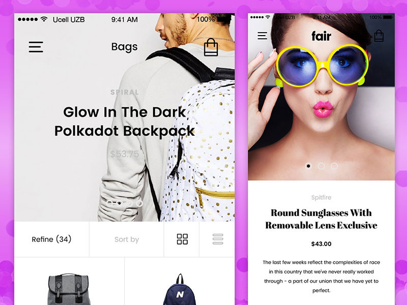 Image source: Fair UI Kit
Are you one of them? Let’s check some basic facts and see what the growing mobile retail can do for you:
In 2013, Amazon sold products with an approximate value over $1 billion just in purchases made from mobile devices.
More than 70% of America’s internet users accessed Amazon from their mobile devices in Q4 2013.
By 2018, 30% of global retail will happen through e-commerce, which makes the double of the calculated 15% in 2013.
2013’s “Cyber Monday” will be remembered by $400 million earned in mobile sales only on the territory of the USA.
 Image source: uixNinja
80% of the purchase decisions mobile users are making are influenced by their mobile channel, even when they don’t use a handheld device to make the final purchase.
You will never again be accused of running an outdated brand
This is an often neglected reason to create a responsive e-store and to provide customers with a high-quality experience. To start with, small and responsive websites are good because they show customers you’re there to respond to their needs, knowing how much they are relying on their mobile devices to perform important day-to-day tasks.
 Image source: Nur Praditya Wibisono
If you don’t cater their needs and expectations, you’re consciously decreasing the value of your own brand, indirectly telling them to continue shopping elsewhere.
Without a responsive e-store is almost equal to promoting environmental issues and healthy lifestyle on a meeting where you smoke and have just arrived with your car. Obviously, you’ve told customers your business is worth of their attention, but did you manage to prove it?
Running an e-commerce website that is accessible only with desktop devices makes it more than clear that you’re stuck in the past and unable to respond to the standards and trends of your time. On the other hand, intuitive and friendly interactions will motivate users to make a purchase and will impact sale rates sooner than you expect.
 Image source: Alexander Zaytsev
With a responsive e-store, you’re showing the world that you’re running an adaptable business that can respond to all technology demands.
Remember what has been said here, and think of a real-life example that can give you the full picture of how it looks: imagine that someone recommended you a great coffee shop, but once you tried to get there the path was full of trash, everything inside was falling apart, and there was no Wi-Fi. We can bet that you would leave immediately never to come back!
Streamlining shopping experience with responsive design
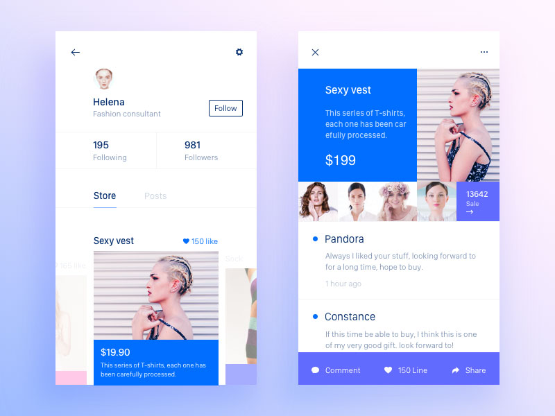 Image Source: Gale P?
The current design community trend is to design small-form, mobile-ready websites that can meet customers’ needs and improve their experience. By small form, we mean that the preferred option is to start with a simple site that works up to satisfy its initial purpose, rather than large ones that will squish content down, and make it almost invisible on small screens.
When analyzing task performance on a website designed specifically for mobile usage, the one and ultimate goal are to make sure that the user will be able to accomplish the task he came for at least equally as good as he would do that on his desktop.
You have to take care of appearance, speed, and intuitive navigation, and to keep the optimization of visual assets as it is, instead of experimenting.
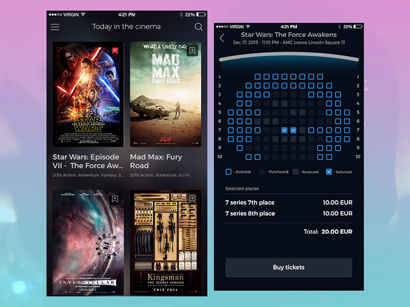 Image Source: Cinema tickets UI Kit
If the starting point is still the conventional desktop size, you can include an eye-attractive header and place links there, adding maybe your logo, cart data, contact information, and so on.
The risk here, however, is that once this website is squished to fit on a smaller screen, the header will occupy half of the vertical viewpoint space, and that won’t be as user-friendly as you expected.
That’s why it is better to design for mobile devices from scratch – you know from point zero how much real estate you have, and you understand the need to make elements simpler and shorter, adding nothing but the most relevant information.
 Image source: Here180
It’s true – the process can be challenging and time-consuming and it will require a lot of thinking how to satisfy customer needs and expectations.
In the end, however, you will understand that everything comes down to keeping things simple, and making the interface as usable as possible. That’s the only thing buyers expect from you. This process forces you to think through what is most important to your users/customers!
The advantages of responsive mobile ecommerce websites
 Image Source: Meg Lewis
Clear offers and streamlined content: Content is usually the same on all devices, and that’s the way it should be. Still, this doesn’t have to mean you’re not allowed to skip ‘ornamental’ introductions and jump straight to the point, namely prices, specials, messaging, and so on. Most of all, try to keep call-to-actions identical on all devices.
An improved user experience: When customers find what they’re looking for easily, they buy, and there is not much philosophy about it. On the other hand, many Google surveys have shown that more than 60% of buyers get annoyed by complex website experiences, namely websites they can’t navigate easily and functionalities that are not clearly displayed.
 Image source: Ruki
Catering multi-channel shoppers: According to Google, 67% of buyers shop using more than one device, and more than 80% of their mobile purchases are completely spontaneous. Knowing this, you have to provide a mobile-friendly shopping portal, and add features such as ‘Save to Cart’ or ‘Add to Wishlist’ so that customers won’t give up on these items once they change the device.
Keeping up with trends: Internet Retail’s Top 500 has only 2% responsive retail websites, which leaves a lot of room for you to stand out of the crowd and to make it there.
Which are the things to remember from this article?
 Image source: Bagus Fikri
If you don’t have a well-designed, extremely intuitive, fast, and responsive e-store or mobile ecommerce website, you’re already way behind your competitors. Still, this is not a rare circumstance – there are many small retailers that are still struggling to do it, so try to contact a professional business consultant to help you jump out while you’re still on time.
Look at responsive web design as a good thing, because it is your best bet to cater individual needs and requirements on every design that has or is about to emerge. Keep checkout the simplest possible, and don’t ask users to fill long order forms as they would on their PC.
That’s what responsive technology is all about – adapting the ordering process to small touch gestures you wouldn’t be able to provide otherwise.
Even if mobile ecommerce is following a general usability trend, that doesn’t mean that people have given up on choosing. We’re all still nitpicky creatures that like to see nice stuff and enjoy a pleasant mobile ecommerce trip, so don’t confuse between practical and dull. There are still many factors to consider when building a high-quality user experience.