want to know what are the different web design patterns? Designers use various website design patterns to easily read or scan through a specific design. Typically, there are three types of patterns that are used the most: F-pattern layout, Z-pattern layout, and Gutenberg layout. These common, beautiful design patterns reveal where certain information needs to be placed the most.

On the other hand, some feel that these patterns are rather misunderstood and followed without considering what they really describe. Designers need to go more in-depth in regards to the “what’s” and “why’s” of each pattern and gain control over how the eye of the viewer moves around the design.
Table of contents

Image source: buatoom
Designers view these patterns as tools suitable for web design projects.
Whenever patterns are properly applied, they result in a sense of familiarity attached to the web design project. The interface becomes personal and intuitive and everything ends up in the right place.
Gutenberg Layout

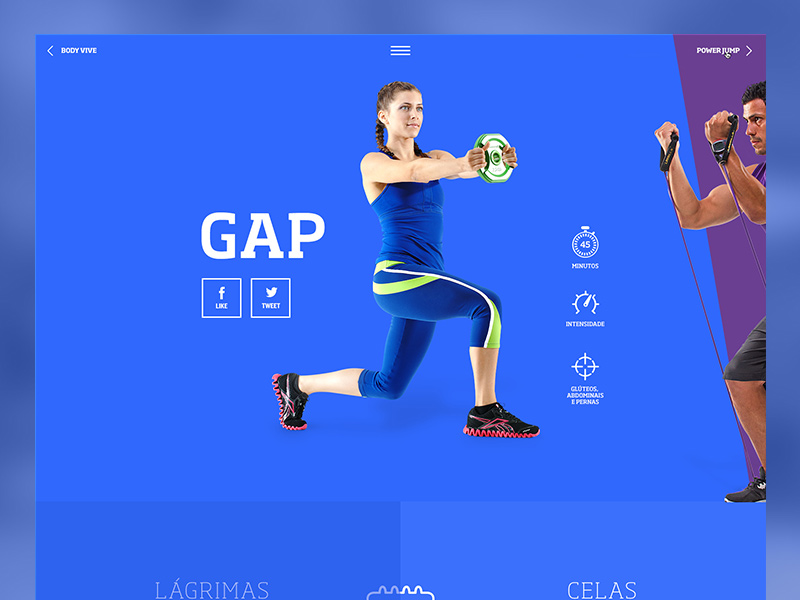
Image source: Den Potapov
This is a layout that allows the eye of the user to move around a design that is applied to a heavy in text content, such as pages found in an online newspaper or a novel.
The Gutenberg Layout is divided into the following sections:
- Primary optical area, located in the top left corner
- Strong fallow area, located in the top right corner
- Weak fallow area, located in the bottom left corner
- Terminal area, located in the bottom right corner
This layout is constructed in such a way that allows the eye to move across the page and also down the page. These are movements that are commonly referred to as “axes of orientation.”
The user’s eye then travels from the primary optical area to the terminal area in through what if often referred to as “reading gravity.” It is through this method that important features like headlines and logos should also be placed.
Furthermore, the Gutenberg layout also makes the suggestion that both the weak and strong fallow areas actually fall out of the “reading gravity” path and are practically devoid of any kind of attention unless they are both visually emphasized in some form or another.
Check out: 21 Mobile App UI Kits Bundle
The F-Pattern Layout

Image source: Saidmakhmud
The name of this layout comes from the general pattern that a user’s eye normally travels when reading over various forms of content. It is also a very common pattern because of the reading habits of individuals from the Western culture.
This makes the F-Pattern quite common on pages that are heavily filled with content. Furthermore, this layout allows users to scan only for specific points of interest whenever necessary.
What this essentially translates into is that your users will actually take the time to scan through approximately 50% of a page in order to reach the specific information that they want or need the most.
Check out: Bootstrap Admin Templates For A Responsive Dashboard
The Z-Pattern Layout

Image source: Der Wölfe
As opposed to the aforementioned layouts, the Z-pattern layout is more appropriate for websites that are generally looser and more sparse in nature.
The best example of this would be minimalist-type websites, which can employ the Z-pattern layout to help draw attention only to a selection of features.
Some designers prefer this method because it can reassure them that only their most important content will be seen.
The Z-pattern layout contains the same type of eye movement as the F-pattern layout does.
However, there is one thing distinguishing it from other patterns for website design. Rather than going back to the left before going down, the user’s eye will go to the left and down at the same time before going left-to-right horizontally.
Check out: UI Decks – Cards And Blocks
The Golden Triangle Pattern

Image source: Ruslan Siiz
This is what the Z-pattern layout will eventually lead into. This pattern is achieved when the user’s eye moves horizontally and diagonally before the shape being closed up and forming a right triangle.
The right angle of this triangle will be formed in the upper left corner of the page.
According to designers, the information contained within this triangle shape should always be the most important. Because the top left corner is one of the most commonly viewed areas.
Check out: Wunder UI- Design System & UI Kit
View All Three Web Page Patterns

Image source: Tôi Đơn Giản
Whenever there is a significant lack of hierarchy in design, all of the aforementioned patterns accurately describe where the user’s eye will be focused.
The problem, however, is that these specific website patterns are often applied where there is already a great sense of hierarchy, in designs that include much more than just simple text.
Furthermore, all these patterns for web definitely share a lot of similarities with one another.
Check out: Essential Web Design Bundle For All The WordPress Ninjas
Final Thoughts – Website Design Patterns

Image source: Ashok Suthar
Layouts such as the Gutenberg, Z-pattern, and F-pattern suggest that the user’s eye will follow a natural path through the design. Again, this is technically only the case with designs that are heavy with text and contain virtually no kind of hierarchy.
If you design something that sounds like this, then you might want to consider one of these layouts. In addition, you should also take them into consideration for those users who scan your design by placing various elements to help them along in their path.
Take the time to decide exactly what specific information you want people to see the most. And use a series of different focal points to help them gradually and comfortably move through your website.
Like this post? Check out more amazing web design content here.
Credit for featured image: Bruno Amorim