Today, the art of kerning in typography has become essential to successful web design projects. Web designers were once criticized for lacking knowledge about applying proper typography practices to their works.
However, that has certainly changed since web designers have taken digital typography to new heights and increased its artistic representation. In this blog, we will explore the meaning of kerning in typography and how to kern properly.
Table of contents
Getting To Know What Is Kerning For Fonts

Image source: Sarah Dayan
There is much appreciation for the art of typography and how it enhances the practical side of a project’s overall design. Words and letters can draw viewers into design projects not only with their message but also with their aesthetic effects.
One typography area designers still often struggle to execute successfully is kerning. There are not yet many outlets online that directly assist design artists in accomplishing proper letter kerning.
There are a few available options to make kerning text more feasible. Still, many designers choose to take projects into their own hands without knowing how to kern properly.
Many web designers still do not fundamentally understand how to use kerning to improve the appearance of letter characters. One of the most important parts of kerning is realizing that it is necessary.
Here is an overview of some helpful kerning tips to further enhance the text in your next web design project.
Check out: Grand Script Fonts
Kerning Vs Leading Vs Tracking
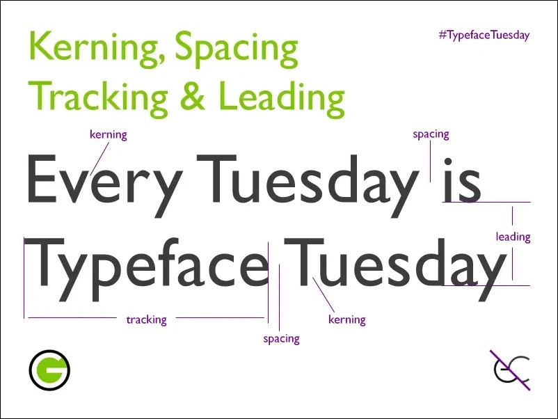
We’ve got you if you’re wondering what is kerning in typography. Kerning is the process of adjusting the spacing between letters to improve the appearance of typed text. Some designers find this to be a simple process. Others deem it to be a nightmare.
The tips below can provide more background knowledge and improve your kerning application skills.
Designers must understand that tracking, the uniform spacing between all typed letters in one space, is not the same as kerning. Kerning refers to the spacing only between two selected letters.
Please do not mix these two terms when tackling your early design projects or discussing them with experienced designers.
Leading is the vertical space between typed lines. You should apply tracking and leading before you apply any kerning to your projects because tracking and leading can undo any previously applied kerning adjustments.
Check out: The Hand-Lettered Fonts Collection
Choose Your Typeface Early

Different typefaces require unique kerning adjustments, so it is important to choose the project’s one typeface early on for the best kerning outcomes.
Do not put yourself in the position to change the typeface late in the project.
This will undo all of the kerning adjustments you previously made with the originally chosen typeface. Rushing kerning could also be detrimental to your project.
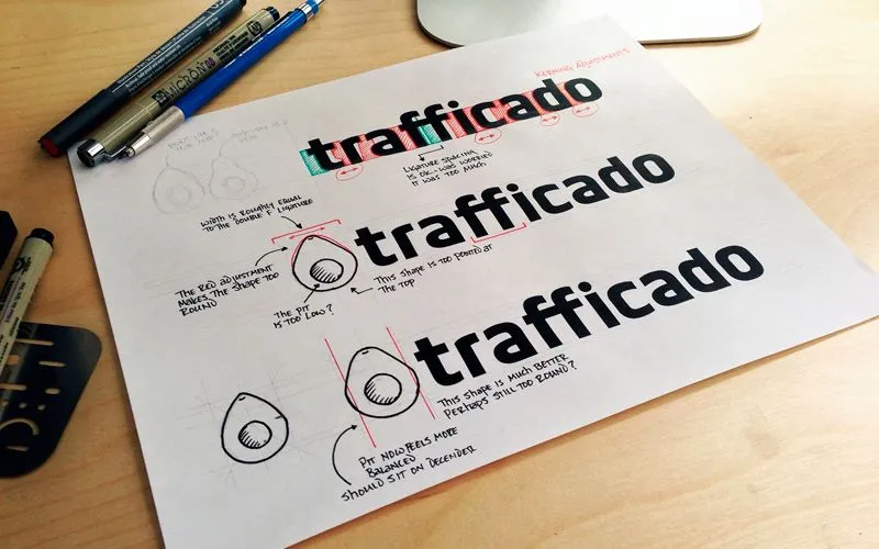
How To Kern It Yourself
Image source: Colton James Wiscombe
It is best to kern by yourself and not use the software program’s spacing settings or functions for kerning logotypes and headlines. Spatial relationships between all letters you intend to kern need to be adjusted individually, so each letter pair should use unique kerning settings instead of the software’s provided spacing.
There are some already-established tools for kerning, including Metric and Optical kerning, but kerning independently can allow you to have more practice and control over your project.
One way to do kerning in fonts independently is to open the “Characters” panel. Then, double-click the space between the two letters you intend to kern. Finally, return to the “Characters” panel and adjust the numerical values in the kerning tool, fine-tuning spacing between the selected letters.
Check out: Lovely Times – 12 Hand-Lettered Fonts Bundle
Flip the Text Upside-Down

Image source: Paul the Designer
When we read the text, we grasp meaning from words and not individual letters.
Designers have suggested that flipping the text upside-down can allow you to view the spacing between each typed letter in a more holistic sense. This can make for more effective kerning by allowing you to see how the letter shapes and their spaces fit together.
Check out: Inspirational Text Overlays Bundle
Blurry View

Image source: Marina Yalanska
Squinting or making your eyes blurry while kerning typefaces enables you to further hone in on the letterforms contrast and white spaces without being completely focused only on the letter characters.
Choosing The Correct Font To Kern Typography
Fonts also dictate spacing variation between letters, and different fonts have different spacing ways. If you are experimenting with fonts, do not do too much kerning on your first selected font because you will likely have to redo all kerning processes for the next one due to spacing differences.
Balanced Spacing

Image source: Vidmantas Staniunas
The best kerning results display letters in a consistent, rhythmic portrayal. All letters should have balanced spacing between each other.
You should be able to sit back from your screen and observe equal spacing in between each character.
Practice Kerning In Typography

Image source: Roberto Montani
Like progressing in and mastering an application of any art form, practicing kerning is no different. It may take several projects or attempts at one project until kerning becomes easier or more natural.
Learning by trial and error makes for a more experienced and efficient designer; learning from mistakes made during practice can bring immense progress.
Conclusion
Designers should remember kerning in typography and use it in their projects, even though it can sometimes be tedious. Letter spacing analysis can lead to the execution of aesthetically pleasing typography, which can dynamically improve design projects.
Credit for featured image: Colton James Wiscombe
Like this post? Check out more fantastic web design content here.


