The transparent ghost button is becoming increasingly prevalent in web design. This fact has come as a surprise to some web designers, who never expected that a hot new trend could rise from something as basic as a clickable button.
Ghost buttons are also referred to as hollow or empty buttons. Apart from having an outline and featuring a small amount of text they are transparent, or close to being transparent. The flat outline is always a simple shape, such as a circle, a square or a rectangle.
Generally, ghost buttons are given a prominent position on a website. They often appear central on the screen and appear in a much larger form than any traditional button.
Table of contents
How Ghost Buttons are used
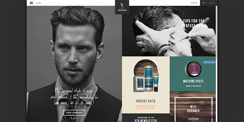
Image source: v76.com
The purpose of using a ghost, rather than traditional button, is because of the way that it will grab attention by drawing a web user’s eyes. This is partly due to the fact that on a screen an empty button appears to merge magically into the background.
The most effective use of a hollow button on a website or app is when it is placed on a large-scale photo background or a flat minimalistic interface.
A web page may feature a small group of ghost buttons or one can be placed effectively all on its own. Small geometric icons can be placed within a button but must be used sparingly.
Design Elements
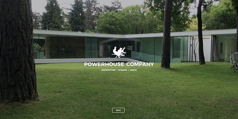
Image source: powerhouse-company.com
There is no particular set of rules for using ghost buttons, but they do share a common set of components and there are some specific factors that apply to the way they are used.
There are a few essential design elements that define a ghost button. The button is hollow and contains only a small amount of text (with or without the addition of a simple icon). It has a thin outline, which is generally black or white. It is bigger than a traditional button and appears in a prominent position. Most of the times, the button is part of a flat scheme or an almost flat design.
Head-Up Displays
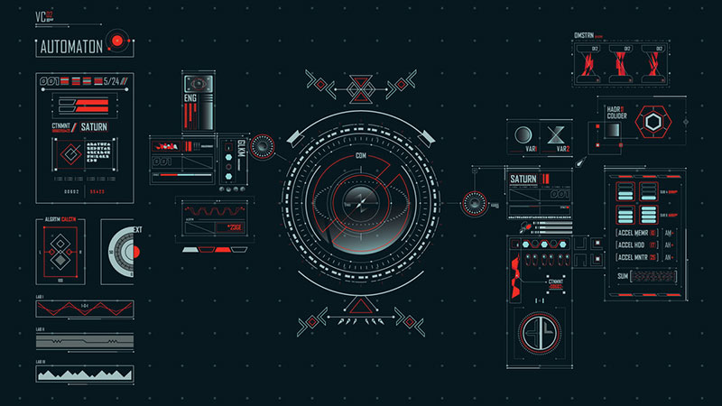
Image Source: Benedict Aji
HUD data is presented in such a way that it will obscure the viewport. Head-Up Displays are not precisely the same as ghost buttons but their basic elements on an interface are often in the form of a clear unit of text enclosed within a thin border.
These have been in use since the late 1960s in military aircraft and have more recently entered mainstream culture through their use in video games, their visualization in movies and their appearance on car dashboards.
The trend for ghost buttons possibly began when HUDs were used in Hollywood movies, usually with in the depiction of a transparent user interface created by FX designers.
Check out: Iconia Pro – Mega Bundle Design Icons
Bootstrap
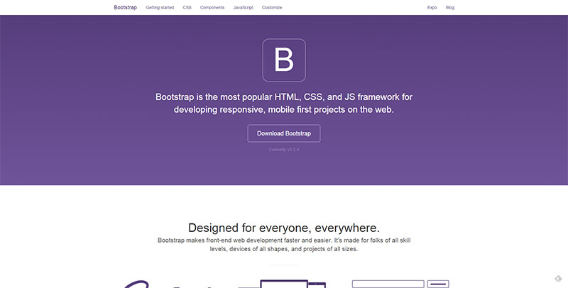
Image source: getbootstrap.com
Also in 2013, on the release of Bootstrap 3, there was an early version of the empty button showing up on the homepage. This was not a fully transparent button, but it did feature some of the plain elements of ghost buttons and it was used on a single color background. This made way for the use of transparency and other common traits that have developed into ghost buttons.
Bootstrap became very popular and was used by a lot of people who wanted to develop a website. The flat design obviously started a trend and had a big influence on the way that ghost buttons are now used in web design.
Check out this blog to learn about best practices for website design.
Apple iOS
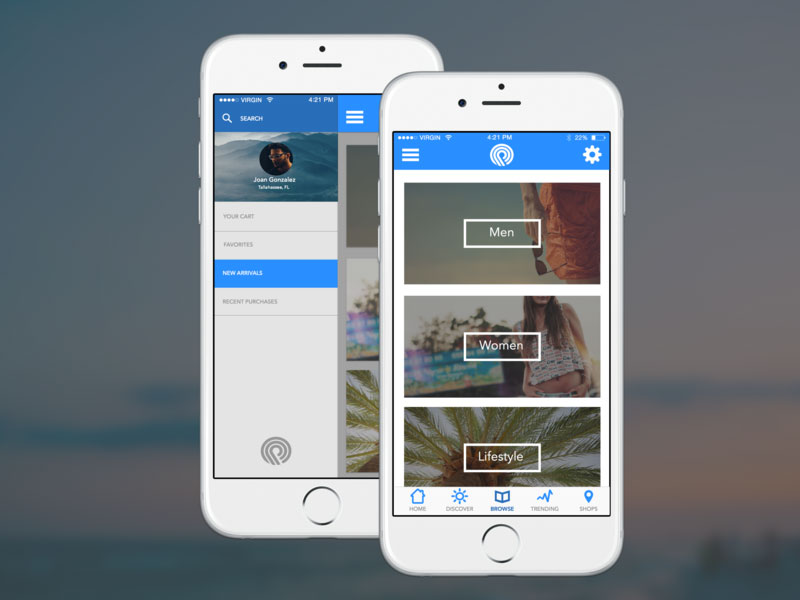
Image Source: Joan Gonzalez
The interface of the Apple iOS 7, when it was introduced in 2013, made great use of minimal icons and buttons delineated by extremely thin blue or gray outlines. The iOS design was not appreciated by everyone initially. But since it was devised by Apple it has obviously had a great influence on many aspects of web design.
Google Nexus
Google also got in early to the trend for using transparent buttons. In 2013 these appeared on the website for the Nexus 7 tablet. The buttons on that website featured a white outline which contrasted sharply with the darker background.
Pros and Cons of Using Ghost Button
Before deciding to go ahead with integrating them into all your web designs, or deciding to ignore them completely, it is important to consider both the positive impact and the downside of ghost buttons.
Advantages Of Ghost Button

Image source: urbaninfluence.com
Transparent buttons give a design a sense of order and a more sophisticated appearance. And they lighten the weight of a design visually.
They are easily integrated with any other elements of web design and they are suitable for any style of design.
Disadvantages Of Ghost Button
Ghost buttons are not what some business site owners would consider being a proper button. And their appearance does differ from what has become the established idea of good web design.
Care is necessary when using ghost buttons to make sure that they stand out and draw attention. Rather than getting visually lost against a busy background. Overuse of ghost buttons can look as if you are jumping on a trend without considering the effect on your design.
When they are not placed correctly ghost buttons can be hard to spot and when ghost buttons are placed on certain photographic or patterned background, the result can be a poor color combination.
Last but not least, transparency may cause text contained in an empty button to become illegible.
Conclusion
Ghost buttons have become popular with web designers over the past two years. And are likely to continue to appear on more websites. They should not be regarded as being a magic solution that is fit for all purposes. When used appropriately they do draw the eye of website users and make an impact. Ghost button can be integrated with all the basic aspects of web design and are easy to create.
Now that they are appearing everywhere. It appears that ghost buttons have become established as a website feature, and they are here to stay.
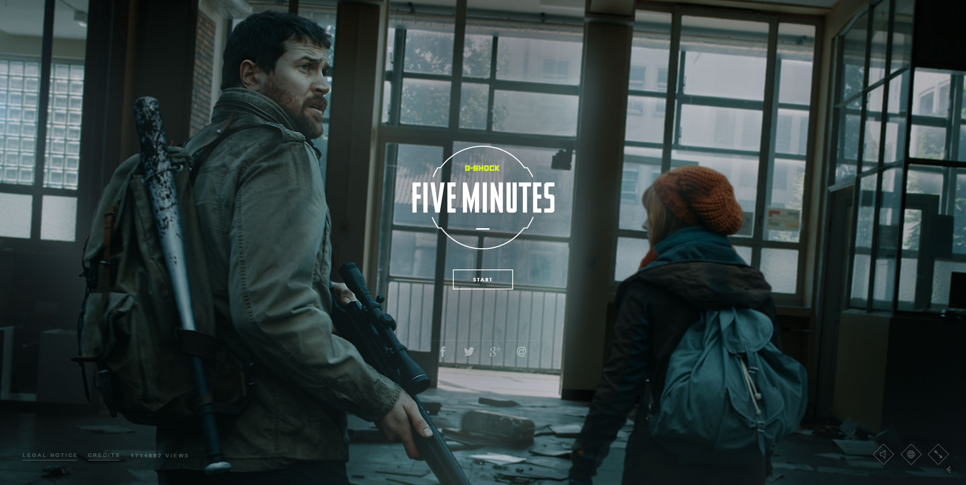
Credit for featured image: fiveminutes.gs
Like this post? Check out more amazing web design content here.


