Web designers always used to concentrate more on showcasing their overall skills in terms of constantly placing animations and illustrations on the websites that they were developing. The biggest reason for this was that they felt they could not only “wow” their visitors more and help drive up website traffic, but also improve the user experience. This is about the time when skeuomorphic design experienced a big shift in its favor thanks in large part to it attempting to use various textures, characteristics, and shadows in order to showcase real life on the screen.

Formerly, developers had to resort to using flash outlets in order to not only make their websites more visually appealing but also to enhance user experience by improving the overall UX aspect in order to add more levels of interactivity. In fact, this was the case only a few years ago, though it feels like it has actually been much longer than that.
Thanks to the advances in software such as HTML5, jQuery, and CSS, the overall use of Flash has sharply declined for these particular instances and has also become largely inefficient and outdated.
As a result, a new and more exciting design trend, which is known as flat design, has started to rear its head. Rather than resorting to design techniques that are considered by many developers to be more artificial in nature, this new trend instead uses techniques that are much more classically digital and simplified. Lets discover tips for better user experience!
Table of contents
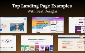
Introducing Flat Design

Image source: jeet.gs
Flat design, in simple terms, is defined as a minimalistic style of the design approach that shows a great amount of emphasis on usability. This is highly evidenced in the crisp edges, clean and open space, 2D flat illustrations, and bright colors that are showcased in this particular design style.
One of the first companies to put this to excellent use was Microsoft, as the company applied flat design to their overall interface. However, there were some individuals who saw this move as a backlash committed by Microsoft against the skeuomorphic design concept, which is something that Apple had made a big part of their iOS interface.
By using flat design, Microsoft will be able to use simple icons and images to help identify applications rather than converting a real object into a small, yet realistic-looking, illustration.
Master the art of user experience with these essential UX resources.
Minimalism Is Efficient, Not Boring

Image source: playgroundinc.com
In terms of flat design, something that is viewed as being nothing more than simple clutter are ornamental elements. After all, if something doesn’t really serve any kind of purpose as it pertains to functionality, then the overall user experience will suffer a major distraction. This is the very reason why flat design is so minimalistic.
On the other hand, something shouldn’t be considered to be “boring” if it doesn’t have any qualities that make it flashy in nature. Instead, as long as whatever you’re creating possesses colors that are bright and vibrant and are successful at attaining attention from the website’s user, then the user’s eye will continuously flow around it. This is something that also contributes to the overall character of the flat design concept itself.
If someone wants to convey a message as efficiently as possible, it’s often best to use simple images (such as icons) than images that are more detailed. This makes it much easier to see the big difference between flat design and skeuomorphic design.
Also read: How You Can Improvise User Login Experience
Navigation To Improve User Experience

Image source: bloomberg.com
There are typically two different ways to successfully navigate a website: primary navigation and secondary navigation. Regardless of which one you may prefer to use more than the other, it’s extremely important to enable both types on every webpage that you make.
Primary navigation allows a website’s user to get to the main areas of the website that they are visiting, which is something that can help increase the user experience. This type of navigation is generally considered to be top-level. As it shows the exact location of the website’s main sections and what those sections contain.
Secondary navigation, on the other hand, takes the aspects of primary navigation and divides them into separate subsections. This is referred to as tertiary navigation.
Tertiary navigation is then used to divide those specific subsections into even more sections. This makes it extremely important to properly plan out the overall navigation structure of your website in order to allow for better website user experience.
Also read: Ways Design Thinking Enhances Customer Experience
Navigating By Searching

Image source: Lukas Bugla
Another useful form of navigation involves searching. This is a feature that virtually every single website should have. It’s no secret that while some individuals prefer searching, there will be others who prefer browsing instead. This signifies that it may be best for a developer to include both features on a website. This is another way to help improve user experience for customers.
Check out this blog to get detailed insights about user experience design.
Put yourself in your visitors’ shoes
It’s important to make sure that design elements are centered on the overall idea of simplicity in order to successfully develop a flat website that is as effective as possible. Rather than using details that are illustrative, instead resort to utilizing colors that are both vivid and solid.
In terms of typography, the most common font type that is used is the sans serif type. This is a font type that acts as the perfect supplement to illustrations, as well as being very concise and “to-the-point.” Any UI buttons placed on the website are also more clear and noticeable than traditional ones.
In the end, the overall goal is to construct a website that is not only functional and cohesive in nature. But one that also improve website UX.
Also read: Easy Ways to Engaging User Experience
Clear Visual Hierarchy To Improve User Experience

Image source: sixrevisions.com
When constructing a website, you should never take any content on your page lightly. Ensure that you use clear headings to help organize all of your content, as well as subheadings, which will make all of the content easier to browse through.
The visual appearance of the content is unimportant. But regardless, it is still extremely important to have some sort of a hierarchy of your content.
Also read: Design for Emotion: How to Create a Connection with Users
Ending Thoughts : How To Improve User Experience
Should you choose to utilize flat design when constructing your website, every part of it should be designed with a perspective that is both user-centric and minimalistic. This will not only improve UX of website, but it will also help ensure that your website possesses an interface that is unified. By taking these actions, your visitors will appreciate the fact that your website is completely functional.
Credit for featured image: moorplace.com
Like this post? Check out more amazing web design content here.