Suppose you want to create a successful brand; treating it as more than a logo is essential. It should stand for everything a consumer thinks and feels when interacting with it, whether on the television, billboard, or magazine. In many ways, beautiful typography is a part of this and allows businesses to stand out. So, if you want to learn to capture something special, look at your creative typography choices.
The problem with modern businesses is that they are too fixated on technology. Yes, it is essential to make use of the tools available. But essentially, once the shiny technological ‘bells and whistles’ have all been used up, only good old-fashioned text will be left.
This text will either drive potential customers to your website or see them leave quickly. Consider whether utilizing paid fonts could improve your corporate website.
Table of contents
Creative Typography & Fonts
Image source: Sherzod Mirzaakhmedov
The word typography refers to the balance and interaction between letters on a page. It constitutes a verbal and a visual cue designed to help readers comprehend the key ideas. This dual role, as both a visual and verbal indicator, is crucial because it allows the human brain to interact with content in the most efficient way possible.
While human beings are not always aware that it is happening, they are subconsciously attuned to the verbal and the visual while browsing a page. They first assess the page’s overarching visual themes and then turn to reading the content. Therefore, successful creative typography creates a supportive visual framework for assessing written content by offering visual cues and making the interplay between visual and verbal clearer.
Also read: How To Use Large Typography To Stand Out
Creative Typography & Web Pages – Importance of Content
Image source: Alexander Antonov
The good news is that visual content can be formed in a thousand different ways. As web fonts and web browser scripts continue to develop and improve, innovative new projects are being created.
The trick to success is to treat each webpage as a branch diversion of a singular root design. If you think about typography this way, it is much simpler to imagine it flowing from page to page, like the branches of a tree.
They all interact and depend on one another for survival, but they are simultaneously distinctly separate components. This is particularly true when creating exclusive categories for paragraphs and headings.
Check out this ultimate guide to the basics of typography.
Digital Clever Typography
Image source: Justin Rands
There was a time when switching to a different font was a journey. For example, if you wanted to swap from Times New Roman to Arial (or transition between any two fonts), the only solution would be to remove all the keys on your typewriter and replace them with a new set. These days, switching between fonts takes seconds, and it is essential to utilize this privilege correctly.
While good typography design has improved dramatically over the last decade, many fonts are still not entirely web-compatible. This tends to be due to unsuitable browser choices.
You could end up picking a font that you like, using it on your website, and then finding out that it does not look like it should. This would lower the quality of your brand. This is why it is so important to plan your typography choices carefully.
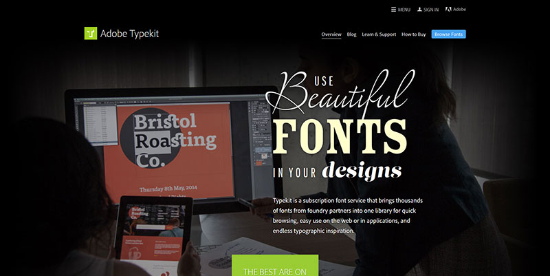
In other words, investing in reliable paid fonts can often be a better choice. If you use resources like Adobe Typekit, you will find that it becomes easier to source and use web-compatible choices.
Also read: Typography Terms That You Should Know
Image source: typekit.com
The Typekit tool liaises with individual foundries, assesses traditional fonts, and creates modern versions. It can also be used in tandem with Creative Cloud, allowing web designers to experiment with different combinations and designs.
For those who would instead host font files on their servers, scores of websites allow for this. Or you can choose to work with an individual foundry. These one-off investments can sometimes cost less than hosted choices with scheduled fees. The point to remember is that licensing will require some forethought. Do think about the number of desired licenses and what form they will need to take.
Ensure that the entire design and marketing team possesses a licensed copy of the certified font to avoid costly mistakes. It is essential to consider what kind of fundamental question it sounds. But it is the foundation upon which your online content sits; what is the purpose of the digital text?
Also read: Best Kinetic Typography Examples And Ideas
Digital Text
Image source: Andrew Johnson
The main objectives of digital text are to offer insights, share resources, and help you send a message to readers. While text may be the most basic way of expressing ideas, it can also be a very intricate tool and convey details in ways that video and photography simply cannot.
The majority of website visitors now find the content they are looking for by searching for the keywords they imagine the content to be centered around. This is why it is essential to construct your copy with care and skill. Once you have grabbed a visitor’s attention, the aim is to keep them interested and transform traffic into conversions.
Useful Creative Typography Trends
Lots of White Space
Image source: adayinbigdata.com
These days, minimalism is all the rage because internet users do not always want to be bombarded with lots of content. The bottom line is that empty space does not necessarily equal wasted space, and a little bit of room to breathe can be really appealing. Yet, this trick is all about the visual, so if you are going to use it, you need to ensure that your digital content is just as appealing.
Heavy Font Weights
Image source: beargryllslive.com
The weight of a font dictates how bold it will appear to the eye, which can alter the overall look and design of the content. For example, if you are aiming for a very slick and sleek look, a thinner font choice is best. Pick up something a little thicker and fatter for a more friendly and down-to-earth atmosphere.
Also read: Tips For Better Typography to Boost Your Design
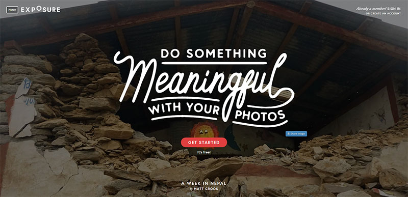
Different Combinations
Image source: exposure.co
As web typography advances, the role of creativity and imagination is essential. For most modern businesses, this means investing in a carefully constructed combination of typesets that work well together and complement one another. With new typography innovations, combining fonts will continue to get easier.
Huge Typographical Logos
Image source: gardenestudio.com.br
It is not always easy to incorporate design typography into logos because you are, in essence, trying to combine two previously distinct branches of the tree. However, this technique continues to grow in popularity, and it is the businesses that manage to create top-quality typographical logos that draw a lot of consumer attention.
Also read: Beautiful and Inspiring Typography Quote Designs
Concluding Thoughts On Creative & Innovative Typography
While a singular font choice is unlikely to determine whether your brand is successful, it will play a big part in whether consumers want to learn more about it. Once an established brand becomes inexorably connected to one particular font, it can become tough to change it and retain a certain level of popularity. For example, can you imagine if Pepsi changed its characteristic font?
This might sound like a disadvantage for a business, but a well-established typography design can be a real boon. Customers interacting with your brand both visually and verbally signify precisely what human beings are designed to do. In other words, you are playing to their strengths so that they will take notice of yours.
Credit for featured image: piccsy.com
Like this post? Check out more fantastic web design content here.
