One of the most important tricks when designing websites is to strike a balance between text elements and other visual elements. It’s even difficult to call it a trick, as it comes somehow intuitively, but you would still be surprised to know how many designers neglect it because they treat the text as a purely explanatory and visually unimportant tool. In this blog, we will discuss how you can use large typography to stand out.
The truth is that large typography is a powerful expressive mean that enables designers to combine two very important approaches: conveying their message in a well-explained, yet eye-attractive manner.
Therefore, let’s check out some specific aspects of large and expressive typography designs on the web. This will help us understand how effective our website is for users, and moreover, how can we use text to underline our style?

Check out this ultimate guide to the basics of typography.
Table of contents
- Why should we use large and expressive web typography?
- To make the website more attractive
- Use large typography invoke emotional responses
- To increase brand awareness
- Use large typography to strengthen your message
- To establish hierarchy
- Instead of images
- Large typography rules are there to be followed
- Keep it simple
- Take care of harmony
- Make it readable
- Blend it
Why should we use large and expressive web typography?

It couldn’t be simpler: we need it to improve the overall quality of our website! There are few ways in which we could use it, but we need to familiarize with the specific reasons to develop this skill first:
To make the website more attractive
If you need to convey an important message to the audience, there is no better way to do it than to use huge lettering. The idea is not a new one, but rather a tried and tested approach since the earliest days of printing technology.
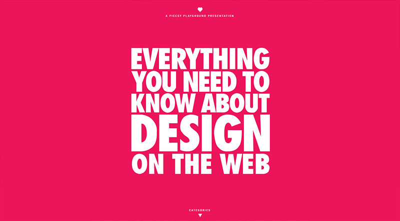
The reason why this concept has survived so many years is that it works, and people perceive it as a natural thing to do to attract their interest and to inspire them to read. That’s why so many websites nowadays rely on killer headlines to motivate users to keep reading.
As you can see, it is a method that hardly ever failed, and you understand how and why it spread in all design spheres, and how it made it to web design too.
Also read: Learn The Difference Between Typography And Lettering

The strongest side of it is probably that it diminishes the importance of color alteration. Expressive good web typography inclusions will be the main focus of the reader even with tenths of attractive elements around.
Use large typography invoke emotional responses

You don’t just need to grab attention with bold and oversized text. You also need to keep it. Involving readers on an emotional level is your best bet in this case, and expressive typography makes it possible because it can provoke a reaction.
The way how readers feel about your website is critical for your actions and interactions, so be careful when making your typography choices.
Once our content emotionally involves somebody, we can relax and rely on the fact that he or she will come back. Still, handle the issue with care, because an emotional connection has to work two ways: if you expect a particular reaction, you have to cause it and to plan it devotedly.
Also read: Typographic Trends That You Must Check Out Right Now
To increase brand awareness

You’ve already come across hundreds of articles advising you to create a portfolio and involve users with attractive content, but the truth about being remembered is much simpler: If you want people to notice your name, make it BIG!
As one would say, shout it out there! It is only when the visitor sees something he likes that he remembers it, and there is no other way for you to impose yourself.
Obviously, the visitor may continue looking, and comparing a couple of portfolios before making his final decisions, but if he remembers you, you are more than likely to make it to the top. Yes, you’re literally putting yourself in people’s faces, but that’s exactly what you have to do.
Use large typography to strengthen your message

This is one of the main reasons to use large types. You need it to strengthen your message and add value to it, while at the same time paying attention to the consistency of your brand.
For creative designers, this is also a way to personalize their projects, and to provide unique user experiences that are unbeatable when it comes to building quality relationships.
To establish hierarchy

As Steve Krug once said, people scan your pages, they don’t read them. So, which is the best way to capture attention while scanning? Large web typography can obviously help in this case by establishing visual hierarchy and letting users know what the most important element to interact with.
That’s exactly what Krug had in mind when he recommended designers mix up their websites and allow page break-ups to draw attention in an uninterrupted way.
Also read: The Best Strategies For Achieving Typographic Hierarchy

There are many other ways to establish hierarchy, but big typography is definitely the most effective, least complicated, and least time-consuming one. For instance, you can make content more playful with sub-headings and text boxes, which would mean that you don’t have to explain to people what is really important and assist their scanning.
Instead of images
If looking to keep your website image-light, use big bold typography to attract attention.

Large typography rules are there to be followed
Now that we understand why large typography should be used, let’s take a look at some basic rules you shouldn’t underestimate if you want to harvest the fruits of well-executed typography:
Keep it simple

A variety of beautiful typefaces may sound like an awesome idea, but that’s just because we think of them separately. Once we put them together, the idea simply loses a sense, and the website starts looking crowded and overdone.
Instead, we should keep up to two fonts the most, because that’s the best way to avoid confusing our users.
Also read: Typography Terms That You Should Know
Take care of harmony

As beautiful and striking as it is, the type is not just supposed to jump out of the page, looking completely artificial and distracting. Instead, it should blend seamlessly into the rest of your design, and even be used to enhance the importance of other elements.
You can use it to restore the balance of your website, and create something that looks both beautiful and practical.
Make it readable

The reason why you’re making your text large is to make it readable. This is a rule that should never be forgotten because there are plenty of beautiful fonts one can’t read or understand.
Remember, you’re not designing for yourself because you already know what the website says. It is your visitors that have to understand it!
Also read: The Best Practices For Mobile Typography
Blend it

With all that we have said so far, we need to warn you that proper oversized typography is not just about the size of letters. It is also about how the text will be incorporated! Style means the world to your design, especially when it complies with the rest of your content portraying the same messages.
Therefore, make sure to use an expected color, namely one that is similar to the primary color scheme used on the entire website. Keep choice down to a couple of fonts, and consider moods and feelings you want to provoke.
Before everything else, make sure that your typeface is readable and understandable because without it everything else will be in vain. It may take you a while until you discover the perfect combination of size, color, and weight, but that’s a secure way to drive traffic to your website. Sounds worth it, doesn’t it?
Like this post? Check out more amazing web design content here.


