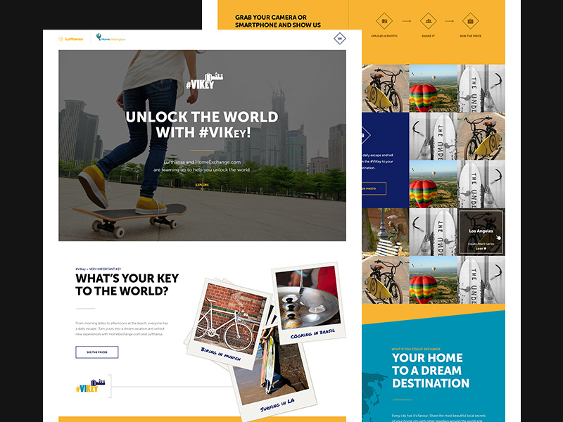
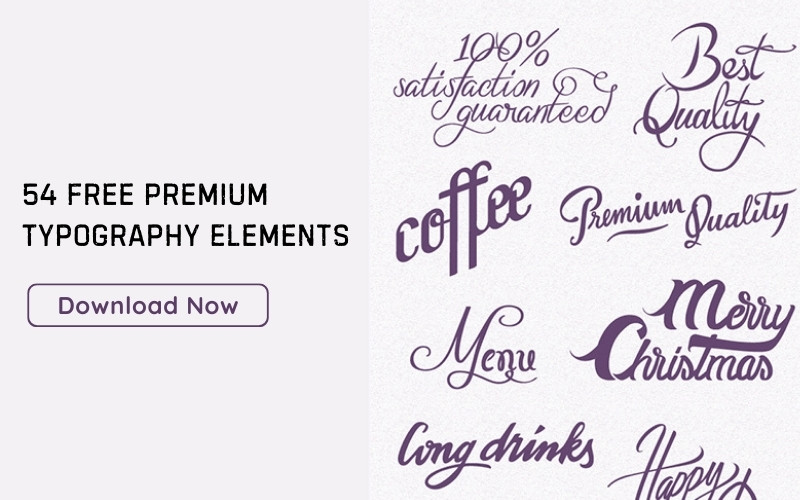
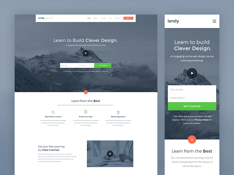
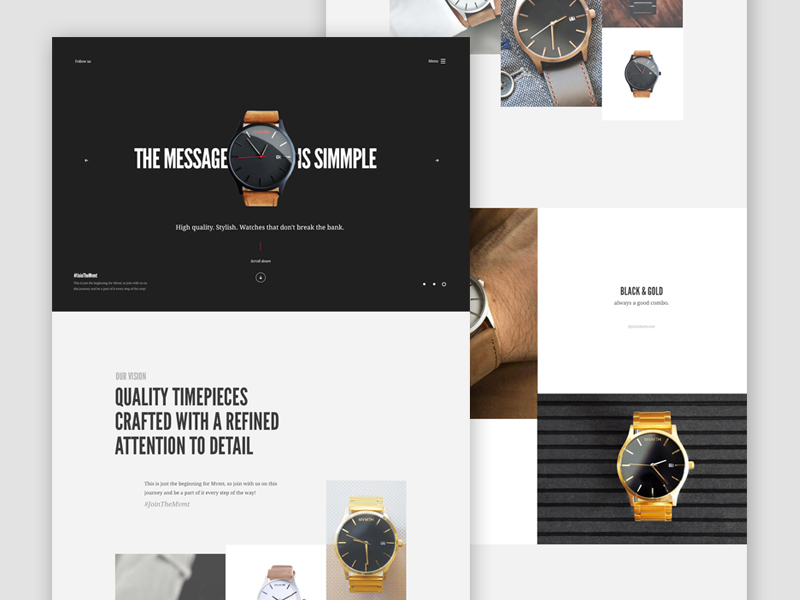
When it comes to communicating various messages through type, it is important to establish a good typographic hierarchy.
This concept covers the need to present content in a nice way that shows the reader exactly where he needs to look and exactly what kind of sequence everything should be viewed in. The viewer will be guided by type and images, according to the way in which these are placed and styled.
Website typography hierarchy and spatial features are used to achieve a system that creates the effect desired by the designer.
When the process gets underway, it is essential for the designer to understand how important these features are, employing them to visually reinforce his content.
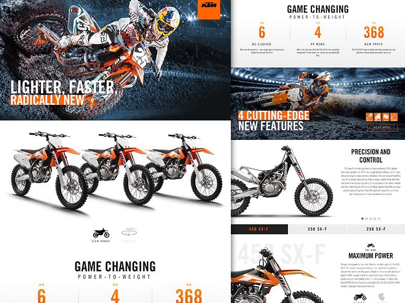
Image source: KISKA
Table of contents
What is Typographic Hierarchy?
Image source: Artem Mashirov
This is simply another form of visual hierarchy that displays the most important words with the highest amount of impact, in order to allow readers to quickly scan and find key information.
If typography hierarchy didn’t exist, words would essentially look the same visually. This is why it is important to create a sense of contrast between different features.
Designers are able to achieve this by combining different characteristics like weight, size, color, etc.
Also read: Learn The Difference Between Typography And Lettering
Styling Techniques
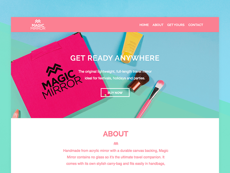
Image source: Owen Wassell
There are five different styling techniques that are traditionally used to achieve a great typographic hierarchy, often combined with one another:
- Size
- Weight
- Color
- Position
- Type contrast
Check out this ultimate guide to the basics of typography.
Style of Type For Typographic Hierarchy
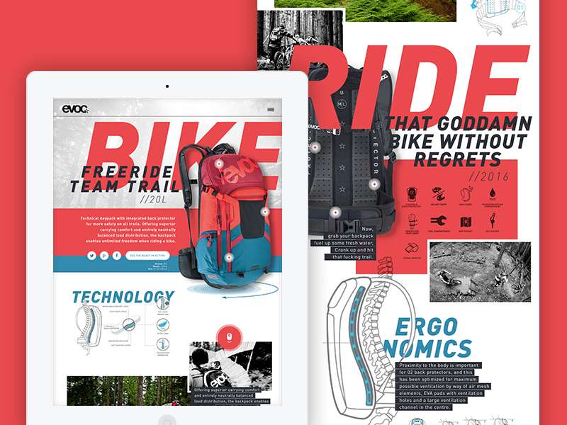
Image source: Andy Jörder /// nd80
Two of the biggest features that play a major role in establishing a great visual hierarchy in typography are weight and the typeface itself, especially when it comes to headlines and sub-headlines.
In order to highlight content, designers will generally use typefaces that are bold, distinctive, or decorative in any way.
Also read: Typography Terms That You Should Know
Size of Type

Image source: Saidur Rahman Munna
Normally, the eye is drawn to the biggest type size first, then to the smaller, as it continues to travel.
Bigger sizes are also generally used in headlines, which are normally located at the top of the page. However, the eye will continue to be drawn to these larger sizes no matter where they are placed on a page.
Also read: The Best Practices For Mobile Typography
Type Color

Image source: Jess Caddick
Color can do one of two different things in terms of typographic hierarchy: either draw attention to a certain feature or de-emphasize it all together.
The best example of drawing attention would be using the red font on a black background, while the opposite would be placing black text on a gray background.
Nonetheless, if you use too much color at once, it can create a lot of confusion.
Don’t Overuse Caps

Image source: Daniel Hoffmann
Most people enjoy using all caps to highlight different points of importance. This is acceptable, but it is recommended that you do so only in small doses.
Moreover, using all caps can actually affect the overall readability of the text.
Placing and Spacing
Image source: Hrvoje Grubisic
A big part of the overall typographic hierarchy involves how and where the text is placed and spaced. It is also a relatively easy process, as you need to ensure that the most important information remains prominent on the page.
Similar elements should be grouped together, while other things should be spread out as evenly as possible.
Also read: What Is Kerning In Typography & How To Do It Properly
Type Alignment
Image source: Kreativa Studio
The level of significance of different features depends on how exactly they are aligned on a page. For example, if something is centered, this implies that this particular content is of some kind of importance.
In addition, headings and sub-headings generally command a lot more attention than anything else, especially if and when they are aligned properly.
Also read: Typography Rules That You Should Follow
Common Conventions and HTML
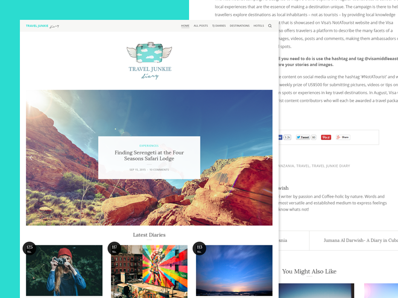
Image source: Sheikh Nuruzzaman
Common conventions should always be used whenever you are working on online projects. HTML is also important to be used as well, minding the following:
- Title (title)
- Body (body)
- Headers (h1 to h6)
- Bold (strong)
- Italic (em)
Spacing Matters In Typographic Hierarchy

Image source: j60
Spacing has always been an extremely important concept in type design. While this is generally hard for beginners to handle, it is also one of the most obvious kinds of concepts in visual terms.
In terms of typography hierarchy design, this is something that is absolutely essential to use, as it can support clarity. Furthermore, a vast majority of hierarchical systems use spacing.
One of the most important typography hierarchy rules to remember is to avoid too much space within entire paragraphs, where normal paragraph spacing should be used.
Choose the Best Solution

Image source: Matthew Smith
When thinking about typographic hierarchy, ensure that you always consider the meaning of your content. Think about the subject matter and what it communicates to your readers.
While all of the aforementioned aspects are excellent ideas to employ for your projects, remember that you may not actually be able to use all of them.
You need to see instead which methods work well for you and which ones really don’t. In any event, this is an instance in which the phrase “simpler is better” will most likely be used.
Also read: Typography Tips To Improve Your Website’s Legibility
Final Thoughts – Website Typography Hierarchy
Image source: Bady
There is a very good chance that you may already be using some kind of hierarchy of typography.
However, when you consider exactly how type can align, you will be able to improve your overall design.
The typographic hierarchy can and should be used to help you add emphasis to content, and also to provide scalability, readability, and basic comprehension.
Credit for featured image: Degordian
Like this post? Check out more amazing web design content here.
