Whenever a user visits a website, the very first thing they usually check is content, as most of the time, people don’t care too much about aspects such as color, sounds, or images on a website. This is because a vast majority of individuals always rely on actual text to help them accomplish whatever mission they have to visit a website. This is why typography rules should become the top priority for any designer. Typography, which is typically defined as the basic art of arranging typefaces, also contains various basic rules of typography that designers should always keep in mind whenever they begin contemplating their next project.
Table of contents
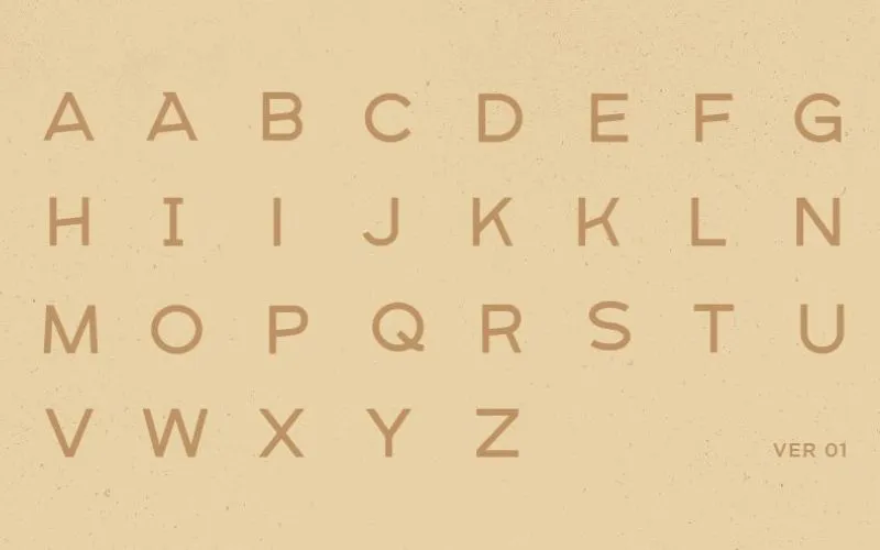
Typography Design Rules For Selecting A Font

Image source: Paul von Excite
One of the most common typography design rules is to select an acceptable font, as there is a vast amount to choose from.
However, this does not mean that you have to resort to choosing a font from an extensive library. Instead, if you wish to use a smaller one, then you should feel free to do so, as you can find some great fonts such as Helvetica.
While there are plenty of free fonts available, web typography rules state that it also pays off sometimes to use those that are not available on free lists.
When someone talks about leading, they are referring to the space between lines of text, measured from baseline to baseline, from each sentence in a block of text.
This is another crucial aspect in terms of web design, as it dramatically influences text legibility. The lack of any leading will make text lines look rather cramped. On the other hand, excessive leading disconnects text lines from each other.
One of the most common typography rules of thumb is using leading, which is around two points above the height of the font, though there are a few ways to change it, according to the program that you use.
Check out this ultimate guide to the basics of typography.
Tracking & Kerning

Image source: Brandon Durhm
While these two terms are different, they both have the same meaning, which is that they talk about the overall adjustment of space that appears between characters in a proportional font. At the same time, there are also some differences.
Tracking involves the adjustment of space between a particular group of letters, meaning the letters should be adjusted to prevent them from running into each other when printed while kerning involves adjusting the space between individual letters.
Also read: Learn The Difference Between Typography And Lettering
Titles & Subtitles Larger Than Body Text

Image source: creativemints
It is always important for a type used on different web pages to be of different sizes, otherwise, we would not be able to determine which bits are actually important. This means that you should make titles and subtitles larger than the traditional body type.
The scale is also something that can be determined by aspects such as color, weight, and spacing.
Also read: The Best Practices For Mobile Typography
Pairing Typefaces

Image source: UENO
You will be able to make your layout much more dynamic by pairing different typefaces. However, using too many of them can lead to everything becoming rather distracting. In addition, it can confuse the reader about which particular elements are the most important.
Generally, you should not use more than three fonts in one project. According to typography rules, typically, you need one font for the title and subtitle and another for the body text.
If your design document is long, you will be able to use more different fonts. On the other hand, when it comes to documents such as brochures, it is generally better to use not more than two different fonts.
Also read: Typography Tips To Improve Your Website’s Legibility
Typography In The Design Context
Image source: Balkan Brothers
When someone talks about macro typography, they are referring to the overall structure of the type and to how it appears in the design context and its general aesthetics. This is usually considered when text is treated as a block of its own.
In terms of micro typography rules, this involves spacing details and is necessary when blocks of text are being created. It is important to be as legible as possible, otherwise, there is really no point or reason to proceed with it.
Serif or Sans-Serif?

Image source: Josh Kennedy
The dash symbols that can be seen at the end of various letters and symbols are referred to as serifs. These are prevalent in documents such as books and magazines, as they always help to lead the eye of the reader to the next letter or word.
Sans-serifs, on the other hand, are the opposite, as they are fonts that do not contain serifs in them. What makes the font easier to read is seeing it at a lower than normal resolution. There are many different web designs that opt to use sans-serifs rather than serifs. This is important aspect of typography rules
Also read: Best Kinetic Typography Examples And Ideas
Basic Rules Of Typography Measure

Image source: Jonathan Howell
In terms of typography, measuring is used to describe the total width of a block of text. This makes this aspect an extremely important thing to consider when it comes to designing a webpage.
X-Height & Set Width

Image source: Dennis Weinhardt
In typography rules, it is no secret that not all typefaces are equal to one another. This means that different typefaces can take up different amounts of space on a webpage.
Each character’s height is known as its “x-height,” which means that, when it comes to pairing fonts, it is important to ensure that they contain the same or a similar “x-height.”
The width of each character is also taken into consideration and is referred to as its “set width.” This is something that spans the entire body of an individual letter, in addition to the space that comes after it.
A system called the “point system” is often used to measure typefaces, being employed ever since the 18th century. For example, one point is the equivalent of 1/72-inch, while 12 points equal one pica (a pica is used to measure the entire width of a column). Type sizes can also be measured in the following ways:
- pixels
- millimeters
- inches
Also read: Importance Of Typography In Web Design
Conclusion: Leading Rules Typography
All in all, a website’s success totally depends on its typography, meaning that all the above tips can help get the best out of your project and make your venture a successful one.
Like this post? Check out more amazing web design content here.


