Want to explore the typographic trends? Who doesn’t want to forget the early days of web typography, when you could use any typeface you wanted as long as it came from the handful of stock fonts installed with Windows or the Mac OS?
Today’s technical innovations place a world of type choices at your service without resorting to hacks or complicated replacement schemes. All these new additions to your toolbox expand your options, without allowing technological advancements distract you from making smart aesthetic choices that promote readability and style.
Table of contents
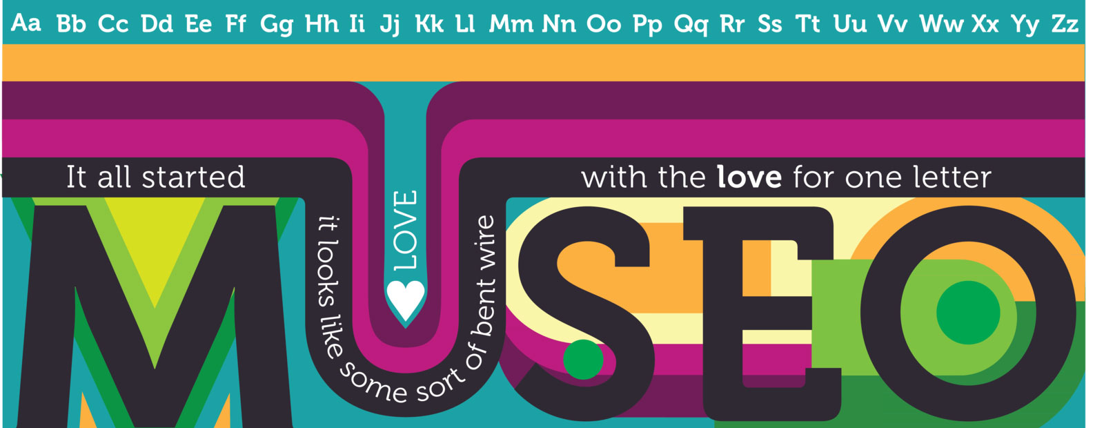
Typographic Decorations

Image source: Erin Radler
It’s up to you to decide whether decorative type offers your greatest temptation toward bad design decisions or the best source of a little visual spice. In the end, moderation holds the key to balancing decoration and clarity.
Ornamentation of any kind can provide an aesthetic touch to critical information or, on the contrary, can obscure it. Perhaps no aspect of web design other than typography offers so many opportunities to embellish and express personality while conveying information.
Typographic Trends in Body Text

Image source: karim nasri
Keep it clean and simple. After all, if site visitors can’t read your message, how do you capitalize on what you’re saying or selling?
But type also can add enjoyment beyond the mere practicalities of telling a story. Decorative type can expand or refine a brand image, invoke a mood, or emphasize a point.
Used sparingly and judiciously, it adds style at the same time that it maintains the flow of information.
Also read: Basic Principles of Typography Theory
Fit the Moment!

Image source: Pablo Martinez
Long headlines and text columns, traditional serif typefaces: Welcome to the mid-20th century. Short bursts of copy, punchy headlines that are big on type size and short on word count: Now you’re talking the 21st century!
It is important to understand historical typography trends so you can echo them when they’re relevant or imitate them for effect, but it is also useful to understand what’s time so you can use or avoid it.
Check out this ultimate guide to the basics of typography.
Look to these typographic trends for inspiration:
Typographic Trends in Handwritten Fonts

Image source: Craig Gittins
Back in the 1990s, desktop publishing featured a handful of scripts that looked too stylized and “clean” to have come directly out of someone’s pen.
Today’s script typefaces offer dizzying possibilities. From scrawls to flourishes, cursive to block printing, you’ll find trending typefaces that look like the output of writers of virtually any age or era.
Don’t use them for more than the short stretches of a headline, however, unless you want to create pages that no one can read.
Delicate Scripts

Along with handwritten styles that deliberately include the blots and blobs of studied or casual handwriting on specific types of paper, smooth scripts abound to create elegant impressions based on the calligrapher’s art.
With swashes and ligatures, these formal styles invoke the old-school lettering on diplomas or the penmanship of days gone by. As with any script typefaces, these beautiful designs work best when you use them in small doses.
Also read: Tips For Better Typography to Boost Your Design
Letterpress-style Typography

Image source: Brad Wofford
What designers call “letterpress style” can point in either of two visual directions. One emulates the slightly embossed effect, or inset, that you sometimes see in classic letterpress typefaces on paper.
The other points to a design style that combines various type sizes and styles to create a filled shape that becomes a piece of artwork itself, once a popular effect on posters.
This lock-up effect takes its name from the way typesetters compose handset type and lock it into place on a press.
Like handwritten typefaces, those that emulate letterpress also include multiple versions of individual characters to provide variations showing different patterns of unevenness in ink coverage.
Photo Overlays

Image source: Eduardo Mejia
This is one of the ongoing web typography trends. You no longer need to fire up image editing software and “bake” type into photos to combine text with images. With CSS, you can apply overlays that maintain their editability.
Keep these effects simple, favoring imagery with areas of solid color, such as skies or sand, or with low contrast.
Icon Fonts
Image source: Patrick Leahy
Dingbat typefaces – ornaments, characters, or spacers used in typesetting – offer you an easy way to apply vector artwork to websites through the use of type that flows properly through responsive designs as they resize to fit various screens.
Look at these symbol typefaces as collections of artwork organized around specific themes, whimsical or serious. Just remember to use them in moderation!
Also read: Typography Visual Hierarchy And What It Means
Grab on New Slab Serifs

Image source: Jonathan Lawrence
Slab serif typefaces feature squared-off rather than curved decorations at the ends of their strokes.
From lightweights to ultra wide and ultra bold, these typefaces are growing in numbers. You’ll find everything from geometric to humanist options, including stylized variations and designs that hearken back a century or more.
Some may also add a typewriter motif to text.
Also read: How To Design A Website With Great Typography
Beautiful Imperfections
 Image source: Evgeny Tkhorzhevsky
Some typeface families have sprouted roughened versions that include deliberate imperfections. These include the letterpress new typography trends noted above, as well as attempts to introduce a teaspoon of handwritten looseness into otherwise precise designs.
Also read: The Best Strategies For Achieving Typographic Hierarchy
Summing Up The Typographic Trends

Image source: Pixate
If you’re aiming for a trendy look, feel free to dive headlong into current design inspirations.
To keep your work timely while preventing it to look just like your inspirations, take a leaf from the book rather than an entire chapter. Regardless of how much importance you place on staying on typographic trends, you can make better choices about how you use type when you know what’s current.
Credit for featured image: Ashley Erickson
Like this post? Check out more amazing web design content here.


