How to design a websites with good typography and make users impressed by it?
Website typography is the ultimate question of every designer, and an ultimate struggle too.
Once they find this answer, they identify it with the highest moment in their careers, and believe there is no higher boundary they can’t cross.
Table of contents
- But how do great typography websites happen?
- It won’t be that difficult to design websites with good typography
- Proper typography keeps the website consistent
- Content comprehension for websites with good typography
- It raises brand awareness
- Typography evokes emotions
- Research for websites with good typography
But how do great typography websites happen?
Before continuing, let us reveal a secret: no one can answer this question. At times, you will even doubt it having an answer at all. According to Oliver Riechenstein, web design is almost entirely dependent on typography (95%) to be more precise, which indicates you should learn how typography works in order to become a great designer.
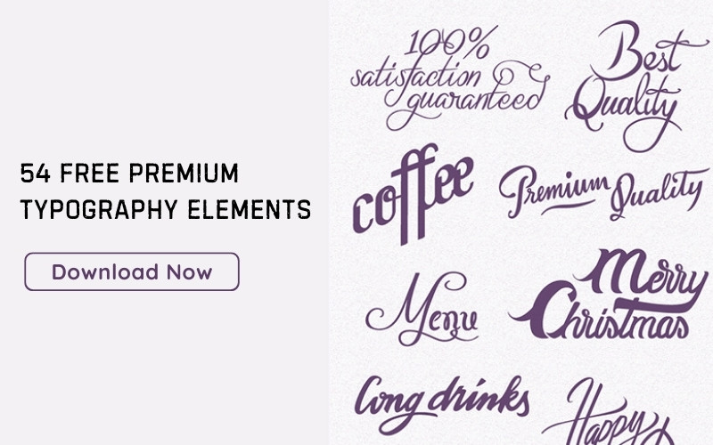
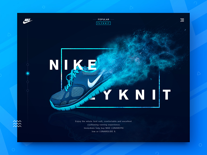 Image source: Tomato
Obviously, not every client is expected to love what you’ve done with your best typography for websites strategy, but you can make them at least understand what the point of it is. The starting point is to choose the most appropriate variables, and to scale them properly.
As a designer, you are probably already somehow familiar with the most important aspects of visual design, such as for instance layout, colors, imagery, grids, and so on, but for typography purposes, you must both know and understand them.
Without any of the two, you’ll be risking causing serious damage to your project, affecting the core of your design, and the reason why it is you that can make a website and not everybody out there with some modest CMS knowledge.
Another reason why typography matters so much is content. Whether you will maintain users or not depends solely on content, and it has to be optimized and accentuated. Once again, Riechenstein draws our attention to this matter: when we optimize readability, we optimize usability too, and we obtain graphic balance instantly.
Check out this ultimate guide to the basics of typography.
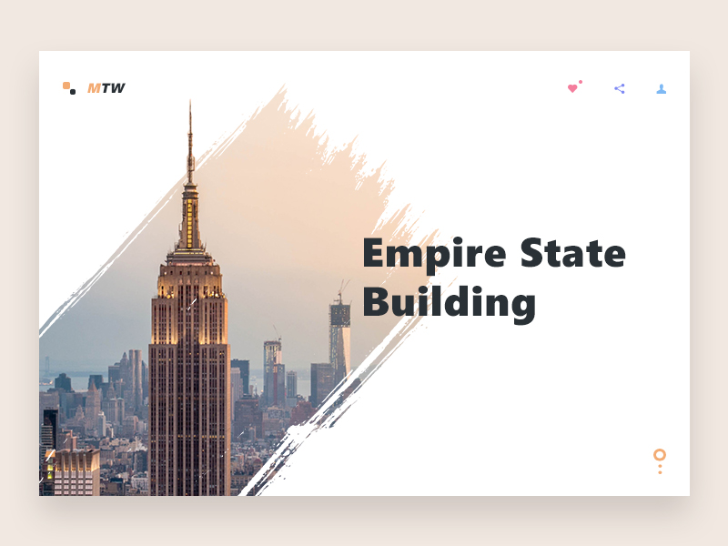 Image source: Prakhar Neel Sharma
It won’t be that difficult to design websites with good typography
Who said great websites have to have images? We know this sounds counterintuitive, but there is a solid reason why we’re saying it, and we can bet you can think of a good example right now. Plus, we’re not telling you to do it, but rather suggesting an elegant and less time-consuming solution where greatness is achieved with nothing but white spaces and best typography for website.
Images play a vital role, and that stands. In fact, images are often critical to the UI you’re providing, but that’s far from a universal rule. There are examples out there to prove the opposite, namely extremely successful designs that don’t contain imagery.
Also read: How To Use Large Web Typography To Stand Out
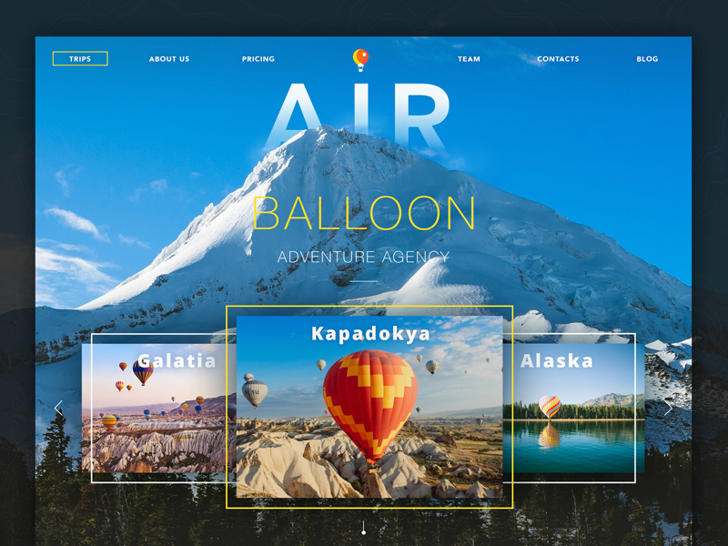 Image source: Valentyn Khenkin
Besides, excluding images doesn’t mean excluding icons and symbols, as those must remain right where they are. We’re rather referring to situations where you’ve added pictures that mean nothing special to your text, and where the message can be conveyed quite simply with a couple of words. If that’s the case, why to spend time looking for the perfect picture?
Even designers who’ve grown fond of imagery will recognize that white spaces and typography are the underlying foundation of every design. It means that, both with and without images, you have to dress up your design by getting the basic elements right first.
Proper typography keeps the website consistent
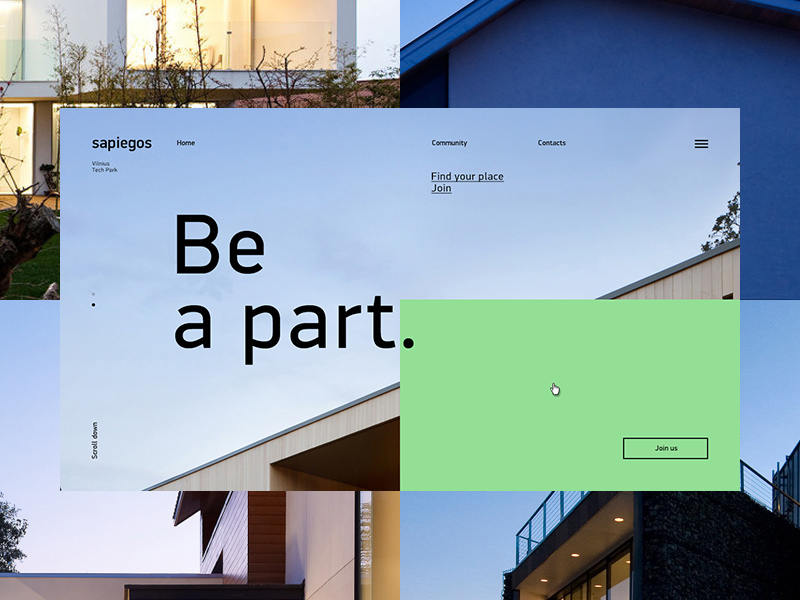 Image source: Alexander Laguta
What users expect when they land on your website is to see something familiar, and to follow an intuitive navigation pattern. In order to provide such a feel, you must keep consistency at the top of your priority list, and save users from wandering around to find critical information, such as by hiding contact data in small printouts. Inconsistency is the other word for web chaos, which repulses users and causes them to look for another site that offers a better experience.
Typography can be very helpful here, too. When done in a good way, it will straighten the website up and make the most critical elements easy to find and very visible. You may think uniformity makes websites look dull and boring, but it is simply the core of how your basic elements will look and function. Knowing this, you’re probably able to conclude that typography plays one of the most meaningful roles in customer satisfaction and boosting conversion rates.
Content comprehension for websites with good typography
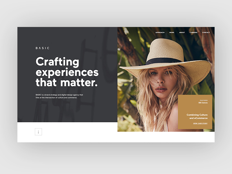 Image source: Veronica Cordero
Take yourself as an example: Did you ever come across a website where content was just impossible to read? How hard did you try to decipher the pilled-in tiny words? Did you have an overall idea of what was really important on that website?
Some content providers go as far as to ruin the experience completely, coloring texts in colors that are simply senseless and frustrating users with lack of contrasts. On the other hand, great designs grab attention immediately, and keep users on board just enough to intricate them, and prevent them from checking competitors’ websites.
This is not simply a bounce rate reduction strategy, but also a legibility and readability assurance. Readable texts mean that you’ve allowed visitors to comprehend your content, while legibility pays more attention to the aesthetic aspect of your design. With both of them on board, you’ll produce the most amazing and navigable website, even without the flashy images everybody praises so much.
It raises brand awareness
Many people would say typography has nothing to do with branding, but the reality is quite opposite. For instance, try to perform a simple experiment: think of a well-known brand you like, download the logo, and change the font and the typeface. Look at it, then. Does your perception about that brand still look the same? Isn’t balance terribly distorted?
In the case of branding, typography helps you extend the ‘voice’ and ‘tone’ of your brand. It becomes even more important when designing for other brands, because then you have to define and differentiate a brand with a story you know nothing about.
Also read: The Best Strategies For Achieving Typographic Hierarchy
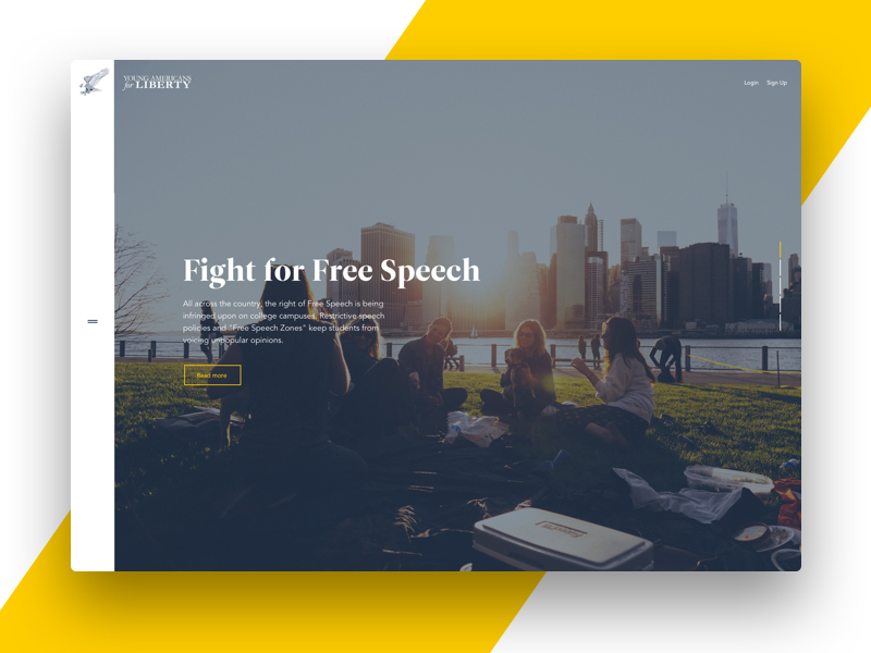 Image source: Corey Haggard
Typography stands for how you’ll express your brand and spread your message, and you need to understand it properly in order to obtain good results. The best way to start is obviously to choose an appropriate typeface, as that is critical both for the feelings and the message you’re trying to deliver.
Typography evokes emotions
The same as colors, different types can be associated to different emotions, both with their looks and the influence of their arrangement. Using best typefaces for websites, you can convey a message, connect emotionally with your users, and create memorable designs that will impress them at first sight.
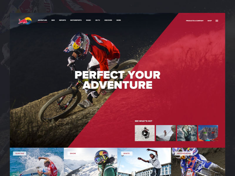 Image source: Corey Haggard
Failing to estimate the real importance of typography in your project may lead to the project becoming unusable, and distancing potential visitors forever. You need to know which response exactly you’re expecting, or simply to arrange fonts in an unexpected way to deliver a feeling of exploring unfamiliar settings and inspiring users to discover what you’re offering even without them being aware of it.
Research for websites with good typography
Typography was for a long time neglected in web design, and there was almost no scientific proof or research to emphasize its role in type design. Luckily for us, that’s no longer the case. There have been many studies dealing with great typography websites experiments, standards, and their effects, which indicate more than anything else that typefaces matter extremely to the satisfaction your website is about to provide.
Like this post? Check out more amazing web design content here.


