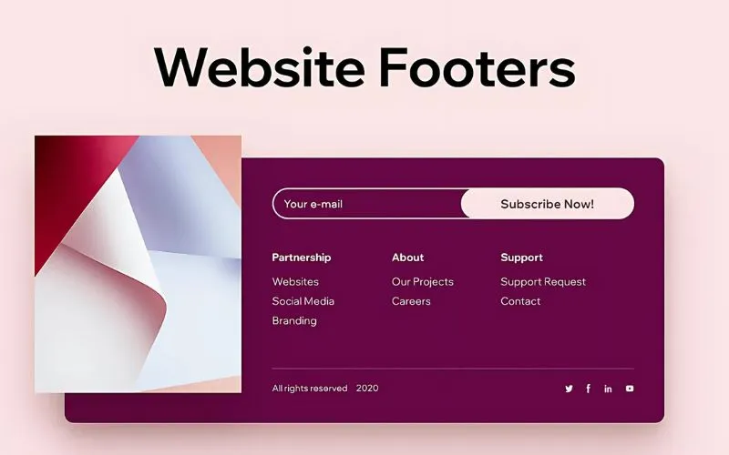
In line with traditional web design concepts, components placed in the page footer are not of any actual worth; most designers believe this and are sure that it must also be the truth. If you place site features in your page footer, they will always find it hard to grab users’ attention. This is why website footer design tends to be disregarded altogether and not afforded any real focus.

It is true that many footers are overloaded and not very interesting, as designers use the bottom part of a page to cram in all of the little things that they have not managed to fit on the page.
This includes disclaimer notes, copyright notices, ‘back to the top’ links, and contact information.
If most designers constantly disregard this space, can a savvy web designer learn how to make website footer design stand out?
We should not forget that a fabulous-looking footer can be a great way to surprise users and keep them close to your website!
Table of contents
- How Are Footers Supposed To Be Used?
- Large & Insightful Design For Footer
- Duplicate Closeness To The Floor
- A Sitemap In Footers
- Connect To The Information For Great Footer Design
- Use Different Tones To Keep The Footer Separate
- Best Website Footer Designs With Sophisticated Goals
- Social Features In Footers
- Order Footer Links For Website Footer Design
- Add A Copyright Warning
- Acknowledge Readability
- The Bottom Line
How Are Footers Supposed To Be Used?

Image source: Islam Usry
In essence, a footer is just another space for data. This is why some designers place contact information and small company descriptions in this area.
There are websites that use the footer for driving directions, phone numbers, and email addresses. Yet, it is also recommended to use the footer to present something creative and customized.
With a tiny change in the footer and a personal touch, you instantly make your platform personal and exciting.
Also read: How to Sell Web Design Services to Small and Local Businesses
Large & Insightful Design For Footer

Image source: Andreas Ubbe Dall
Many designers know that disregarding an entire platform ending with just a few throwaway links or sentences is a waste. Skilled and intriguing platforms should have engaging and exciting footers. A large and insightful footer will appeal to users.
To start designing a website footer, you need to separate the footer from the page information using a range of tones. However, remember that the color theme of the entire platform should be homogeneous, as everything needs to look and feel streamlined.
Duplicate Closeness To The Floor

Image source: Jac-Martin Dorion
Whilst this may sound a little weird, it is a tried-and-tested trick. Many design experts prefer to duplicate closeness to the floor or to the ground.
In other words, they try to finish layouts using features like trees, birds, buildings, and the horizontal viewpoint.
Also read: What Is Accessible Web Design?
A Sitemap In Footers

Image source: Marco Paccagnella
Including a sitemap in your footer can offer advantages. For instance, it is a good way to briefly describe the information on the platform and can be a handy way to help users navigate.
A footer with an accessible sitemap draws in focus from users and can boost clicks and traffic.
Check out this blog for an in-depth look at web design basics.
Connect To The Information For Great Footer Design

Image source: Mobby Dick
It is important to remember that two of the most vital connections within any website footer must direct users to the About Us and Contact Us pages.
Your users will want to know about the company or the website’s creator, and you need to ensure that this data is simple to access. Some might also want to know about your team members and how they can be reached.
As people lose track of business cards, this is a better source of information.
Also read: Follow These Tips To Become A Better Web Designer
Use Different Tones To Keep The Footer Separate

Image source: Bruno Amorim
As the footer’s primary purpose is to finish the website plan, it tends to be constructed in a color that contrasts strongly with the predominant tones across the platform.
Bright tones are just as useful as darker ones, so pick the colors that feel right for you.
Best Website Footer Designs With Sophisticated Goals

Image source: Seong Lee
Aside from visual attractiveness, a good website footer design can be employed to present critical data quickly and efficiently.
It can include contact details, addresses, sitemaps, and more. Additional features, like RSS feeds and email registration links, are also routinely placed in the footer.
Social Features In Footers

Image source: Laura Budinger
There is no harm in placing social features within a footer.
The users who might choose to follow you on social media platforms will appreciate the opportunity to click through and join your page in an instant.
Also read: Great Examples Of Creative Illustration Styles In Web Design
Order Footer Links For Website Footer Design

Image source: Alessandro Risso
Gathering similar website footer design components together will give the space a clear sense of order and regulation and will result in a clean and tidy look.
Consider using multiple columns—or horizontal columns—for data like contact details, links, social media features, services, and other components from your most important areas.
Also read: Tips For Educating Your Web Design Clients
Add A Copyright Warning

Image source: Mark Wyner
This tiny piece of writing can make a big difference to the security of your website, so remember it.
While most platforms add it as just one line of writing across the bottom end of a screen, it is possible to create it in a way that feels assimilated to the rest of the footer.
Including the year of creation and any pertinent details related to the copyright owner is a good idea.
Acknowledge Readability

Image source: Andrew Korytsev
Since footer data is often presented in a very tiny fashion, your choice of font and color is more important than ever. The best approach is to stick with high-contrast footer design inspiration—for example, a light background with dark-colored text.
The Bottom Line
Good footer design ideas can convey many things about an online platform. They let users know what you are about, what you do, what you can offer them, and even why they should stick with your website.
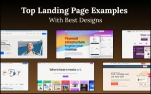
Credit for featured image: plentyofpixels.com
Like this post? Check out more fantastic web design content here.