Tablets are becoming more and more popular every day, as many people choose to use them over a traditional laptop or desktop PC. Therefore, designing good websites with tablets in mind couldn’t be more important.
At the very least, companies should create useful content that is mobile-device friendly. And in the best case scenario, they should be developing a tablet dedicated strategy.
Table of contents
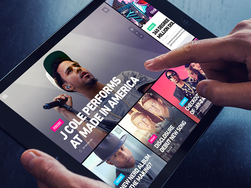
Sites that work well on smartphones may not necessarily work well on tablets either since the way both devices are used can differ considerably.
Smartphone users tend to own tablets as well. So it is vital to adopt mobile web strategies for both tablet and smartphone optimization. There are several factors to bear in mind when considering the needs of tablet users.
Also read: Why You Need A Mobile E-commerce Strategy?
Websites for Tablets
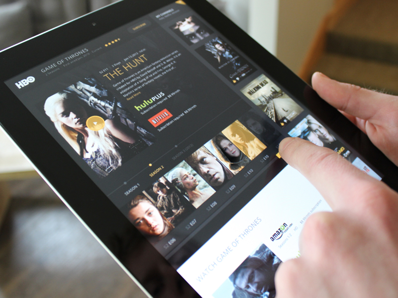
When it comes to designing websites for tablets, it is important to give users the app-like reading experience. When thinking of tablet-friendly web design, we must first consider the various purposes for which most users are turning to their mobile devices.
The most popular activity on tablets is to access web content and find information while watching videos and reading the latest news. As creators of content, it is important to engage with tablet users who are used to interacting with many visually appealing apps that contain excellent graphics and high definition visuals.
Remember the Touch Screen While Designing For Tablets

Image source: John Berner
Tablet users rely on touch screens to access websites.
As you can imagine, a finger has less precision as a tool than a cursor. So you need to bear this in mind when designing your site and refrain from using any navigation areas that require zooming in to be able to make selections.
While many web apps have now been recreated for designing for tablets, in order to suit this alternative method of navigation, developing a specific app for your website may also deter potential visitors.
In order to make your site equally accessible to both PC and mobile users, everything must be easily accessed whether using a cursor or a finger. In addition, nothing should be so large as to look out of proportion when viewed in the traditional PC format.
Check out this blog for an in-depth look at web design basics.
Swipe instead of Scroll
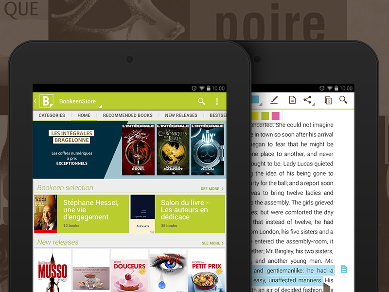
Image source: Céline Kniebihler
When everyone used PCs to access the internet, scrolling websites were the norm, but today swiping is the way forward.
Therefore, website designers must think of more exciting and interactive ways to designing for tablets, eschewing scroll and click in favor of swiping and flicking. There are now useful means to present pages in a magazine-style format, using HTML5 and CSS3, with page flipping capacity in order to improve the user experience.
Also read: Mobile Web Navigation: Best Practices
Forget Flash and Plug-Ins
It is a bad idea to include Flash as an essential part of your website design. Browser plug-ins are risky, since many tablets cannot access this technology. Therefore, it makes sense using standards like CSS and HTML.
HTML5 can still create an excellent user experience and is extremely effective when used in conjunction with media like audio and video. Regardless of the platform it is being used with.
Speed and accessibility are of the essence when browsing on mobile devices, so keeping JavaScript to a minimum is the best way to maintain your website load speed.
Adaptive Design

Image source: Matthew Spilman
The best resolution for tablet screen while designing for tablets is around 1024px, which you need to choose in order to keep your website tablet and user-friendly.
If you don’t comply with this, your website will be scaled down, spoiling its appearance and resulting in the need to zoom in. This has a negative influence on user experience.
Also read: Why You Need A Mobile Friendly Website?
Touch Friendly
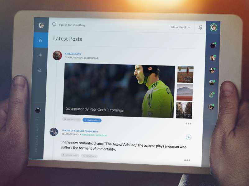
Image source: Rittim
Remember that not everyone has the same sized hands when designing your website for mobile devices. Leaving a large space around hyperlinked text is the best way to ensure that even those with larger than average fingers can still easily access your content.
In turn, making larger gaps between lines will help you prevent clicking on the wrong hyperlink, field or drop-down menus while removing hover controls will ease navigation.
Above all, your site must be intuitive and simple to use, without discouraging users through an awkward and unfamiliar format.
Device Orientation

Image source: Kristi Martin
Unlike a PC screen, a tablet can be viewed from different angles, so your website must be able to be easily navigated from both landscape and portrait orientations.
It must rearrange itself quickly and adapt easily. While images need a high quality, in order to be able to be viewed clearly whichever way around users view them. Most tablets function best with a 16:9 aspect ratio.
Also read: The Key Elements Of Mobile UX
Final Recommendations – Designing For Tablets

Image source: Luis Alves
There is no point in putting your website out there for customers without testing it on a range of devices, in order to make sure it works perfectly.
Visit your site on a touch device and check for yourself whether it is easy to use and if it looks right. There are also simulators available, which will show you whether your website can function seamlessly on a mobile device.
A website can return web pages in a range of formats to be used on different devices, to be found on the same URL or on a dedicated one. Nevertheless, designers need to create something individual and unique. Especially if the site is likely to be used frequently on mobile devices.
Designing websites for tablets must be much more interactive and engaging than one designed solely for PC users. So keep tablet users at the forefront of your mind when thinking your website design.
Credit for featured image: Michal Csanaky
Like this post? Check out more amazing web design content here.

