In website design, user interactions begin with a decision. They have to determine the worthwhile nature of each action prior to clicking on an image or a link. And, when users choose to connect with an app or site, they are affected by multiple influencing elements, such as visual hierarchy, typography, color and interface objects. That’s why it is important to simplify web design.
On the other hand, if no forethought is given to user flow, even the most spontaneous visual chain of command, freshest typography, or gorgeous color schemes won’t make a bit of difference. The name of the game is simply because it reduces confusion during navigation, gives websites a sleek look, and aids in the achievement of desired results and goals, which are usually sales, subscribers, and signups.
Simplifying website design can seem hard to pin down sometimes though, so here are a few tips on what website designers can do to achieve simplicity.
Table of contents
Plan for a Simple Website Design

Image source: compass.com
There’s no reason why a plan to simplify your website design should become an overwhelming nightmare when all you have to do is take baby steps to get started. Focusing on the fundamental elements of your website can be a simple task for starters.
Try putting a limit on how many colors are utilized and placing as much context as possible above the fold. Then eliminate everything that isn’t absolutely necessary and reduce the overall pages. Improving on these steps and fine-tuning can be taken care of later. Getting started is the key here.
Also read: Signs Of A Professional Website Design Company
Interaction Design and Hick’s Law

Image source: wabiwabi.com
William Edmund Hick was a British psychologist who experimented with the decision-making processes. In 1951, those experiments determined that the number of available options to choose from directly influenced the amount of time that a decision took to make and those findings resulted in Hick’s Law.
Now Hick’s Law has become the modern day line of reasoning for simplified mobile and website design. Limiting the sheer number of choices in dropdowns, navigation menus and more are considered by web designers to be the most basic construal of that law.
This is a good approach, so it’s important for designers to cut down on the overall number of choices on-screen to include only what is necessary for accomplishing their users’ pressing goals.
Check out this blog for an in-depth look at web design basics.
Simplify Web Design by Adding Essential Elements Only

Image source: versions.com
It can be very difficult to start prioritizing everything on your website that is necessary and what is not. You may feel that everything seems to be vital.
And, that’s the main reason that numerous websites end up failing to attain the elemental focus that they need and the result is a jumble of components, some important and others not so much, spread all over the page. That’s what makes focusing only on those components that are necessary so important.
Also read: Examples Of eCommerce Website Design To Get Ideas From
Simplify Web Design with the 80/20 Rule
First, determine which 20 percent of your page content delivers 80 percent of the content people are visiting your site to see. Whether it’s the social confirmation like media badges, testimonials, review snippets, or the copy and your signup form, there is your 20 percent. Focus on showing only that 20 percent that delivers 80 percent of value on every page of your website.
The 80/20 rule is a basic principle for helping you with clean and simple website design over time. While it is pushing you to cut down to just the basic essentials, it also helps by increasing the preferred results that you’re hoping to accomplish with your site.
For instance, you could experience an increase in sign-ups, purchasing and conversion rates just because visitors are less distracted by excess content when they’re on your web page. This rule also helps you to allow newer leading content to have proper placement for directing users’ attention to what they may be actually searching for.
Focus on a Satisfying User Experience

Image source: comovee.com
Major web players these days get massive traffic volume, so they cram their pages full of opportunities for visitors to click on, which may work well for them. By the same token, if massive numbers of users are accessing a particular web page every day, many of them will probably click on a link that could keep them there or just send them somewhere else. Both circumstances have value for the owner of the website, however, they may have none for the user. So, remember that focusing on making their experience satisfying is the key.
Also read: What Are The Qualities Of A Good Website?
Page and Secondary Content Reduction
Reducing the number of pages on your site shouldn’t be too hard since fundamentally you know that many of them are unnecessary. You can either eliminate them altogether or incorporate them into other pages. Make sure they belong together before doing so, however. This will help a great deal in your plan for basic website design.
Treating your secondary content, in the same manner, will also help to diminish the number of options that users face on your site while also reducing their cognitive stress. When you diminish stress with fewer options, you will have a better chance of having your users pick the actions that you desire.
Remember that your secondary content, such as sidebar tools, external ads, and widgets, can end up watering down your main content instead of enhancing your products or services. So, trimming your secondary content can result in drawing your visitors’ attention to the primary content.
Also read: Why The Website Builder is Popular Today?
Simplify Web Design with Limited Color Scheme

Image source: lunargravity.be
Most people think that they shouldn’t have to limit their color scheme to a couple of colors when they could have a dozen. However, limiting your color scheme is a must when you want simple looking websites. Less is more, so try to settle on two to three colors, to begin with. You can easily use multiple shades like dark blue menu items and header on a lighter blue background.
Also read: Reasons Why You Should Redesign Your Website
Interface Design Basics
Executing the interface design basics effectively will unsurprisingly help you to make the decision-making process less stressful and smoother for your users. It will only take milliseconds for users to know whether they want to remain on your site or not.
Just be sure to design your main navigation choices as concisely as you possibly can, bearing in mind that your content, colors, structure, and layout must be in harmony with simplicity’s golden rules for you to get the most from your website and ensure that your users will experience an enjoyable visit.
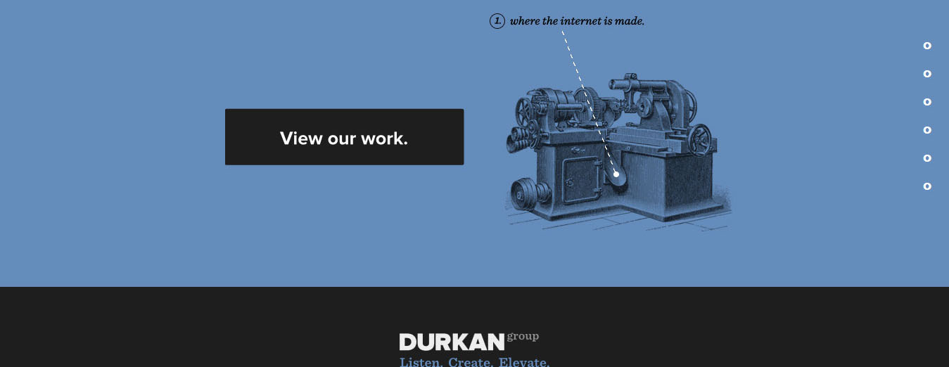
Credit for featured image: durkangroup.com
Like this post? Check out more amazing web design content here.


