
When selling goods and services online, your product will only be as good as your website. No matter how good your product is, it’ll suffer from low conversions if the website works poorly. What makes a bad website? Poor design and usability. According to Stanford’s Web Credibility Research, 75% of people judge a business’s credibility on how its website looks. Additionally, 60% of website visitors consider its usability important when shopping online. To get your ideas of how a usable and well-designed website looks, here are 25 eCommerce website design examples for you to check out.
Table of contents
- 1. Apple: Professional Ecommerce Website Design Example
- 2. Amazon
- 3. Flamingo
- 4. Spores: Dark Ecommerce Website Design Example
- 5. Mrs. Property Solutions
- 6. Warby Parker
- 7. 3Wishes: Minimalist Ecommerce Website Design Example
- 8. CartStack
- 9. Nova Smart Home
- 10. Smokehaus
- 11. Close: Clean Ecommerce Website Design Example
- 12. Twine
- 13. Vidizmo
- 14. Grove
- 15. Magic Spoon: Top Ecommerce Website Design Example
- 16. Allbirds
- 17. Skullcandy: Modern Ecommerce Website Design Example
- 18. Bacca
- 19. The Scott Resort And Spa
- 20. Villa San Miguel
- 21. Infinite Recovery
- 22. Endy: Elegant Ecommerce Website Design Example
- 23. SoFlow
- 24. Shleps: Best Ecommerce Website Design Example
- 25. Krave Jerky
- Conclusion: Best Ecommerce Website Examples
- Author Bio
1. Apple: Professional Ecommerce Website Design Example
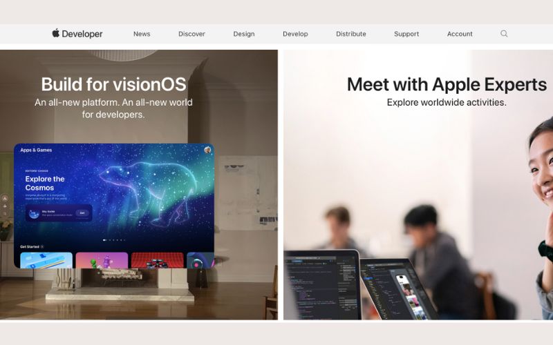
Let’s start with this tech giant, one of the best ecommerce website design examples.
Apple’s use of a minimal design is aesthetically pleasing and effective in drawing the visitor’s attention to the highlighted products.
The website design uses white spaces and plain backgrounds to get customers focused on the large close-up photos.
It’s uncluttered so that visitors won’t get distracted.
Unlike the usual eCommerce website, Apple’s product page mimics a landing page complete with social proof, selling propositions, and key benefits.
Check out this blog to learn about best practices for website design.
2. Amazon
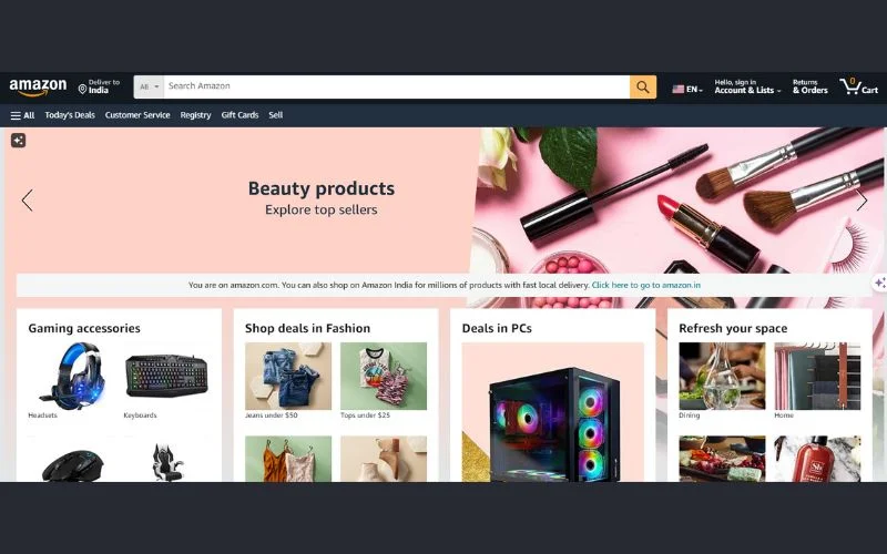
Here’s another giant in the industry.
What makes Amazon a great eCommerce website is that it’s user-friendly.
It has an on-site search engine so customers can easily find their needs. Even greater is the multiple filtering options, which narrow the search results to the most relevant products.
This way, only products you’re highly interested in will be presented to you.
Here’s another great thing about this eCommerce website.
Although it sells millions of products, the website doesn’t look overwhelming. It simplifies the interface by hiding all the product categories in a hamburger menu.
If you don’t have a specific product in mind, you can choose a category that best fits the kind of products you are looking for.
But hamburger menus aren’t only great for product categories.
If your website is related to eCommerce products, like this medical equipment review site, you can use the hamburger menu to list features that visitors can enjoy.
3. Flamingo

Flamingo is a website for a leave management tool that’s helpful for the HR department of big organizations.
What makes this website great is that while it uses white spaces to highlight the tool’s main feature, it also uses colors to highlight its functionality.
Right on the top fold, you’ll know who this software is made for and what it does, giving you a glimpse of how it can be helpful.
Lastly, you get a subtly distinctive CTA button that makes it easy for visitors to know what they have to do next.
4. Spores: Dark Ecommerce Website Design Example

Spores is a media company that leverages an NFT marketplace. It partnered up with SuperBoom for an animated show project.
Since it currently promotes the kids’ show, the website adapted by becoming more playful to attract its target market.
The use of vivid colors and dynamic elements makes it immediately entertaining for its audience to explore.
It also includes a short show preview so website visitors can taste what they’ll be up for.
5. Mrs. Property Solutions

As the name suggests, this website is for a realty online business. It is one of the best ecommerce website design examples for realty businesses.
In this industry, credibility must be established when people see your website.
Big lumps of money are involved, so people want immediate assurance that they’ll negotiate with someone trustworthy.
Mrs. Property Solutions does that including a review rating and a credible review source right on the top fold.
If these trust symbols aren’t enough, this website visibly provides its contact number so visitors can immediately reach out to them to ease their doubts by having a communication line ready to answer any concerns.
6. Warby Parker

This sleek website is for an eyewear brand that also utilizes a minimal website design.
The strategic use of white spaces and light color tones helps website visitors keep their focus on the glasses.
Instead of just slapping a picture of the product, they have an image of people wearing it to get visitors to see real cases of how the glasses are used.
The navigation is also made straightforward, so it’s easy for people to find what type of eyewear they need: sunglasses or eyeglasses.
Another great thing about this eCommerce website is that it prominently displays its top-selling feature, which minimizes the risk for potential customers and reduces the friction in getting people to buy the product.
Best of all, it features a frame quiz, which is great for the user experience. After answering a few questions, people are then suggested the best frames based on their preferences.
7. 3Wishes: Minimalist Ecommerce Website Design Example

3Wishes is a lingerie and costume eCommerce store.
This is one of the best ecommerce website design examples for usability.
Right at the top, you’ll see the categories you can choose from. Then, below, you’ll see your options, complete with an image of the product, the product name, and the price.
If you want to narrow down your choices, this website has a filter option that will only give you preferred results.
8. CartStack

CartStack is a website offering conversion enhancement tools and services, including abandoned cart recovery.
Like the real estate website, a conversion website requires establishing credibility immediately.
This website includes an image of the tool feature with a review source and rating.
Plus, it features a dynamic “How It Works” button to immediately draw visitors’ attention and encourage them to check the tool more thoroughly.
9. Nova Smart Home

This telecommunications company went ingenious with its website.
The website is primarily made for their smart home devices and how smart they are.
The top fold features a 3D animated house model that displays the different devices used inside a house.
Clicking on the icons will bring up all the innovative products made for that specific area of the house.
This way, visitors can quickly visualize what the product is for and where they’ll be using it in their homes.
10. Smokehaus

Smokehaus is one of the best ecommerce website design examples, and it outdid others in creativity.
It wittingly emulates the feel of a physical store, which is excellent for achieving a memorable user experience.
Rather than presenting the products in grid form, the site used a draggable slider to mimic the look and feel of a butcher shop.
Plus, when you add an item to your cart, you’ll get validation like “Yum! We love that one” or “Good choice!” to encourage you to finish the purchase.
11. Close: Clean Ecommerce Website Design Example

Close is a predictive dialer website made so the sales team can perform better in lead-calling strategies.
You’ll be presented with a unique selling proposition, which will help you understand what this tool can do for you.
But Close doesn’t stop there. It includes a demo video of the features to explore them better.
If that’s not enough to close the deal, you’re also provided with a distinctive free trial button to test the product yourself.
It also uses the hamburger menu to hide other website features to avoid visual clutter.
12. Twine

Twine is a website where you can find web development and graphic experts to hire.
Since it offers quite a wide range of services, it uses a slideshow element to highlight everything it offers.
It also has an on-site search engine to get what you need faster.
Best of all, whether you’re a freelancer or someone looking for one, you’ll immediately know where you’ll go on the website.
Once you find the services you need, you’ll find a directory listing all the specific expertise they offer, making it easier to find the exact person you’re looking to hire.
13. Vidizmo

Vidizmo is a website for video and digital media services used by video-sharing platforms.
Since they offer a wide range of products and services, they organize everything in lists using dropdown menus.
It is an on-site search engine and features services highlighting the company’s leading offers.
Of course, many will have doubts about a service, especially when there is so much competition in the field. Vidizmo makes the choice easier by providing a “Why Leading Organizations Prefer Vidizmo” feature on the homepage.
They also included a section highlighting all the businesses and organizations they worked with to nail their credibility.
14. Grove
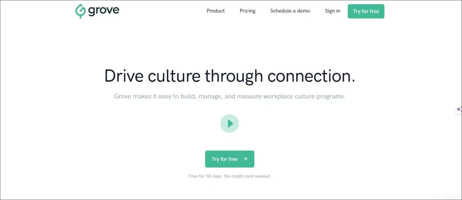
Grove is an HR platform website helping with recruitment processes.
Like most of the websites on the list, they used white spaces to draw attention to their features.
The selling proposition uses a unique color to stand out quickly and is complemented by a simple but powerful copy.
But they added one more unique element to it…
Each of the features they highlight is accompanied by an image of a person using the tool happily. Psychologically, this reinforces the feeling that once you take advantage of the tool, you’ll enjoy a satisfying feeling.
15. Magic Spoon: Top Ecommerce Website Design Example
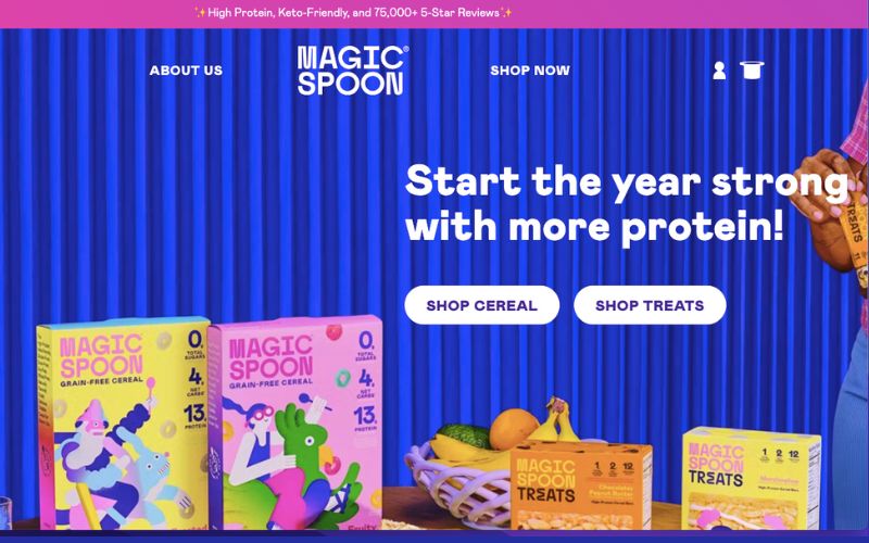
Magic Spoon is a cereal website and one of the best ecommerce website design examples.
While most on this list implement minimalism and white spaces, this website uses a scintillating color palette to achieve a splashy feel.
The website complements so much of the brand name by making it look charming enough to leave you spellbound by its design.
It tries to make the website delightful by reflecting how people would feel once they tasted the cereal.
16. Allbirds

Allbirds is a footwear and apparel brand website.
Its unique value proposition is highlighted not only in the copy provided on the top fold but also by the background image it comes with.
Allbirds take advantage of a well-curated product collection using high-quality images.
For a better user experience, it includes a store locator tool.
On the homepage, you’ll enjoy a visually appealing teaser that links to material that supports their claims.
17. Skullcandy: Modern Ecommerce Website Design Example
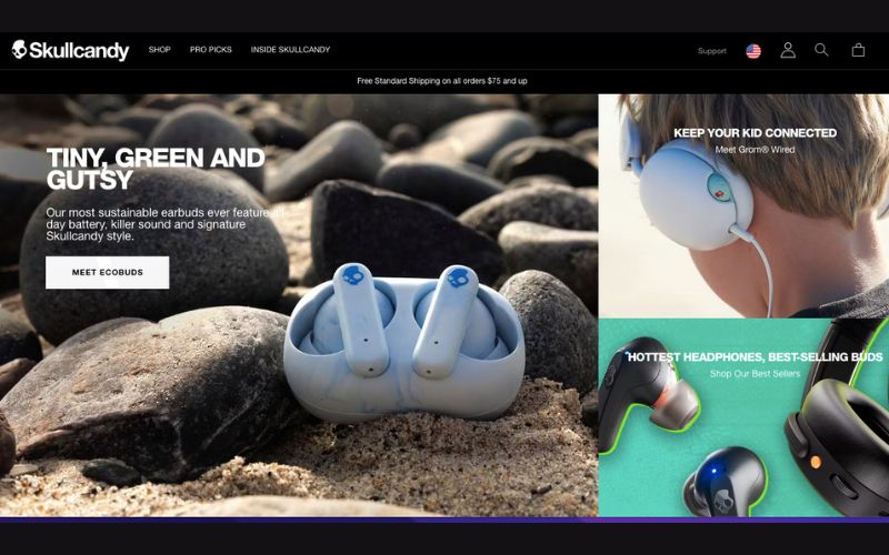
While Skullcandy is an audio brand, the visuals on its website are so catchy that you can almost hear music from its images.
Like Magic Spoon, they use a brilliant color palette to bring life to the website.
They include lifestyle shots to show how visitors can incorporate the products into daily routines.
The catchy slogan is by far the best part of this website. It’s optimistic enough to improve the brand’s memorability in the minds of its target market.
Lastly, for a great user experience, this website uses a sticky add-to-cart button so people don’t have to scroll back up if they decide to continue with the purchase in the middle of scrolling through pages.
18. Bacca
While Bacca is in an industry near Skullcandy, it uses minimalism to highlight product features.
Bacca’s eCommerce website uses a plain backdrop to make the product stand out.
It takes advantage of a full-width mode so shoppers can see through the page clearly, even on mobile, without zooming in.
The best part of Bacca is how they made the navigation bar sticky so you can jump between sections to get to where you want to go next.
19. The Scott Resort And Spa

Once you land on The Scott’s website, peace and serenity immediately surround the area.
It uses an accommodating green theme complemented by a calming image to encourage the spa’s goal of a relaxing atmosphere.
The Scott utilizes striking imagery like looping videos and full-width galleries to sell its offers.
It also features unique full-screen overlay navigation, a smart solution that provides ample space for information.
20. Villa San Miguel
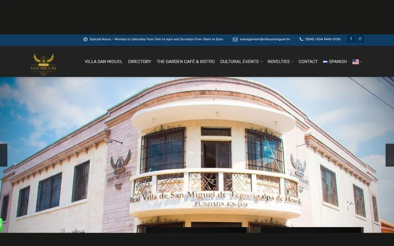
Much like Scott’s website, Villa San Miguel aims to create an inviting atmosphere with its website.
Since it’s a detox and wellness website for alcohol and drug dependents, making the website as soothing as possible is a big key to helping visitors take action.
This website also avoids clutter. Other than the unique selling proposition and a background image of the facility, there are not too many elements on the website, so you won’t get distracted.
21. Infinite Recovery

While at wellness websites, Infinite Recovery is also an excellent option.
Unlike Villa San Miguel, Infinite Recovery only has the unique selling proposition highlighted in a soothing gradient backdrop instead of an image.
The website is also easy to navigate. By clicking on the “Get Help Today” button, you’ll reach its sole purpose without scrolling further.
One thing I’d like to highlight for wellness websites is their recurring use of green, which indicates tranquility, progress, and stability.
22. Endy: Elegant Ecommerce Website Design Example

If your products are sleep-related equipment and accessories, Endy is a good eCommerce website to consider.
It is incredible how they showcase a use case of a guy sleeping soundly in the products.
Using a pink theme adds a bit of pop to the page.
They used animated GIFs, a feature show-off video, and a detailed product image to make the website more enticing.
23. SoFlow

SoFlow encourages movement and dynamism, which you’ll feel once you see their website.
This electric skateboard and scooter brand employs a moody color palette with a contrasting call-to-action button to make it stand out and take action faster and easier.
The menu bar is generously spaced, giving enough room for words to breathe.
Lastly, the thick white font easily draws people to the copy, which will enhance their interest in the product.
24. Shleps: Best Ecommerce Website Design Example

Simple but aesthetically pleasing. It achieves a balance between the copy and the image.
Shleps is a footwear brand that aims to communicate a sense of comfort not only when wearing the shoes but also when browsing the website.
It features a video demonstration of how it was manufactured by Lithuanian Grandmas to warm visitors’ hearts. It also includes high-quality photos to highlight the craftsmanship of the footwear.
Wrap it up with a straightforward call-to-action button to land a sale.
25. Krave Jerky
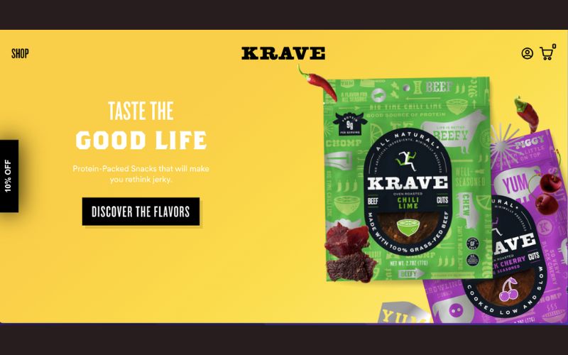
Dynamic and colorful, those words clearly describe the vibrant atmosphere this food website brings.
The website is designed to give visitors a playful browsing experience, reflecting the bouncy feel of this food item.
While the colors are striking, the solid background color doesn’t distract people from the content.
In many cases, colorful buttons make the call to action stand out. But in Krave Jerky’s case, a black button with a white font makes the call to action jump out.
Conclusion: Best Ecommerce Website Examples
A successful eCommerce website is conversion-focused. As a recap of the 25 ecommerce website design examples we have, a good website should have the following elements:
- Whether minimal or dynamic, the product and its features should stand out
- Whether in vibrant color or black and white, the call-to-action button should jump out
- Always include an enticing copy on the top fold
- Take advantage of visual hierarchy to direct the attention of website visitors
- Add usability features like online search engines and filters
There’s no one-size-fits-all format for a website. It all depends on what the product is about or what feel you want visitors to have.
One key factor in all of this is using the right color combination to achieve the atmosphere you’d like. This is a simple but effective website growth hack.
Additional tip: Add a lead magnet to your website to capture emails you can nurture and retarget, just like some of the websites above. You can then use these copies for a successful email marketing campaign.
I hope you find the samples helpful as you create or improve your eCommerce website design.
Author Bio
Burkhard Berger is the founder of Novum™. On novumhq.com, you can follow him on his journey from 0 to 100,000 monthly visitors. His articles include some of the best growth hacking strategies and digital scaling tactics that he has learned from his successes and failures.


