
A well-executed button can be the strongest asset for every campaign/landing page, and a final gateway to generate more leads. Its ‘call-to-action’ role is essential for communicating with users, and convincing them to take a particular step and perform the action we want them to.
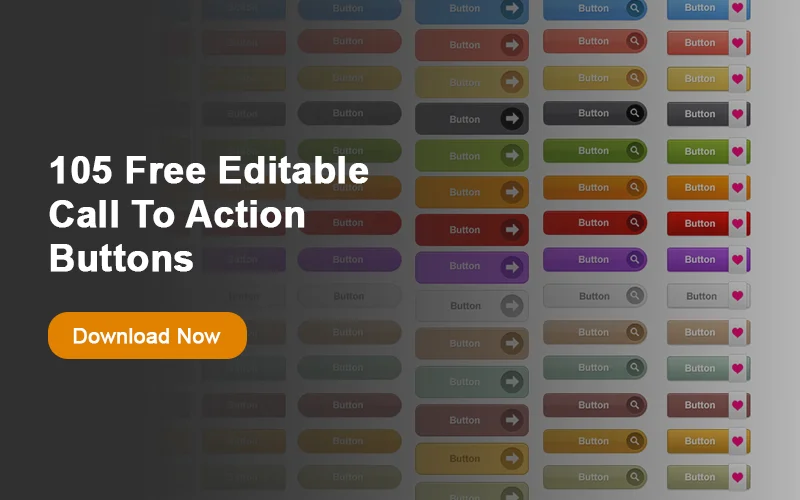
Effective call to action could motivate users to perform any action associated with our ultimate goals (signing up, subscription, purchase, or download).
But how could we introduce good call-to-action buttons, that inspire users to perform the action? Let us share few functional design techniques that can help you create a call to action button:
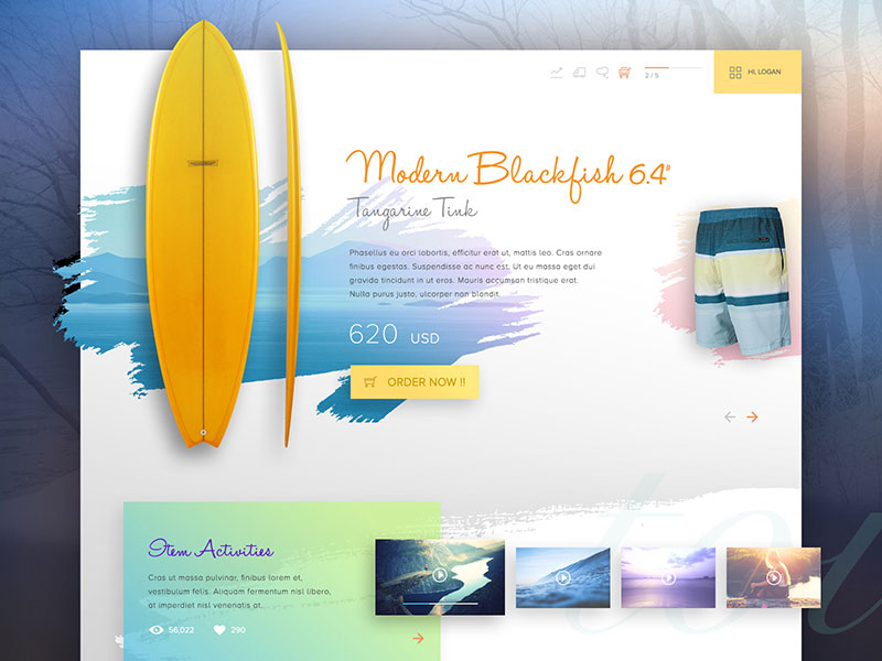 Image source: Tintins
Table of contents
Wording
 Image source: exposure.co
Exact and proper wording is the most effective feature to create good call to action button. For instance, comparing ‘Add to cart’ and ‘Buy now’ will certainly show that the later is more urgent; while comparing ‘Free trial’ and ‘Try it for free’ will show you that you have to choose a statement that is more catchy and attractive.
In fact, phrasing the action with strong, commanding, and confident sentences is the strongest way to convince users to go for that action and not waste any time since they could miss a great opportunity.
Also read: How To Improve Website Usability
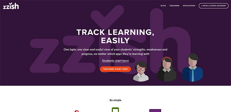 Image source: zzish.co
The most important feeling you need to create is a sense of need and urgency. Here are some examples of how it could be done:
- Offer expires on June 16
- Available now only
- Reserve now, and get a free gift
Sometimes, the sense of urgency ‘hides’ behind a single word, something like ‘fast’, ‘now’ or ‘today’. What these words do is to inspire instant action, and reinforce the sense that clicking a particular button will give users some immediate benefits.
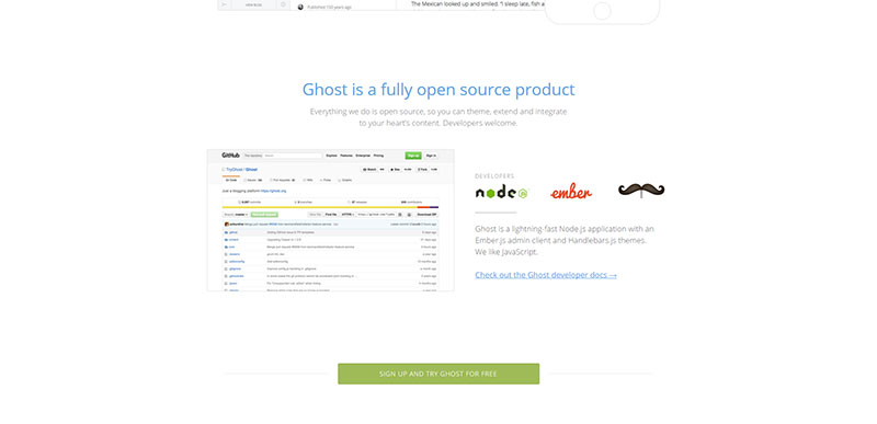 Image source: ghost.org
Still, try not to take the CTA button too far from the context of your website. Avoid phrases that may sound too aggressive (‘Buy now’, for instance); and make language as audience-friendly as you possibly can.
Another important aspect is to be clear and precise about the results your users would obtain once they click on a particular button. They need to know that clicking on the ‘Add to cart’ button will take them to an expected page, and there will be no surprises or unexpected actions. Failing to comply with this requirement will most probably result in an increased bounce rate.
Also read: Usability Vs. User Experience
Color And Size
 Image source: filament.io
We live in a world where users rarely have the time to read detailed information, and they rely almost entirely on what they see and notice. If the visual scanning of content leads them to something that is actually worth of their attention, they will stop and read it. It is a designer’s task to lead their attention to the specific part he wants them to pay attention to.
Firstly, the size of a button is what matters most. The designer is supposed to strike a balance between oversized buttons that seem too powerful, and their tiny counterparts that blend with the rest of the content. What you need is a button that can stand out, but still small enough not to overwhelm your design.
Also read: Keep Your Digital Project On Track With Usability Review
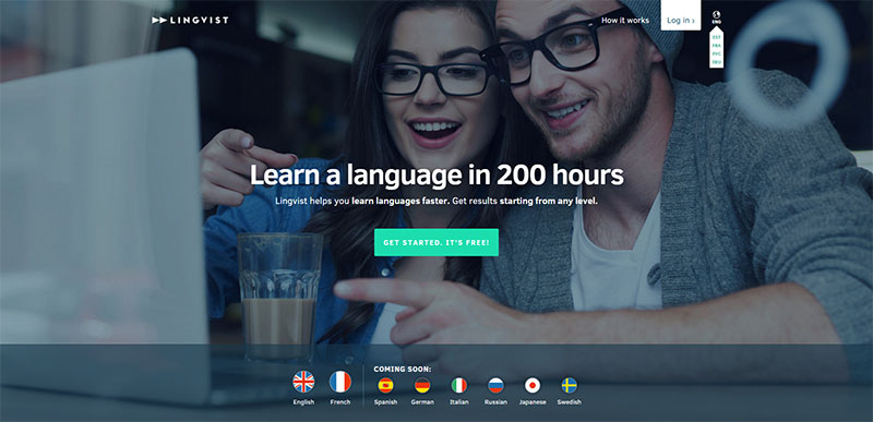 Image source: lingvist.io
An important aspect to consider is the color of your CTA buttons: while you’re free to choose the color you like, you should use one that actually contrasts the background of your website. In such way, the button will simply ‘jump’ in front of users, motivating them to click on it.
Here are some important guidelines:
- The CTA buttons should be the largest buttons used on a particular page
- Smaller buttons should be filled with sharp and contrasting colors
- Fill oversized buttons with less distinctive colors (to decrease their effect)
- The CTA buttons should command action, without overwhelming your complete design.
Positioning For Effective Call To Action
 Image source: asdasdasdsad
As good as it is the button will be of no use if it is not properly positioned. Placement is a critical factor for the success of your interface design.
You need to place your CTA buttons in a place where they would attract as much attention as possible. For instance, placing them in the top section of your page would almost certainly lead to better conversion rates, because users notice the button, and they feel motivated to take action.
Also read: Importance Of E-commerce User Experience And Usability
 Image source: vimeo.com
Long story short, the position of a button on a web page should be prominent (there will be no success in calling out left sidebars, page centers, or headers).
What about the fold? Should you place your CTA button above it? The fold is, in fact, a myth. CTA buttons placed below the fold can also be successful, and increase the conversion rate even more.
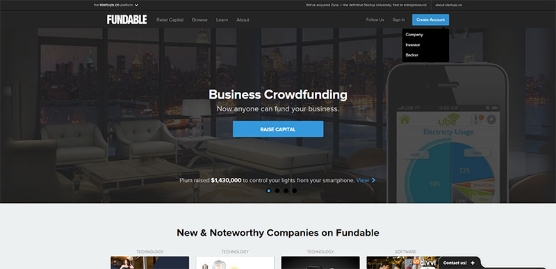 Image source: fundable.com
Placing a CTA button above the fold is good for large and complicated offers, where people prefer to read more about their benefits before they take action. In these cases, people don’t bother clicking your CTA button above the fold.
As an experienced designer, you know that whitespaces are precious tools that help you grab and maintain visitors’ attention. Whitespace is an ideal background for an important CTA button. However, you should be careful with the size of the button (don’t make it striking big); and you should avoid placing it too far from the rest of your text, because it could look disconnected.
Check out this blog to learn about best practices for website design.
Make Sure That Buttons Actually Look Like Buttons
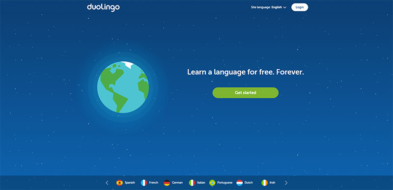 Image source: duolingo.com
Signifiers (known also as affordances) are a very important aspect of conversion and UX design.
Web designers use signifiers to make their website’s elements look exactly like the items they are supposed to represent; and to perform the functions they are supposed to perform.
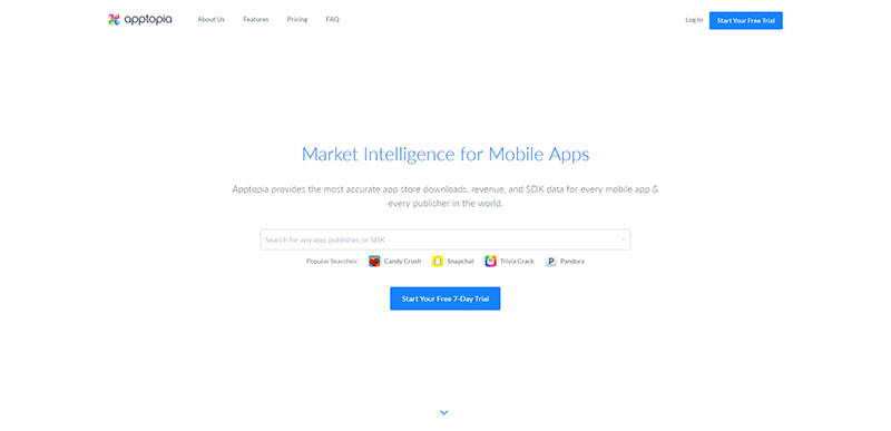 Image source: apptopia.com
It means that when you decide to use a button, you should make it look exactly like a button.
Users need to have a clear overview of the results they would obtain by clicking on a button, and to understand instantly which action would be triggered. There are many graphic ways to achieve this:
- Decorating the button
- Positioning the CTA text in discreet border areas
- Making a clear distinction between the button and other graphical elements
- Making it function like a real button, once users click or move the mouse over it
- If the button is not hyperlinked (it doesn’t automatically turn the arrow into a hand symbol when approached with the mouse), the same effect can be achieved with CSS.
- Enabling the button to change its features (color, size, position, etc) when approached with the mouse, so that it would further indicate users that an action could be performed.
Also read: Improving Customer Loyalty Through User Experience
Making Effective Use Of Negative Space
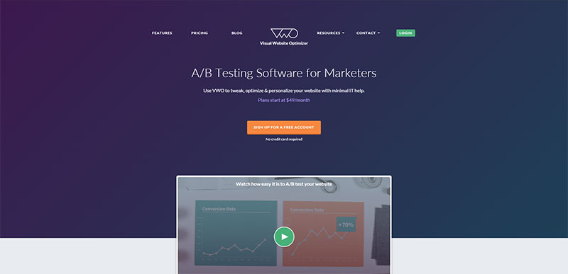 Image source: vwo.com
In order to increase the effectiveness of your CTA buttons, you need to make them stand out from all other elements on the page, and attract users demanding a particular action.
That is exactly why you need to use all the negative space available around the buttons. For instance, you can incorporate more blank space, especially around important buttons that guide users towards an order/purchase of a product.
SEO For Effective Call To Action Buttons
In most cases, a CTA button is directly connected to a page that has been indexed by a particular search engine. Adding alt attributes (such as ) will provide text for the search engines to associate the button with a particular page.
In order to benefit the most from a CTA button, you should display its alt attribute to visitors (enabling it to appear once the mouse arrow is positioned on the button). It would mean that you have reinforced the ‘call-to-action’, and there is a bigger chance that users would go for it.
Like this post? Check out more amazing web design content here.

