Web design is more than a discipline-it is the core of how a website should look and feel, namely the art of being able to provide all essential information in an eye-capturing manner. Design means your first encounter with visitors and the first visual impact that is so critical for their decision whether to use the website or not.
Table of contents
How can you improve design proximity on your website?
That decision is, in fact, the role of proximity in web design.
Proximity will probably intrigue you, or you might even be completely unfamiliar with what it means. Defined, proximity refers to space nearness or series closeness.
 Image source: Stereo station design & web
Proximity closeness stands for a paragraph where each sentence relates to the others or explained simpler, the existence of visual connections between elements in a unity. Obviously separate elements that have no connection to each other in the opposite way.
Proximity is fairly easy to apply on light-content websites, while heavy ones are almost always dealing with relevance issues, and creative ways to introduce rich content.
The way how you use the principle of proximity, and you combine it with similar design principles, is the cornerstone of the user experience you’re going to provide. Oftentimes, proximity plays a critical role in the overall success of your website.
Many professionals with years of expertise in web design compare proximity to a dinner that has been blended and drank through a straw-if it is already there, it has to be applied properly. Otherwise, it will create a mess.
The line pretty much explains how important proximity is to web design in general.
No wonder designers are so concerned about it: they need to develop a visually pleasing designs of product and to think how to group elements properly to make the layout more organized.
At the same time, this principle tells them which elements should be removed or divided, in order not to affect the visually perfect relationship.
Check out this blog to learn about best practices for website design.
Whitespace

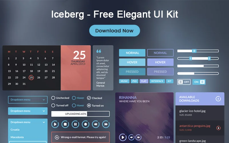
The way how you use white space on a page is an important proximity factor since spacing elements (margins, padding, and column gutters) are your most valuable balancing tools between the items you’re going to display.
The general rule is to avoid too many white spaces since this makes your page appear empty and content-void. However, white space is awesome in certain cases, where you’re trying to accentuate an element or to obtain a dramatic effect.
One of the common mistakes you’d see in amateur design is a lack of white spaces. There is a logical explanation for this: a novice designer pushing his way in the design world, perceives his work as a way to convey a message.
While the conveyance thing stands, inexperienced beginners perceive content to be the essential mean of communicating information, and they try to put in as much of it as possible.
Check out: Figmatia – Responsive Web Design System
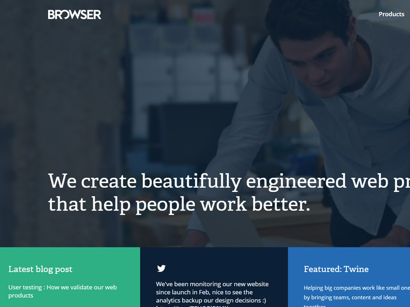
Their almost natural inclination is to throw content evenly all over the page, which leaves no white space to guide towards connection at all. Even when there is white space, it is just a randomly abandoned surface that serves no organizational purpose at all.
The truth is that white spaces have an indispensable effect on user behavior, sometimes even more than the content does.
They are supposed to guide users to the desired direction, rather than overwhelming them with information from the very first moment.
Check out: Mobile App UI Kits Bundle
Relating elements in groups
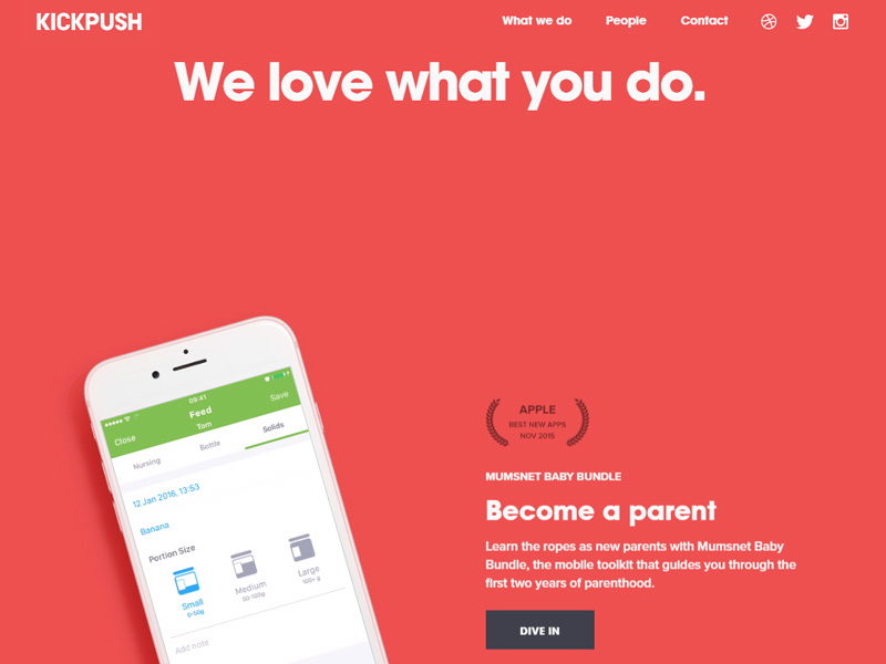
Image source: Kickpush
What elements are to be designed are entities that serve a purpose, meaning that white spaces create room between the entities to make them look like a group, in particular, one that has nothing to do with other elements.
Grouping your elements is a good strategy since it enables you to create an effective design where nothing looks cluttered or overdone.
What grouping does for the user is to orientate him with a single glance, and to save him from wandering around looking for the content he needs.
Grouping should logically follow a pattern, connecting or dividing entities through appropriate balance and usage of white space.
The meaning of visual hierarchy

Being the designer of a website includes a specific type of responsibility, namely to be completely familiar with the site’s architecture, and the information flow towards an effective proximity.
For the purpose, a designer must know how to create a striking visual hierarchy of content. Sounds complicated, but the only thing it actually takes is to know how to use white spaces and how to group related content.
The best ways to maintain hierarchy is to group, and then sub-group elements on the website. Being able to see this, the users knows and understands where relevant information is located, which means that you’ve transmitted the website’s message and purpose successfully.
Scan-able and readable layouts

The reason why you’re actually considering grouping and visual hierarchy now is that you want to keep content hierarchically organized, and to make it easier to scan and to read.
Let’s take headings as proximity in design example: they are the main scanning tool because they allow users to locate the main and most important points in a text. Obviously, the designer has to employ a ‘get and go’ approach in order to reflect that hierarchy, namely to list intended items and to sub-list less important ones.
A properly applied proximity on a website will not overwhelm users with information, but it will still ensure that they understand everything that is important to them. Sounds like magic, doesn’t it?
Once again, proximity will be a piece of cake if your website is a light-content one, but a long and exhaustive challenge with a heavy-content one instead. Therefore, think whether there is a way to restrict content first.
Check out: The Ultimate Branding Templates Bundle
Make use of grids
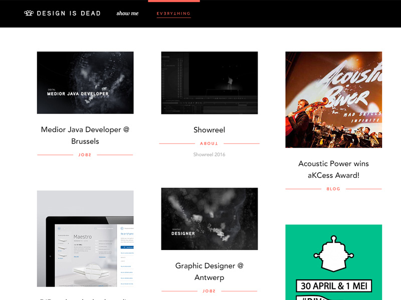
There is another good way to group items, and it is grids. If the layout is grid-based and all gutter sizes are appropriate, there will be ample room between sections.
A designer accomplishes proximity simultaneously, without even planning it. Grids are simply awesome, considered to be the ‘breathing’ force of a website that organizes content in a seamless and natural way.
Take the lead and show users the right path

There are many benefits from appropriate proximity, and one of the most important ones is that it enables content navigation without any delay or unnecessary obstacle. It means that primary navigation will be clearly distinguishable from any other element on that page, and users will find it and use it the easiest way possible.
Proximity makes visual hierarchy possible since it enables users to drill deeper into the content without having to worry whether they’ve arrived on the right place and whether they’ll be able to go back.
It is a pleasant feeling of comfort and familiarity, which will improve the overall satisfaction of users, and it will make them prioritize your website in no time. You can guess that they’ll find no logical obstacle to abandon a site where everything is well-organized, things happen quickly, and actions are performed efficiently.
Check out: The New Visual Hierarchy Market
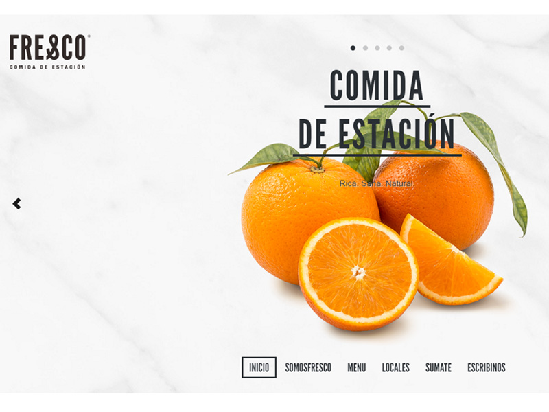
A good tip for novice designers (together with the one of learning from experienced designers) is to look at print designers, and the principles they were inputting long before the web even appeared.
Finally, not everything is about proximity. There are other helpful design principles that can make the site more beautiful and usable, but proximity definitely comes first.
Final thoughts on Design Proximity
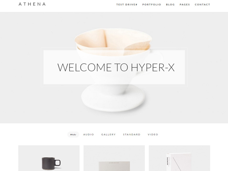
We expect that the article was detailed enough to reveal and highlight the real importance of proximity in ui design. We remind you once again that web design proximity is not the only principle you could/should think of, but you should consider it as the key shortcut to a successfully designed website.
Design principles proximity is great because it serves both appearance and function, and you should miss no chance of learning how to use it from professionals and design experts.
Like this post? Check out more amazing web design content here.
