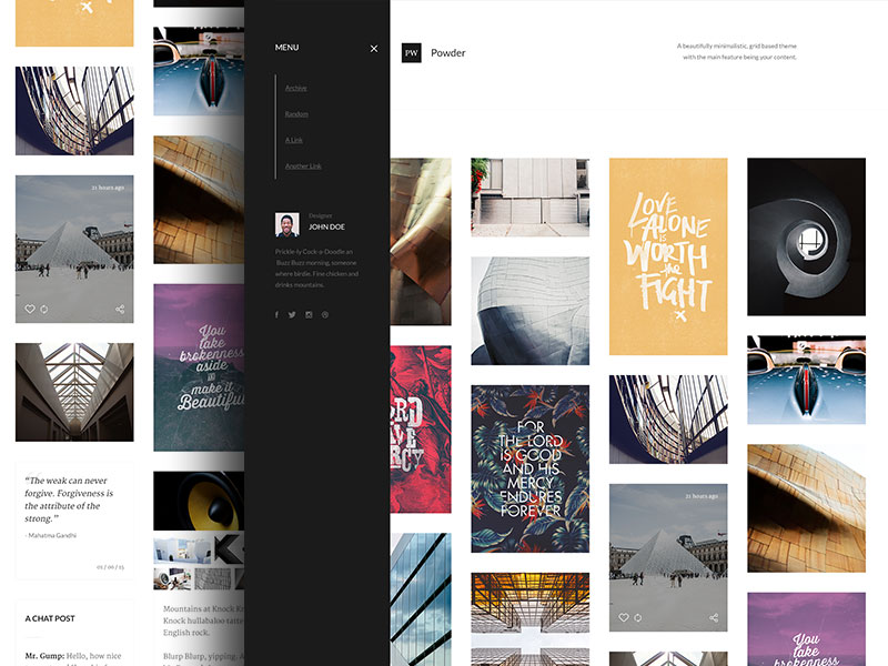
Within the span of just a few years, the aspect of minimalist web design concepts has become increasingly popular thanks to the many different websites that showcase this basic philosophy.
Minimalism in web design has been known to feature a “signal-to-noise” ratio that is considered to be the highest possible, but there are many individuals who are unsure as to exactly what this means.
When it comes to various types of design, the term “noise” refers to anything that can distract someone from completing their main goal.
 Image source: Tiep Nguyen
This means that if a website contains a lot of different design elements, it can prevent someone from having a great overall user experience.
Simpler Is Not Always Easier
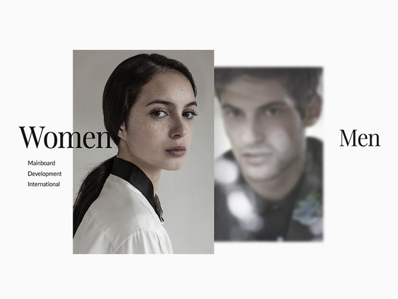 Image source: Kevin McCutcheon
Just because various minimalist web design principles may sound simple, that doesn’t mean that they actually are. You will still have to provide the same amount of usability with less of an interface, despite the fact that there are not many elements at all.
There are generally four different things that define minimalist web design:
- Visuals
- Focus
- Space
- Typography
How to Achieve Minimalism
 Image source: Simon Goetz
The simple answer to this question is the following: minimalism is best achieved when a design is reduced to only the elements that are absolutely essential for it.
Various minimalistic expressions span various disciplines and art forms. However, in terms of web design, minimalism can be something that is difficult for designers to fully master.
At the same time, it is extremely easy for virtually anyone to master this concept. All that is required is tp learn how to break things down to the elements that are absolutely necessary for a design to fully function.
In simpler terms, you only need to take things away until there is nothing else that can be removed without disturbing the design’s overall purpose in any way.
How Do You Begin the Minimalistic Design Process?
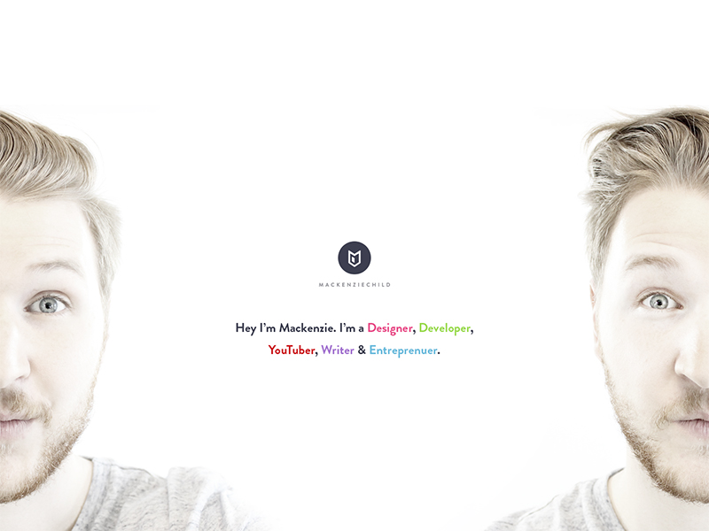 Image source: Mackenzie Child
Define your website’s overall purpose: In order to prevent any kind of confusion, it is absolutely essential that you come up with a very clear purpose for your website. In simpler terms, determine exactly what your website will be used for the most.
Are you looking to display awesome photos? Perhaps you prefer to share all of the latest world news? Or maybe you would like to open your own online store? Regardless of your intention, the purpose of your website MUST be very clearly defined.
Always remember that less is more: At some point in your lifetime, you’ve probably heard someone use the phrase “less is more”. This is absolutely essential when it comes to minimalism in web design.
The best way to achieve this, as mentioned before, is to utilize only the elements that are essential to your overall design concept.
 Image source: Dmitriev Sergey
Negative space is a positive thing: Perhaps the biggest design element in the minimalistic design style is the use of negative space. To be more specific, plenty of negative space.
Many people generally view the minimalistic design style as being one that contains a small visual image that is surrounded by a vast amount of colorless negative space.
This could actually not be further from the truth. In fact, many different colors are utilized with the exception of any texture. Aside from color, there are some designers who prefer to use backgrounds that are white, black, or any kind of dark color.
As a general rule of thumb, when there is more negative space around an object, there is an increased chance that the eye will be drawn to the visual itself. This is one thing that makes the minimalistic design style a powerful one.
In addition, plenty of negative space also allows for various elements to be organized in a rather comprehensive fashion. This is something that can prevent a user becoming too overwhelmed visually.

Image source: Hoang Nguyen
Photography that is large and vivid: Large and vivid photography is something that can really help drive a minimalistic look while, at the same time, not dominating too much of the negative space required for the design itself.
Hero headers and hero images, two of the most common features in minimalistic web design, are generally defined by sliders or images that are often placed near the top of the website’s scroll. Photographs can also establish settings and a connection that are both atmospheric and emotional, all while keeping with the minimalist style.
The one thing to remember with any photograph is that whichever ones you select should always contain all of the visual minimalist characteristics. If they do not, you will lose your overall advantage.
 Image source: Mark Anthony
Never sacrifice usability in favor of visual flair: You should always give signals to all of your users by utilizing different colors or any other kind of visual cue. Whitespace as a sculpting tool is the perfect way to create as much room as possible for various elements, provided you do not go too completely crazy with this option.
In addition, all labels should always appear on hover if you have icons that are representing your website’s overall navigation aspect.
The user should not always know where they are so that they can reach their desired destination, but they should also be able to read everything about it, which means that you should always utilize a typeface that is both clear and easy to read.

Image source: Adrien Rochet
Keep out anything that is truly not needed: As previously mentioned, you will only want to include aspects on your website that are absolutely essential for the design to be successful.
Keep only these particular things in mind, disregarding anything else that does not truly contribute to the overall function of your website and its design.
Always keep hierarchy in mind: If you have many different websites, you will have literally only a few short seconds to both convey your main message to a user and show them exactly where they need to go.
Elements should consist of different weights and sizes in order to create an acceptable path, which generally ends in a “call to action” area.
The bottom line is that website users always feel comfortable when they know exactly where they’re going. If for some reason they don’t, this can lead to them getting frustrated or angry.
Final Thoughts
When you create a website using the minimalist design style, do not, at any time, think that all that is involved in simply removing parts of the design itself.
This kind of style requires a rather sharp eye, and if a design is not handled in the manner that it should be, then the final product will not look good at all.
It is important that you keep all the above elements in mind when you start creating your own minimalist design concept.
Credit for featured image: Jack H (Stylistic)


