“Which font should I use?” Choosing a font or typeface can be crucial to the success of a project. Well chosen words have to be read in order to say anything to the audience. With so many fonts and foundries out there, how can you choose the right font for a branding logo, a mobile application, a newsletter, website, book or magazine? Don’t panic; a few simple rules will help you make an informed decision.
Always keep function, as well as form, in mind when choosing a font or typeface. Some fonts look good and appeal to clients, but lack the technical features a project may require. Be sure the fonts you use will work in the application you intend.
The effect typefaces have on our moods may be slight, but should not be underestimated. How does a font “feel” to your eye? Does it seem classic? Vintage? Goofy? Avantgarde? Comic Sans type, all by itself, doesn’t make people laugh but it does seem to fit into the mood of comical or upbeat writing.
Today it’s possible choosing a font that matches the mood of almost any project in which it could be used.
Table of contents
Not sure how to tell if a font is good?
Following foundries on social media and reading typographical blogs will keep examples of good and bad typography in your consciousness. The more you notice, the more you’ll know.
Finding fonts from larger foundries can be difficult; they don’t always catalog what they have to offer in ways that do it justice. However, some sites have tagging and rating systems, even filter-based searches, that can make it easier to find the font you want.
Check out this ultimate guide to the basics of typography.
Cool looking is not necessarily efficient
A font you like is not necessarily the most effective one for your project. For example, lightweight sans-serif fonts may look fresh and modern to some readers, and they certainly allow lots of words to be packed onto one page, but those words will be extremely hard for some people to read.
Script fonts can be very confusing to someone learning English as a second or third language. When in doubt, test a look you like on a few people who might not be as fond of it as you are.
Also read: Typefaces Based on Handwriting of the Homeless
Readability is important

Image source: Ion Lucin
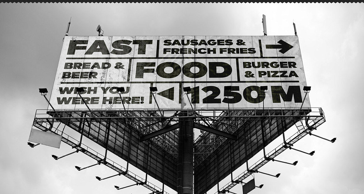
Consider the conditions in which the project will be read. Obviously, script type wouldn’t work on an outdoor billboard ad; for that, you need bold, clear, easy-to-read type. Readability is also important for a long body of text like a book.
Selecting a typeface that is apt for your project

Image source: Adrien Coquet and Dath Hugo
Unusual typefaces can stand out in a reader’s memory. That’s good! They can also distract the reader’s eyes and make it harder to read the content of the project. Not so good! As a general rule, “fun” fonts work for headers and decorative effects; simpler, more readable fonts work better for the main body of a document.
Also read: Cute Readable Fonts From Google Typefaces
Be sure the typeface has the characters you need

Image source: Troia Classic Serif Font Family
Some fonts, especially display fonts, don’t have a complete set of characters. Some typefaces have all upper-case, all bold, or all italic letters; some lack numbers, and some aren’t scalable. That’s fine for headlines. Avoid using these fonts for the main body of an article.
Use unusual typefaces judiciously

Image source: Amy Hood
Some unusual-looking fonts are classified as “display” fonts. They’re almost always used for special effects like logos and headers. A restaurant menu’s logo and headlines printed in Abracadabra could give the menu a touch of magical charm.
A whole menu printed in Abracadabra might make you feel befuddled… it might even make a few customers disappear. Display fonts can have a distracting, confusing effect, especially if the 1’s and 7’s, or i’s and l’s, look alike. It’s generally good to let the display fonts call attention to themselves as headers and guide words, where the reader can guess their meaning, but keep the more detailed text in a font that’s easy to read.
Our advice is to play it safe and use fonts that focus on readability and legibility.
How to pick fonts that go together

Image source: Google Web Fonts Typographic Project
When you’re mixing typefaces, the general rule is to combine a serif font with a sans serif font. Headlines in sans-serif with the main body in serif is a classic combination: safe, easy, familiar and effective.
For a more unusual effect, you might try combining an old-style typeface with a more modern-looking typeface. In order for this to work, there needs to be enough contrast between the fonts that people who don’t pay much attention to typography can tell the display font from the basic typeface.
For example, there’s not much contrast between Arial and Helvetica, so mixing those two typefaces wouldn’t provide a good contrast effect.
Also read: Typeface Showcase: Amazing Free Fonts

Image source: Please! Don’t Overuse Helvetica
On the other hand, combining fonts of different weights and styles within the same typeface, like Arial Black and Arial Narrow, can work well. Font combinations with very different weights, like Elephant and Times Roman, offer fresh looks. Choosing fonts that go together well often depends on the effect you want; the possibilities are almost endless.
To simplify the typeface selection from all those possibilities, think about the effect you’re trying to achieve. Do you want a strong contrast or a harmonious effect? Do you want the typography to emphasize graceful curves, or clean, sharp angles?
If you want a jumbled effect, you can use lots of different typefaces. Usually, you want a look that suggests clarity and consistency, so two typefaces at most should be enough. Too many typefaces can be distracting to readers.
Also read: Typography, type and typefaces
Conclusion – Choosing A Font Or Typeface
Choosing the right typeface can make or break a project. Rules can help you choose typefaces and fonts that go well together. Knowing what’s available can help you design innovative graphics that work. So, use these rules when they work for you. And when they don’t, break them.
Credit for featured image: FontFont by Monotype
Like this post? Check out more amazing web design content here.


