The value of a user-friendly UI design for keeping visitors engaged is something no designer should forget. When faced with difficulty completing an action on an interface, many people will give up and leave the site. One design flaw can distinguish between success and failure for an online business. A desire for more dynamic user experiences and the constant need for user interfaces to keep up with new technologies also means that good UI design principles are a requirement now and in the future.

All UI designers need basic knowledge of UI design principles and guidelines. These basic UI design principles are not just recommendations.
In addition to preventing lawsuits from being brought against their clients, web designers have to be aware of all the possible consequences of failing to follow good UI design principles.
The following UI design principles and guidelines are of great importance.
Elevate your UI design prowess with the help of these UI Design archives
Table of contents
The Principle of Preferred Action
End users should never feel uncomfortable because they don’t know what action to take. Web design should make a preferred action obvious to users so they have a clear understanding of it.
Learn more about UI design principles and the best UI design practices.
Fitts’ Law

Image source: kay smith
In 1954, Paul Fitts worked on a mathematical model of human motion called Fitts’ Law. He began studying factors of human movement while serving in the US Air Force, where his main concern was aviation safety. As a university psychologist, he developed his model based on calculations relating to time and movement in human responses.
Fitts’ Law is a principle that can be applied to UI design because his calculation included factors such as the time it takes the average person to select a control about size and motion. His studies included human movement when using a pointing device.
In web design terms, this means that increasing the size of an icon can decrease the time it takes to select an item from a menu. Regular-sized icons are faster than smaller icons, and there is an obvious benefit to placing icons at the top of a page rather than at the bottom.
Also read: How To Create A Familiar User Interface Design For The Users
Principle of Context

Image source: Oli Lisher
It makes sense to keep things in context by placing control icons or links right next to whatever they intend to alter. For example, on LinkedIn, you will find a pencil icon next to your name if you want to edit that name. When you want to change your name or profile photo on Facebook, however, you have to click “Settings” in the right-hand top corner, find “Account Settings”, look for “Name or profile photo” and click on “Edit photo or name”.
Web users expect things to be the same as in real life. They want the control to be placed where they can find it.
Also read: How To Create Intuitive Web Design Interfaces
UI Design Principles of Defaults
Think of the default ringtone on a new cell phone or the background image on its screen. Most people never change them from the factory setting. The same applies to other types of equipment with a default setting, which most people never think of changing. Many end users may not even notice that they are using the default setting.
Always assume that the default setting will never be changed by an end user. Therefore, the default must be the most practical or useful setting for the majority of users.
Miller’s Number

Image source: Afrian Hanafi
In 1956, George Miller published his much-cited paper, The Magical Number Seven, Plus or Minus Two. He was also the author of Plans and the Structure of Behaviour and co-founder of Harvard’s Center for Cognitive Studies.
Miller’s Number is the principle that the human memory can only hold a limited number of items at one time, which is 7 ± 2.
Miller defined this limit as the amount of time the human mind can process simultaneously, or “channel capacity.” He established that it becomes overloaded when this amount is exceeded. Most of us can easily handle several ideas but no more than the channel capacity.
Miller’s Number should be considered when creating lists or outlining essential ideas. Any more than nine items at once would be too much for the average brain to handle, while 5 to 7 items will be manageable for most people to think through.
Also read: What Is The Future Of User Interface Design
UI Design Principles of Guided Action

Image source: Kumar Vivek
When end users are expected to perform a specific action on a website or app, it is always best to guide them through the process.
LinkedIn is a good example of these UI design principles. When the endorsement feature was introduced, users of the site were not expected to figure out what they were supposed to do. LinkedIn made sure that users could see a strong call-to-action banner on all the profile pages, which encouraged more of them to use the feature.
Even though most people like to give them without placing an apparent request, endorsements would unlikely have become such a popular feature on LinkedIn.
Also read: Popular Trends In Web Design
Principle of Feedback

Image source: Elvira Arkanov
People need to feel confident and in control when using an interface, and this is easier to accomplish when they get feedback on each action.
In this respect, Gmail is a good example of how users are encouraged to keep using the product because they are clearly notified of any action they have just taken.
UI Design Principles of Easing

Image source: Andrew McKay
This principle is based on the fact that most people prefer to handle a number of quick tasks rather than tackle something more intimidating.
Completing a lengthy online form can seem like a never-ending task, and it is difficult to go back and review previous answers. A complicated online application form should, therefore, be set up in small stages. Users should be able to see a progress bar that indicates exactly how much has been completed so far and how many more steps lie ahead.
Also read: Micro Interactions – What They Are And How They Work
Usability Heuristics
Basic UI principles cover all the interaction design principles set out by Jakob Nielsen. His usability heuristics are broad outlines rather than specific rules.
They provide users with visual feedback, familiar concepts, flexibility, control and freedom, consistency of standards, pleasing design, and helpful documentation. They also prevent, diagnose, and recover from errors.
Good UI Design Principles are Laws Not to be Broken
Some design experts regard these principles of user interface and guidelines as laws that must not be broken. The reason for this is that there are consequences in ignoring them. The punishment for a designer who fails to apply good UI design principles will be a backlash of anger from clients and end users who have had a bad UI experience.
By keeping these basic UI principles in mind, a designer will be more sensitive to the needs of end users. A designer must also have a valid reason not to apply one or more of them.
Also read: How User Experience Plays A Significant Role In Premium Websites.
Conclusion: Good UI Design Principles
UI design principles and guidelines are based on psychological studies by prominent thinkers. Applying those models and other guiding principles achieves the best results. They are all based on how the human brain works. It is a good idea to regard these as strict guidelines for UI design.
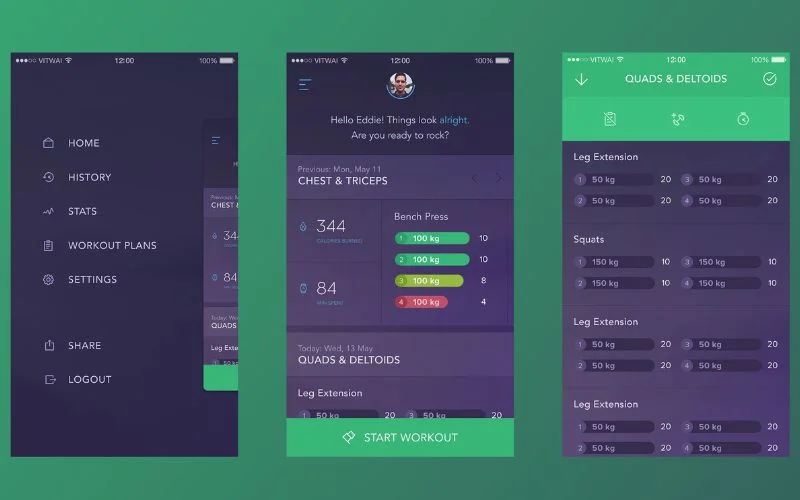
Credit for featured image: Vitaly Rubtsov
Like this post? Check out more fantastic web design content here.


