Want to know how to choose the right font for your website? The ability and vast amount of possibilities in terms of using type on the web have both expanded at an enormous rate over the past number of years. Previously, designers were practically forced to use fonts that were considered to be “web safe” rather than simply choosing web fonts to use.
This is something that ultimately caused everything to end up looking almost exactly the same. Another issue involved using various types of images to replace the fonts that were used, which ended up not only causing all kinds of problems for readers, but also causing various technical issues in the web browser itself. Thankfully, now you can take advantage of a wide variety of typefaces to assist you in how to choose the right font for your website.
The overall number of hosting services for different web fonts has been on the rise since around 2010, as well as an “open font” format coupled with a large support of the @font-face option in many major web browsers.
Companies like this enable their users to pay a subscription fee, which will allow them to host a large range of various web fonts on the website that they run. Some of these popular services include Fonts.com, Typekit, Fontdeck, MyFonts.
Making your website typography better

With the current font sites and services, there is one simple question that you should consider asking yourself: where do you start making a decision when it no longer appears to be a case of fonts like Arial, Verdana, Times New Roman, and/or Georgia, but instead finding a select few of the more than 30,000 different fonts that these services offer?
Choosing the right font for a website was, until very recently, completely dependent on selecting one of two options, those options being sans or serif. However, this is something that becomes a little more sophisticated in nature with the aforementioned options, as well as headline, body, and display. Furthermore, the many different choices that are contained within these options are what have grown beyond belief.
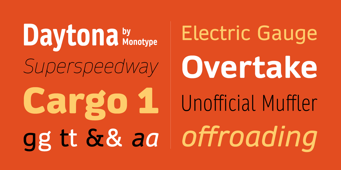
Also read: Best Calligraphy Fonts To Spice Up Your Writing
How to choose the right font for your website: The basics

Here are some of the fundamentals that it’s recommended you begin with in terms of choosing the right font for your website.
Virtually any and every kind of typography project is entirely based on either serif or sans serif options, though numerous other categories of typefaces exist. All in all, sans-serif usually comes out on top as the most popular choice among designers.
The one thing that can be as extremely important as the typeface that you opt to use is the overall amount of space that surrounds the text itself. There are three different terms that can be utilized in instances like this: tracking, kerning, and leading.
Tracking is defined as the space that exists between any group dos characters. Kerning refers to the space that exists between all letter pars, while leading, also known as “line-height,” is the amount of space that exists between all lines of text.
Readability is another important fundamental when it comes to choosing web fonts. The overall number of characters per line can be an important factor in terms of working with various amounts of text for the web. This makes it important to think of not only where the text will appear on the screen, but the overall screen size itself before you begin to design the font types to be easy to read.
Explore this guide on using fonts efficiently in web design.

Hyphenation is fundamental that you will want to flat-out avoid doing. This is something that can actually cause a huge mess with the text itself.
Alignment and justification are two other important fundamentals to make note of and follow. These aspects are most applicable to large blocks of text; however, it’s also important to keep in mind how the text itself will align on the screen, as well as whether or not text blocks will either be fully justified or have ragged edges.
It’s also important to keep in mind the overall number of typefaces that you will end up using. Generally, you will want to go with no more than two different font faces with whatever project you’re working on. The only exception to this should be if you have an acceptable reason to go with more.
Contrast is another aspect that’s important to keep in mind. Whichever font you opt to choose, it will not be readable unless you ensure that there is enough contrast between the text itself and the background. Elements such as stroke weight, size, space, and color are what mostly contribute to contrast.
Also read: Modern Fonts To Express Your Ideas
Self-hosted font-face or not

Image source: Filthy Media
There are some web designers who choose to take advantage of a specific web font service of their choice to assist them. They feel that this is the best way to overcome the vast amount of technical issues that they are likely to experience during the initial design process.
A wide variety of web font services exist. Some of these services are absolutely free, while others require a fee to use them. There are also other services that offer a free option, with the opportunity to pay to advance to a level to take advantage of more professional options.
Something to consider while choosing the right font

When choosing web fonts, it’s important to first begin with the type itself. It will actually make the overall website design process much, much easier if you select all of your preferences regarding fonts first. For instance, consider taking the time to determine how the fonts you select will play in with all of the other design elements of your website.
In terms of choosing the right fonts for your website, you will be able to make your brain go into a proverbial “visual overload”. Thanks to the many different choices that will be at your disposal. Furthermore, if you have a general idea from the beginning of what you specifically want to look for, it will be a lot easier to navigate through all of the clutter involving the fonts.
It is absolutely essential that you select those that match both the message and tone of the specific project that you’re developing. For instance, if you are developing a travel blog or a food blog website then you might want to consider using some fun fonts for this website theme.
Also read: How To Add Font To Canva : Your Ultimate Guide
Headlines

The very first place where web designers will flock to in order to test out their fonts is the headline area of their websites. This is also the specific area in which web fonts will really start to come into their own since they will be both eye-catching and distinctive.
Headers and logos typically have creative potential in terms of radical experimentation and creativity. They are also aspects that are essentially unchanging elements involving layouts.
Being able to style headlines, navigation features, and quotes with different font types make options such as accessibility and search optimization a very important asset to web designers.
Also read: Beautiful Fonts For Your Aesthetic Designs
Body text

In terms of reading passages of text that are large in size. The font families that are the most suitable for this task are generally limited to less than 100. Web designers, typically, will have a group of approximately five or six font types that they use on a regular basis.
As a web designer, it’s important to know the reading habits of your website’s audience. In addition, you should also keep uptake and technical knowledge in mind. However, at the same time, you need to be crystal clear in regards to all of your objectives. Especially in terms of encouraging your audience to engage in sustained reading.
How to choose the right font for your website: Tips & guidelines

Here are a few tips that you can take advantage of to help you in successfully choosing web fonts.
Be as selective as you can. For instance, select a font that you feel will be the most appropriate for your website’s content. Also ensuring that it’s web-ready.
Always make sure you put your fonts first. This means that when you begin thinking about the design choices that you want the most for your website, think about the specific fonts that you will be using.
No matter what, always take your time and don’t rush. Quality fonts and typesetting are two things that require a great amount of patience.
Keep the overall file size in mind. There are fonts that can typically support approximately 200 different languages. This is something that, as a result, can create a rather large file.
Never forget that, as previously mentioned, browsers are always changing. This makes it especially important to stay on top of updates made to your browser. There are some browsers that now display substitutions including ligatures, small caps, and different numerals. All in all, this means that options that were previously takes away can now be included should the web designer choose to do so.
Always design for the medium. In other words, when choosing web fonts, keep in mind which particular ones will look the best on a screen. In addition, ensure that they are proportioned well enough to be read in smaller sizes. The best way to achieve this is to impose a larger x-height. And take out more of the fine details that otherwise wouldn’t render very well on the screen.
Also read: Basic Principles of Typography Theory
Test and test again

When a web designer uses web fonts, it’s important that they test these fonts. Not only using different platforms but different browsers as well. This means, essentially, that constantly checking cross-browser compatibility is extremely important. As is checking a wide variety of options that are also available. By taking advantage of all of these tips, you will be no more be confused on how to choose the right font for your website!
Also read: Tips For Better Typography to Boost Your Design
Credit for featured image: Jim Wasco
Like this post? Check out more amazing web design content here.


