Both the good and the bad things about web design fonts are that there are just too many of them. Using modern fonts for websites in your designs won’t be as easy as it seems once you start comparing the choices, sizes, and weights.
Using fonts efficiently, however, can be the key to a successful design, as it will enable you to convey a clear message that users won’t have any trouble discovering. To be completely frank, your entire visual success is likely to depend on the way you’re handling text.
Table of contents
We’ve gathered some helpful tips for using fonts effectively and are therefore a good place for you to start mastering the skill:
Web design fonts in the service of hierarchy
Visual hierarchy matters to every design project, as it is an indirect way to tell people which elements on the screen are most important, and where they should look. It is that sense of importance that users follow to read materials properly, being guided by visual cues to know where something starts or finishes.
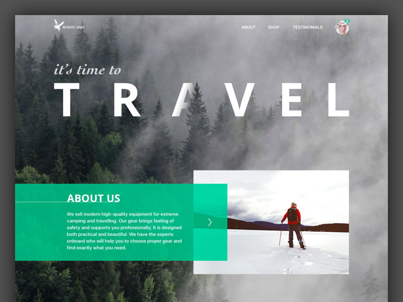 Image Source: Tania Bashkatova
Meanwhile, hierarchy reveals important information to the designer concerning things users are likely to read first, second, or so on.
That’s how designers predict our reaction to information, and they organize their projects accordingly.
Fonts are the most practical tools for creating visual hierarchy because it is enough to change their size in order to lead people through the site.
Altering popular website fonts comes in handy when there is a lot of content to handle, and designer put bolder headlines to help us distinguish them from the body text for enhanced readability.
Expand your font knowledge with these insightful resources:
- How To Choose The Right Font For Your Website
- Everything You Need To Know About The Helvetica Font Family
- Alphabet Fonts: The Ultimate Guide
- Modern Fonts To Express Your Ideas
- The Classy Fonts Bundle Review
- Best Calligraphy Fonts To Spice Up Your Writing
- Is There A Place For Serif Fonts In The Digital Age?
- Free Font and Designs For Commercial Use
- Fonts Like Helvetica To Spruce Up Your Designs
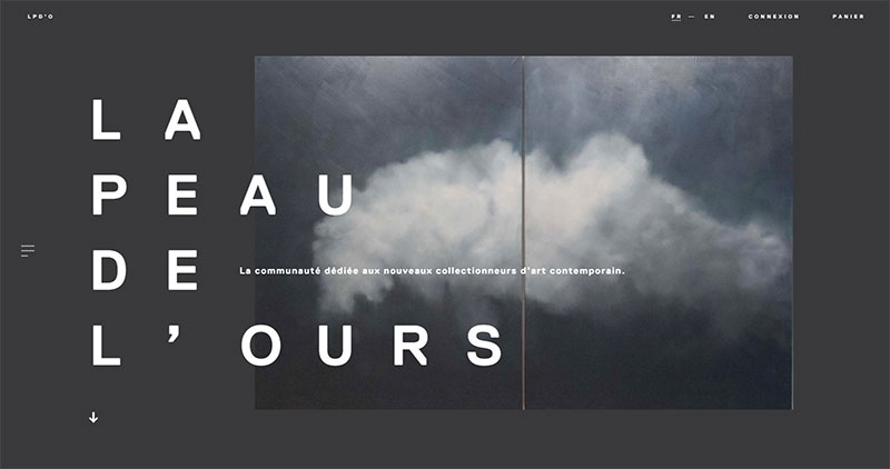
Enhanced readability of fonts in web design
 Image source: Dann Petty
The readability of your font is always important, but you need to be especially careful when posting large text sections. A good piece of advice is to avoid elaborate fonts and upper-case texts, as those may strain the eye. Better yet, save them for headings and titles.
Then, it is readability that will determine whether the way you’re using a typeface is effective or not. When typography is good, users enjoy reading it, and it doesn’t require them any efforts to understand what it is about. The winning scenario is to make users forget about types at all and focus on content instead.
 Image source: Jason Kirtley
So how do make the text more readable? There are few factors that have to be considered, such as length, leading, style, padding and margins, colors, and contrasts.
The length of the lines: refers to the number of characters you are including in one line, and it has an important role for the overall readability. Unexpectedly wide lines intimidate readers, while extremely short ones confuse them. The secret is to achieve balance.
- The Leading: Leading is the space between text lines, which is almost equally important to line length.
Needless to say, lines are not supposed to touch the ones above/below them, because readers won’t be able to comprehend the text.
- The style: The typeface style has a different type of influence on readability: the most scannable font website design are usually serifs and sans serifs, and the rule says that overdone decoration (novelty types, for instance) seem too complicated to decipher.
- Padding and margins: The same as leading, padding, and margins make use of the space around the text to control the way it will impact readers.
- Colors and contrasts: When it comes to color, you have to choose one that corresponds well with the background or explained better; it contrasts it. Most designers recommend light text on a dark background because they believe this is the easiest way to read and understand the textual content.
Also read: Learn The Difference Between Typography And Lettering
Fonts that correspond to your style
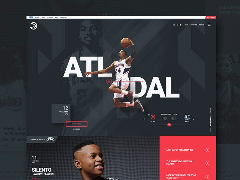 Image source: Jeff Corey
Once again, fonts are critical for communicating the right message to your audience, so you should take them seriously. Choosing the right web design fonts can lead your website straight to the top, while a bad choice can have drastic effects on the perception users have of your website. The ultimate goal is effective communication.
In order to choose the right font, you have to first think of the nature of your content: how much text do you want to display, and is the text going to be used for serious purposes or for entertaining ones? Ask yourself these questions before you proceed.
The artistic power of typography
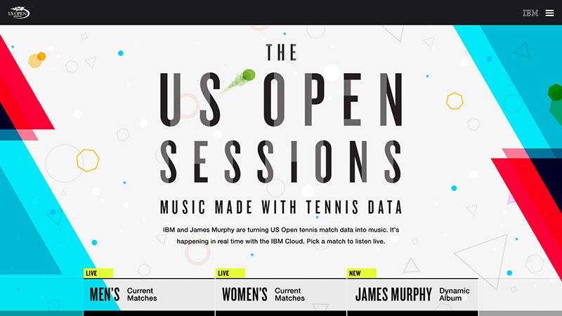 Image source: Michael Sevilla
Best web typography is not just a science examining headlines and text box distances, but an art that can add depth and value to your design. Most typefaces were designed meticulously, meaning that they possess a valuable aesthetic asset to enrich your primary design arsenal.
The more beautiful your web design fonts looks, the more attention the text will grab, and that’s exactly whatever branded out there desires.
Also read: Typographic Trends That You Must Check Out Right Now
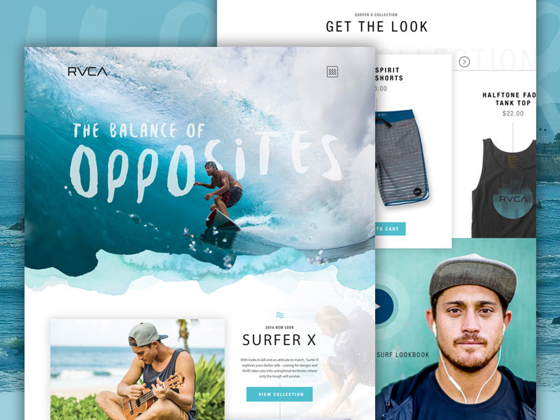 Image source: Joe Leschisin
Meanwhile, avoid sticking to prescribed frameworks and font rules, and follow what you think is right. Enlarge the size, or expand the shape is you think that really matters, or go creative with blotches, swirls, spats, textures, and other details that could spice up your simple and understandable font.
Typefaces are beautiful in their own way, and people can interpret them in all sorts of contexts. That makes them powerful enough to state a brand’s identity and to be used as artistic means put in the same basket with other crafts and arts.
 Image source: Jozsef Deak
Their presence in a medium increases expressiveness both mechanically and visually, and makes content look more vivid. Explained simpler, compelling typography makes your message even greater and more attractive, and being aware of online tools such as Google Web Fonts, WebINK, and Typekit, missing one becomes simply inexcusable.
Also read: Typography Terms That You Should Know
The psychology of fonts
 Image source: Julien Renvoye
Typefaces are all around us. If you think about it, that’s what you’re doing at this very moment: you’re reading a typeface. You may wonder why you didn’t notice it, but that was exactly our purpose: to let you concentrate on the content instead of the amazing curves and finishes of our letters.
Knowing this, you’d probably assume that all commonly used web design fonts are similar, but that would be fairly wrong: common website fonts count in thousands. And they are everywhere we turn—packages, presentations, websites, newspapers, documents, emails, and so on.
 Image source: Mike from Creative Mints
That’s already enough to conclude that they matter and that they impact readers more than anything else that may appear on a website. As a business owner, you should probably think about the marketing expectations of your target audience. And the emotions that should be tackled using different web design fonts.
People perceive serif fonts as more readable than their sans-serif counterparts. Because they read them faster and understand them more easily.
The fact that a font or its size are common will also have a lot to do with perception, as shown by the Arial example. Arial is a clean and universal font, known to help users understand content and to improve their experience and satisfaction. But it won’t work for business that want to add ‘creative vibes’ to their websites.
Also read: Typography Rules That You Should Follow
 Image source: Jessica Hägg
Even when trying to do this, don’t exaggerate with ornamentation. Because the Brush Script that you like so much may compromise both readability and comprehension.
Instead, save decorative fonts for announcements and corporate events, because that’s where you’re supposed to look sophisticated, reliable, and authoritative. Overall, consider both the purpose of your text and the psychological associations with a front before you’ve decided to use it.
Also read: Typography Tips To Improve Your Website’s Legibility
Go creative!
 Image Source: Erik Messaki
Dear designers, it is time for you to stop playing on the safe side, and to quit Helvetica and Times New Roman for all sorts of websites. Verdana, Comic Sans, Georgia, and Franklin Gothic are all ‘safe’, but still able to add visual depth to your content, and make your work more creative. Why not try them?
Like this post? Check out more amazing web design content here.


