Tired of Helvetica? It’s time to break free from the same old font and try new fonts like Helvetica!
In this blog, we’ll explore fantastic alternatives that will breathe new life into your designs.
Whether designing a logo, crafting a poster, or revamping your website, these fonts will surely add a touch of pizzazz to your projects.
From sleek and modern to quirky and bold, these fonts are here to spruce up your creative projects.
So, if you’re ready to spruce up your designs and stand out from the crowd, join us as we explore the wonderful world of fonts that look like Helvetica!
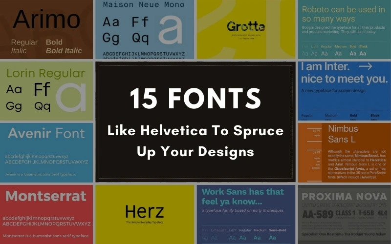
Table of contents
- What Is Helvetica Font?
- Awesome Helvetica Alternatives
- 1. Inter Font: Helvetica Look Alike
- 2. Roboto Font
- 3. Nimbus Sans Font
- 4. Aktive Grotesk Font
- 5. Lorin Font: Best Font Similar To Helvetica
- 6. Montserrat: Free Font Similar To Helvetica
- 7. Avenir Font
- 8. Maison Neue Font
- 9. Arimo Font
- 10. Proxima Nova Font
- 11. Herz Font
- 12. Univers Font
- 13. Grotte Font
- 14. Work Sans Font
- 15. Stag Sans Font
- In Conclusion – The Best Fonts Like Helvetica
What Is Helvetica Font?
Helvetica is one of the most famous and commonly used fonts in modern typography history. It was created in 1957 by Swiss designers Max Miedinger and Eduard Hoffmann. It quickly became very popular in the mid-20th century.
Designers loved Helvetica because it was neutral and could be used for many projects. It has been used on US tax forms, EU tobacco warnings, and logos for American Airlines, BMW, Sears, and Microsoft.
You can also find Helvetica on road signs and in movies. Since the rise of digital technology, it’s been everywhere—on software, apps, and websites.
However, some designers think Helvetica is overused. They want something different to make their designs stand out. That’s why we’ve put together a list of Helvetica alternatives. These fonts offer the same clear, simple style as Helvetica but with a unique twist to make your designs more memorable.
Explore this guide on using fonts efficiently in web design.
Awesome Helvetica Alternatives
1. Inter Font: Helvetica Look Alike
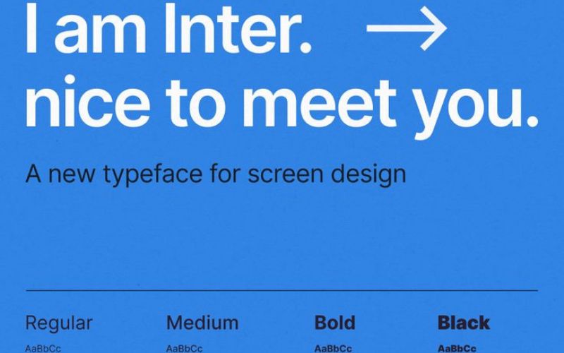
Inter is a font that works well on screens, especially for UI design. It’s even better than Helvetica in this context. Inter has more space between letters than Helvetica, which means you can make the letters spread out more at larger sizes.
The main difference between Inter and Helvetica lies in how their letters end. Helvetica’s letterforms have almost strictly horizontal or vertical endings, giving them a very sharp and clean look. Inter, conversely, doesn’t have that same level of crispness. However, Helvetica is slightly less readable than Inter.
Check out: Is There A Place For Serif Fonts In The Digital Age?
2. Roboto Font
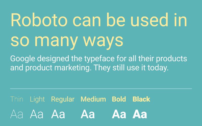
Roboto is one of the best free Helvetica alternatives but has two sides. On one hand, it has a structured, mechanical skeleton and mostly geometric shapes. But at the same time, it also has friendly, open curves.
Unlike some other fonts, Roboto doesn’t twist its letters to fit a strict pattern. It lets the letters keep their natural width, which creates a smoother and more comfortable reading experience.
You’ll find this rhythm in other fonts, like humanist and serif types.
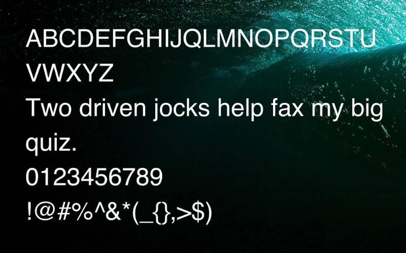
3. Nimbus Sans Font
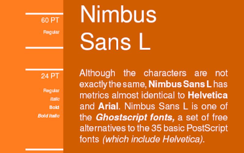
Nimbus Sans is a Helvetica look alike. They share similar features, like how their letterforms end in horizontal and vertical lines.
For example, the “R” has a graceful bend, and the “G” has a little descending spur. However, there’s one significant difference: Nimbus Sans is darker.
In terms of typography, its letterforms are thicker at a given size, making them appear slightly darker when you read large blocks of text. Using Nimbus Sans, you might want to adjust the line height or lighten the text color to balance it. But that’s entirely up to you!
Check out: Best Calligraphy Fonts To Spice Up Your Writing
4. Aktive Grotesk Font
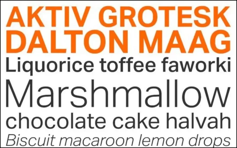
Like Helvetica, Aktiv Grotesk is a sans-serif font that looks clean and simple. The designers made this font because they thought Helvetica was used too much and had some limitations in design. They wanted a font as flexible as Helvetica but better for modern digital design.
Aktiv Grotesk differs from Helvetica in a few ways. For example, the ends of the ‘c’ and ‘s’ letters are straight across instead of diagonal, like in Helvetica. This makes Aktiv Grotesk feel more geometric.
Also, Aktiv Grotesk usually has lines of the same thickness, unlike Helvetica, where they vary. Some letters in Aktiv Grotesk, like ‘a’ and ‘g’, only have one loop instead of two, like in Helvetica.
Check out: How To Use Fonts Efficiently In Web Design
5. Lorin Font: Best Font Similar To Helvetica

Lorin is a modern sans-serif font with a rounded look, designed by the Fontastica foundry. It’s more rounded and trendy compared to fonts like Helvetica.
Lorin is great for projects where you want to add some charm and personality, like creating store logos or designing product packages.
6. Montserrat: Free Font Similar To Helvetica
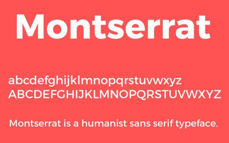
Montserrat is a free font similar to Helvetica that brings back the style from the early 1900s, but it’s not as formal and sleek font as some others, like Futura. Right now, Montserrat has three different versions available.
There’s the regular version with alternate capital letters and one called “Subrayada” with built-in underlining.
The alternate capital letters are more fun and probably better for big titles or signs. Julia, the designer, says they were made to show the diversity and spirit of Buenos Aires.
Check out: Alphabet Fonts: The Ultimate Guide
7. Avenir Font
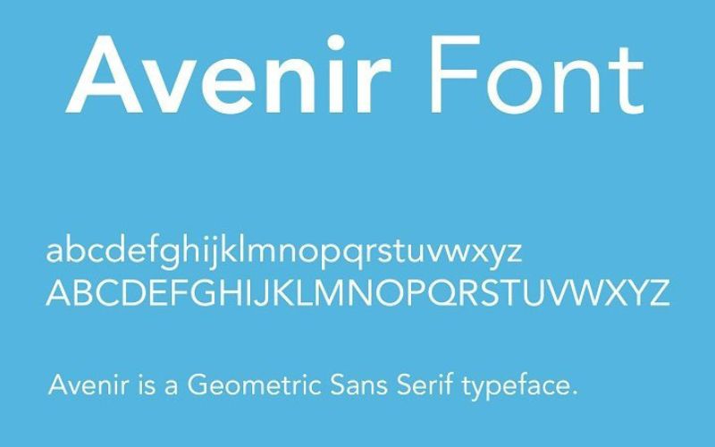
Avenir is a font made by a famous Swiss designer named Adrian Frutiger in 1987. He wanted it to be a more natural version of beautiful geometric fonts, smoother and better for long paragraphs.
Frutiger thought it was his best creation. The name “Avenir” means “future” in French, hinting that another font called Futura inspired it.
But unlike Futura, Avenir isn’t entirely geometric. It has thicker vertical lines, ‘o’ isn’t a perfect circle, and some letters are shorter.
8. Maison Neue Font
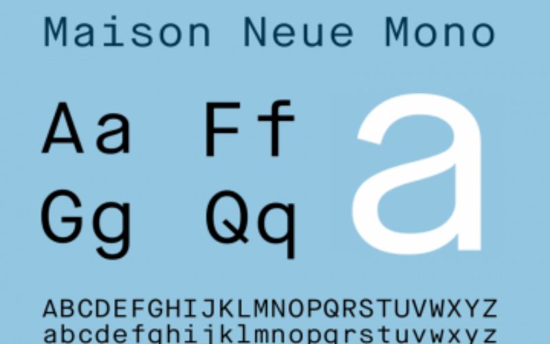
Maison Neue is a font created by Timo Gaessner and launched by Milieu Grotesque in 2012.
It’s a newer version of the original Maison font, redesigned to work better with modern display and printing technology. Maison Neue comes in five different weights: light, book, medium, demi, and bold, each with italic versions.
Plus, there’s a cool monospaced version available as well.
Check out: How To Use Large Web Typography To Stand Out
9. Arimo Font

Arimo is a font family that works well in any size. Steve Matteson designed it to be a modern, easy-to-read font without fancy decorations.
It’s similar to Arial, so you can switch between them without messing up your layout. Arimo is great for screen reading and includes characters from many European languages.
It’s perfect for developers who want a font that works across different devices and platforms.
10. Proxima Nova Font

Proxima Nova is a font that combines modern shapes with a geometric style, like a mix between Futura and Akzidenz Grotesk.
Since the middle of the 2010s, it’s been the most popular font you have to pay for on the internet, and many websites use it. There are seven different versions of Proxima Nova, each with slanted versions, plus some other styles like small caps and condensed versions.
It works great with other fonts, like Helvetica Neue, Adobe Garamond, and Lucida Grande.
11. Herz Font

Looking for perfect fonts like Helvetica? Herz is your match! It’s a bit narrower and has extra space between letters, giving it a neat and straightforward feel like Helvetica.
With its modern twist and straightforward design, Herz stands out while being practical and neutral. It’s a great choice for projects like the Jeep font and many others where you need something simple yet stylish.
Check out: Typography Terms That You Should Know
12. Univers Font
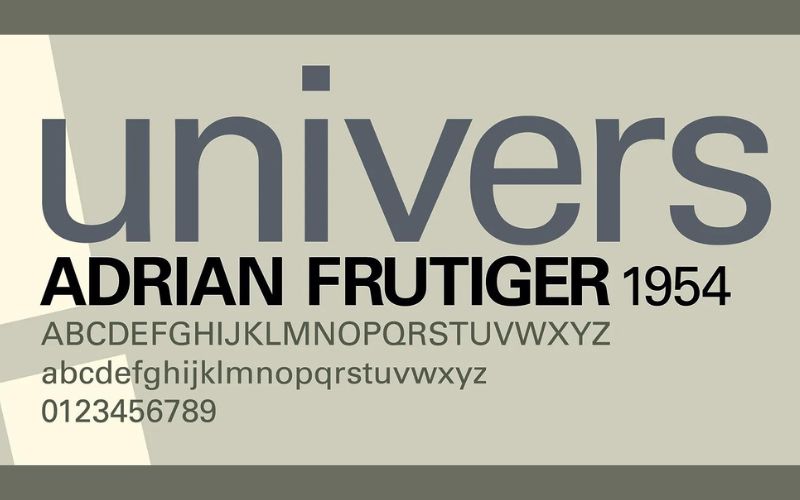
Univers is a timeless font made by Adrian Frutiger from Switzerland.
It emerged in 1957 when other famous fonts like Folio and Helvetica were also created. Univers looks like Helvetica because they’re both based on an old font called Akzidenz Grotesk from 1896. But Univers offers a lot more options than Helvetica.
You can choose from many different thicknesses and widths, making it versatile for all projects.
Check out: The Best Practices For Mobile Typography
13. Grotte Font

Grotte is a font available in three styles and can be used in many languages, including Spanish, Portuguese, German, Danish, French, and Cyrillic.
Grotte is a great font for designers who want a font that works well with different languages. Its friendly, rounded look gives it a more youthful feel compared to other Swiss-style fonts.
14. Work Sans Font
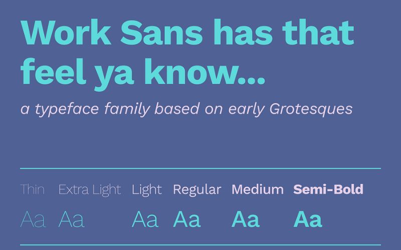
Work Sans is a freely available font inspired by early Grotesque fonts. It’s simplified and works really well on screens, such as computers and phones.
For example, accents and marks on letters are bigger than they would be in printed text. Regular font versions are best for reading on screens at medium sizes, while bolder versions are better for big titles or signs.
The Github project page also contains a version of Work Sans specifically designed for desktop computers.
Check out: What Is Kerning In Typography & How To Do It Properly
15. Stag Sans Font
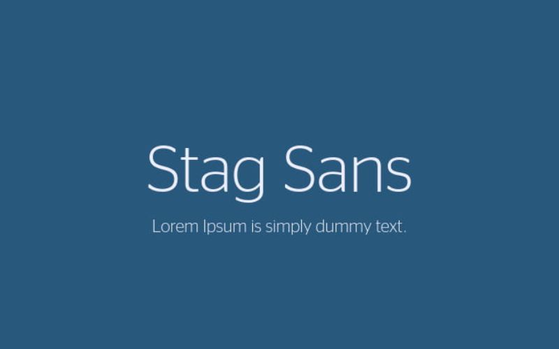
Stag is a font family made by Commercial Type. It started as a slab serif font made for big titles in Esquire magazine.
The sans-serif version is a great font for headlines because it stands out but isn’t too busy for smaller text. Its good mix of rounded and straight edges complements its serif sibling, making the whole family look strong and straightforward.
In Conclusion – The Best Fonts Like Helvetica
With these fantastic fonts similar to Helvetica, you have a world of creative possibilities at your fingertips.
Whether crafting a logo, designing a poster, or revamping your website, these fonts offer a fresh twist on a classic style, helping you stand out.
So experiment and let your creativity soar as you elevate your designs to new heights with these remarkable alternatives to Helvetica. Your next masterpiece awaits!
Like this post? Check out more amazing web design content here.


