
Have you ever wondered how the homepage of Amazon has transformed over the years?
At first, Amazon was just a small online bookstore. Its homepage was simple, like a sign pointing to books. But as technology improved, so did Amazon’s homepage.

It got better and better, offering more things and making it easier to buy stuff. Now, it’s a big part of how we shop online. From suggesting things we might like to buy to letting us order with just one click, the Amazon homepage has become really important.
So, let’s take a trip down memory lane and see how it all happened!
Evolution Of Amazon Homepage
1. Homepage Of Amazon In 2001
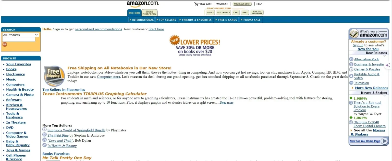
In 2001, the Amazon webstore design was noticeably simpler compared to its current version. The browsing bar on the right side remained relatively unchanged over time, with minimal evolution.
The main alteration to this section was the removal of certain topics from the sidebar. Additionally, the upper navigation bar underwent significant improvement and expansion. Instead of promoting specific products as in the primary interface, the right side now featured advertisements for research topics.
Amazon.com opted to divide the left browse bar into three distinct parts, forming the framework of the webpage. Another noteworthy change was the increased prominence of the “Sign In/Sign Up” option as the website grew more successful.
Additionally, Amazon’s logo became more prominent, no longer integrated within the upper browsing bar but appearing as a separate entity.
To learn more about the Amazon company, check out the evolution of Amazon.
2. Homepage Of Amazon In 2005
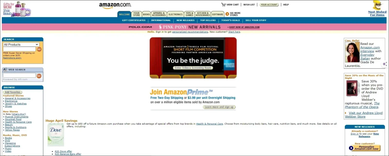
By 2005, as Amazon continued to gain popularity, the primary focus of their website’s advertising shifted to promoting Amazon Prime.
The positioning and significance of the Amazon.com logo remained consistent, occupying the same space and maintaining its importance to the website, a tradition upheld to this day, except for a brief return to the original design for a few months.
The left browsing bar reverted to its previous design, featuring orange-colored topics to aid navigation. The upper bar expanded in scope, while the left bar returned to showcasing specific products.
Check out: Examples Of eCommerce Website Design To Get Ideas From
3. Homepage Of Amazon In 2006

In 2006, the Amazon logo returned to being integrated into the upper search bar. The left search bar underwent a simplification process, resulting in a cleaner and more streamlined design thanks to new software introduced that year.
Additionally, a highlighted search bar was added to enhance navigation convenience. While some adjustments were made, the overall layout of the page remained largely unchanged.
It seemed that by this time, Amazon had settled on a design that suited their preferences, opting to make minor improvements while maintaining the overall structure.
4. Amazon’s Homepage In 2010
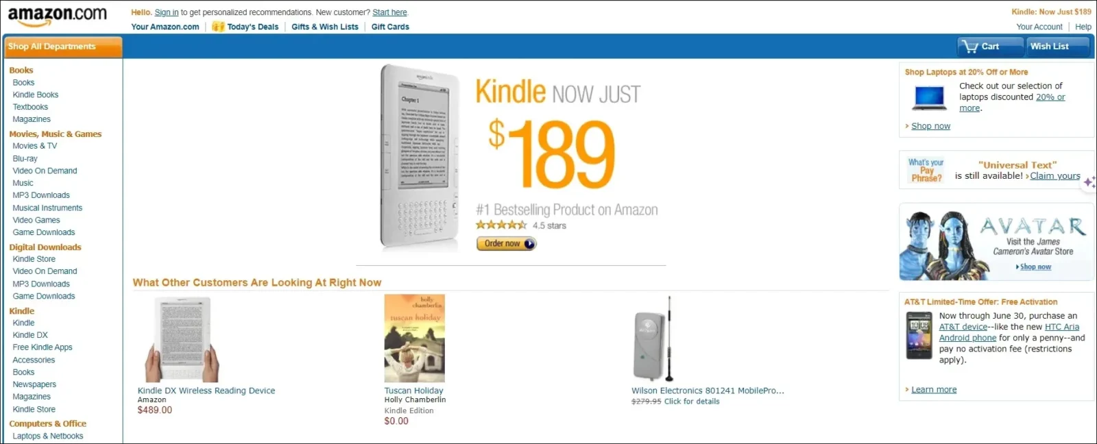
In 2010, Amazon reverted to using a more prominent logo and expanded the search bar for improved usability.
While the left and right sides of the page maintained a similar layout, subtle changes in font and size enhanced the overall cleanliness of the design.
The upper browse bar was replaced with links to Gift Cards and Today’s Deals, creating more space for promotional content.
As Amazon continued to expand its offerings, the spotlight shifted to their latest product: The First Generation Kindle, which quickly became the most prominently advertised item on the website.
Check out: Why You Need A Mobile E-commerce Strategy?
5. Amazon’s Homepage In 2013

In 2013, the left-side bar transitioned into a concealed feature, requiring users to hover over it with their mouse to reveal the search topics.
Meanwhile, the right side of the page began displaying an increased array of products once more, with the Kindle maintaining its position as the primary focus.
Check out: How To Create a Good User Interface : Essential Tips for UI Designers
6. Amazon’s Homepage In 2015

The updated design of Amazon.com prominently featured the latest Amazon product, dominating the entire page, while Amazon Prime was highlighted in various sections.
The product ads on the right side have been removed, contributing to a cleaner appearance, and the left-side browse bar remains concealed, further enhancing the website’s streamlined look.
Notably, the predominant color scheme surrounding Amazon was shifted to a dark grey, departing from the traditional white hue.
Check out: How To Write Ecommerce Product Descriptions
7. Amazon’s Look In 2024

The latest Amazon homepage has a clean and modern look. When you visit the site, you’ll notice the search bar at the top, where you can easily find what you’re looking for.
The main focus of the page is on Amazon Prime, which is highlighted in different places. On the right side, you’ll see various products being advertised.
The left side of the page has a hidden bar that shows search topics when you hover your mouse over it. Overall, the Amazon website design is easy to navigate and has a sleek design.
The Bottom Line
As we wrap up our journey through the evolution of Amazon homepage design, one thing becomes clear: change is constant.
From its humble beginnings to its current sleek design, the Amazon website layout has adapted and evolved to meet the needs of its users. But amidst all the changes, one thing remains constant: Amazon’s commitment to providing a seamless shopping experience for its customers.
As we look ahead to the future, one can only wonder what new innovations and improvements await us on the digital doorstep of Amazon.
So, here’s to the ever-evolving journey of the homepage of Amazon, a testament to the power of adaptation and innovation in the digital age.
Like this post? Check out more amazing web design content here.