One characteristic we all seem to share as human beings is a lack of ability to predict or understand other humans. We‘d love to know what someone else may be thinking or how they are likely to react to something we say to them. Or how they are likely to express a preference between products—particularly when one of those products is our own. That’s why psychology in web design is important.
A good web designer should always have potential users in mind: how to attract them, engage them, what makes them tick, and what makes them click. There are a number of solutions to these mysteries, mostly based on personal preference or anecdotal evidence.
Image source: Brad Haynes
And while there’s no single magic factor or combination of factors, academic and commercial research has produced some theories of psychology in web design which are worth considering and applying to your own content.
Table of contents
The “Z” pattern
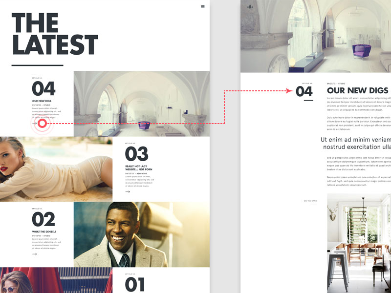
Research suggests that users read a screen in a “Z” shape – across the top from left to right, then diagonally down and across the bottom, again from left to right.
The theory suggests that the theory suggests that the most important content should be within this zone to capture their attention. And users who find something less informative or engaging there may have left your site before they spot what they (and you) want to find there.
Also read: Sleek Web Design Trends and Strategies
Gestalt Website Psychology Design: consider the overall picture
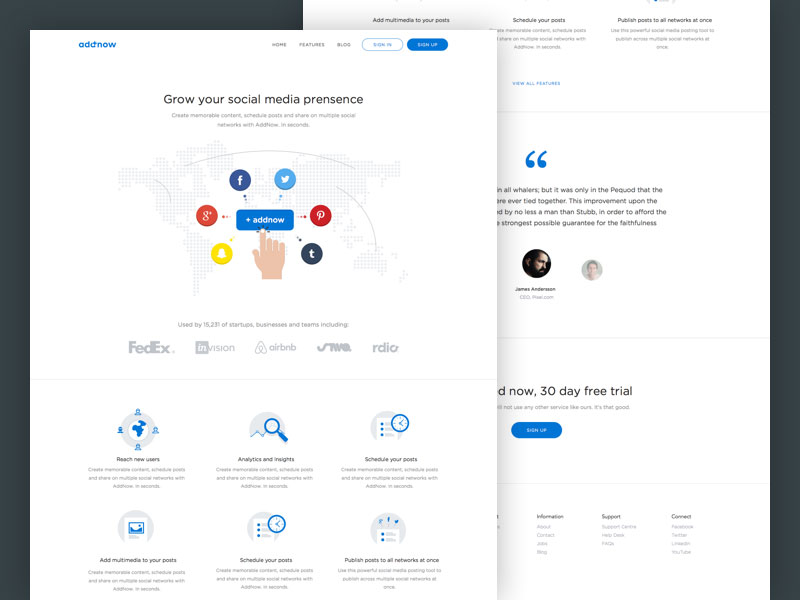
How the human mind makes coherent sense of a large amount of information, and then processes it as a whole, is what Gestalt research studies.
An overall picture of your website is what will be processed by users’ brains when they view it for the first time. The details are examined later – but only if the viewer is motivated to examine them in detail.
Also read: Online Resources to Learn Web Design
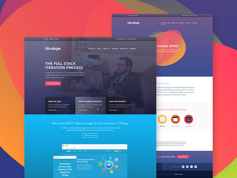
Designers should keep this in mind and create an effective overall structure (by prototyping, wireframes and so on) before getting stuck into the details of fonts, curves, shades and shadows and so on. If the client isn’t engaged by their first impression of the design, all that will make little difference.
Check out this blog for an in-depth look at web design basics.
Color Psychology For Web Design
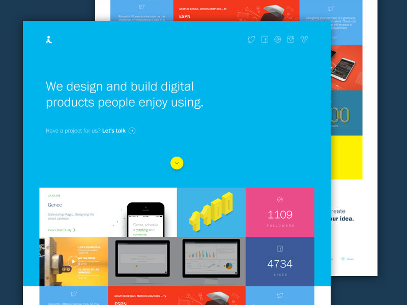
The more visual and colorful online content becomes, particularly when led by marketing, the more attention this area receives. Marketing professionals and scientific researchers all have their theories (and frequently update them) but some trends have emerged which may be useful.
Blue is a popular favorite color, seen as a source of calm and security for both genders.
Red apparently increases people’s appetites, while blue has the opposite effect. Think how many red-themed restaurants you’ve been in!
Yellow is seen as a stimulating color. It’s associated with happiness, sunshine and fun, but be warned: not everybody reacts so positively to such a heightened emotional state and may feel anxious rather than euphoric.
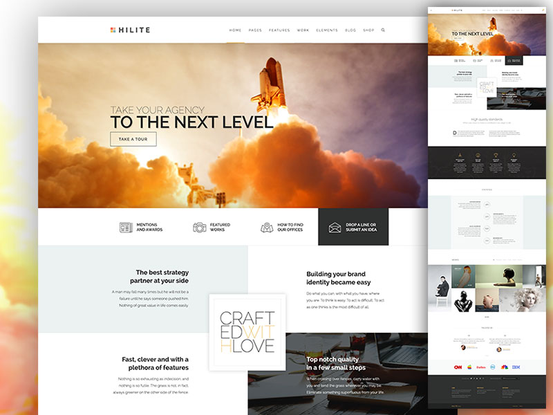
Green has been named by psychologists as a color that encourages creativity, as well as its natural affinity with organic and outdoor products.
Black is perceived as a premium color, an indicator of elegance, class and high value. The application of some black to your color scheme seems like a quick and easy way to add some desirability.
Readers Drawn In By Short Lines
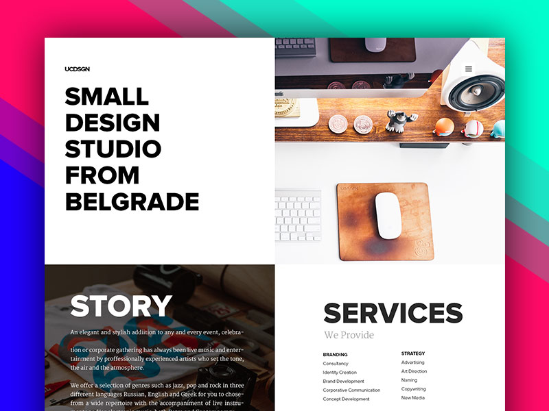
Reading shorter lines of text is preferable to reading longer ones, according to research. But longer lines are easier to read for larger amounts of text. So beginning with a narrow column, perhaps with a well-chosen positive image to the right, will get more users reading.
Once engaged, they will happily read on at length for some time, so opening out to a wider column will make this process easier for the user and a more efficient use of space for the designer.
Also read: Ways to Boost Your Creativity Backed by Psychology
The Psychology Of Web Design: Keep It Simple
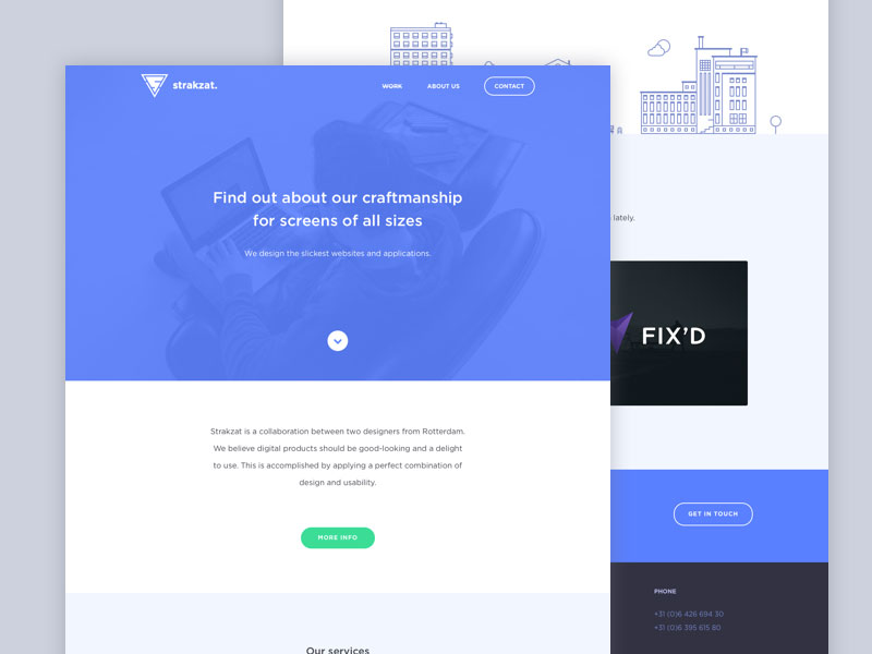
The internet has changed the way people seek information. They demand immediate solutions to their questions or problems, and will make snap decision to look elsewhere if they come across too much detail or find a site’s navigation and design unhelpful.
It’s important to lead with the headlines, display an appropriate level of information, and present it briefly and in layman’s terms. Attracting and retaining as many visitors as possible should be more desirable than presenting all the content at once. The detail should still be present but accessible by the theory of the inverted-pyramid model, with the details further down or linked.
An exception to this may be content catering exclusively for a technical or specialist audience, one which you can be certain would require nothing but “hard-core” information.
Also read: How to Start a Freelance Web Design Business
Persuasion
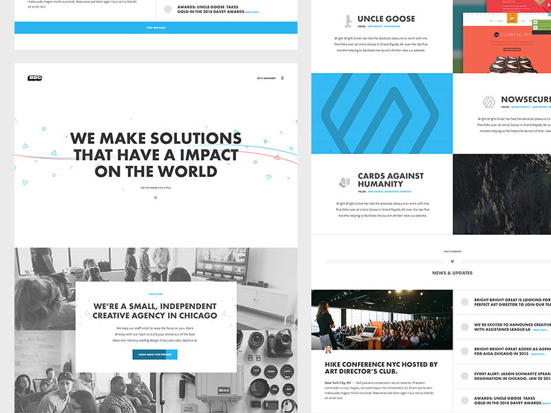
Perhaps the most important application of psychology in web design is the age-old skill of persuading, and that relies on the quality of your text and content as much as its presentation. Effective communication, a persuasive pitch and an enticing offer will multiply your chances of drawing a positive response. More requests can be converted into a “Yes”.
Explanations and answers will help win clients over. Research shows people will want to know meaning of an action or why you want something from them. And taking the time to enlighten them will, of course, make them feel that they mean more to you.
That concludes this survey of some useful findings from academic research into psychology in web design. The research, debate, psychology behind website design, and changing trends never stop developing.
Like this post? Check out more amazing web design content here.

