
Do you know what does & mean? Ampersands underline your business’s responsiveness and collaborative nature, but before you apply one, we recommend you define it and read about it. With the ‘what is an ampersand’ question, another classic question is whether your brand’s name suits the purpose.

Table of contents
Ampersands Meaning: What Is An Ampersand?
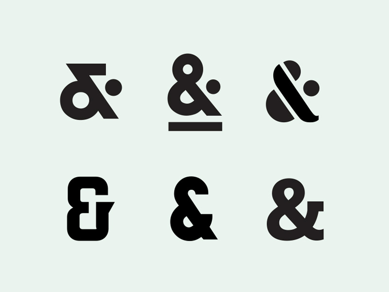 Image source: Steve Wolf
An ampersand (&) is a symbol that represents the word “and.” It’s a shorthand way of connecting two ideas, words, or phrases without writing the whole word “and.” The ampersand is one of the oldest symbols in typography, with roots in ancient times. Its name comes from a historical phrase “and per se and,” which was used when reciting the alphabet and means “and [the symbol that stands] for ‘and’.”
In modern usage, the ampersand is commonly seen in business names (like “Procter & Gamble”) or titles and in more casual or design-focused contexts where space is limited or a stylish touch is desired. While helpful in these settings, the ampersand is typically avoided in formal writing unless it’s part of an official name or title.
Also read: What Is Lorem Ipsum? Understanding The Placeholder Text
When To Use An Ampersand
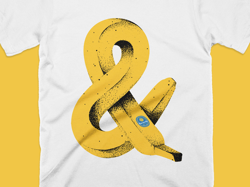 Image source: Brent Schoepf
Brand Names and Titles: It’s often used in company names, business partnerships, and titles of works (e.g., “Johnson & Johnson,” “Tom & Jerry”). The ampersand can make these names look more concise and visually appealing.
Design and Typography: An ampersand can be used stylistically in design contexts, such as logos or decorative typography. Its unique shape can add a visual element that the word “and” might not.
Lists and Phrases: Sometimes, an ampersand is used in lists or short phrases where space is limited, such as in tables, charts, or social media posts.
Parentheses and Asides: When text is within parentheses or as an aside, the ampersand can be used to save space (e.g., “(bread & butter)”).
Informal Writing: An ampersand might be used for brevity in casual writing or communication, though it’s less common in formal writing.
Check out this ultimate guide to the basics of typography.
The 27th Letter Of The Alphabet
 Image source: Steve Wolf
Nowadays, ampersands are common business symbols, and they’ve become so important that users often call them ‘the 27th letter of the alphabet’. But why is this so? How did this symbol become so important?
First, ampersands are an ancient symbol that appeared over 1,500 years ago. As you know, Roman writing used to be a cursive and decorative font, which is how they came across the ampersand for the first time—while writing the word ‘et’ (and), they linked e and t in a word that resembles today’s ampersands significantly, and that can be seen using specific fonts, such as Caslon.
Also read: BMW Logo Meaning & History: From Propellers to Pavement.
On the other hand, people probably started considering it as an additional alphabet symbol much later when it acquired its name.
English students in the early 1800s recited it interestingly enough, pronouncing it like a proper letter. They taught them to say ‘Y, Z, and per se and’ instead of saying ‘Y, Z, and’. ‘Per se’ meant ‘by itself’, but since it was so difficult to pronounce, the mistaken pronunciation and the way it sounded inspired professionals to call it ampersand.
You can also find it in uncommon configurations, including the ‘&c’ one, which many people don’t know means, etc.
Also read: F1 Logo Meaning: Hidden Details, History & More
Uses Of Ampersand
 Image source: Yossi Belkin
You can see them in all variants and settings, but ampersands don’t always preserve their original integrity. If you want to use them properly, try following the standard usage rules of what they represent and how they should look.
People commonly use them to replace ‘and’ in names and short phrases, but that doesn’t mean you should use them to connect parts in extensive sentences or longer text blocks. Ideally, ampersands should only connect two different parts of a single name.
You will most commonly see them in web design of business settings and headlines, most related to consulting, law, architecture, engineering, etc. In contrast to ‘and’, do not follow or precede the ampersand sign with commas, even when it’s used in a list.
As we said before, adding a ‘c’ to your ampersand will transform its meaning to et cetera, even if this is not as common as the original ampersand.
Also read: Beats Logo Meaning, History & Significance
What Are Ampersands Different Styles
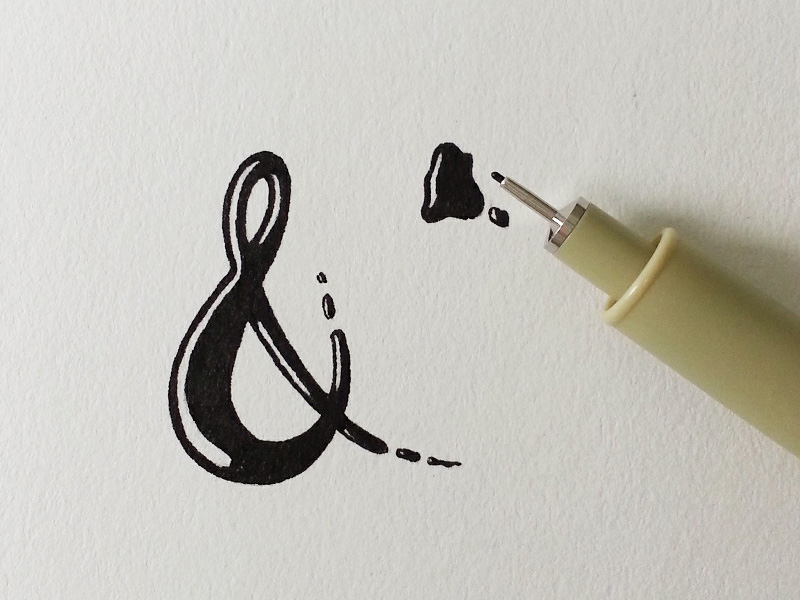 Image source: elsey Phillips
You will only be able to understand how cool ampersands are after you’ve understood how many different styles and their differences. The primary division is between Italic and Carolingian, even if every distinctive sub-style has its typeface and symbol. You can check examples to see the specific font differences – ideally, compare Italic and Adobe Caslon Pro, and the difference will be more than visible.
- Roman ampersand: The classic solution recognized in the entire world
- Italic ampersand: A more romantic and easy-going style for less formal settings.
- Lowercase ampersand: These are italics in the technical sense of the word but are based on a lowercase e, which is visible in their shape.
- Eclectic ampersand: Ampersands are great tools for personalizing your design and adding character, so don’t be afraid to experiment with them.
Well-Known Brands That Use An Ampersand
 Image source: Simon Ålander
- Johnson & Johnson – A global healthcare company.
- Ben & Jerry’s – A popular ice cream brand.
- Procter & Gamble – A multinational consumer goods corporation.
- Tiffany & Co. – A luxury jewelry and specialty retailer.
- Barnes & Noble – A major book retailer.
- H&M – A global fashion retailer (Hennes & Mauritz).
- Marks & Spencer – A British multinational retailer.
- Arm & Hammer – A brand known for baking soda and household products.
Also read: Coca Cola Logo Meaning: Hidden Details, Famous Slogans & More
What Is It So Cool About This Symbol Nowadays?
 Image source: Damian Kidd
Most people would say it is their traditional style or calligraphic curves. But we’d rather say it is a minimalist design imposing them back. Thinking minimal also refers to applying as few symbols as possible, which is probably why ampersands still appear on logos, titles, or simply in people’s handwriting.
The truth is that ampersands are intriguing and always motivate people to discover more about brands. At the same time, an ampersand is a rare language character that stands alone and has meaning regardless of where it appears. What we mean here is that to apply a single letter, it has to have a specific meaning. But that’s not the case with ampersands at all.
Small and cute, ampersands are economical, as they save screen real estate. Unlike other practices with similar purposes, the ampersand will also look versatile and beautiful. And you get to use it as a separate design element.
This article mentions that ampersands are traditionally used in brands such as M&Ms, A & W Root Beer, Dolce & Gabanna, Ben & Jerry’s, and many more. These companies have a long tradition of using ampersands and relating them to their logotype. But the exciting part is that they all use a unique font to emphasize the meaning of their brand.
There are many extra benefits you could prescribe to ampersands. For instance, shortening a company’s name to fit the logotype. An ampersand will help you make your name legible in digital media without sacrificing length.
Companies With Ampersand In Their Name

Like this post? Check out more fantastic web design content here.