Shopping online can be a satisfying experience. Shoppers don’t have to leave the comfort of their home, and they can take as much time as they need to make product and price comparisons and make informed decisions as to which item is best for them. However, if the checkout page design isn’t done properly, the shopper’s experience can be a negative one.

If for example, it takes a great deal of your time to look for the checkout link and fill out registration forms, only to be told that the product you are looking for is not in stock, it can be enough to ruin your day. S Make it a point to set aside enough time to customize your checkout UI process to ensure that everything will run as smoothly as possible.
Table of contents
- The Design and Layout
- Make Registration Optional
- Making The UX Better For Better Checkout Page Design
- Make the checkout process visual
- Let customers know if the items they are looking for are available
- Make it easy for customers to modify their orders
- Wishlist For Checkout Page Design
- Related products
- Don’t forget to include an order number and contact information
- Always show the final price before checkout is completed
- Reviews and testimonials to design checkout pages
- Support for checkout UX
- Make certain the Back button is always functioning
- Send your customers a confirmation email
- Ending thoughts : Checkout Page Design
The Design and Layout
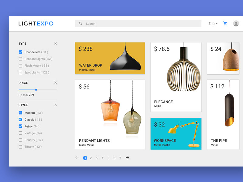 Image source: qubstudio
Your web page layout is where a customer will decide whether or not to purchase what they are looking for. It is here where you need to utilize good shopping cart practices, provide plenty of white space, and clearly explain the steps involved in the ecommerce checkout page design process .
Make Registration Optional
Keep in mind that your customers have come to your website with one goal in mind; and that is to shop. They don’t want to waste time filling out unnecessary registration forms. If a registration process is needed, it should be done during checkout rather than before it.
When you take these practices into account, you increase the chances of those visiting your website becoming actual paying customers.
Also read: Improving Customer Loyalty Through User Experience
Making The UX Better For Better Checkout Page Design
 Image source: Ali Sayed
What should happen when a customer places an item in their cart ? Most importantly, it should be obvious that an item has been placed in the cart. One approach is to display an appropriate animation or graphic that clearly indicates what has taken place.
Make the checkout process visual
When a checkout process is visual, less clicks are required to complete an online checkout transaction. When this is the case, your website’s conversion rate is likely to increase. If you can’t avoid spreading the process across more than a single page, give your customers the courtesy of being able to see where they are in the checkout progress.
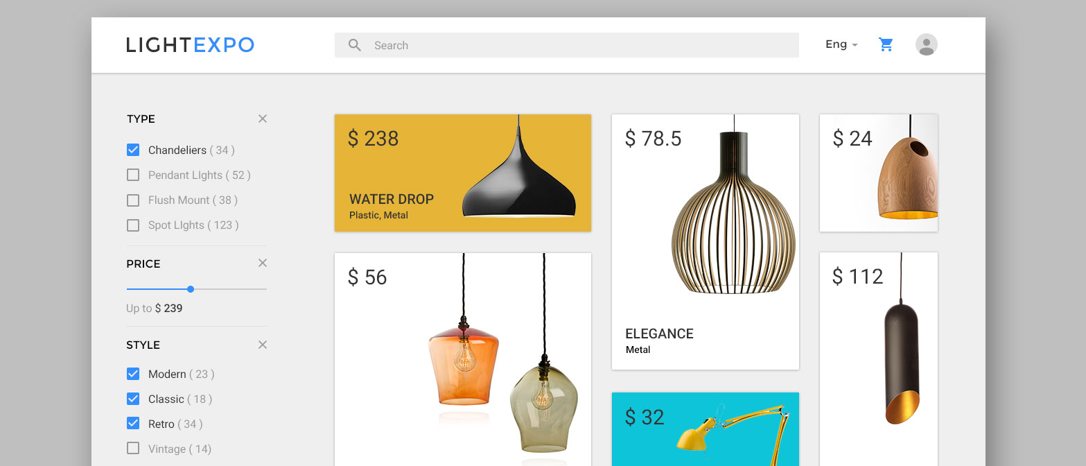
Let customers know if the items they are looking for are available
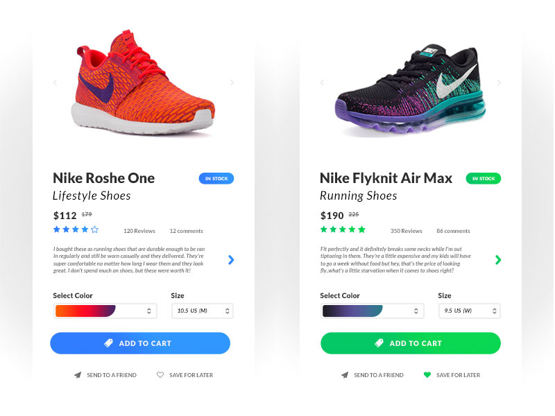 Image source: Taylor Reiman
It’s absolutely essential that you always keep your customers informed as to whether the items they are looking for are in stock and available. If they are, let the customer know the number of items currently in stock. When items are not in stock but expected to be available at a later date, consider adding a pre-order option that allows customers to purchase the items ahead of time.
Check out this blog for an in-depth look at web design basics.
Make it easy for customers to modify their orders
Everyone makes mistakes, including online shoppers. If a customer has accidentally added the wrong item or the wrong number of right ones to their cart, it should be easy to correct the situation.
Also read: Must-Have Elements of a Complete Ecommerce Product Page
Wishlist For Checkout Page Design
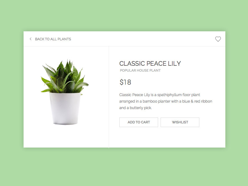 Image source: Mari Johannessen
Make it possible for customers to save items in their cart for later, or add them to a Wish List. Some online shoppers prefer to use carts as a wish list for items that they might eventually consider purchasing. Give them an opportunity to do just that, and allow them to add more items to their list whenever they wish.
Related products
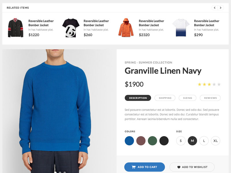 Image source: Silk UI Kit
Recommend related products before checkout. This is a practice that isn’t used much anymore, but it’s a good way to help customers make certain they have what they need before checking out.
Also read: From Prototype to Profit: How to Turn Your Ideas into Products
Don’t forget to include an order number and contact information
An extremely important part of the custom checkout page process is to let your customers know they can reach you through whichever contact methods you prefer if they have questions, comments, or concerns . While live chat is always an option, not everyone enjoys using it, so it’s best to include a phone number and email address as alternate contact methods.
Always show the final price before checkout is completed
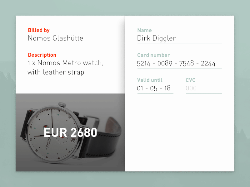 Image source: Alex van Zijl
Make it a point to show your customers the final price of their order before they complete the checkout process. Make sure the final price includes all applicable fees and taxes.
Also read: A Guide to Validate Product/Business Ideas to Save your Time and Money
Reviews and testimonials to design checkout pages
 Image source: Sven Kaiser
Include testimonials and product reviews or ratings. If possible, include testimonials and ratings for products your customers may be thinking about purchasing. These help them make informed decisions.
Support for checkout UX
Give your customers access to online support. There is always the possibility that a customer may encounter a problem while checking out. Make it a practice to to give your customers personal assistance should an issue arise.
Make certain the Back button is always functioning
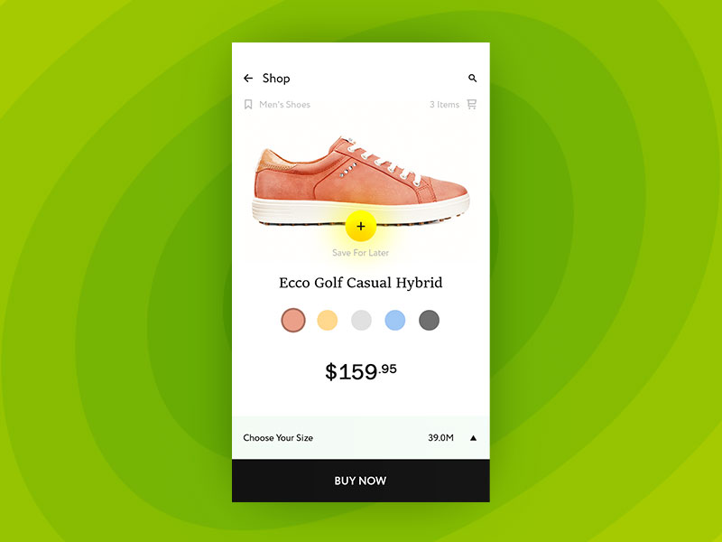 Image source: Alexandru Stoica
Customers occasionally need to use the Back button at some point during the checkout process, so this button should function at all times. If the Back button is disabled, a practice some websites take, a customer is more likely to leave your site without making a purchase
Also read: Design Better Products By Understanding Your Users
Send your customers a confirmation email
When a customer finishes placing an order, send a confirmation email detailing what they ordered and the estimated delivery date. This helps your customers verify they have ordered the right items.
Ending thoughts : Checkout Page Design
Several things are involved in creating a good checkout page design, with the most important feature being that all distractions are eliminated to allow customers to focus on their primary objective. Customers should be able to understand the entire process, and the process should be as easy as possible for a customer to follow.
Like this post? Check out more amazing web design content here.