The opinion on visual (digital) design has changed significantly ever since the arrival of CRT screens in the 1970s and 1980s. Dissimilar to other artistic branches, where development depends on social attitudes and talent, the development of animation in UI design seems to rely completely on the evolution of tools and technical methods.

Let’s have a look at animation in UI design. The first impression would be that everything is created to enhance users’ experiences.
Toolkits are supposed to be rich and broad, from basic animation elements to most upgraded effects; and it is supposed to cover all the necessary aspects of a stable prototype transition (using Quartz Composer, After Effects, or Framer).
The various applications that appear per day are the biggest incentive for the improvement of animation design in many applications.
Table of contents
- Animation in UI design is not new
- Animation in UI design is necessary
- Animation in UI design should not be misused/overused
- The most important animation principles
- Animation in UI design can serve as directions
- Animation tools
- Context
- Delays
- Responsiveness of UI animation
- Progressive loading
- Subtle application of animation in UI design
Animation in UI design is not new
UI animation has been here for a while, and their communicative role is gaining more and more importance with time going by.
Well-executed motions can guide the users; they can provide excellent content and keep readers satisfied. Thanks to animations, you can always surprise your users, reward their loyalty, and make your site more engaging.
However, too much user interface animation or rasping transitions can distract users from what would originally be an excellent digital experience.
Learn more about UI design principles and the best UI design practices.
Animation in UI design is necessary
The first thing to ask ourselves before we start using animations is: How can these animations contribute to our UI efforts?
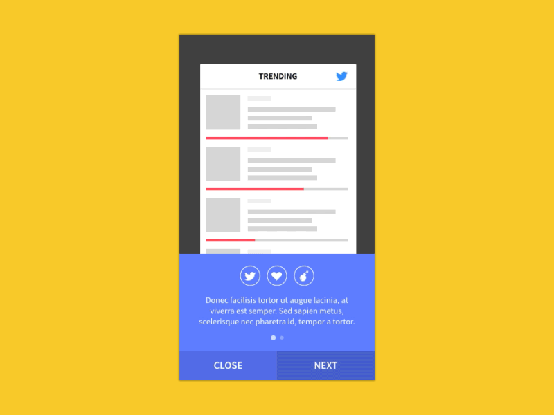
Such interaction qualifies perfectly for a school example of good UI animations. To start with, interaction requires a 100–500 ms network request, but the consuming experience can be easily masked with the right application.
Animation in UI design should not be misused/overused
There are piles of spontaneous and precipitated animations on the web. Unfortunately, there are many cases where such are not amateur mistakes but infamous cost-cutting tricks of experienced designers.
Don’t be diluted so that users won’t notice bad ui motion. They will, and it will frustrate them because it is an obstacle standing in the way of their goals.
Act professionally and understand that design is not a game. Your app needs to show more functionality than simply drawing attention towards useless pop-up animation for UI.
Also read: Improving Customer Loyalty Through User Experience
The most important animation principles
To be honest, it is quite difficult to categorize ‘musts’ and ‘must nots’ in animation design. However, there are a few basic principles worth mentioning.
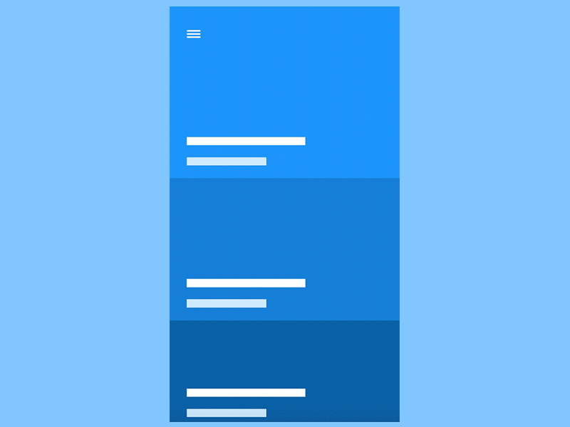
Before we list them, we warn you that mobile apps’ usage mostly relies in the menu slides.
Personalized standards
Should we really remind you to apply the highest standards possible?
Your apps should look better than most of the apps your users have seen, and they should always resemble a ‘futuristic touch’.
Be unique!
Provide modern solutions and show some really engaging content. Use motions that speak loudly about the quality of your work and such that you are able to construct a stable, memorable relationship with your users.
Stretching and squashing
The stretch-and-squash strategy is one of the most important animation principles.
It refers to the external forces a designer has to apply to move his objects in a convincing manner. There are many factors that can influence movement: gravity, artificially produced force, size/mass, or the movement of nearby surfaces.
Overdone stretching and squashing could make your app look funny.
Animations were actually discovered by Walt Disney, who concluded that exaggerated physical reactions add more comedy value to real-life movement (think how tigers move when they bounce). Whether you’ll exaggerate or not depends on the nature of your animation.
Replicate real-life actions
The entire purpose of an animation is to resemble specific real-life moments.
Take a moment to look around. The way a ball bounces may be the basis for your new project. If you cannot find inspiration this way, check some YouTube cool UI animations and video tutorials.
Let’s consider the technical side: You need to create a spacing diagram, with tiny space on the top (increasing gradually after every 0.1s) that widens the most at the bottom.
Also read: What Are The Principles Of Interaction Design
Setting the scene
Staging an animation means developing a strategy that helps users focus on particular items/areas of their screens before action begins.
You need to give users enough time to locate the animation and understand what it is about. Otherwise, if everything happens in a glance of the eye, they won’t even realize what is going on.
Setting a scene for your animation is not only a technical task. You need to warm people’s emotions and awaken their desire for visual action.
Anticipating UI Animation
Anticipation is intermingled with staging, as it helps to direct users’ attention towards the animation.
The same as in a thrilling movie, users agree to wait only for something that looks worth of their attention.
Animation in UI design can serve as directions
One of the reasons we employ motion in the first place is because it helps users orient themselves.
It gives our virtual space a sense of physical dimension and attracts attention to a specific part of the screen.
Therefore, it works in the service of proper workflows, guidelines, and effect estimation. It is not uncommon for motion to keep users on track and to help you avoid expenses for graphical explanation and video tutorials.
Also read: Good UI Design Principles And Guidelines
Animation tools
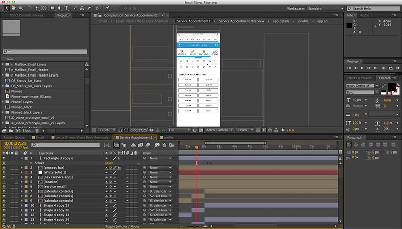
The tool most designers use to illustrate UI sequences/behavior is called After Effects.
This program produces lively animations and it provides generous preview options to ensure the success of our UI. It is helpful before, during, and after technical production.
However, you can choose between many different tools, as most of them already upgraded to trendy and fast prototype tools. You can also choose a ready-to-use Web or Mobile UI Kit and customize it according to your requirements.
Context
Motion creates the ‘physical state’ of your environment and the assets it contains.
This is how it contributes to the context of your content and it helps to avoid skeuomorphic restrictions on creativity.
Why not deform objects or add inertia to the simplest of them? The only result we could achieve is a playful and involving experience!
Delays
Delays are very common in the online world, but even the most persistent among them can be removed (or at least reduced) with catchy and noticeable pre-fetching effects.
Unfortunately, the procedure is not simple: restricted mobile networks and their users will not appreciate huge amounts of pre-fetched data, which they’re not even likely to use.
The reality is that you cannot avoid delays entirely. A good animation can help you distract users for a while, but the animation cannot last forever. When facing a bigger problem, we recommend you use effective animation layering.
Also read: UI Design Principles – Some Of The Best Practices To Keep In Mind
Responsiveness of UI animation
As with other design elements, the motion should remain intuitive and responsive.
It must react in a comprehensive and complementary way which reassures users of the quality of your app instead of confusing them.
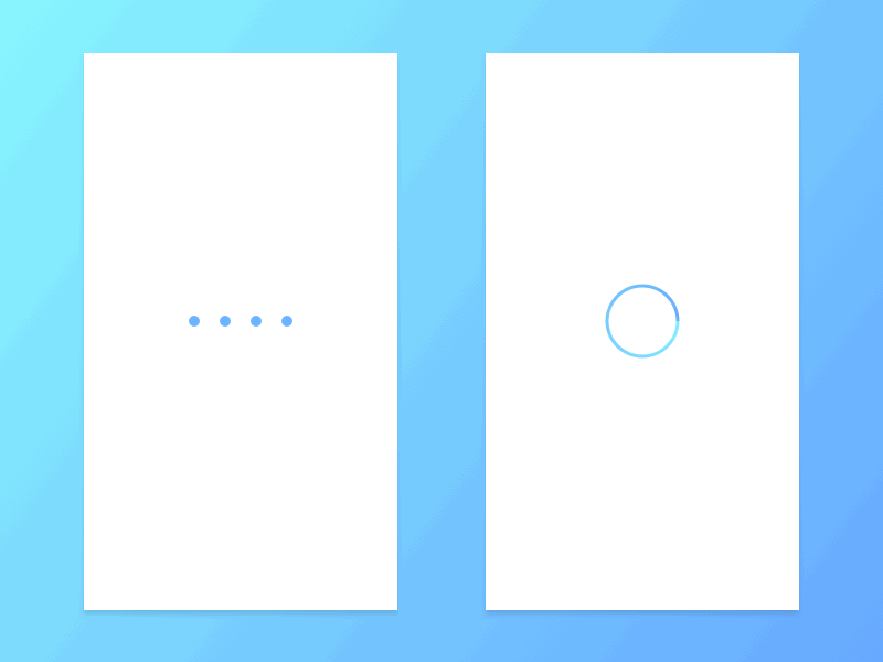
Progressive loading
Progressive loading is employed to reduce the time users perceive as being spent waiting while their data is loading.
Don’t worry too much. Users already know that the entire information will not be available at once, but don’t frustrate them with delays and availability difficulties. Instead, use animations to create the illusion that the app is far more responsive than it seems.
Subtle application of animation in UI design
Your animations may be cool and engaging, but avoid confusing users with too many of them.
You need to be subtle and careful and include only those items that can really attract attention. Usage and transition aspects should also be modestly elaborated because overdoing them can really frustrate your users.
Like this post? Check out more amazing web design content here.


