Do you want to know how to increase user sign ups? Yeah, we know that pain.
It doesn’t matter what type of website you’re running. High conversion rates will still be difficult to accomplish.
You will usually be looking to sell more or engage users enough to make them subscribe. And you will do your best to deliver value and quality in order to boost conversions.
Nevertheless, when thinking of how to increase user sign ups, there are few design and content aspects that must be observed.
To start with, all websites have three types of audiences: sign up newcomers, explorers looking to confirm that your website offers what they need, and lastly, visitors who know little or nothing about your website, and want to learn about it.
As the designer of a website, you need to create an attractive vibe from the first moment visitors land on the pages.
You need to use some of the website registration best practices to transform your website from an unfamiliar medium to an interesting corner where users are more than interested in sharing data. Let’s check out how to get people to sign up for your newsletter.

Table of contents
- Everybody prefers free
- Put call-to-action buttons in visible places to increase user sign ups
- A/B testing to increase user sign ups
- In the case of sign-up calls to action, for instance, you will have to decide on:
- How to get people to sign up with simplified sign-up forms
- Let them know you’ve taken care of privacy issues
Everybody prefers free
Think of yourself as a user, and imagine you’ve just come across an unfamiliar website. Most of the time, it was a banner that pointed towards that website that intrigued you enough to visit it. Or an interesting blog you read on a good blog that made you decide to check the website out.
In certain occasions, however, it will be Google’s common search query that takes you there. Still, in order to investigate it, the website requires you to sign up. What will you do?
The logical inclination would be to try it out without waiting! If you don’t do that, you’ll never know what that website has to offer. Or whether it is worthy of your commitment and your time.
The first trick to sell and boost conversions is to introduce a free trial. Since you’re already interested in that website, and you’ll increase user sign ups for it if it meets your standards.
Also read: Best Free Graphic Design Websites for Students
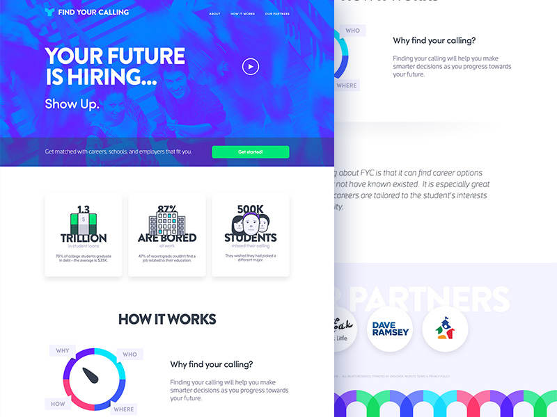
Trials are also included to give users the opportunity to check whether they like your features before they commit to your services. When doing it, keep in mind that most users will refuse to reveal credit card information. Even when you’re not charging them for the trial.
Instead, offer the service at no charge, instead of making users undergo what they believe is a serious security threat. Forget about the credit card number, and let them discover how fabulous your work is.
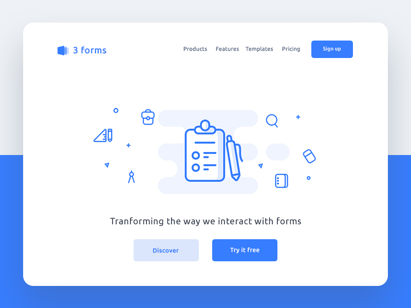
As the trial is slowly approaching its end, remind them that it will expire and that they have to buy your services in order to continue using them. Offer proof.
If you’re about to claim whatever on your website, back it up with some relevant proof. Your audience will be skeptical by default and will be required to see whatever you claim your product can do. What can you do for the purpose?
Also read: Best Fonts To Use For Your Websites and Blogs
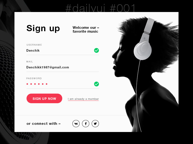
Ask customers to review your product for a great sign up experience, and use their testimonials. If your product is good, people will know to appreciate it. There is no better way to verify what you’re saying than to use testimonials from your most loyal or at least average customers.
Use case studies. Case studies are very popular, and we’ve all seen how effective they can be.
Scientific studies and tests with positive results. Personally, we can share the example of a small log manufacturing company that dissolved the myth of log homes being energy-inefficient.
What they did was ask a well-known university to complete an independent study, which managed to prove that log homes lose no more of their heat than other homes do. Even nowadays, they relate most of their sales to this particular study.
Third-party reviews. Use the reviews other magazines and blogs are writing concerning your business, and share them with accurate links.
Social proof. Even when you’re running a well-known business with thousands of customers, there is always room to promote your work. Make sure everybody knows where you stand compared to your competitors. Since customers don’t really like feeling as if they were the only ‘tricked ones’ out there.
Plus, bring upfront the prominent companies that make use of your service. Because that can definitely ensure you a bright future.
Show what you know! Good demos are the best way to convince people that you’re offering a high-quality product. So expose all the good sides of your brand in it.
Put call-to-action buttons in visible places to increase user sign ups
It’s very difficult to be successful and you need to know how to get new customers.
Call-to-action buttons are the most important assets you have to increase user sign ups for your services, and if they’re not there, you’ve definitely messed up your conversion future.
The site is simply unimaginable without them, so try to make them as visible as possible.
Even if this is somehow common sense, you can rely on the fact that many good vendors neglect it, confuse users with similar buttons, or hide the call-to-action somewhere on the bottom of their pages.
Also read: The Most Popular Discount Websites for Web Design Resources
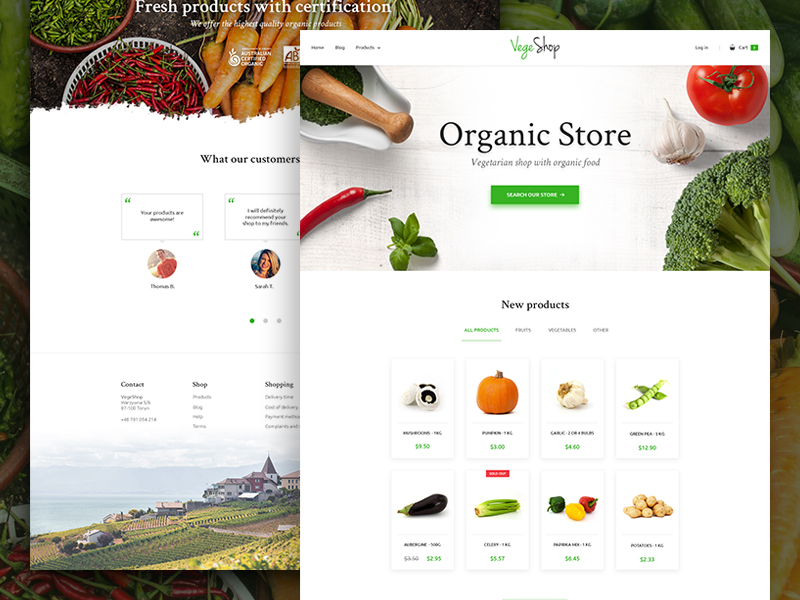
To start with, distinguish the cal-to-action from all other elements. Use colors that grab attention, strong contrasts, larger types, and smart positioning to obtain the best results possible.
Once they’re there, test them, and confirm whether they’re working better than the other buttons. Sometimes, the test will show you that you’re not using the appropriate phrases or icons, and will require you to combine elements in a different way.
A/B testing to increase user sign ups
A/B testing (or split testing, as some call it) has a paramount influence on the quality of your content and design decisions, and is therefore the most important testing technique you should apply.
The method is to make two separate drafts of your design with minor differences (A & B), and test both of them to see which one performs better.
In the case of sign-up calls to action, for instance, you will have to decide on:
- The color of the button;
- The shape of the button;
- The position of the button regarding the text and the imagery surrounding it
- The wording structure (Shall it be ‘Sign up for free’; Become our member’, or something completely different?).
Many designers go so far as to test all of these aspects, but for smaller sites, it may not really make sense. What matters the most to beginners is color, wording, and distinction, which means that two simple tests can do the job of determining what is really beneficial to conversion rates.
In case you deem it necessary, you can always perform the rest of the test later on.
Check out this blog to get detailed insights about user experience design.
How to get people to sign up with simplified sign-up forms
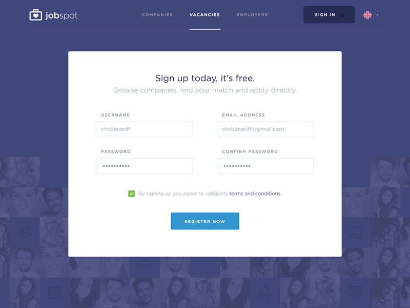
Once again, think of your personal sign up experience: How do you feel about exhausting sign-up forms that ask for absolutely irrelevant information? Most of the time, they look pointless and suspicious, and many users give them up before they’ve completed them. Therefore, make them as simple as possible.
As practice shows, an outstanding sign-up form should have no more than the bare-minimum information for using the website, and mustn’t require any financial transactions. If possible, ask for nothing but the name and the email address, and if you’re charging, make sure you need the minimum credit card information the processor can work with.
Also read: Designing For Mobile UX – Best Practices
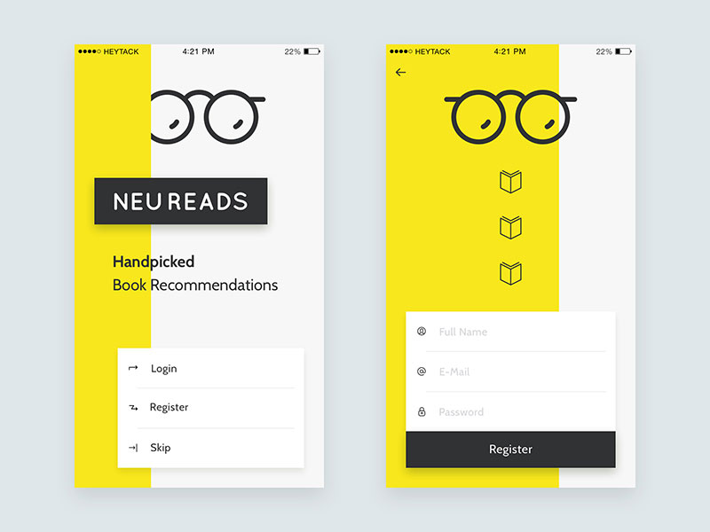
If your users prefer, enable the site to use the billing address instead if they also require a shipping address. The reason why we’re emphasizing the importance of simple sign-up is that users usually perceive it as a barrier for them to access your site, and barriers should be kept low when raising conversions.
Look at every extra sign up the field as a risk, and don’t let users go away just because you’ve asked them to provide too much information.
In case you really need that data to proceed, make the sign-up basic, and add a recommendation for users to update their profiles while using the website.
What is also imperative is to make sure that all important information is displayed on the registration page, such as the cost, the features they’re about to obtain, privacy terms, and other important conditions.
In such a way, they will learn about everything important in time and won’t abandon the sign-up page to look for information elsewhere.
Also read: UI Design Principles – Some Of The Best Practices To Keep In Mind
Let them know you’ve taken care of privacy issues
Your privacy policy link has to be as close as possible to the sign-up button or even the submit one because it helps visitors stop being hesitant about sharing private data with third parties. Websites that display security information in such a way are considered more credible and achieve higher conversion rates than those that hide it. We hope you now understand how to get people to sign up for newsletter.
Like this post? Check out more amazing web design content here.
