We all love ice cream, and that’s where Baskin Robbins comes first. So today, let’s discover Baskin Robbins logo meaning!
The Baskin Robbins logo might just look like a colorful “BR”, but there’s more to it than meets the eye. Behind this simple design lies a fascinating story full of meaning and history.

Understanding the symbolism behind the Baskin Robbins logo can give us insight into the brand’s values and its origins.
Let’s take a closer look at the hidden layers of significance behind Baskin Robbins hidden logo.
Table of contents
Brief History Of Baskin Robbins
It all started in 1945 when two ice cream enthusiasts, Burt Baskin and Irv Robbins, decided to join forces and create something special. They opened their first ice cream shop in Glendale, California. They started with the dream of providing people with delicious and innovative flavors.
What made Baskin-Robbins stand out was their commitment to offering 31 flavors of ice cream. One for each day of the month. This idea was revolutionary at the time and captured the hearts (and taste buds) of customers everywhere.
Over the years, Baskin-Robbins continued to grow and expand, becoming a beloved part of American culture. They introduced iconic flavors like Pralines ‘n Cream, Jamoca Almond Fudge, and Mint Chocolate Chip.
Today, Baskin-Robbins has thousands of locations worldwide. Each offering a wide variety of delicious ice cream flavors, sundaes, and other treats. Whether you’re craving something classic or adventurous, Baskin-Robbins has something for everyone.
Also read: The Holy Grail Of Dos and Don’ts For Retro Logo Design
Significance Of The Logo
Baskin Robbins has recently undergone a transformation to reveal a refreshed Baskin Robbins brand identity. According to the company’s press release, the Baskin Robbins new logo reflects the brand’s trademark playfulness, commitment to excellent taste, and high quality.
The goal of this makeover is to strengthen connections and loyalty among younger consumers. The redesigned logo aims to create an immersive and exciting experience for customers, with vibrant colors and modern designs that highlight the brand’s playful nature.
Despite the changes, the brand’s promise of offering 31 flavors, one for each day of the month, remains unchanged.
Also check out: Pixalogo – The Best Logo Design Bundle
Baskin Robbins Logo Meaning
For many years, the Baskin Robbins logo has sported a playful color combination of pink and blue hues, with a quirky font showcasing the iconic number “31.”
This design aimed to capture the lively and joyful essence associated with indulging in a scoop of their delicious ice cream.
However, a recent update has brought about a more refined and polished look to the Baskin Robbins branding. The new logo features an elegant and sleeker typeface in brown and pink tones, signaling a more mature and sophisticated image.
This modernized logo pays homage to the brand’s original emblem from 1947 while infusing it with deeper and more vibrant colors.
At the center of the redesigned logo is a bold and elegant “BR” monogram icon in brown, cleverly integrating the “31” concept in pink. Surrounding this centerpiece, the full brand name appears in a clean and contemporary sans-serif typeface, with “Baskin” on the left and “Robbins” on the right.
This fresh yet timeless representation revitalizes the beloved ice cream brand, seamlessly blending its rich history with a modern aesthetic.
Also check out: Aurora 3D Logo & Text Maker
Slogan Of Baskin Robbins
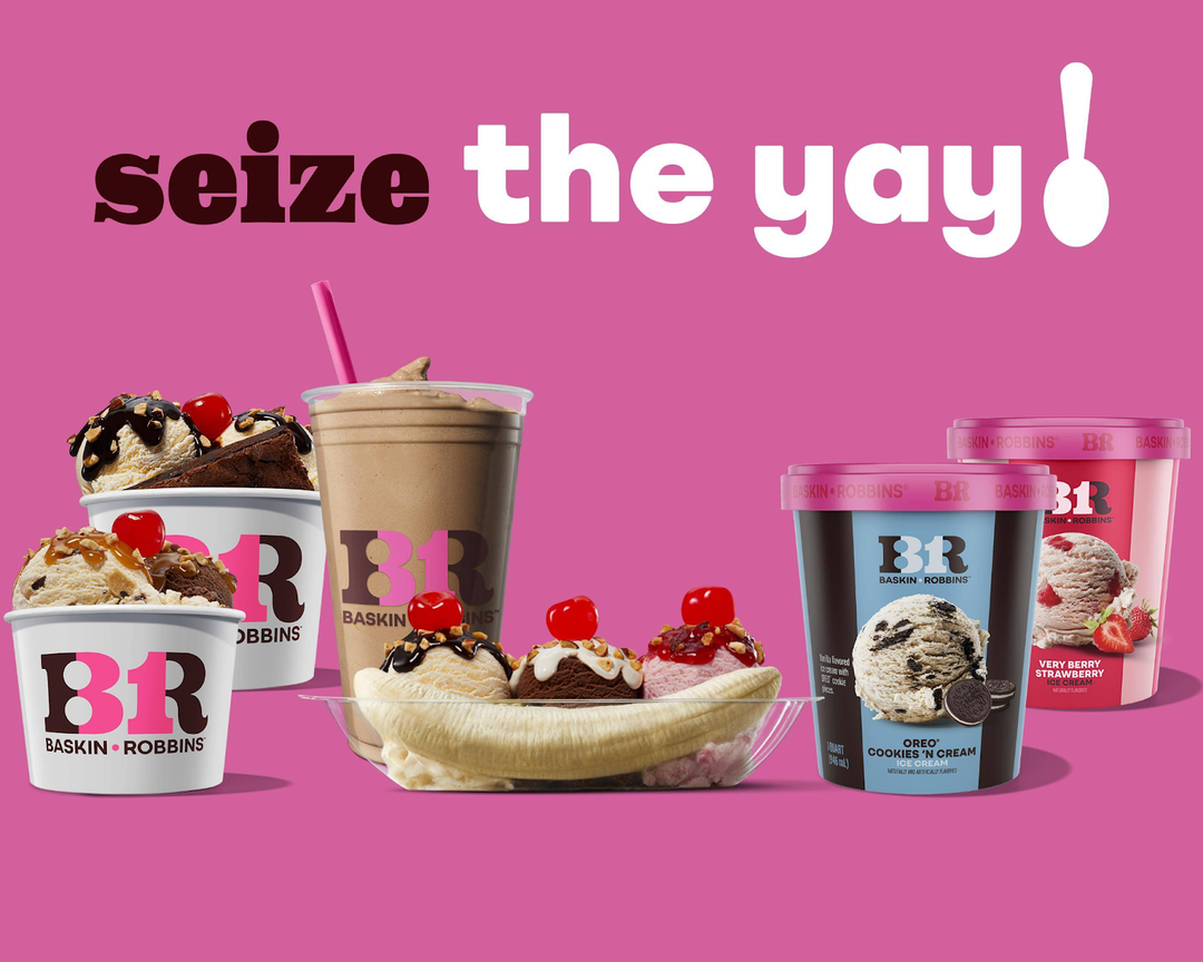
Baskin-Robbins is spreading joy with a fresh update to its famous brand. They’re changing the logo, packaging, uniforms for employees, and even the tagline, all to remind customers to
“Seize the Yay”
Jerid Grandinetti, VP of marketing and culinary at Baskin-Robbins, said that for more than 75 years, Baskin-Robbins has been the place where people celebrate important moments.
He explained that their new look and ideas recognize how special ice cream is to their customers and how they always try to make new and delicious flavors.
He also said that sometimes we forget to appreciate the little things that make us happy, so they want people to stop and enjoy any happy moment with Baskin-Robbins.
Discover some cool logos and their hidden logo meanings.
Other Baskin Robbins Slogan/Tagline/Motto:
- 31 flavors.
- More flavors. More fun.
- Baskin-Robbins. What’s your flavor?
Also check out: Dream Logo Builder – Modern Unique Logos
In Conclusion
Delving into the Baskin Robbins logo reveals a rich tapestry of significance and hidden logo design details.
From its vibrant colors, symbolizing variety and joy, to the clever integration of the number 31, representing their famous 31 flavors, every element tells a story.
It’s a logo that not only represents a beloved ice cream brand but also encapsulates the essence of indulgence and innovation.
So next time you see that iconic pink and blue swirl, remember the sweet secrets it holds about Baskin Robbins’ delicious delights.
Like this post? Check out more amazing web design content here.


