Are you ready to explore the depths of the LG brand? Have you ever wondered how the LG logo was formed? What is the LG logo meaning? You probably have LG products in your house, and it’s a trustworthy brand. Originating from South Korea, this company has grown to become one of the oldest and most widely recognized.
It’s amazing how a company can grow so much to become world-famous and one of the most trusted electronics brands. LG sells its products in more than 75 countries. LG sells more than just electronics, starting with home appliances, mobility products, and business solutions.
Lets dive into knowing the LG logo meaning!
Table of contents
- A Little History About LG
- Meaning Of LG Logo
- LG Logo History: The Evolution of LG Logo
- First “Lucky”. (1950-1963)
- First Goldstar Logo (1958-1964)
- Second “Lucky” Logo (1963-1978)
- Second Logo of Goldstar (1964-1983)
- Third “Lucky” Logo (1978-1983)
- Third Goldstar Logo (1983-1995)
- First Logo When “Lucky” and “Goldstar” Merged (1983-1995)
- Logo Of LG (1995-2014)
- LG (2008-2014)
- LG (2014- 2023)
- Present LG Logo (2023- Now)
- The Meaning of LG Slogan
- Conclusion
- Frequently Asked Questions
A Little History About LG
The LG company we know now has come a long way. LG was first established in 1947 by In-hwoi Koo in South Korea. At first, it wasn’t an electronics company but a Chemical Co. Ltd. Chairman In-hwoi Koo named the company “Lucky,” which sounded like “Lak Hui,” which means “giving joy to all.” The company named itself after Korea’s first makeup cream, “Lucky Cream.”
Discover some cool logos and their hidden logo meanings.
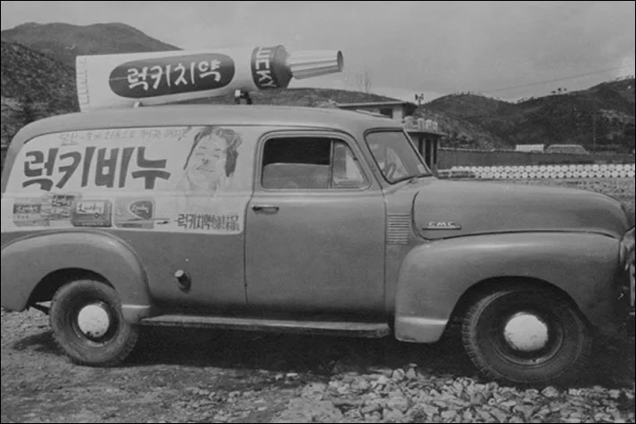
Later, the company sold “Lucky Toothpaste,” which also became a huge success. Due to its success in 1974, the company changed its name to “Lucky Co. Ltd” and grew into a leading chemical company.

A company called “Goldstar” was established in 1958. It was the first leading electronics company in Korea. Both companies became leading companies in Korea, and soon after, in 1983, they merged to form “Lucky Goldstar.”
In 1995, on 1st January, LG posted an ad with a smiling face and the simple message “Happy New Year.” This ad spread curiosity among customers. Then, on the 4th of January, LG posted another ad in the newspaper, this time in full page width, saying, “Lucky Goldstar turns into LG.” This was the first official greeting from LG.
On December 31st, 2015, after 20 successful years, LG went through another transformation. The company made a custom font called “LG Smart Font.” The LG Smart Font took the emotional connection of handwritten text, made it customer-oriented, and created a new image. LG applied this font to its famous slogan, “Life’s Good,” for stability and unity.
Meaning Of LG Logo
According to LG itself, the letters ‘L’ and ‘G’ in a circle symbolize the world, future, youth, humanity, and technology.
A company spokesman said: ‘Our philosophy is based on humanity.
Also, it represents LG’s efforts to keep close relationships with our customers around the world.
LG Logo History: The Evolution of LG Logo
First “Lucky”. (1950-1963)
The first logo of Lucky Co. Ltd. was a very simple design with text included: a horizontally oriented oval shape placed above bold Korean black lettering. The oval shape was solid red, and the brand name was written with thin white lines. The logo was there for more than a decade.
Check out other logo and their hidden meanings.
First Goldstar Logo (1958-1964)
Goldstar was a brand launched in 1958. Its first logo was a simple cursive wordmark with a crown-shaped icon above it. Both elements of the logo were monochrome. The crown element with the wordmark brilliantly balanced the whole logo.
Explore Baskin Robbins Logo Meaning and it’s secrets
Second “Lucky” Logo (1963-1978)
The original Lucky logo is composed of red, white, and black colors with a Korean inscription. It has a solid red square with a stylized letter “L” on it. The horizontal part of “L”, in fact, the lower part, has a zig-zag line. The wordmark for the logo was in Korean, which translates “Lucky” into smooth angles and straight lines.
Check out: The Holy Grail Of Dos and Don’ts For Retro Logo Design
Second Logo of Goldstar (1964-1983)
The company changed its logo concept completely in 1964. Now, it features a solid black square with a round circle containing the crown icon. The abbreviation “GS” boldly represents “Goldstar.”
Check out how you can secure your ideas from being stolen.
Third “Lucky” Logo (1978-1983)
Lucky Co. Ltd. completely changed the logo. The new logo features blue, white, and black colors. On the left, a clover design is placed in a blue square, and the brand name is written in bold. Korean characters are placed on the right side. This logo only lasted for five years.
Third Goldstar Logo (1983-1995)
Goldstar redesigned its logo and changed its color palette. The emblem stayed the same, but they changed the color to solid red and positioned the wordmark beside the icon. The wordmark was modern sans-serif typography in a soft, bold style.
First Logo When “Lucky” and “Goldstar” Merged (1983-1995)
When both companies merged, the company became “Lucky Goldstar.” The logo features a square red background with an “L” on it and a white crown placed above a zig-zag line. The wordmark is written in Korean and features black, straight lines. The logo lasted until 1995.
Logo Of LG (1995-2014)
On 1st January, the company shortened its name from “Lucky Goldstar” to “LG.” This was when the new era of the company began. The logo was a red circle, and “LG” was a light-gray wordmark on its left. The typography was in bold Helvetica font, which made it look simple. The red circle had three white lines on it. The “G” was drawn around the inner edge of the circle, with “L” placed in the center and a solid white dot placed on the left of “L.” The composition of this created a face.
Check out 15 Fonts Like Helvetica
LG (2008-2014)
In 2008, the logo underwent a slight change to give the red circle a 3D look. The letters were turned a slightly darker shade, and the red circle was made shiny for a fancy look. The white lines turned silver, and the contrast softened.
Learn how you can choose the right typeface for your design.
LG (2014- 2023)
The company also redesigned the logo, changing the circle’s color from fuchsia red to burgundy, which gave it a modern look. As for the lettering, they updated the font to a more contemporary style while retaining the same dark grey color.
Check out the Best Calligraphy Fonts To Spice Up Your Writing
Present LG Logo (2023- Now)
In 2023, LG redesigned its logo again to a more minimalist design. The new logo is a bright scarlet red square with thin lines making up a face, formed by the letters “L” and “G” with a solid white dot. The new logo is flat, giving it a cleaner and more minimalistic look.
The Meaning of LG Slogan
LG’s slogan is quite motivational and inspiring. It is really great how the slogan has influenced the public. The LG company is famous worldwide for its slogan, “Life’s Good.” By that, they mean their product has emotions involved with the public, how the company has grown with people. The company also says a message by the slogan: even though life can be imperfect, Life’s Good.
Conclusion
It’s impressive how this well-known company has succeeded globally, from being a makeup cream to a global electronics company. It’s surprising how people have grown attached to the company. For example, if you want to buy any home electronic appliances, you’d look for LG. Now you know the LG logo meaning.
Hope that you learned something about the LG logo meaning.
Frequently Asked Questions
1. What does the LG logo stand for?
Ans. The LG logo stands for the company’s slogan, “Life’s Good.” The letters “L” and “G” form a human face, which reflects friendliness and a customer-first attitude.
2. Why does the LG logo look like a face?
Ans. LG designed the logo to look like a smiling human face to create a warm, approachable image. It’s their way of showing that the brand cares about people and relationships.
3. What do the colors in the LG logo mean?
Ans. The logo uses red and gray. The red color represents friendliness, warmth, and passion, while the gray (or silver) adds a modern, reliable feel to the design.
4. Is there any hidden meaning in the logo?
Ans. Yes! Apart from the face, some people also notice that the “G” looks like a power button, hinting at LG’s role in electronics and technology.


