The field of web design continues to reinvent itself, prompted by innovations in behind-the-scenes technology and also by aesthetic trends.
Color trends have come and gone over the emerging history of web design. Today’s website color schemes feature vivid, vibrant colors, in ways that flout the normative expectations of a few years ago and occasionally step away from the brand standards of companies.
") Image source: Cosmin Negoita
Image source: Cosmin Negoita
A virtual rainbow of saturated colors proliferates online, even in industries formerly known for their conservative palettes and restrained web design color schemes.
Unlike the bright colors of a few years ago, these shades are a broad spectrum of subtle, influential colors.
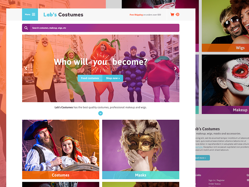
Monochromatic Sites with Branding Potential
 Image source: Matija Sundalic
We see today more and more sites that implement one strong color through a variety of page elements, from backgrounds to buttons and type, to image overlays.
This form of color usage comes straight out of the time-tested norms of brand standardization. Coca-Cola’s signature red, Ford’s blue, T-Mobile’s magenta, and AT&T’s cyan all help prompt immediate identification.
Companies that set up single-hue dominance on their sites can tap into the power of color to build memorable associations.
Monochromatic sites play with a range of tints, transparencies, and tones based on one strong shade. Designers can move one step beyond these color schemes by adding color complements, analogous shades, and by developing color triads.
At the same time, single-color sites can rely on black text plus a bright color to mimic the power of two-color projects in print, taking advantage of the recollection value of a single vibrant hue paired with a neutral shade.
Influences from Fashion and Interior Design
 Image source: Delip Nugraha
Fashion always dominates color trends, leading the way for interior design to echo its dominant motifs. Both these creative industries rethink their color preferences on an annual, if not a constant, basis, with fashion faster on the move because interior design represents a bigger-ticket investment.
Flip through the pages of Vogue, Marie Claire, or W and you’ll see bright prints, neon colors, and black-and-white designs with hot color accents. These same trends that jump off the pages of fashion magazines also pop up in web design color schemes thanks to fashion’s greater-than-ever impact on other realms of design.
Flat Color

Image source: Emmanuel Julliot
The move away from pseudo-realistic, skeuomorphic backgrounds and page controls to sites with less, if any, shading and shadowing signaled the advent of flat design, so named for its absence of dimensional effects.
Flat design prompted the increased use of vibrant colors, partly because it lacks other means of highlighting individual page elements. At the same time, increases in screen size, resolution, and display performance helped vivid shades climb to the top of the list of web design color schemes.
Bigger, higher-resolution monitors do a better job at reproducing the range of colors that designers choose. Gone are the restrictions of web-safe color — all 216 shades of it — that once represented the only hues whose appearance a designer could predict across all screens.
Today’s screens can reproduce at millions of colors, freeing designers to use whatever website color schemes they want. From phones and tablets to notebook and desktop computer screens, size and performance restrictions no longer constrict color use.
Mosaic-Style Design
 Image source: Philip Walmsley
Vibrant color meets mosaic-style design in two trends that suit vivid shades. Color blocking builds a grid of rectangular and square shapes, each representing a content area. You saw this treatment in the controversial look of the Windows 8 interface.
When you navigate among color blocks, the position of your cursor reveals colored hover states, which change shades to foreshadow the outcome of a click.
Color Meets Texture
 Image source: thepatternlibrary.com
Textures once filled screens with tiled but neutral patterns, underlying other website content.
At the intersection of texturing and bright color, you’ll now find the subtleties of today’s tinted patterns, applied either all over or as an accent on backgrounds and images. Some of these effects are in fashion again, as flat design begins to mutate into new forms.
High Contrast
 Image source: Thomas Reeve
Add one highly saturated shade to an otherwise black/white/gray design to create high contrast, focusing the eye on specific information through the color’s ability to attract attention.
That high contrast drives the ability of minimalist web design color schemes to highlight talking points without using verbal tricks such as extravagant calls to action.
The Psychology of Color
 Image source: Efimov Ivan
Trends and preferences are also explained by psychology and social science that underlie color’s cultural meanings. Depending on the society in which you consider them, colors entail widely disparate associations.
Websites targeting an audience with a multicultural background should consider color association as a part of their design briefs. For instance, in the U.S., certain color associations dominate viewers’ reactions to specific hues.
- Pink – Confidence, brashness, youth, romantic love, emotional sensitivity
- Red – Danger, warning, sexual tension, love
- Yellow – Caution, positive thoughts, happiness, enjoyment
- Orange – Heat, excitement, drive, creativity
- Green – Wealth, growth, safety, the natural world
- Blue – Peace, reliability, calm, balance
- Purple – Power, richness, spiritual harmony, equilibrium
Using Vibrant Colors
 Image source: Alan Podemski
Bright, saturated shades work with many looks. To find the best use of color in web design, choose shades that complement your message and suit your product.
Expand your creative horizons beyond business as usual, and see what creative industries and organizations do with vibrant hues. From ad agencies to design firms and artists to musicians, these innovators started the hot-color trend.
However, you will also find their influence on sites that focus on delivering news, analyzing the weather, or offering health tips.
Into the Future
 Image source: Andrew Burton
Like web design itself, web design color schemes go through pendulum-swing phases that shift back and forth between more or less of specific site features.
Eventually, flat design will regain some dimensionality, but bold color usage is here to stay. Look for it to highlight options that regain popularity once they have color to refresh them, such as gradients on buttons or backgrounds.
Only when you think of color as an end in itself rather than a necessary or an arbitrary choice in web design, you are in tune with what’s hot and what’s here to stay.
Credit for featured image: Camri Hinkie