What’s the story behind Apple logo history? We’re about to find that out in this blog.
The Apple symbol is as rich and diverse as the company itself. With each iteration, it has undergone subtle yet significant transformations, reflecting the evolution of the famous company and the changing landscape of technology.
Each iteration tells a story of progression, vision, and identity, from the original logo’s rainbow-colored stripes to the sleek and minimalist design we know today. But beyond its aesthetic appeal lies a more profound significance—a symbol that represents not just a brand but a revolution in how we interact with technology.
Join us as we uncover the secrets and story behind Apple logo and also discover the different Apple logos so far.
Table of contents
Evolution Of The Apple Logo Over The Years
1. The First Design: 1976 Original Apple Logo
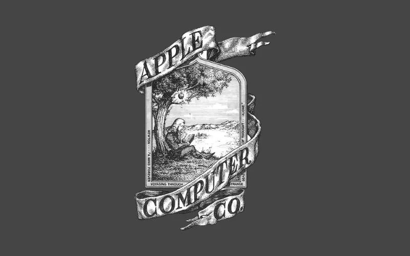
The first Apple logo, made by Ronald Wayne, shows Isaac Newton sitting under a tree, about to be hit by an apple. The company’s name is also wrapped around the picture.
Even though it had a unique and artistic design, it didn’t fully show what Apple was about and soon became old-fashioned. Their first computer had this logo with a classic badge and a ribbon around it, saying “Apple Computer Co.”
The letters were bold and fancy, making them look cool. The badge showed a detailed picture of Isaac Newton sitting under an apple tree, reading a book.
Also read: F1 Logo Meaning: Hidden Details, History & More
2. The Rainbow Strip: 1977 Old Apple Logo
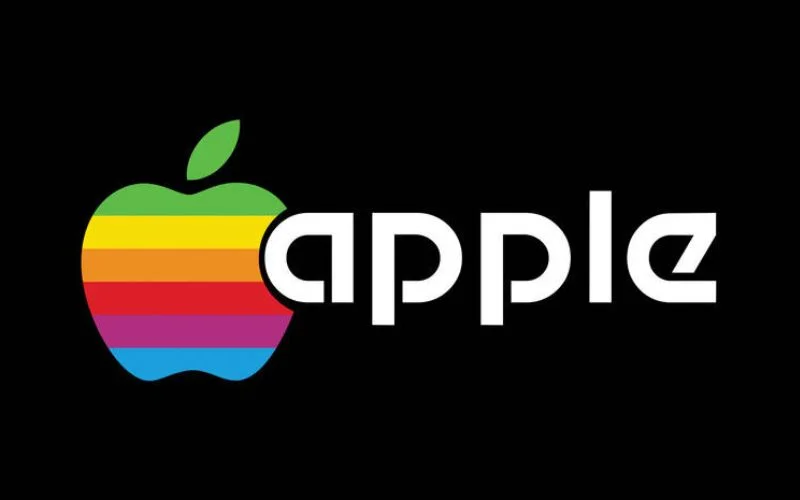
Steve Jobs didn’t like the old logo because it looked too old and was hard to print on small things. So, he asked a designer named Rob Janoff to make a new one.
Jobs wanted a logo that showed how critical modern computers were and also fit with the name “Apple.” The new logo was a simple apple with rainbow colors. This matched the Apple II computer, the first computer with a color screen.
The apple had a bite removed on purpose so that people wouldn’t mistake it for a cherry. Sometimes, apples and cherries can look similar, but the bite makes it clear it’s an apple.
Discover some cool logos and their hidden logo meanings.
Also check out: Pixalogo – The Best Logo Design Bundle
3. Minimal Changes In Logo Design: 1984
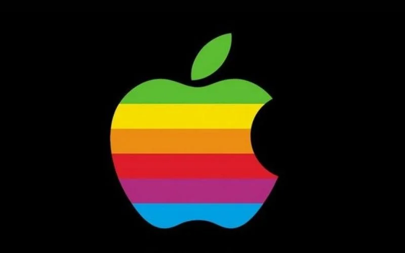
After that, the rainbow Apple logo changed a bit, but it was still necessary. When the Macintosh computer came out, a company called Landor Associates made a change: they took away the words from the logo.
This made it just the picture of the fruit, and this simple symbol became famous for many years.
4. The Monochrome Black Apple: 1998
One big challenge for Jobs was to change how people saw Apple, starting with the logo. He first made the rainbow logo into a see-through blue to match the first iMac. Later, in 1998, he changed it to solid black to go with their new silver computers and make it seem fancy.
This black Apple logo change also showed Jobs’s liking for skeuomorphism. That means making things on the computer look like real things so they’re easy for people to understand.
Also read: Most Common Mistakes in Designing Logos
5. The Aqua Apple Design: 2001
The company continued using the black logo until 2000, when it changed to a new one that looked made of glass.
This change came because Apple was becoming more popular, and its products were becoming more expensive. They needed a logo that showed their severity and unique approach.
The logo looked classy and had a gradient shade, making it look even fancier. The company used this Apple aqua logo from 2001 to 2007.
6. The Metallic Apple Design: 2007
This one is the most remembered one in the Apple logo evolution. In 2007, Apple decided it was time for a new look that matched their focus on being more eco-friendly. The new logo looked like it was made of shiny chrome, which made it seem more valuable.
This change happened when the company was also building its buildings to be more energy-efficient. So, the new logo reflected their new way of design thinking.
They used this metallic Apple logo until 2015. Since it wasn’t too long ago, people still remember it well, and it’s one of the fanciest looks Apple logos have had.
Also check out: Premade Logo Templates Mega Bundle
7. Latest Design: 2020 – Today
Today, the Apple logo looks almost the same as before. It’s primarily seen in black, white, or grey (which looks like silver). The grey one is used on the website and store as a small icon, and it’s close to silver to make the logo look fancy, like the logos on Apple devices.
This logo works well for a few reasons. It’s simple, so people can easily recognize and remember it. It clearly shows the company’s name but is also abstract, so it fits with what Apple does. Plus, the logo’s sleek style matches the company’s focus on making things look simple yet perfect.
Meaning Behind Apple Logo

The “bite” taken out of the apple isn’t just to make it different from other fruits like cherries. It goes back to the story of Adam and Eve, who took a bite from the apple of knowledge.
The image shows that people are curious and want to learn new things, and using Apple products can help them do that.
Also, the “bite” in the logo is like a play on words since it sounds like “byte,” a digital data unit.
Also read: Tips for Startups to Pick Professional Logo Service
Apple Logo Font
Apple uses Myriad Pro for its branding. It’s a modern creative font made by Robert Slimbach and Carol Twombly for Adobe.
This font has simple, straight lines complementing the logo’s clean look. It helps make the brand look neat and consistent.
Apple Logo Colors
The colors of the Apple logo have changed, but the original rainbow-colored one from 1977 is still very famous. As things changed, Apple decided to use fewer colors.
In 1998, Steve Jobs stopped using the rainbow logo and switched to a single color: just the outline of an apple. The shape of the logo stayed the same.
They did this because the colorful logo didn’t match the new metal Mac computers. Now, depending on the background, the logo can be different colors.
Final Thoughts
As we wrap up our journey through Apple logo history, it’s clear that this iconic symbol has evolved alongside the company itself.
From the colorful beginnings to the sleek, minimalist designs of today, each logo iteration tells a story of innovation, progress, and identity.
The history of the Apple logo reflects not only changes in design trends but also the transformation of technology and the enduring impact of one of the world’s most influential brands.
Indeed, the history of the Apple logo is a testament to the company’s journey that continues to shape the future of technology and inspire generations to come.
Like this post? Check out more fantastic web design content here.
