Are you a car lover, precisely a BMW lover? Then you have come to the right place. Explore the significance of the BMW logo meaning and where it came from.
Almost every Manchester driver recognizes the BMW logo just by seeing it. But only a few look deeper into its meaning. Most don’t know what it means, its history, or where it originated from.

BMW has gained fame for its renowned car manufacturing. Today, the name is recognized and celebrated worldwide and has become synonymous with luxury, high-quality, and high-performance vehicles. In this blog, we will discuss the meaning of the BMW logo.
Let’s explore the significance of the BMW logo history and meaning
Table of contents
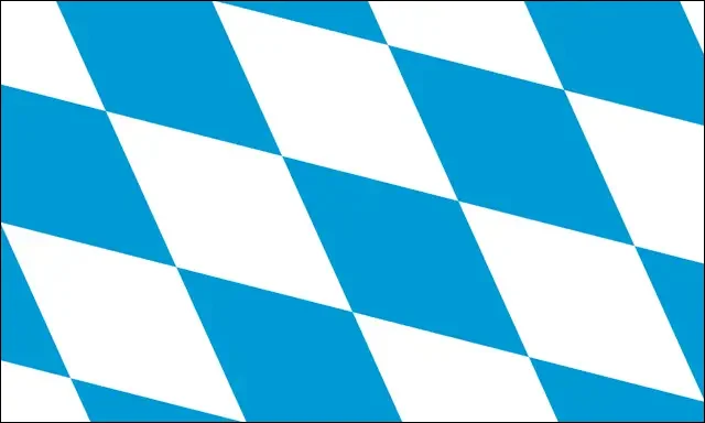
So What Does “BMW” Actually Mean?
BMW stands for “Bayerische Motoren Werke,” which translates to “Bavarian Motor Works” in English. This highlights the company’s Bavarian origins. Established in 1917, the BMW logo has evolved, yet blue and white have remained consistent.

Some still believe in the myth that the BMW logo meaning implies a spinning propeller, reflecting the brand’s past in aircraft engine manufacturing. However, the true significance of the logo lies in its representation of the Bavarian flag colors. That is why the blue and white emblem of BMW’s ties to Bavaria, Germany. Throughout the history of BMW, it has maintained a strong association with its Bavarian roots, reflecting its commitment to its tradition.
The logo’s blue and white color scheme reminds us of the company’s origin and continued dedication to its Bavarian identity despite global recognition and expansion. BMW AG is the company’s full name. “AG” stands for Aktiengesellschaft, meaning “an incorporation owned by shareholders.”
Discover some cool logos and their hidden logo meanings.
Let’s Dive a Little Deeper Into BMW’s History
BMW’s origin, “Bayerische Motoren Werke” or “Bavarian Motor Works,” started in 1917. It came from the renaming of “Rapp Motorenwerke,” an aircraft engine manufacturer based in Munich, the capital of Bavaria in southern Germany. Even though the name changed, everything within the company remained the same.
The company was included in the commercial register in July 1917 but lacked a distinct logo. Similarly, its initial advertisements from the same month featured no emblem, instead highlighting its intended products.
“In the early days, the logo and its meaning were by no means as present to a broad public as they are today, as BMW had no end customers to solicit,” said Fred Jakobs. The primary focus was producing and servicing German Air Force aircraft engines.
Check out Cool Logos And The Meaning Behind Them.
BMW Logo History: BMW Logo Evolution Throughout The Time
1. 1913 (Rapp Motorenwerke)
The First BMW vintage logo, before it was changed to “BMW”, used to be “Rapp Motorenwerke”. The logo was a round shape with a bold black border. Inside are two fine white stripes and two white stars divided by the all-capital letter “RAPP MOTOR” wordmark. The logo of Rapp Motorenwerke had a black horse figure within. Curved along the upper and lower part of the circle were the words “RAPP” and “MOTOR”.
Want to create your first logo? Check out Ironov – Dynamic Logo Creator
2. 1917 (First BMW Logo)
The iconic blue and white checkered logo was first designed in 1917. It was a thick black frame with a thin gold outline and “BMW” letters in a rounded serif typeface curved along its upper part.
Check these 30 Most Creative Animal Logo Designs
3. 1933
In 1933, the logo was modified and modernized by bolding the gold line, which made it clear and bright. The typeface was also a bold serif for an improved, smoother, sleeker typography design. This gave the logo a more sophisticated and elegant look.
Don’t miss these 20 Beautiful Fonts For Your Aesthetic Designs
4. 1953
BMW replaced the gold with a light silver color in the logo, and they changed the shades, too. The white stayed, but they replaced the blue with a light sky blue color, similar to turquoise. The outline of the logo was also changed to a thinner line. This logo stayed with the company for almost 20 years.
Check out Pixelo’s New Free Font and Designs For Commercial Use
5. 1963
The BMW old logo was redesigned again, got sharper lines, and the typeface was changed to bold sans-serif typography in white. Inside, it wasn’t so bright or colorful but simply dark blue and white. The circle and “BMW” contrasted against the black circle, creating a transparent, catchy logo that shows power and trust.
Check out Basic Principles of Color Theory in Web Design
6. 1997
In 1997, the BMW symbol received a three-dimensional look. The colors and everything else remained the same, except someone drew a black line to separate the inner part of the blue and white. This gave the logo a more modern and professional look.
7. 2020
This is BMW’s latest logo, a straightforward and minimalist design with a flat design. The black framing has changed to grey as an outline with a transparent background, and the typeface has also changed to grey. The center part of the logo is the same, with blue and white.
Check out Coca Cola Logo Meaning
The Mystery Behind The Color Of BMW Symbol
BMW’s colors, like blue and white, represent Bavaria and Munich, Germany. These BMW logo colors have been consistent over time, but sometimes, they change a bit to match what people like. Changing the font color from gold to silver was vital because it showed the company that more people wanted to buy their cars. This change also showed BMW that it could change with the times and bring new ideas. The brand uses these colors to show its history, new ideas, and what it wants to do in the future.
Check out interesting facts about Baskin Robbins!
Conclusion: BMW Logo Explained
So now you know the significance, meaning, and history of the BMW logo. It’s such an old company and has developed a lot throughout the years, from aircraft manufacturing to high-quality cars.
As we continue to witness BMW’s evolution and groundbreaking advancements, let the logo’s symbolism remind us of the brand’s incredible journey and enduring legacy in shaping the future of mobility and manufacturing.
Like this post? Check out more amazing web design content here.


