Are you a Pinterest user? And curious about the Pinterest logo meaning? In the online world, how things look is super important. So, when a logo changes, it’s not just about design; it shows how a brand grows and what it stands for. Pinterest is all about sharing cool pictures and ideas. But did you know its logo has changed too since it was established?
Let’s dive into the journey of the Pinterest logo meaning. We’ll see why it changed and how it became a symbol of what Pinterest is all about.

Table of contents
What is Pinterest?
Pinterest is a social media platform on the internet where folks come together to chat, connect, and discover others who share the same interests. It’s all about freely sharing photos. Users can upload their pictures and organize them into collections known as “boards” by pinning them. Despite its focus on images, the site stands out for its simple design and easy-to-use features, drawing in users from all walks of life. It has created a unique space online, offering a platform where people can freely express their passions and connect with others who share similar tastes and hobbies in a fun and creative way.
Check out: YouTube Changes Its Logo and App Design
Pinterest Logo Meaning and History
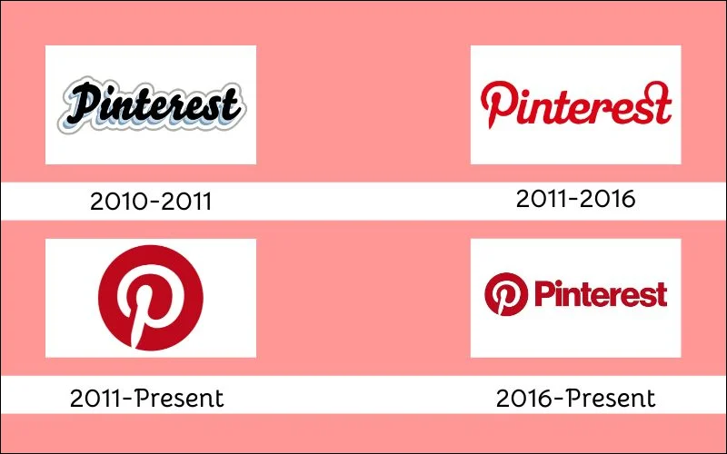
Pinterest was founded in 2010 by the Iowan e-entrepreneurs Ben Silbermann, Paul Sciarra, and Evan Sharp. It quickly became a big deal, making $2,803m in 2022 alone. People flock to it to share photos and cool graphics. But coming up with the correct logo wasn’t easy. It had to be memorable, strong, and simple. At first, it was just black and white, but then they switched it to red and white, which caught on quickly.
Making the logo look cool was important because they wanted to attract people to use their social media platform. The logo underwent some changes before landing on its final look. It started out basic, but then it got stylish with the red and white combo.
In 2011, the Pinterest logo took off, and everyone started recognizing the emblem. It became a symbol for sharing cool stuff you’re into. The logo became a big part of Pinterest: sharing ideas, inspiration, and creativity. And it’s still going strong today, loved by millions worldwide for its simple yet powerful logo representing the spirit of sharing and connecting. The word “Pinterest” consists of two words combined. ‘Pin’ stands for making an accent on one of the features supported by the application; ‘interest’ describes its versatility and capability to satisfy multiple purposes.
Check out: Coca Cola Logo Hidden Meaning.
Evolution of Pinterest Logo
2010-2011 (First Pinterest Logo)
The first logo was created with the Bello Script font, which resembles a handwritten script in calligraphic style. It featured black cursive lettering with a light blue shadow, and a broad white outline edged with a thin gray line. While its layered appearance was visually appealing, it was too faint and ordinary. The logo looked cool due to its layers, though it was too light and “usual,” which is why it only lasted for a few months.
Check out what kind of font does Amazon uses.
2011- 2016

In 2011, Pinterest refreshed its trademark, unveiling the iconic Pinterest logo. This new symbol is a bold red circle with a sleek white letter “P” inside, cleverly designed to resemble an elegant pin, with pointed bottom parts on the vertical bar. Initially, the icon was frequently used independently, alongside the newly created logotype, which was also introduced in the same year. While noticeably different from the original logo, developers Juan Carlos Pagan and Michael Deal aimed to retain the overall stylistic direction in this update.
Try these 15 Fonts Like Helvetica To Spruce Up Your Designs
2011- Present

In 2011, Pinterest’s logo received more attention with a new, simpler design. It looked more serious and professional than before. Designers kept the original style by putting a fancy “P” inside a red circle. This logo has stayed important over the years, still representing Pinterest.
Discover some cool logos and their hidden logo meanings.
2016- Present (Pinterest Logo Now)
In 2016, Pinterest introduced a new logo with two parts: an iconic design and the name written next to it. Both parts are dark red and white. The “P” on the round emblem stayed the same as in 2011, but the writing next to it got a new look. Now, it’s a bold, sans-serif typeface with the letters close together. This change didn’t affect much, just the font, and combined the name with the famous round icon.
Here’s Why You Should Use Eye Candy Color Schemes
Pinterest Icon and Color
Today, Pinterest’s logo boasts a straightforward font with bold, easy-to-spot letters that cater to all age groups. As it turned out, the logo almost completely replicates the icon of “Path,” the primary red color, the shape of the white letter “P,” and even the proportions of the elements match. The only difference is that the Path icon is a square with rounded corners, and Pinterest’s is round. This visual similarity often confuses users in the app store, leading to difficulty in distinguishing between the two apps. Despite this, Pinterest’s logo offers clear, visually appealing branding, ensuring accessibility for users of all ages.
Check out these 15 Best Color Scheme Generator Tools For Designers
Pinterest Logo Font
The letters in the 2011 Pinterest logo font were custom-made and unique to the brand. However, by 2017, they opted for a different approach, using a font called “Neue Haas Grotesk.” They made slight changes, like rounding the dot on the “i” and adjusting the “s” to fit better with the “e.” This adjustment aimed for a more standard appearance while preserving Pinterest’s identity.
Despite the change, Pinterest’s font and logo remain a symbol of creativity and connection. They reflect the platform’s journey from its early days to its current status as a global hub for inspiration and discovery, cherished by millions worldwide.
Conclusion
The Pinterest logo evolution reflects the platform’s growth and its commitment to simplicity, clarity, and accessibility. From its humble beginnings to its current recognizable form, the logo has evolved to embody the essence of Pinterest—a space for creativity, inspiration, and connection.
It is truly great that Pinterest can compete with Instagram and Facebook as social media platforms. And a fantastic journey to explore the Pinterest logo meaning.
Like this post? Check out more fantastic web design content here.
